Geometric Sans! Markus Frenzl on Antonia Henschel’s homage to Futura
How do you spell future? When Paul Renner began constructing a new typeface in 1924, he aimed to create nothing less than a font for a new era, even one for a new society that had just begun to conceive the world in new terms. The Grotesque signaled the departure towards Modernism in typeface design in the same way the flat roof did in architecture.1 The Futura presented in 1927 became a typographic expression of this new departure, which in many areas of design involved parting company once and for all with the ballast of historicism and the past. The express goals of design work at the time lay in reflecting the technological advances being made, shaping the new era by employing simple, fundamental geometric shapes and “(…) generating a congenial design language for this new reality. The linear Antiqua (Grotesque font) without serifs was the right typeface to this end, both in terms for concept and form.”2
In his book “Typographie als Kunst” published in 1922 Renner had already looked at the poignancy of basic shapes3: “When we reflect upon which shapes are anchored most securely in our imaginative dominion, which shapes we are able to recall the fastest and most clearly, then we will all come to the same conclusion: It is the simplest of volumes: orbs, cylinders, cones, cubes, shafts and the like.”4
The idea of creating shapes entirely out of geometrical elements was already in the air when Renner designed his Futura
He hereby seized upon ideas put forward by the avant-garde of his time, movements and schools such as De Stijl, the Russian Constructivists or the Bauhaus: The search for a “form without ornament”, for a constructive, rigorous aesthetic based on elementary shapes, which it mostly links in an additive way in order to achieve a form of expression suitable for the industrial age and automated production. This aesthetic of the engineered, serialized, rationalized, standardized and patterned was also reflected in the designs for the “New Frankfurt”. Having been appointed a teacher at Frankfurter Kunstschule in 1925, Paul Renner not only found himself at the heart of New Building, but also in the vicinity of the Bauer foundry, which was to implement his font design.5

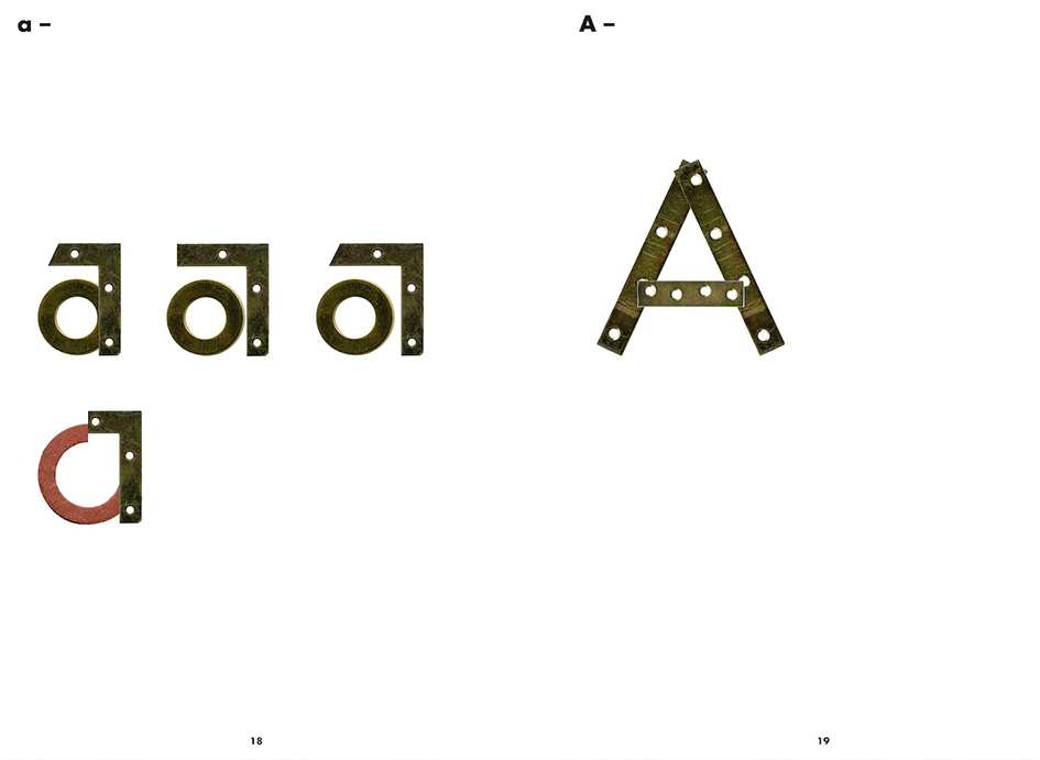
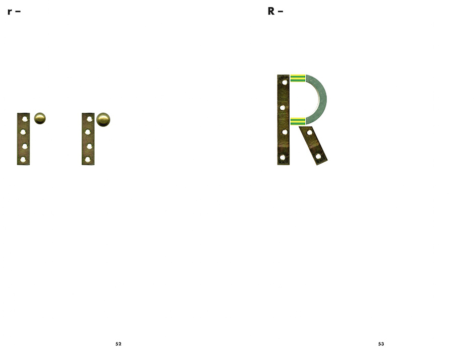
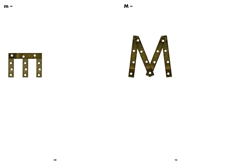
The idea of creating shapes entirely out of geometrical elements was already in the air when Renner designed his Futura. Yet he did not want his geometrically constructed typeface with its almost circular curves to seem as though it had been drawn with a compass.6 Renner used basic shapes like the circle, square and triangle, but he eschewed a dogmatic approach to geometry and softened this in order to make his design easier to read and more elegant. Minuscules such as a, b and j really are formed by line and dot or circle only in the typeface. But the minuscules for a, g, n, m and r that were part of Renner’s original draft for Futura now seem rather strange, appearing too obviously constructed, too additive, as though having been assembled from individual elements from a construction kit. In early versions they look like someone has popped the wrong font into the text. Without these shapes, which were later offered as special characters, Renner’s font family became a world-wide success – and thanks to an ingenious licensing agreement, it also proved highly lucrative for the designer and his heirs. The refined version of the Futura then actually managed to progress to being the typeface of a new era. It served as a template for Frankfurt’s sign painters in labeling and signposting the urban space of a New Frankfurt, after it had been decreed that this was to be standardized.7 This sans serif font also advanced to being a popular face for advertising and posters. It was used as a typeface for emphasis and in progressive magazines. Innumerable companies adopted it as a corporate font or in their logos, and it was even used to label the placard left on the moon during the first lunar landing of 1969.

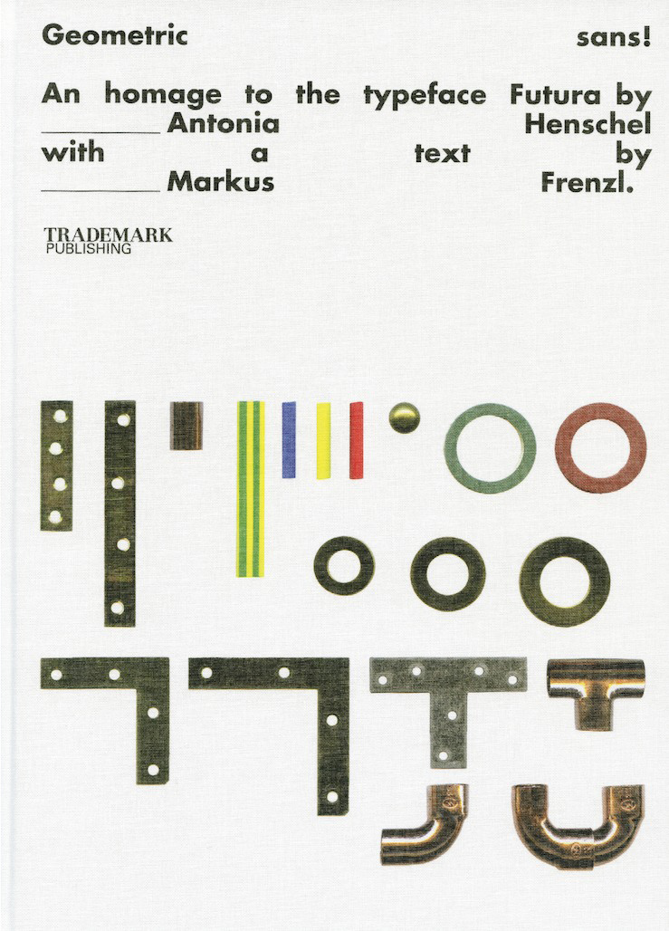
A gasket. A washer. An angle bracket. A piece of piping. A flat mending plate. Standardized and regulated objects can now be bought in every DIY warehouse. After World War Two, the idea of basic geometrical shapes became an – often criticized – dogma of Functionalism, for example through their use in many designs created at HFG Ulm School of Design. Since the postmodern era a design using squares, circles or cubes has also always been read as an ironic riposte to the geometry craze of Modernism, and as a potshot at the selfimposed restrictions of Functionalism.
Today, the Bauhaus is considered both part of the historical avant-garde and as an authority invoked by hobby craftsmen across Europe in realizing they have cobbled something functionless together from too many individual pieces. It is a design-historical esprit d’escalier that they can now buy the parts for their projects in DIY stores carrying the famous school’s name. This is why Antonia Henschel decided to visit the Bauhaus for her homage to Futura – or rather, to pay a visit to what most Europeans who do not work in design or architecture now associate with the name. In a chain of the DIY store that named itself after what is possibly the most famous design school of the world and which now owns the rights for the most merchandise sold under the term “Bauhaus”, she bought washers and copper pipes, connector pieces, sleeves and corner angle brackets. Here, she toyed with the old idea of creating a contemporary typeface using simple geometric shapes in the most direct way imaginable – as well as seizing an idea that was all the rage among typographers and font designers in the 1920s, who used shapes from the type case such as circles, half circles or rectangles to create so-called figure or type compositions: abstracted animal themes, ships or figures for calendar pages or new year greetings cards.

Antonia Henschel picks up on precisely this additive composition method using rudimentary basic shapes, which was employed in 1920s design, and creates a wry comment on this using the digital means of our times. Her design then becomes a play between yesteryear and today, between analogue and digital, between retro with a wink, machine aesthetic and echoes of the excessively constructed special characters of Renner’s original version of Futura.
Antonia Henschel’s 2016 “Geometric Sans!” is an homage to one of the best known typeface designs of Modernism, which at the same time rattles the latter’s noble status as the classic font per se just ever so slightly.
1 Cf. Klaus Klemp in a guided tour on August 14, 2016, at the Museum Angewandte Kunst, Frankfurt am Main
2 Friedrich Friedl & Nicolaus Ott & Bernard Stein (eds.), Typographie – wann, wer, wie, (Cologne, 1998), p. 40
3 Cf. Petra Eisele & Isabel Naegele, “Elegant, klassisch, modern: die Futura,” in: Alles neu! – 100 Jahre Neue Typografie und Neue Grafik in Frankfurt am Main, Klaus Klemp & Matthias Wagner K, (eds.), exh. cat. Museum Angewandte Kunst, Frankfurt am Main, (Stuttgart, 2016), p. 84
4 Renner, Paul: Typographie als Kunst, Munich 1922, p. 33, quoted: ibid
5 Cf. Petra Eisele & Isabel Naegele, loc. cit., p. 85
6 Cf. ibid, p. 90
7 Cf. ibid, p. 86

Text by Markus Frenzl, the English translated version of this introductory text is published under permission.
Markus Frenzl is a German professor for design-theory.
Antonia Henschel is the CEO and creative director of Frankfurt-based Sign Kommunikation.
Buy your own copy HERE


Tags/ inspiration, typeface, modernism, grotesque, futura, antiqua, bauhaus, future, paul renner, new era, geometric shapes, de stijl, bauer foundry, construction, hfg ulm school of design, markus frenzl, functionalism, antonia henschel, sign kommunikation


