Studio Output beefed-up BBC Three’s brand new digital presence
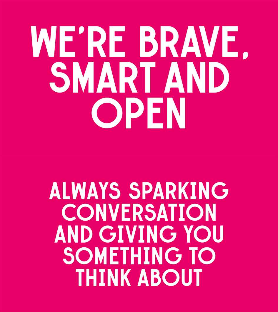
We helped BBC Three reconnect with its audience, by defining the brand’s character and designing a new visual toolkit that’s more relevant for the digital world it lives in”, write Studio Output on their latest work that speaks volumes of their disciplined, clean approach towards a historic brand. Stemming from Red Bee’s original ideas in 2016, Studio Output created a visual toolkit that could roll out across all digital and broadcast platforms. Their design for BBC Three “allows the brand to stand alone from the BBC stamp yet possess an interchangeable digital presence”. “The beefed-up brand is brave, smart and open, inspiring a simple but flexible system that allows a range of expression across all touch points, from social through to broadcast. The identity was originally created by Red Bee in 2016, with several logo versions for different uses. We simplified these, freeing the logo from its retaining ‘stamp’ device in BBC environments” they add.

With BBC Three’s different sets of values floating around, Studio Output want to capture the social media and mobile generation’s attention with their social-first content design. “The BBC Three brand needs to thrive while promoting a wealth of material in social environments. We set straightforward guidelines for the existing brand typeface, layout and framing. These distinctive elements help BBC Three to gain attribution for its fantastic content” they say.
BBC Three has a constant presence across the social web, with timely and sharable articles and memes, therefore the brand system flexes to its environment and topic, with looser type treatments, pops of colour and daft illustrations coming into play.
Their ‘Tricon’, (BBC Three’s newly-named signature element), is liberated from the BBC blocks and with those elemental improvements BBC Three’s branding is more flexible and hopefully will thrive online.
“Rather than a static set of guidelines, we built an online hub which introduces the new brand and helps people use it. This means that up-to-date downloadable assets are always to hand, alongside examples showing how to express BBC Three’s distinctive character”.
Bold, simple yet as distinctive as it should, BBC Three’s new visual identity comes in two bright palettes for flexibility across different content. True to their motto, Studio Output made the difference through innovative and memorable design for one of Britain’s most iconic logos.
Tags/ inspiration, corporate identity, identity, social media, brand, bbc three, studio output, historic brand, red bee, visual toolkit, tricon, memorable design, britain


