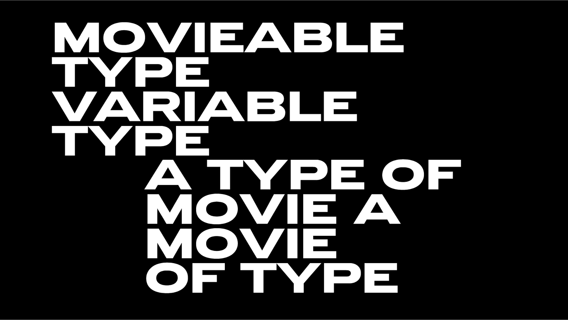
Stacked fonts: when typography is arranged in meticulous ways
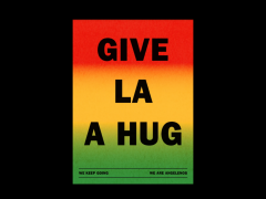
In the event of the latest lock down regional restrictions in UK due to the pandemic, this week's Font Sunday theme by Design Museum was dedicated to the stacked fonts that we love.
As usual Twitter's design community flooded the timeline with impressive examples of graphic design and typography in which two texts are stacked on top of each other.
You might have heard quite a bit of news about lock down regional restriction rules, Tiers 1,2 and 3. To mark this buzz word, today's #fontsunday from noon is stacked / tiered fonts. pic.twitter.com/9vdaOvZCe9
— Design Museum (@DesignMuseum) November 29, 2020
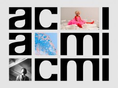
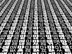
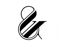
In the gallery, Typeroom presents some highlights to inspire.
Explore more here.
Tags/ typefaces, twitter, design museum, font sunday, covid


.jpg)
.jpg)
.png)


.jpg)


