No post-election anxiety: the typography of politics
“In light of yesterday's news which announced #BidenHarris2020 as the winners of the #USElection, #FontSunday will now be all things type from campaign trail to election night” announced Design Museum this past Sunday.
“From polling stations and ballot boxes, campaign slogans to stickers - send in your examples from noon” concluded and eventually Twitter responded. After all, design is politics and vice versa.
According to a recent study by Virginia Tech professors, Katherine Haenschen and Daniel J. Tamul people do “perceive typefaces, type families, and type styles to have ideological qualities.” Blackletter, a serif typeface, was rated as the most conservative while Sunrise, a sans serif typeface, was the most liberal of them all.
“Although the Virginia Tech study indicated that sans serifs are perceived to be more liberal than their serif counterparts, they’re actually used in similar quantities by both parties” reports Fast Company.
According to Susan Merriam, cofounder of Center for American Politics and Design, a first of its kind research group investigating the graphic vernacular of American politics that was founded in 2018, “if a candidate uses a serif typeface, that person might be trying to convey a sense of tradition and authority.”
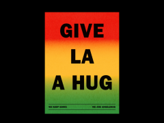
From Corita Kent's Love Justice circa 1970 through Gerald Ford's presidential campaign button in custom type circa 1976 to Lance Wyman's poster for the Obama campaign in 2008, Typeroom highlights some of this Font Sunday's political extravaganza.
Explore more here.
Tags/ design, typography, politics, elections, usa, joe biden
.jpg)


.jpg)

.png)


.jpg)
.jpg)


.jpg)
.jpg)
.jpg)
.jpg)
.jpg)
.jpg)
.jpg)
.jpg)
.jpg)
.jpg)
.jpg)

.jpg)


