Madefor Wix: the platform introduces a bespoke digital-first typeface for a design-centric identity 7
Wix aka one of the world's global leaders in website creation launched their own custom digital-first typeface, Wix Madefor, a type system that"balances modernity and tradition, giving the brand a fresh tone of voice" which hopefully will stand the test of time.
"At Wix, we take a lot of pride in our in-house multidisciplinary design studio, and we noticed the brand was missing a critical element of design, a custom and easily-recognizable typeface," said Hagit Kaufman, Wix VP of Design and Brand.
"We set out to create a bespoke typeface that was distinguishable and represented our brand values. Most importantly, the typeface needed to work well online, maintain its character when scaled across large displays, and support legibility across user interfaces and long-form text. And of course, it needed to be beautiful! We believe we've created exactly that with MadeFor."
As noted Wix and Dalton Maag came up with five initial design concepts "each exploring a slightly different direction."
Say hi to Madefor, our newly designed typeface. Designed together with @daltonmaag, its distinct personality illustrates our values and passion >> https://t.co/fw0ZUDMVOs
— Wix (@Wix) September 30, 2020
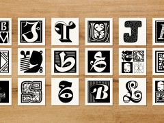
Now that you've met Madefor, tell us which letter was made for you! pic.twitter.com/M5dMqlZyJX
The process "allowed Wix to clarify the typographic proportions and identify the features that best conveyed Wix's tone, voice, and core values. The typeface was refined and modified to ensure adaptability in a variety of display environments. The character set supports many languages, allowing Wix to speak to its global customer base in one, unified voice." Geometric and minimal, the MadeFor typeface family features characteristics which aim to provide "a distinct personality."
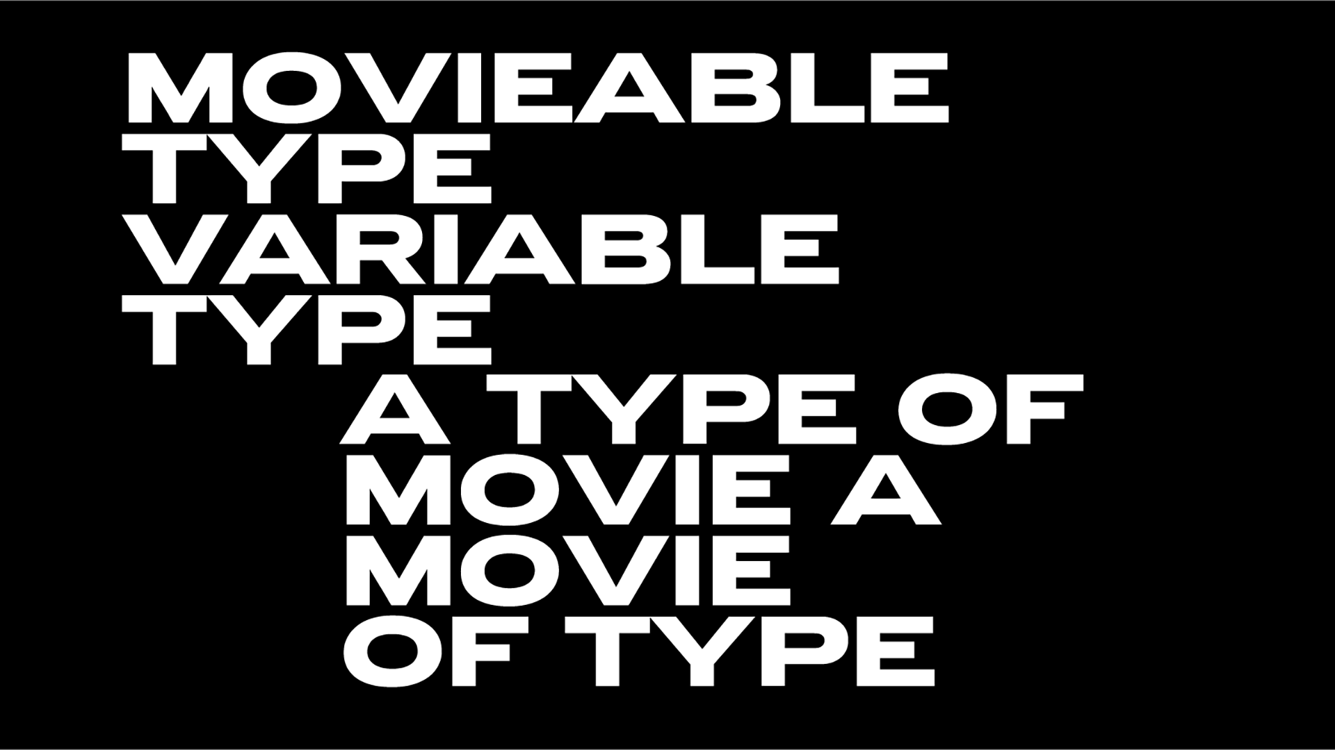
"For example, 'pipe-bend' terminals seen in the 'j' and flaring angled terminals seen in the 's' allow for readers to easily skim a page. The wide proportions of the display style grab attention and allow the features of the typeface to be truly appreciated. The text styles are narrower and looser to work efficiently at small sizes within paragraph text and across Wix's user interface. The italic styles complete the range of expression and were designed for content that needs emphasis or simply wants to feel more playful or personal."
"The collaborative nature of the project allowed us to hone in on exactly what the Wix Design Team needed and resulted in a compact typographic toolkit with a subtle, but unique personality," said Matt Burvill, font feveloper at Dalton Maag.
"The project benefited from the dynamics between Dalton Maag and Wix. The mix of departments, backgrounds, cultures, and genders allowed for balanced feedback and resulted in a typeface that truly feels like it was made for all."
The MadeFor type system includes three display weights and three text weights, with each style available in regular, bold, and extra bold. Each of the text weights also comes with a matching italic style.
Discover more here.
.jpg)
.jpg)


.jpg)
.jpg)
.jpg)
.jpg)
.jpg)


