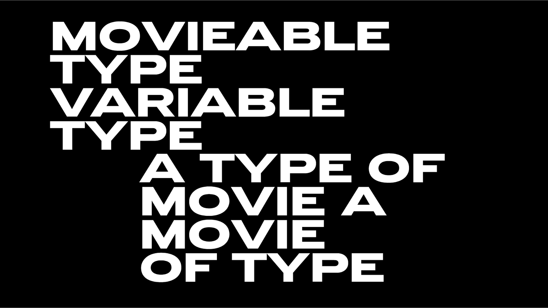
Parachute, Muir McNeil, Dinamo & more: the best & brightest type foundries to know in IdN’s typeface design issue
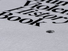
Being a part of the creative zeitgeist ever since 1992 when it was founded, IdN magazine is an international publication for creative people on a mission to amplify and unify the design community. For its latest issue, the magazine explores the gemstones made of type aka the art of type design.
“Perhaps the most romantic way of regarding typefaces is that they embody the unspoken messages in our words. And as such they affect us all, designers and non-designers alike. But a typeface in itself is not typography any more than an alphabet is a word, despite the intrinsic relationship of one to another. Words could not exist without an alphabet while an alphabet needs to form words to have a purpose” reads IdN’s intro.
“When a type designer sets out to design a typeface, their first consideration should be to set its tone and style, possibly the biggest challenge in the entire field of visual creativity. A type designer needs to imagine all the possible scenarios and media that the typeface they are about to design might be applied to. This involves mixing different sizes and lower- and upper-case letters in the same design project.”
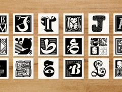
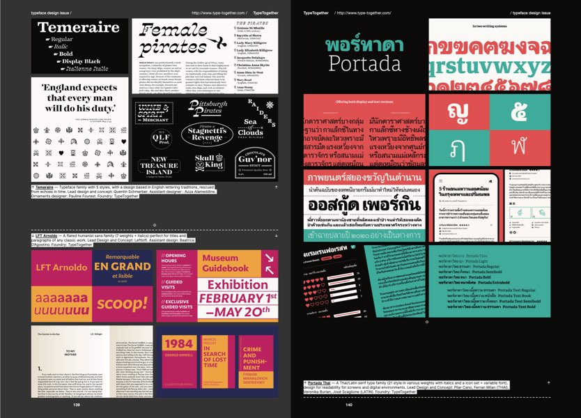
Featuring the best and brightest type foundries in the globe, from our very own Parachute Typefoundry's multi awarded PF Marlet typesystem through BÜRO, Dinamo, Grilli Type, Monotype Studio, Muir McNeil and more, the must-own publication is 160 pages filled with typefaces and the beauty of type in many forms.
“A good typeface should not be too overwhelming or complicated; it should be unique but flexible enough to crop with any media, functional and legible. The other essential that is often forgotten is that it should be able to stand the test of time. Typefaces can be used for many years; Helvetica or Neue Haas Grotesk, for instance, were developed in 1957 by Swiss typeface designer Max Miedinger with input from Eduard Hoffmann. Even now, they still look chic, and are fully functional when applied across a wide range of visual environments” adds IdN.
“Designing a typeface is about much more than just making beautiful letters. There is a Chinese idiom that roughly translates as ‘each word is a gem,’ meaning that a writer should really articulate every word he/she uses. Type designers should see each word they have created as a gem and hope that those who use them will treasure them as a gem also.”
Own your copy here.
Tags/ typography, parachute, type design, typefaces, magazine, monotype, type foundries, idn magazine, grilli type, dinamo


