Font Li Beirut: support Dr. Nadine Chahine’s design collective for a city ravaged
Beirut-born award winning Lebanese type designer Dr. Nadine Chahine has launched a campaign made of love with letters of hope for a city ravaged, her city.
On 4 August 2020, a large amount of ammonium nitrate stored at the port of the city of Beirut, the capital of Lebanon, exploded, causing at least 190 deaths, 6,500 injuries, US$10–15 billion in property damage, and leaving an estimated 300,000 people homeless.
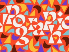
To show support and solidarity for the people of Beirut, the international type design community has come together to create a typeface that would raise funds to support the victims of the blast and the reconstruction efforts. Curated by Chahine herself the typeface Li Beirut, which means "For Beirut" in Arabic, has more than 300 glyphs drawn by 160 designers from all around the world.
Among the contributors are award winning designers such as Jean-François Porchez, Jessica Hische, Erik Spiekermann, Martina Flor, Tobias Frere-Jones, Hannes von Doehren, Erin McLaughlin, Erik van Blokland, Petr van Blokland, Martin Majoor, Neil Summerour, Toshi Omagari, and David Berlow. Arabic designers include Mamoun Sakkal, Bahia Shehab, Pascal Zoghbi, Khajag Apelian, Wael Morcos, Yara Khoury, Kristyan Sarkis, and Maha Akl.
Typeroom caught up with Chahine on a project that speaks volumes made of letterforms for solidarity.
Typeroom: How did the recent blast affect Beirut’s design community?
Nadine Chahine: The design community was already reeling from the effects of the pandemic, the economic and banking crisis, and the currency crash, before this explosion shook the city to its core. The areas affected host several of Lebanon’s creative agencies. The studios crashed, the equipment all broke, morals were destroyed. There is serious physical damage with great economic impact, but there is also the impact on mental health and the ability to survive through so many of these problems, and to still be able to find work, and to create. This is why we need to support financially but also show empathy and solidarity.
TR: How did you manage to coordinate the Font Li Beirut initiative?
NC: At first I emailed a few designer friends but then Jean-François Porchez helped me get in touch with more of our common friends and also designers that I had not yet met, and now happy to have collaborated with. I also posted the announcement online, and it was all done in the span of a week. It took every waking moment, but the result is so brilliant (both as a gesture of support and as a design product) it was worth the effort.
TR: How many designers participated in the font design?
NC: All in all the final tally is 160 designers. I had missed a few entries so the number is slightly higher than what I initially counted. I was so happy to see so many designers take part, and we have new and young designers as well as some of the biggest names in the field. Really great to see such communal effort.
TR: The Font Li Beirut includes decorative isolated Arabic letters and Latin capitals as well as Arabic numerals and a few symbols, all in one font file. Which is the core symbolism of it?
NC: There are two main points. That decoration takes time to design, and time is the most precious commodity we can offer, and as such, decorative design is very much a labour of love. It was important to send across that feeling.
The other point is, these designs are very different from one another and yet work so well together. It symbolises unity in diversity. This is important, both on a Lebanese and an international level.
TR: Which charities do you plan to support?
NC: I have chosen reputable ones that are collecting funds for Beirut efforts and work in Lebanon either directly or through local partners: Plan International, Action Against Hunger, and Save The Children.
TR: This is not your first campaign. A few years back you launched another one for the family of Georges El-Rif who was brutally slain in broad daylight and in front of witnesses in Gemayze in Beirut, Lebanon. Will you please share with us the lessons you learned from your first campaign for justice?
NC: The need for speed… That campaign launched almost immediately after the incident which is why it managed to raise funds so quickly. This is why I asked for a very quick turn-around time and launched the typeface, the catalogue, and the postcards just two weeks after the explosion. It was not possible to launch earlier though I wish I could have…
There is no other Arabic typeface that brings together so many designers together, a first in the history of Arabic type design. And what talent! Thank you to all who contributed!! شكراً للجميع ومع كل الاحترام والتقدير https://t.co/EOFhIVGeUF#FontLiBeirut#Beirut#typography pic.twitter.com/8fh4wdRDaR
— Font Li Beirut (@FontLiBeirut) September 2, 2020
TR: The Font Li Beirut campaign includes a line of printed goods. Why is that?
NC: It felt necessary to be able to mail printed material around the world with the message “printed in Beirut” because that signals that Beirut’s famed presses will not stop in spite of the disaster that had struck. It is also another way of supporting local businesses, and that is very important too. This is also a very special and unique typeface, and I wanted to commemorate that.
TR: How can one help the initiative if they have difficulty to contribute financially?
NC: Just help us spread the word! That would be great!!
TR: How would you describe the state of the Lebanese visual culture today?
NC: Rich and varied! There’s a big trend for retro design too, looking back at pre-computer designs, and that is interesting to keep an eye on.
TR: Which Lebanese typographers of the past would you consider the most important for all to know?
NC: Probably Murad Mroue. He collaborated with Linotype in the fifties to create the Simplified Arabic style of Naskh that we see in newspapers today. It allowed for faster type setting and newspaper expansion in the region.
TR: Lately, the type design community shows signs of solidarity for many issues. From Black Lives Matter to COVID19. Do you feel things are changing in the way designers approach their craftsmanship?
NC: I hope so. It feels quite positive, and I love when we build structures of cooperation between us.
TR: What keeps you inspired?
NC: I always say it’s the streets of Beirut, so you can imagine my sorrow at what had happened to my city… But there is another Beirut that I dream of, and I design for a better future for my city and my country and region.
TR: What are you working on now?
NC: I’m in the final stages of putting together my first library release (for my ArabicType foundry as all my previous library releases are at Linotype/Monotype) and that is a collection of 7 typeface families. Hopefully to be released this fall!
TR: What should change for a better day in the Lebanese creative industry?
NC: We need a new political system in Lebanon that is just, less corrupt, and where you can build a business without fear of the next invasion, or the need to rely on political leaders for handouts. All of our businesses would benefit, and that feeds into more work for the creative industry.
TR: So, eventually, will type save the day?
NC: Not really. I love type with every cell in me, but type is a tool for communication and can be used for the good and the bad. Just think of the brilliant designs of Nazi Germany to see that good design might not necessarily serve a good purpose. And it is in the recognition of that, that we designers can choose to engage in initiatives that support the good in our communities.
Doing good via design is a conscious choice, and not something intrinsic to the field. But we as humans also posses the duality of good and evil in our being, and visual communication is part of that.
Be part of this typographic labour of love to Beirut here.
Tags/ typeface, font, campaign, erik spiekermann, tobias frere-jones, toshi omagari, beirut, typography for good, nadine chahine, mamoun sakkal


