Paula Scher X Public Theater: stencil typography in full force for the COVID-19 era
For the first time ever, Paula Scher’s typographic posters for Shakespeare in the Park, the annual free performances presented by the Public Theater, went missing from New York due to Covid-19. But the promotional campaign for the Public’s 2020-2021 season is here to flood the online realm with a bold, typographic heavy aesthetic.
“When the pandemic scuttled Shakespeare in the Park, Scher and the in-house team at the Public found themselves without a fully developed visual language for the new season. The design direction had already begun––with a 'Revolt/Love' theme inspired by Richard II and As You Like It, which were originally announced back in January––but the final posters were never completed” notes Pentagram.
War, lust, type! How Paula Scher's typographic affair with The Public Theater redefined our culture
“Each season campaign is a reaction to the one before, with the designers looking for new ways to change the spirit and use of Knockout, the font of the Public identity. Variations have included typography that is outlined, inlined, slashed, stretched, slanted, skewed, reversed and extended––but amazingly, never stenciled. The 2020-2021 campaign reinterprets the Public identity in stencil typography that resonates for a season that is still under construction and a work in progress.”
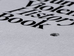
The new season coincides with the publication of Twenty-Five Years at the Public: A Love Story, a comprehensive survey of Scher’s work for the institution, out now from Princeton Architectural Press. This behind-the-scenes account of the relationship between Scher and the Public chronicles over two decades of brand and identity development and an evolving creative process in a unique “autobiography of graphic design.”
Explore more here.
Tags/ typography, stencil, pentagram, paula scher, public theater, coronavirus, covid19


