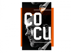
Pittogramma: an open call for unpublished typefaces designed by Italian type designers under 30
Pittogramma in Italian is the pictogram which is used mainly in wayfinding and is featured on the street signals. Till now.
Mario Rizzotti and Santiago Villa have launched a brand new project by the same name aiming to share and valorize projects designed by young Italian graphic designers. “Pittogrammawas a funny metaphor to use as the name of the project,” says Rizzotti.
Eventually, Typeroom caught up with the Italian creative for more info on this brand new typographic initiative.
Typeroom: What is Pittogramma’s core idea?
Mario Rizzotti: Pittogramma was born on June 2020 and was conceived by me and Santiago Villa, a colleague of mine at the Milan-based design studio Lissoni & Partners.
The idea was to make something together, something that would have helped the graphic design scene for young people, especially because for a young graphic designer it’s very difficult to approach the design scene here in Italy especially because it’s very conservative.
So there you go, Pittogramma is a signal to promote and valorize projects designed by young Italian graphic designers.
TR: How do you approach Pittogramma content-wise?
MR: For the pilot issue, Pittogramma 00, we chose to feature projects we found online, type designs suggested by our teachers and friends, -mainly projects that we believed deserved a broader audience.
As for the upcoming first official edition, Pittogramma 01, we have launched an open call titled Caratteri Inediti, which stands for Unpublished Typefaces. Through this we aim to map the situation of the type design discipline in Italy and of course to valorize the selected typographic projects created by the next generation of graphic designers.
Although we are still looking for partners to produce this issue, we decided to kick it off anyway. Alessio D'Ellena (the designer of LAICA for ABC Dinamo) and Cinetype's Michele Patanè contribute as judges to the choice procedure. The cover text features a typeface by CAST and for the texts in the issue we are going to use a typeface gently offered by the open-source foundry Collletttivo.
TR: Who helped you to bring this project to life?
MR: We have been able to make Pittogramma 00 thanks to the support of great companies such as Fedrigoni, the biggest Italian paper mill, Grafiche Veneziane, a printer who always invests in projects like ours and CDcromo, a post production company here in Milan. The help of these three companies was not just a way to make the publication but also to move closer to the students and the real companies, closing the gap between each other.
We also had the help of Atto, an established studio in Milan who provided the introductory text regarding the current state of younger type designers in a “mature” type design Italian scene and of Louis De Belle, a great photographer, who documented through his images Pittogramma 00 in detail.
In the end Pittogramma became much more than a simple publication; it became a point where different realities merged to support the idea that together is better.
TR: What are the logistics of the publication?
MR: It is a small publication of 32 pages in 168x240mm format, a decision we made because we could have one publication with just one printing sheet 700x1000mm and zero paper waste. Yet, we are quite open to change the format of the upcoming issues as long as we accomplish a sustainable project for paper mills and printers.
Another very crucial point of Pittogramma's strategy is the plan to distribute it totally free to more than 100 graphic design studios in Italy, over 50 independent bookshops and spaces, and over 30 design schools. So, we want this project to reach as many the biggest and broadest audience possible.
TR: What projects do you plan to feature in the upcoming future?
MR: We are always on the lookout for projects that start with the right question, projects that have a balance between the research and the practice. Of course, that doesn't mean it should be a 50/50 balance but the two sides need to converge to a balanced point.
Get involved and explore more here.
Tags/ typefaces, publication, open call, italy, mario rizzotti



.jpg)
.jpg)
.png)
