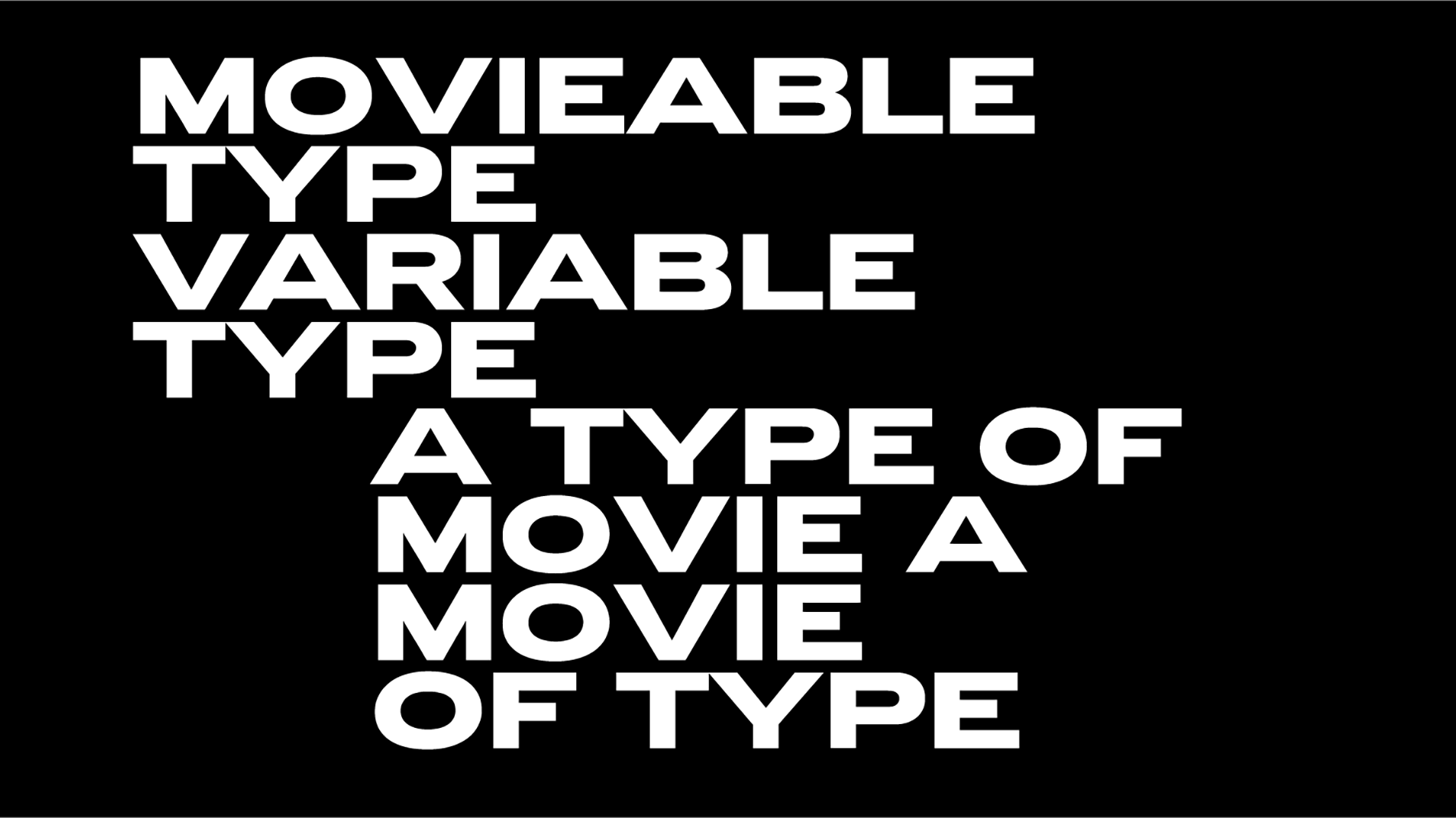
Lance Wyman & Rick Banks present F37 Wyman, a font for the ages
Based on extraordinary lettering work created by celebrated US graphic designer Lance Wyman in 1976, F37 Wyman is a digitised version of the designer's Bicentennial font in collaboration with Manchester creative Rick Banks.
"The font was commissioned as part of the graphic identity marking 200 years of American Independence. Wyman completed his eye-watering designs in 1970 while working in Mexico, where he’d temporarily relocated after designing his outstanding graphics for the Mexico 68 Olympics" notes the studio.
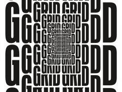
"Working with Lance Wyman directly, we’ve digitalised his modernist lettering into a working font. Each letter is designed on a grid and uses OpenType to snap each letter into place, creating an even bolder optical illusion" notes the team.
"Lance's original '70s lettering is so beautiful and iconic in its sense of simplicity and modernity. It just had to be revitalised and digitalised for the modern world," Banks told Creative Boom. "Interestingly, some letters weren't really working, so Lance redesigned them and we suggested some alternates too. We tried some things and they just didn't work so we reverted back to the previous designs."
Speaking of the collaboration, Lance Wyman tells Creative Boom: "I hope the font gives designers a creative tool. I look forward to giving it a try myself. It was originally designed to celebrate a bicentennial, I want to explore what else it can be used to celebrate" Wyman added.
The acclaimed designer created a limited edition of posters, each personally signed by Wyman himself in New York and you can own them here.
F37 Wyman is available to purchase via Banks' foundry.
Tags/ typeface, type design, opentype, lance wyman, rick banks


