UEFA EURO 2020: all the logos, all the time, for the win
With UEFA EURO 2020 kicking off on 11 June -held across the continent for the first time in the competition's 60-year history, with 11 host cities in all and on television screens around the world- it's time to celebrate.
But what about the UEFA European Championship brand itself?
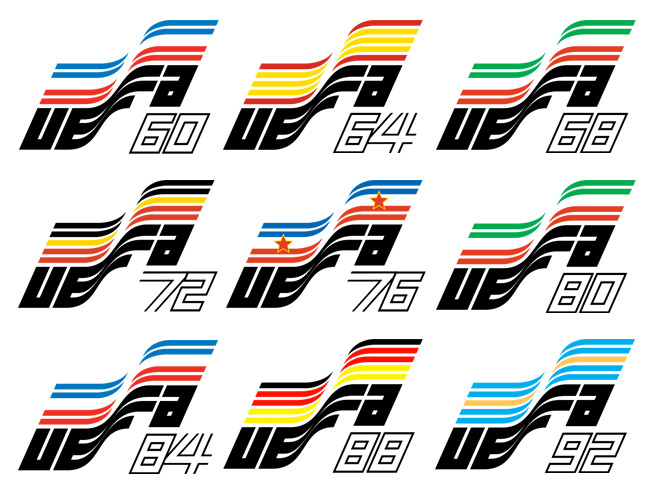
Every four years the logo of the tournament is brand new and here is a look at the evolution of the UEFA Euro Cup logos over the years.
From 1968 to 1992, the first seven times the European Championships were held, the logos were similar with each one comprising the flag of the respective venue and the year of play.
Union of European Football Associations aka UEFA's acronym is printed in a bold, geometric font with each year outlined. Although not groundbreaking, the branding is old-school and gives a much-loved retro feel.
By 1996 the Euro returned to its motherland aka England and since then the logos are changing, bearing the flag colors of the hosting country.
Every EURO logo since 1960...#EURO2020 pic.twitter.com/0eAhoMZ6wK
— UEFA EURO 2020 (@EURO2020) September 21, 2016
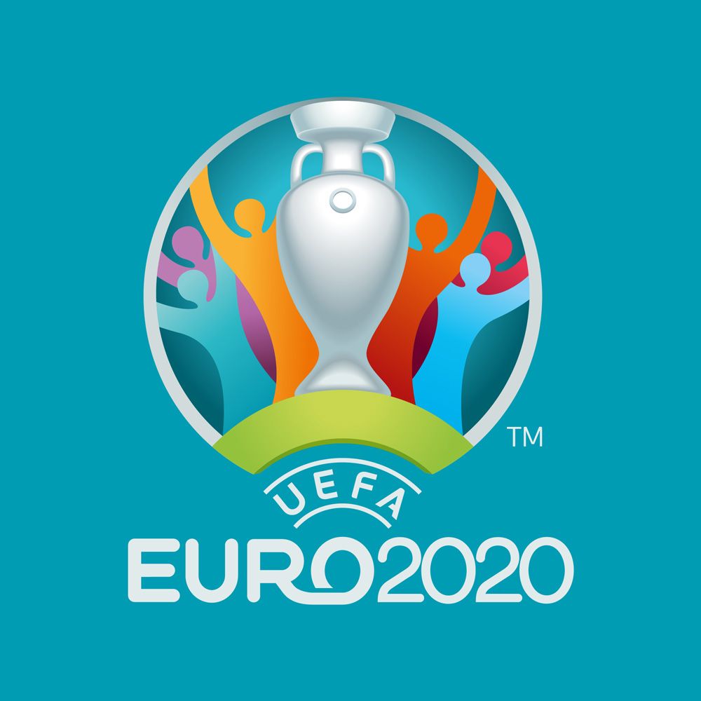
Fast forward to 2016 when UEFA unveiled its new branding identity and logo by Y&R, for the 2020 EURO championship.
The challenge of the design was to come up with an identity that expressed the theme of connection in combination with the festive celebration of football and cultural diversity of UEFA Euro 2020 explains Design Boom.
"There is nothing like football to bring Europeans together. UEFA EURO 2020 presented us a huge challenge: to create a brand that celebrated diversity and promoted belonging for a tournament taking place in different countries and different cities" writes Y&R.
"While researching, we found a symbol strong enough to link all cities and citizens of Europe: the bridge. It was the perfect metaphor for football in this continent and it inspired us to create what we call the Football Bridge."
"Graphically, we developed two visual identity systems: a 2D horizontal bridge system that connects every city landmark to our logo, and an isometric city landscape. These were the systems that allowed us to build all the elements that ultimately tell our story."
"Y&R was selected as the creative agency following an international pitch to develop the brand for UEFA EURO 2020. A bridge motif was developed for the logo to symbolically unite all of the 13 European cities. Across Europe, these structures bring people together – in the same way, that football can connect and unite us all. alongside the individual motifs, each host city is celebrated in the imagery with its iconic monuments, historic buildings and the stadium where the games will take place."
And now a typographic throwback to Parachute's trophy.
Back in 2012, UEFA EURO kicked off with Parachute’s Beau Sans Pro as its official typeface.
An extensive list of communication and promotional products such as city banners, tickets and magazines, merchandising like t-shirts, hoodies, caps, video games as well as a vast array of souvenirs were designed with Beau Sans Pro, designed by our very own Panos Vassiliou.
Inspired by Bernhard Gothic -considered one of the first contemporary American sans serifs and designed by Lucian Bernhard in the late 1920s- Beau Sans is a type designer’s attempt to simplify the anatomy of a text typeface without compromising its readability.
"The first version was completed back in 2002 and introduced one year later in our 3rd catalog, under the name PF Traffic. Sometime later it was decided to make a few improvements but the project was so carried away that the new typeface which emerged needed urgently a new name" comments Parachute’s founder Panos Vassiliou.
The graduate of the University of Toronto with a major in Applied Science and Engineering who transitioned like a line of stroke from engineering to typography knew what he was after.
Most importantly the type designer who has won numerous international awards including a Red Dot knew exactly what to explore with this newly discovered project of his.
By introducing Bauhaus-like minimal forms to the characters he created Beau Sans, a modern sans serif family of 16 fonts.
"Just like all other Parachute fonts, it covers a broad range of languages by incorporating 3 major scripts i.e. Latin, Greek and Cyrillic in one font. Furthermore, every font in this family has been completed with 270 practical symbols for packaging, public areas, environment, transportation, technology, fabrics and urban life. This typeface is totally recommended for titles and/or body text when you want to give a distinct and contemporary identity to a product or service" he adds.
Beau Sans Pro is a typeface that clearly matches UEFA's message for the game.
May the best team win.
Tags/ typography, typeface, parachute, type design, logo, beau sans, uefa, football, soccer, euro
