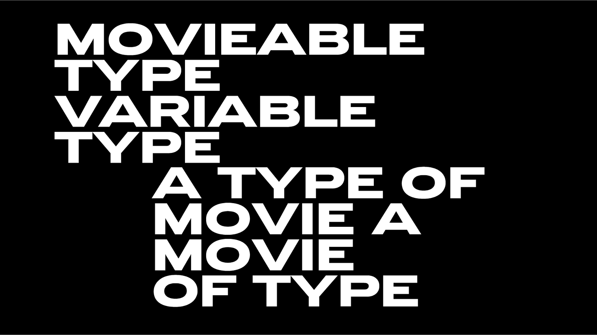
Big in Japan: a type-heavy tribute to the land of cherry blossoms
To tie in with the Charlotte Perriand exhibition, Design Museum's Font Sunday visits this part of the world the great 20th-century designer was inspired by aka Japan.
From one of Japan’s most prolific artists, Takenobu Igarashi to the Tokyo Olympics and more, Japan is a place of many marvels.
“Surprisingly, despite rapid globalization and mixing of styles, works of Japanese designers continue to stand out from the crowd" writes Katya Tinmey on "the most mysterious component of the Japanese poster." Typography!
“First, you need to understand that Japanese typography is based on a unique and complex writing system. In modern Japanese language, three writing sets coexist: hieroglyphs — kanzdi; two syllabary alphabets — katakana and hiragana; and Latin letters — romaji. Second, variety of directions of writing also enriches Japanese typography — the Eastern vertical way of writing with the direction of the text from right to left and the Western horizontal, with the direction of the text from left to right. The choice of the set and direction of writing depends on the subject of the text. Using such a diverse typographical salad, the Japanese poster simply cannot be unnoticed."
“When thinking about the aesthetic characteristics of Japanese graphic design, it’s difficult to select a specific set of attributes that define it as a whole” Gurafiku's Ryan Hageman once said.
“If anything, Japanese design is defined by its sheer diversity and the variety of styles and approaches it encompasses. Although, what makes it unique in comparison to the design of Europe, the United States, and elsewhere, is its use of non-roman characters. The Japanese written language has its own unique rhythm and designers work with the characters to stunning effect”.
Following are some highlights. Explore more here.
#PaulaScher, Rampal & Laskine “Sakura: Japanese Melodies for Flute & Harp” album cover for CBS Records, 1978 @DesignMuseum Japanese themed #FontSunday #PerriandLiving @cooperhewitt https://t.co/ng1NP80Zo5 pic.twitter.com/Tki0H1smgT
— Pentagram Design (@pentagram) June 27, 2021
#FontSunday Ryuichi Yamashiro’s poster design for an exhibition of his collage work, 1972. #PerriandLiving @DesignMuseum pic.twitter.com/z2h1brC9b2
— Wayne Ford (@wayneford) June 27, 2021
#FontSunday Marketing design for the Shiseido Beauty Salon, Tokyo; by Keiko Hirano, 1993. #PerriandLiving @DesignMuseum pic.twitter.com/ie6gCFWMk5
— Wayne Ford (@wayneford) June 27, 2021
A lockdown Japan/manga inspired project: Ninja Peanut, set of comics - some spreads. #FontSunday #PerriandLiving @DesignMuseum pic.twitter.com/NHwkPT1ACh
— Jake Tilson (@JakeTilson) June 27, 2021
#FontSunday Posters for the annual Nippon Cultural Broadcasting Company Jazz Festival. Designed by Takenobu Igarashi. #PerriandLiving @DesignMuseum pic.twitter.com/qKE2h78ruQ
— Wayne Ford (@wayneford) June 27, 2021
A project documenting 'noramoji', the charming yet neglected old shop-lettering found in old neighborhoods in Japan. Lovely.https://t.co/KdjcI0r9He#fontsunday @DesignMuseum pic.twitter.com/cOWPn4UDKj
— Irène DB (@UrbanFoxxxx) June 27, 2021
Love this from Yusaku Kamekura @Olympics @DesignMuseum #PerriandLiving #FontSunday #TokyoOlympics pic.twitter.com/uGghayWfhi
— John Fairley (@FairleyGraphic) June 27, 2021
IDEA magazine cover archive. https://t.co/O0QYNVayoc
— Present & Correct (@presentcorrect) June 27, 2021
OOF. #fontsunday @DesignMuseum pic.twitter.com/lWBeM4FTTO
Tokyo Metro posters by Hisui Sugiura (1927-1929) pic.twitter.com/1RqOjdmxAB
— Irène DB (@UrbanFoxxxx) June 22, 2021
#FontSunday The graphic design of Shun Ishizuka. @DesignMuseum #PerriandLiving pic.twitter.com/XYNZQyFAgt
— Wayne Ford (@wayneford) June 27, 2021
Tags/ twitter, japan, font sunday


