Dev Valladares guides us through his stunning Tibetan typography project
Dev Ethan Valladares has a double Padawan braid. He occasionally talks in third person.
A former Visual Communications and Motion Design student at Srishti Institute of Art, Design and Technology in Bangalore, Valladares was born and brought up in Mumbai and he has a soft spot for anything Typography.
Having discovered a yearning for the experimental and unconventional, his latest project is stunning and thoughtful. Here he guides us through a fairylike typographic project as he is committed to dream on.
“It all began back in the summer of 2014 when we visited Leh, a beautiful town in Ladakh, a mountainous state in the north of India. With the diversity we have in this country, everything about their culture was new to me – from the food they ate to the clothes they wore to, yes, the language they spoke and wrote in. Although they spoke the Ladakhi language, they wrote in the Tibetan script. It was absolutely gorgeous. I asked around for manuscripts or books they had with the script, but there didn’t seem to be any available.
Fast-forward a couple of months to the Vernacular Typography course we had in college where we were asked to pick an Indian script and stick to it for the entirety of the course. Initially I thought I’d go with the Devnagiri script, something I knew and understood, but the more I thought about it, the more I knew that Tibetan was the one for me.

About the actual project itself.
I had originally assumed not knowing the language would be an obstacle, especially when it came to finding typefaces and source material online, or to actually proof-reading text. However, with the first assignment we had to explore the letterform, I realised how liberating this ignorance was. I wasn’t at all concerned with the semantics, context, legibility or the meaning; just with the pure design of the letterform. There was a freedom to explore and experiment without the fear of indecipherability holding me back. I looked at the text as image, devoid of meaning and full of potential.
I also knew I had to push myself to make the most out of this language in mere 4 weeks. There was close to nothing typography-wise that I could find online, so I almost felt responsible for filling that void.

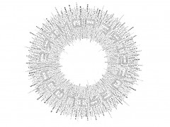
The first week I played around with a single letterform from the script. The next week I looked at sentences as image, setting them in a circle, inspired by the prayer wheel of Buddhism and liberating the type from its rigid perfection. Animation was involved.
The assignment after, I scoured the Unicode Website for the most visually appealing and balanced glyphs I could find in the script, symbols, page breakers, paragraph markers, and loads of other special characters. While I initially laid each one out separately, the feedback I received in class was that they looked like they were pieces of a bigger picture. I painstakingly experimented over a weekend to find the best possible combination, (manipulated it a tiny bit), and the result looked – quite aptly – like an Om within an Om.

With the direction I was going in, a typeface was almost definitely on its way. The idea was to create an English tribute to the Tibetan script. Rotating, skewing, distorting, duplicating and mirroring each Tibetan character, I created each corresponding English uppercase and lowercase character. TibetEng (for that was the name of the typeface) not only visually resembled Tibetan, it also stayed true semantically; the A came from the Tibetan ‘A’, the B from the ‘Ba’, C from ‘Ca’ and so on.
“I think there’s amazing potential in every single script in the world. Each contains letterforms that carry with them their own context”
The only thing left to was to bring Tibetan type into existence; to give it a tangible form. I combined – at random – various TibetEng characters with roman ones, in a way that would depict one letterform from one perspective and another from another. I had the 3D printing hurried up to meet the class deadline so the quality wasn’t the best, but at the end of the course there was a certain satisfaction of actually touching, holding and feeling my typeface.

I think there’s amazing potential in every single script in the world. Each contains letterforms that carry with them their own context. And while it’s one thing to understand what you’re doing, it’s absolutely another to experiment with something you’re unfamiliar with – to be in a free world surrounded by pure, untarnished letterforms that are just begging to be tinkered with.”
Explore more of this spectacular project here


Tags/ inspiration, glyphs, dev ethan valladares, experimental, bangalore, mumbai, india, tibetan script

