Wang Zhi-Hong roams the path of typographic wisdom with grace
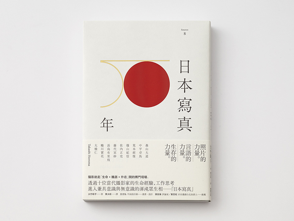
This is a tale of magnitude, this is a man of great importance. Born in 1975 in Taipei the leading graphic designer graduated from Fu-Hsin Trade and Art School in 1995. Five years later he started offering design solutions in fields of publication, art, architecture, film and music through his Studio. Based in Taiwan and a member of Alliance Graphique Internationale (AGI) since 2015, Zhi-Hong has been collaborating with trade publishers in launching his imprints, Insight and Source, featuring translated titles on art and design, such as the works by Nobuyoshi Araki, Taku Satoh, Tadanori Yokoo, Takuma Nakahira and Rei Kawakubo. A six-time winner of Golden Butterfly Awards, Taiwan’s highest honor for excellence in book design, he has received numerous international recognitions ever since he introduced us to his carefully crafted, minimal and supreme graphic design work.
“For Asian designers ‘modern design’ is not something to transcend or overcome ideologically, but rather a foundation to be flexibly used every day. Moreover, from an historical perspective deliberately juxtaposing ‘Asian design’ and Western design has no absolute value. It is against this backdrop that the possibilities inherent in a refreshingly new and youthful approach first became apparent in the early years of the New Millennium, most notably with the appearance of a young man from Taiwan called Wang Zhi-Hong” says Muroga Kiyonori, Editor in Chief of Idea Magazine of his importance.
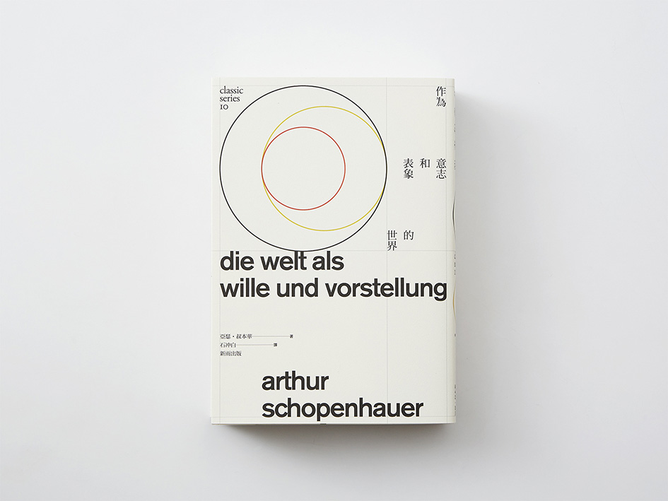
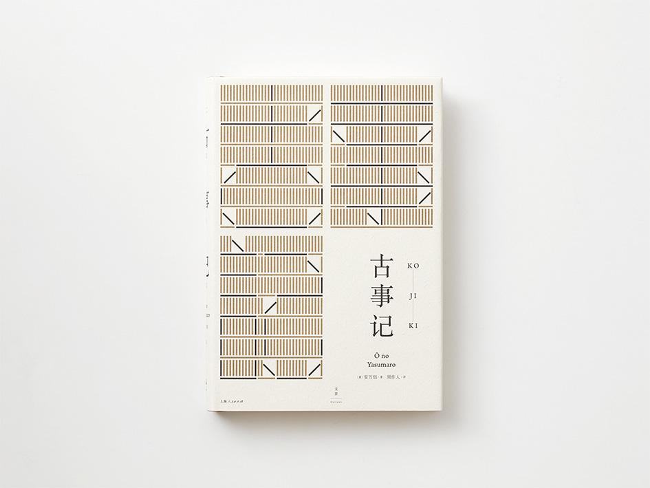
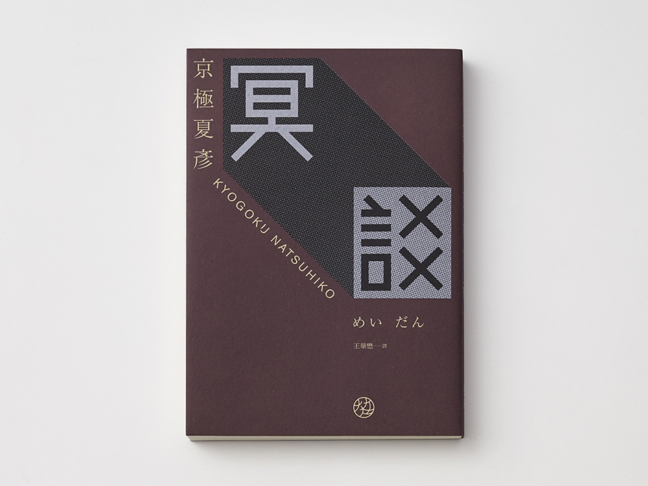
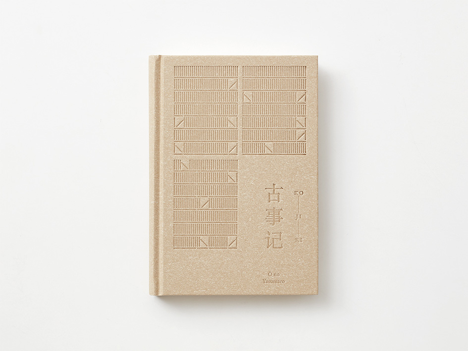
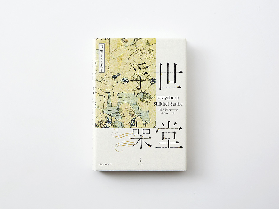
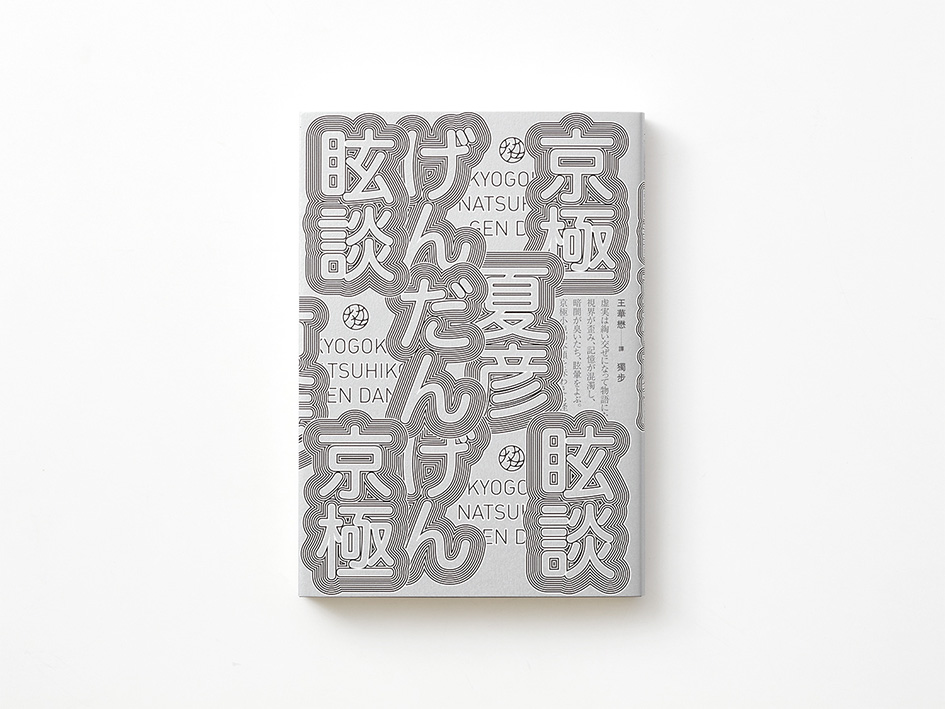
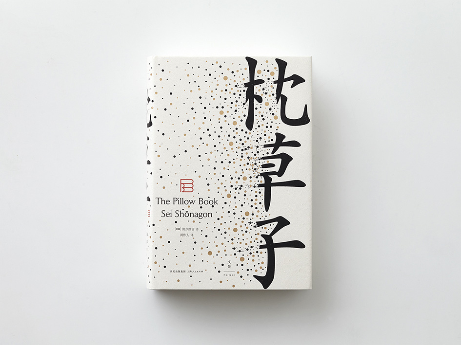
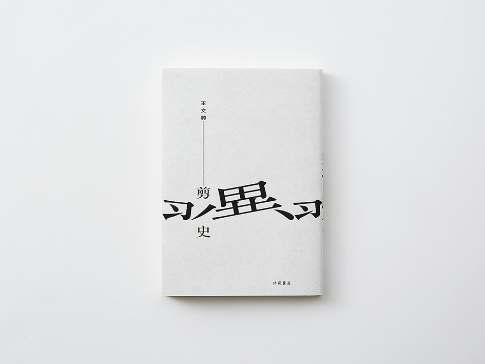
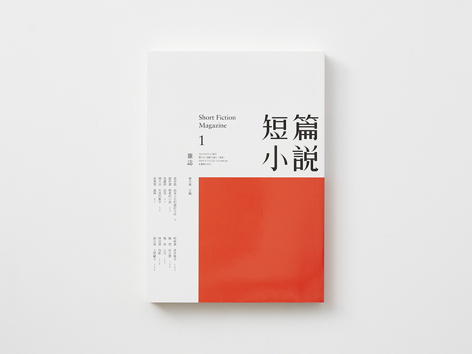
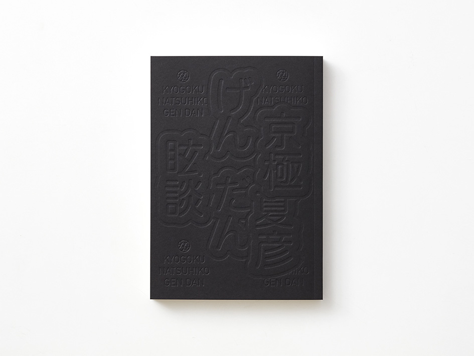
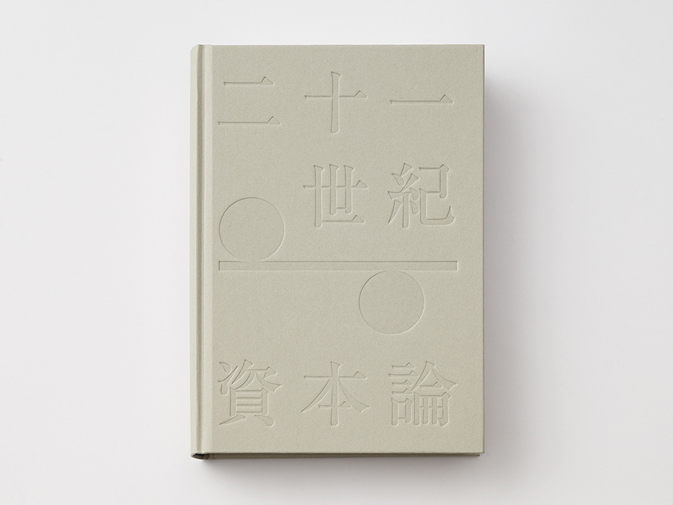
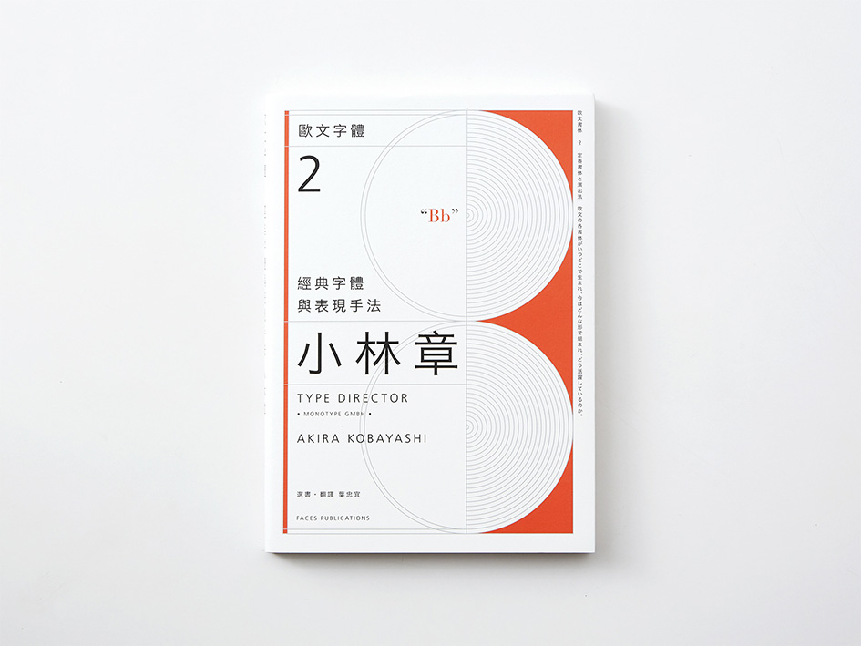
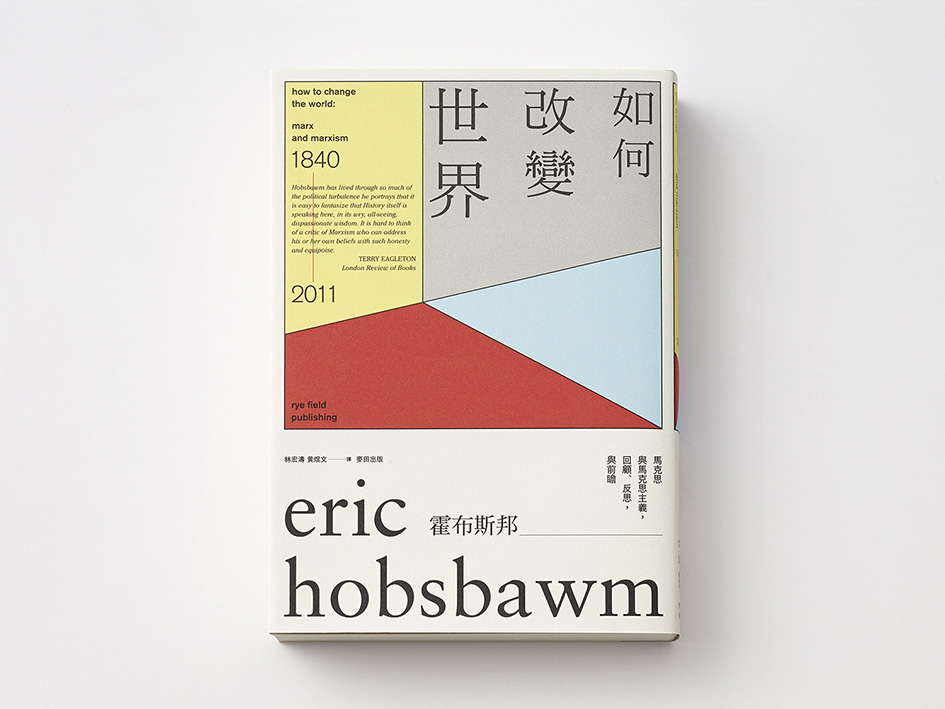
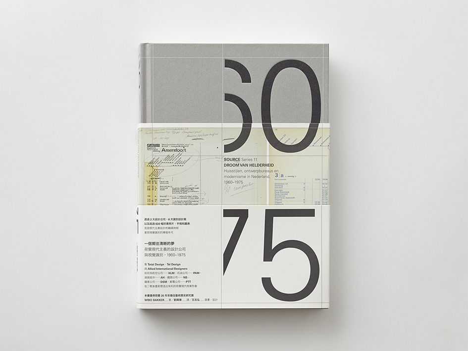
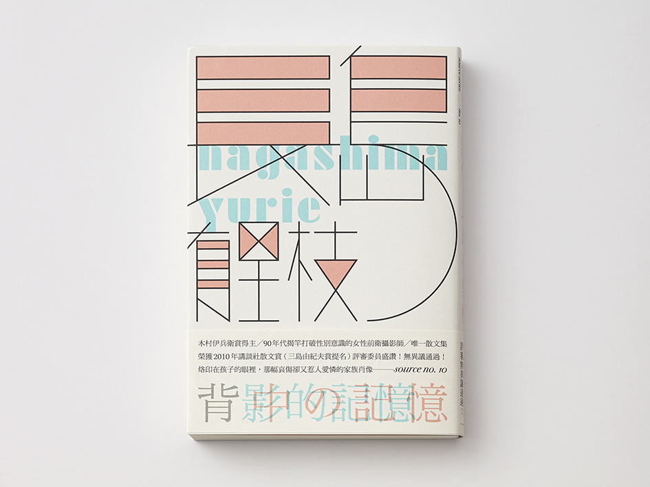
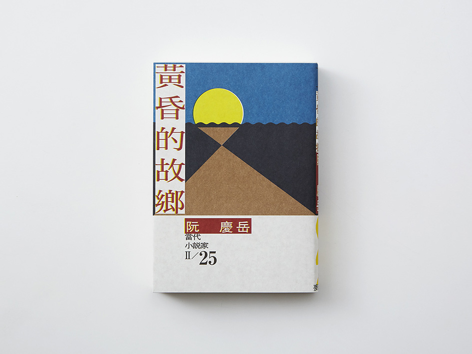
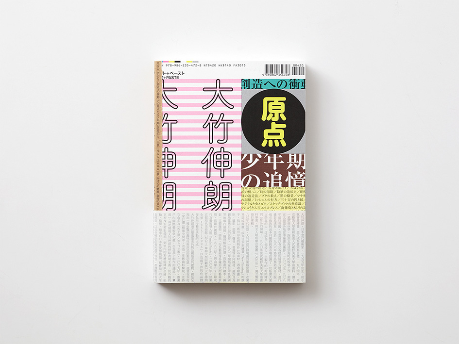
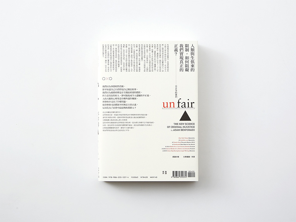
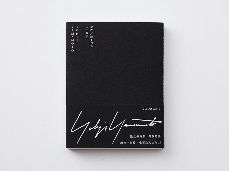
“Wang made his presence felt in the world of book cover design in 2001, crafting a brand new design style that blended classicism and modernism with a distinctive focus on typography. It has been Wang’s ability to reference and boldly combine elements from Taiwanese, Chinese, Japanese and Western cultures in his work, often in great detail, that has been so appealing and become a defining characteristic of his design style. Whether we look at the way in which Wang references history and culture or his focus on technical details, he has proved particularly adept at both, as evidenced by his array of impressive book covers” he adds.
Since the turn of the New Millennium, graphic design has undergone major changes in Taiwan with typography embracing a period of unprecedented expressiveness
A man who has “gone to great lengths to make reading more fun” Wang Zhi-Hong attitude towards design and typography reinvented the way we perceive the visual language of his region. His innovative, abstract style have made him a legendary figure in the global graphic design scene with reason. He believes that silence is an attitude as his work should speak for itself, “a flawless organic whole, each element coming together in perfect unison”.
“There are those who consider Wang Zhi-Hong something of a misfit, but his stubbornness has been a key element in transcending the limitations of the era” comments Chan Wei-Hsiung, Founder of Business Next, Short Fiction Magazine.
Take your time and immerse yourself into his realm with “Design by wangzhihong.com” a publication full of the stubbornly detailed, pure visual language of design master Wang Zhi-Hong curated by the man himself.
“In the 1990s, many people were eager to work for advertising companies with their plethora of commercial images to play with but I found that unappealing and so decided to focus on typography. As a professional field that had been largely overlooked in Taiwan typography offered opportunities for future growth as well as the potential to ensure the more balanced development of graphic design. Ultimately, I launched my graphic design career by establishing a studio that focused on the unfashionable area of book cover design” he writes.
“This collection of works is made up of two main parts: “Design by wangzhihong.com” brings together a selection of my works from 2001–2016 in a catalogue format, whereas those showcased under the title “Text by wangzhihong.com” discuss the thought process behind individual projects in more detail. Whether a catalogue entry or informal essay the pieces are organized chronologically and although some of the earlier works are a little rough and ready, this selection offers readers an introduction to my development as a professional designer. This includes different approaches and ideas that have informed the publishing environment in Taiwan, including the various experiments and explorations I have engaged in over the years.
Since the turn of the New Millennium, graphic design has undergone major changes in Taiwan with typography embracing a period of unprecedented expressiveness. As a result, book cover design has developed from a profession in which few people were interested into an intensely competitive field with many talented designers. In addition, it has also become one of the main points of entry for foreigners to understand the nature of Taiwanese graphic design, developments that were inconceivable when I first started designing in the late 1990s. I very much hope that this comprehensive and detailed record of the period proves informative and instructive for those seeking to better understand the increasingly popular field of book cover design in Taiwan” he adds.
For more check here.
Tags/ typography, inspiration, graphic design, taiwan, asian, alliance graphique internationale (agi), wang zhi-hong, nobuyoshi araki, taku satoh, tadanori yokoo, takuma nakahira, rei kawakubo, golden butterfly awards, idea magazine


