The long history of Olympic typography, a debate
Since the introduction of the modern Olympics in 1896, graphics have been used to capture the spirit of sport as well as the time, place, and culture of the host city” write Dan Rhatigan and Allan Haley of the typography and branding of the most important show and sport event of our times. “All along, typography has played a huge part in setting the tone and binding other graphic elements together. With technological advancements in typography as the world moves digital, these visual representations have evolved, and their role has become a hybrid solution of facilitating seamless communication between the games and its audience (much like a brand would communicate with customers) and creating a lasting legacy for the tournament” they add.
For this year’s Rio 2016 Olympic games Dalton Maag, the office of Swiss typographer Bruno Maag, designed a soft and round custom typeface. “One of only a few bespoke fonts created by a Brazilian team, the Rio 2016™ font depicts the theme of the Olympic and Paralympic emblems: Passion and Transformation. Each letter expresses a characteristic of the Rio 2016™ Games, its people and the city. Their shapes are based on the movements of athletes and the topography of the metropolis and the surrounding landscape. The varied curves in the different letters have a unique informality, inspired by the joyfulness of the Brazilian people”.
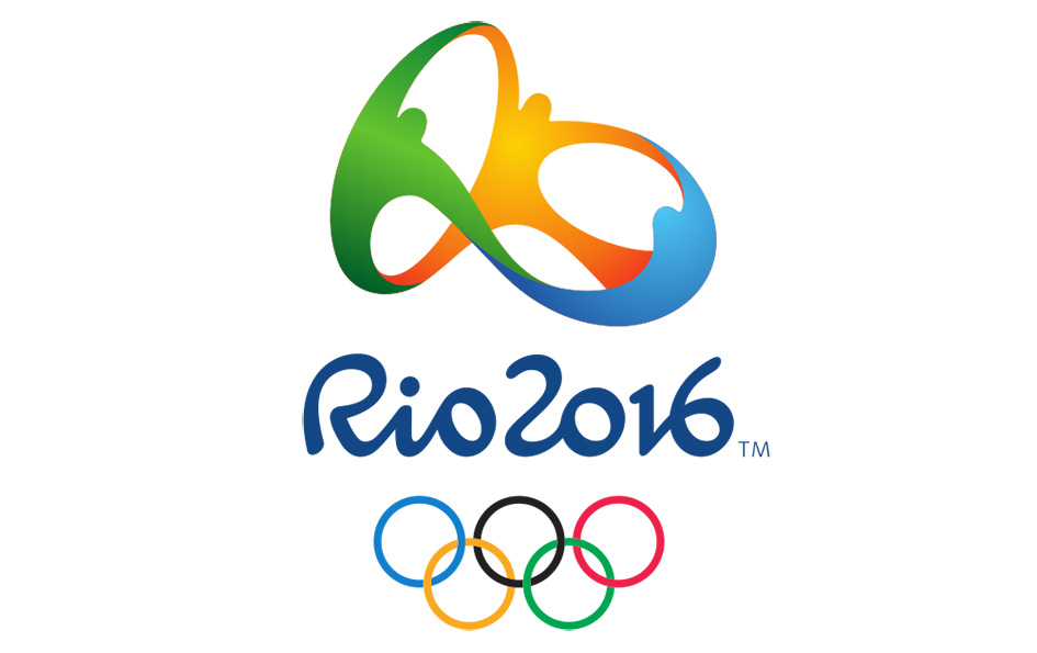
Maag’s organic brush script seems joyful. “A lot of graphic designers are really scared of the organic shape,” he told The Creative Review back in 2010, “the thing they can’t control—just let it go.”
“The looping curves are completely appropriate for Brazil, referencing both Oscar Niemeyer’s architecture and Rio’s famous Carnival at once. The kerning is tight—intended to save on paper, according to Maag’s thinking on sustainability” writes CoDesign’s Kelsey Campbell-Dollaghan. “The only obvious weak point in the design is the way it’s presented on the Rio 2016 website, which places each character against a photo of Brazil or Olympic athletes. “Each letter expresses a characteristic of the Rio 2016 Games, its people, and the city,” explains the committee. For example, a lowercase “r” was supposedly inspired by the Pedra da Gávea, the iconic rocky outcropping that towers over Rio; while “T” mimics the famed Christ the Redeemer Statue. It’s an unnecessary post-rationalization device. This is a small qualm, but it illustrates how our desire to over-explain design choices can muddle the beauty of a simple, strong piece of work”
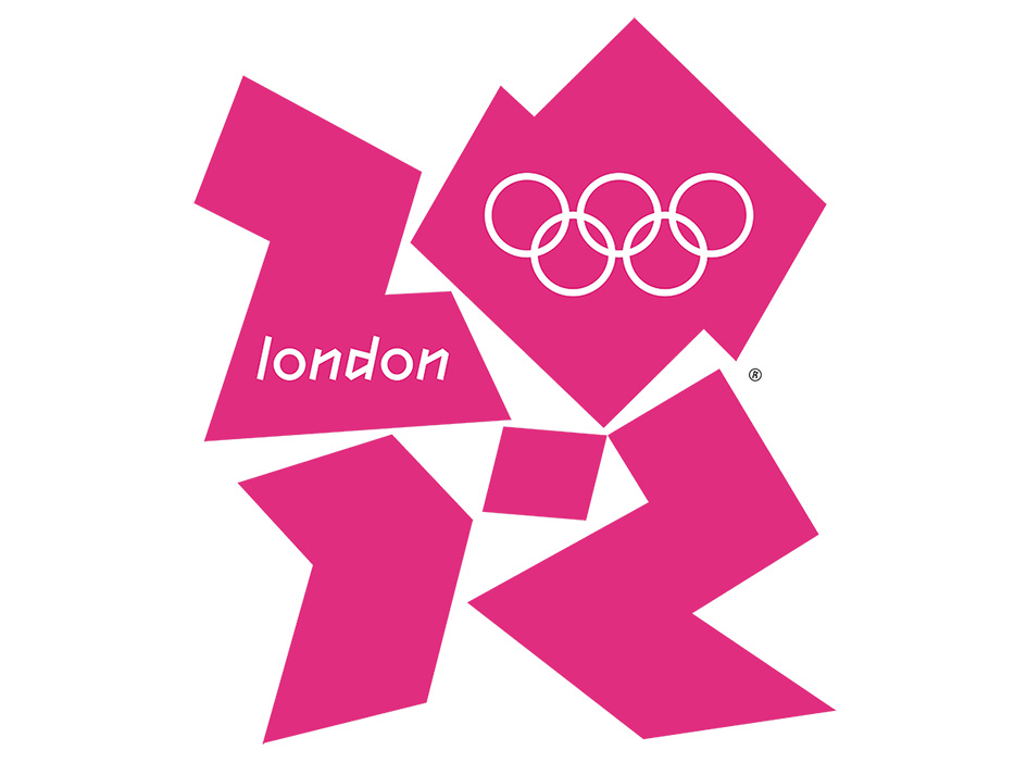
With the debate of Olympic Games branding and design still going strong after the much-hated London ’12 typeface and logo, the visual language of this major event of our times remains an issue. Six years ago NYT’s Alice Hawthorn had a say in the matter. “Garish colors, aggressive shapes and dodgy typography were just a few of its design crimes. Some thought it looked like a swastika. Others spotted Lisa Simpson doing something unmentionable. The animated version caused seizures among some people with a particular type of epilepsy. Fly posters appeared across East London featuring an unofficial version of the logo in which the numbers 2, 0, 1 and 2 were replaced by the letters of an off-color word. The London 2012 organizers and their designers, Wolff Olins, responded by claiming that the logo was intentionally brave, bold and ahead of its time but that we would learn to love it. That was nearly three years ago, plenty of time to win us over. Were they right?”
Just My Type’s Simon Garfield didn’t feel for it either. “Like the logo, the uncool font is based on jaggedness and crudeness, not usually considered attributes where sport is concerned. Or maybe it’s an attempt to appear hip and down with the kids—it looks a little like the sort of tagging one might see in 1980s graffiti. It also has a vaguely Greek appearance, or at least the UK interpretation of Greek, the sort of lettering you will find at London kebab shops and restaurants called Dionysus. The slant to the letters is suddenly interrupted by a very round and upright o, which may be trying to be an Olympic Ring. The font does have a few things going for it: it is instantly identifiable, it is not easily forgettable, and because we’ll be seeing so much of it, it may eventually cease to offend. Let’s hope they keep it off the medals.” In another review for the Face of the 2012 Olympics, Hrant Papazian points out that "If you look at it as a formal outgrowth of the logo it just might make perfect sense. But if you look deeper, if you consider its genesis, it feels very different: uncomfortable".
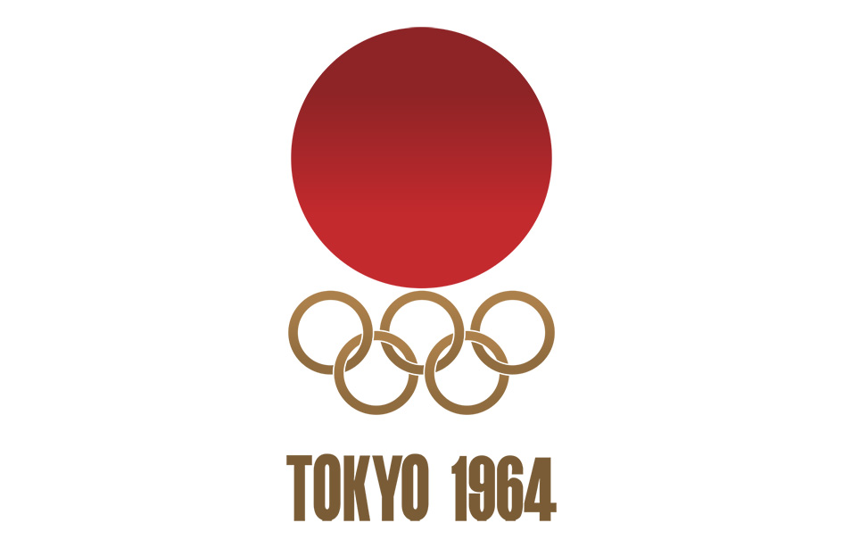
Ever since the the 60s, when “the visual aspect of the games embraced contemporary graphic design principles, with the “total design” of the Tokyo 1964 games introducing abstract pictograms and comprehensive sans serif typography to communicate Japan’s modernity” the Olympic visual identity has evolved. Yet, there are some inevitable crowd favourites.
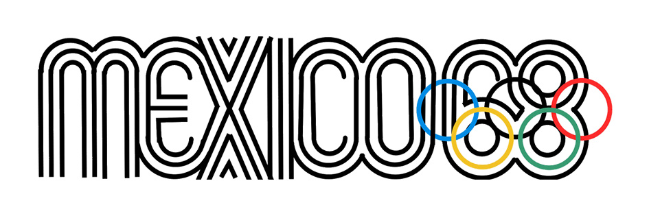
“The simple red Japanese sun, five Olympic rings and sans serif typeface of the 1964 logo still resonates as an icon of contemporary design. The iconic graphics of the 1968 Olympics in Mexico City used custom type that mirrored Lance Wyman’s dazzling op-art graphics to transform the games into a Mexican fiesta. The 1972 Munich and the 1976 Montreal games both used the Univers family with a clean, typographic idealism that echoed, in design’s language, the same ideals of cooperation as the games themselves — typography freed from the messy realities of everyday life” write Rhatigan and Allan Haley.
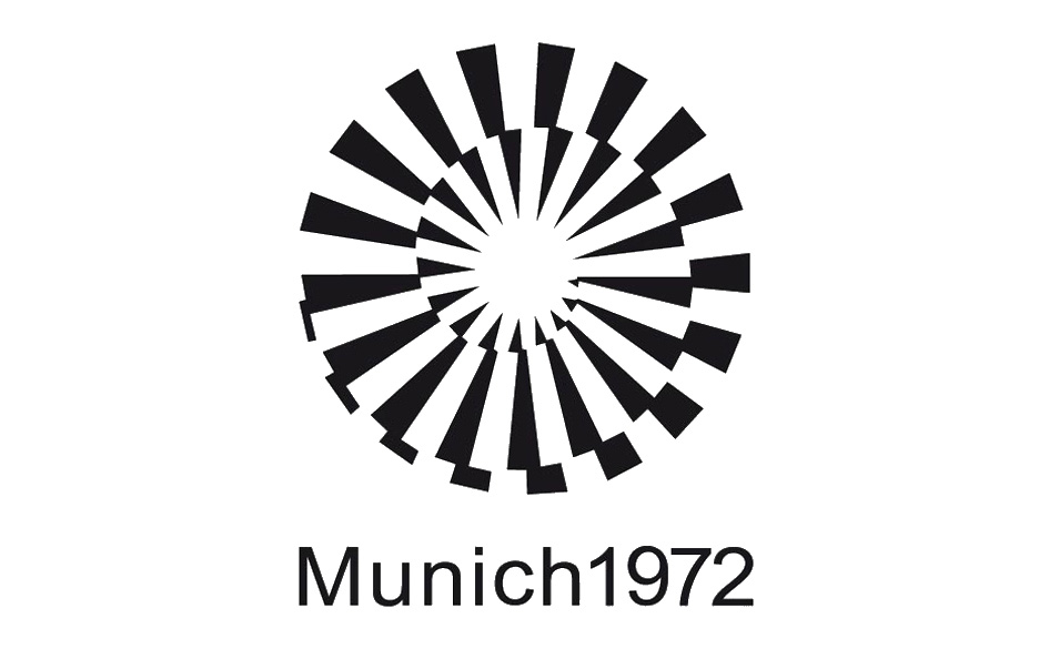
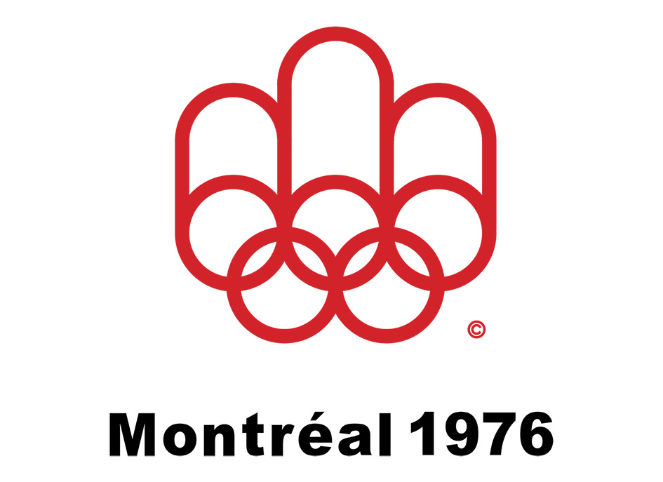
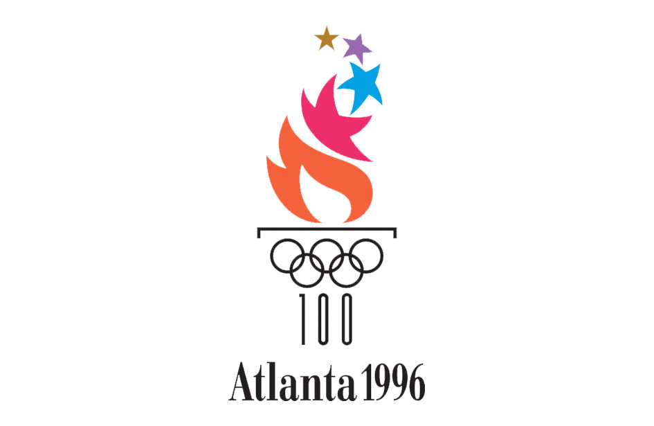
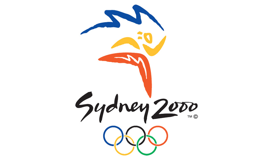
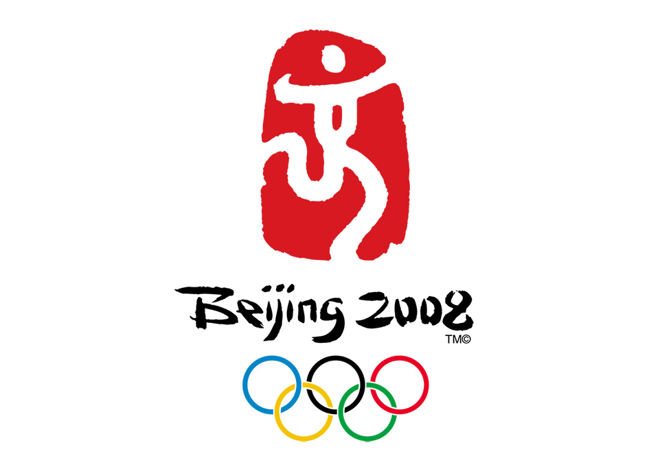
“This “international style” of typography continued for years afterwards, a fitting solution for the increasing complexity of the Olympics’ graphic needs, but also in keeping with the rise of the sans serif in commercial design and branding. Now and then, such as with the use of Georgia in Atlanta in 1996, a serif typeface took the main stage to convey a more stately, ceremonial atmosphere. In recent years, a more playful, expressive approach to type has become common. While sans serifs are still used extensively, the key visuals such as those for Sydney in 2000. Beijing in 2008, and the upcoming 2016 games in Rio use soft-edged scripts for a spirit of movement, friendliness and warmth” they add on the branding of the most celebrated fiesta of the month.
Winners and losers, typography is a sport that anyone should embrace.
Tags/ inspiration, visual identity, branding, monotype, custom typeface, simon garfield, olympics, sport, london 2012, rio 2016, dalton maag, mexico 1968, dan rhatigan, allan haley, oscar niemeyer, dionysus, kelsey campbell-dollaghan, pedra da gávea, christ the redeemer statue, hrant papazian


