MuirMcNeil on their ultra playful typography for TypeCon 2016
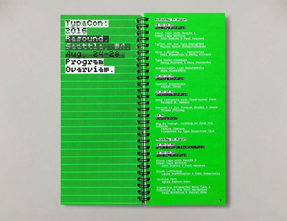
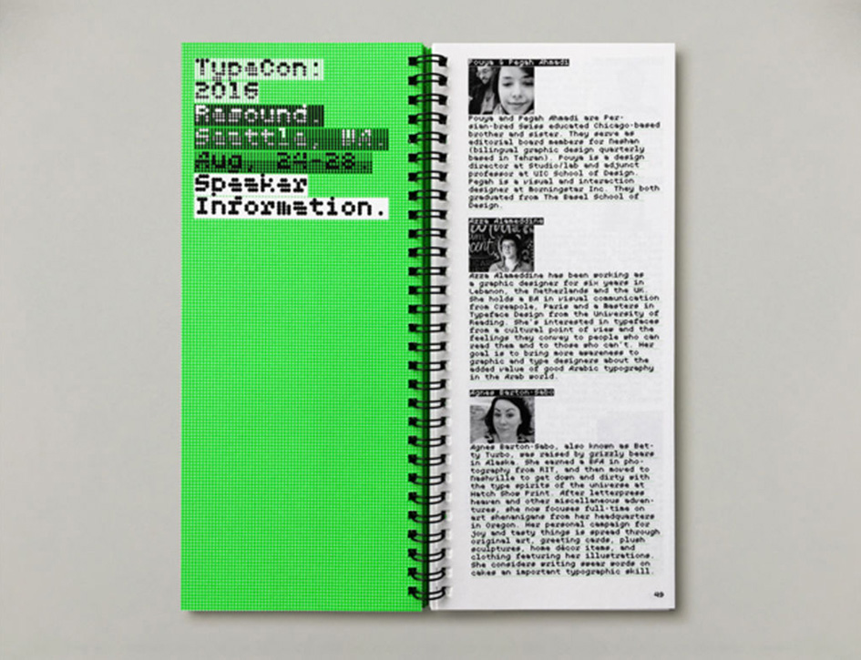
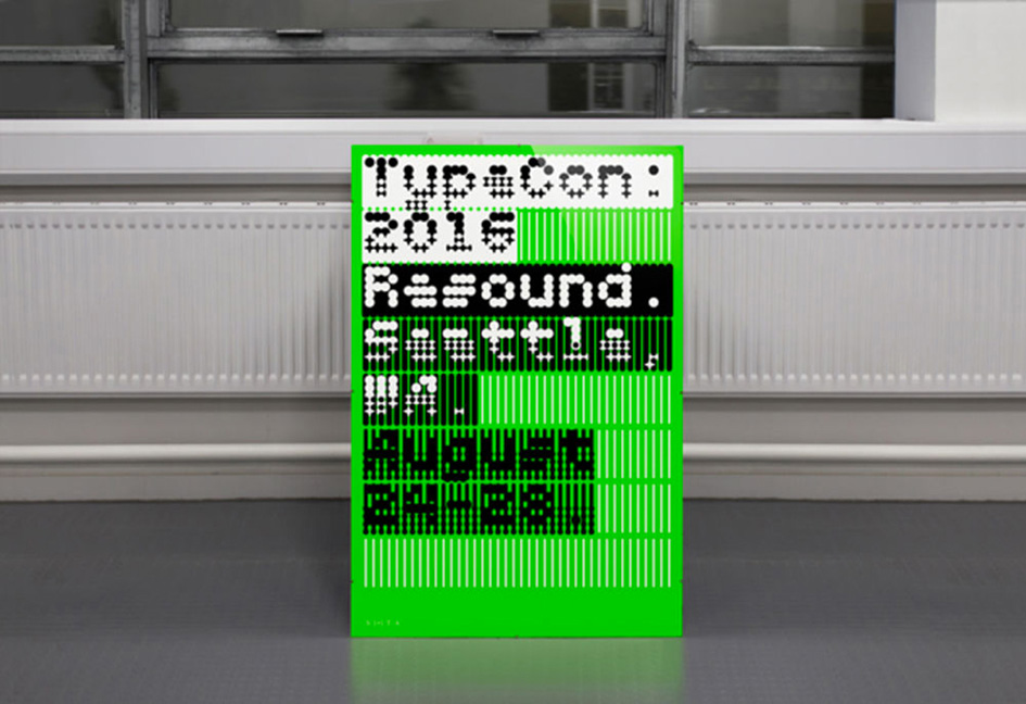
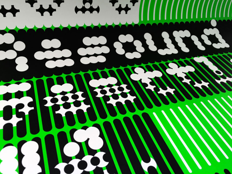
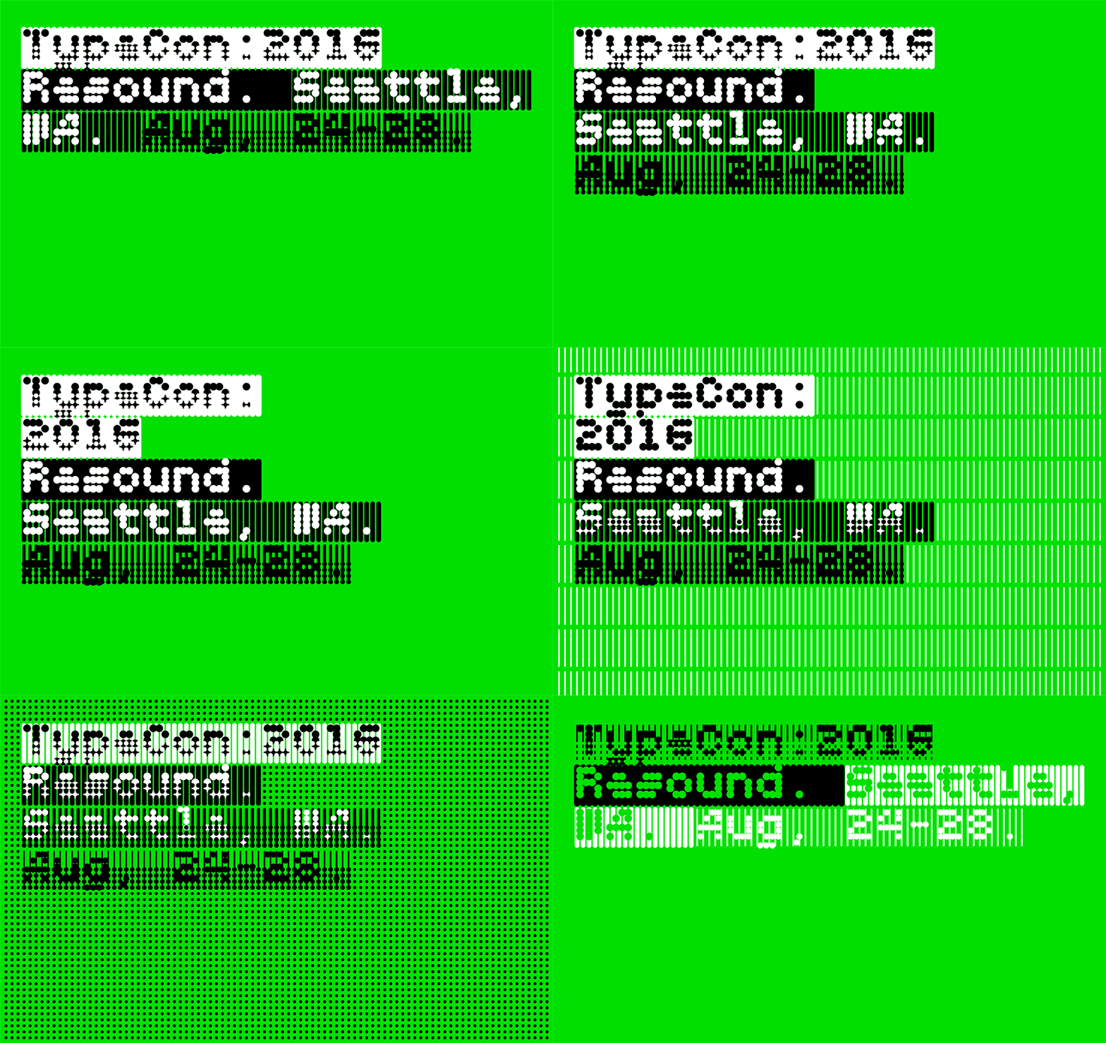
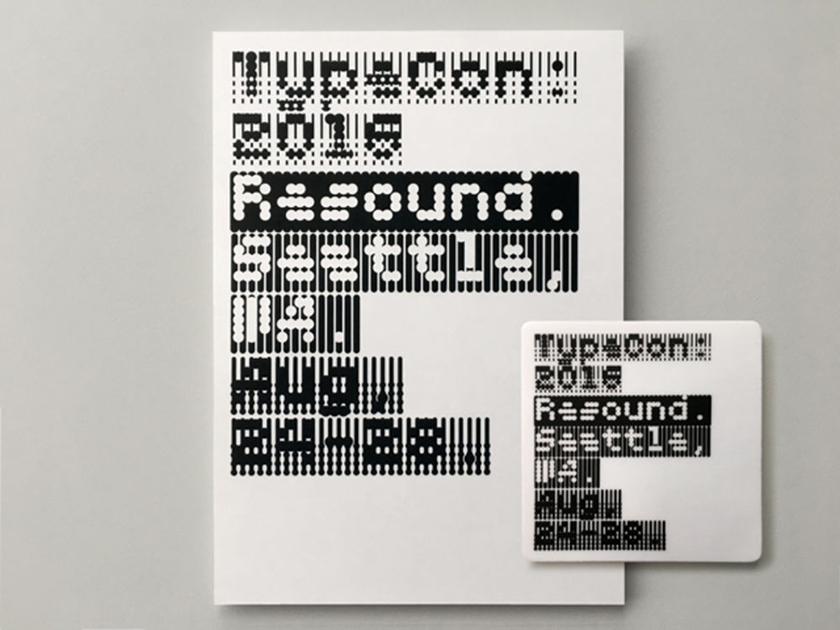
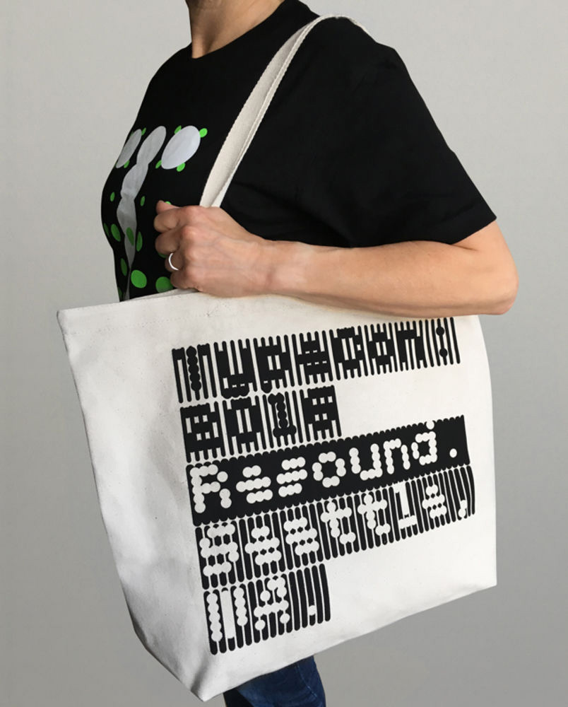
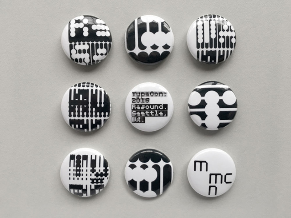
When the Society of Typographic Aficionados approached Hamish Muir and Paul McNeil to develop the identity for TypeCon 2016, they were fully expecting something that embodied what MuirMcNeil is known for, a striking, cohesive, and ultimately modular design system that would embody the spirit of the annual convention of the American Society of Typographic Aficionados, one of the largest and most significant events in the international design calendar. MuirMcNeil constructed a systematic visual hierarchy that operates across all graphic components. The entire system is based on an extensive set of custom parametric typefaces and corresponding background panels, utilizing black and PMS 802C neon green. The communication of information is driven by the content, therefore the visual structures vary accordingly within a set of defined constraints. In individual applications, different levels of information are emphasized or diminished as required, using predefined formats.
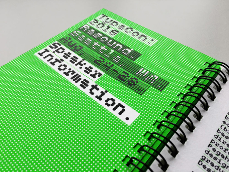
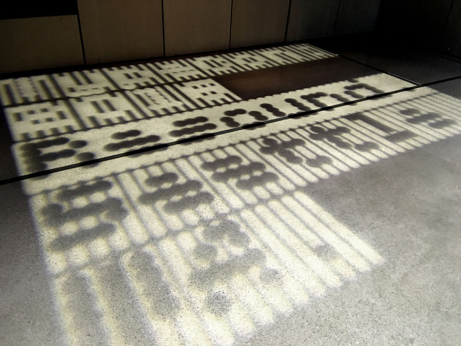
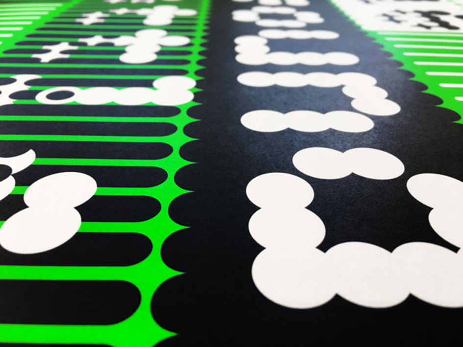
A layered modular type system named MMcN TwoPoint consists of 56 base fonts. Through controlled layering, these base fonts end up providing over 3,100 additional typographic configurations to play with.
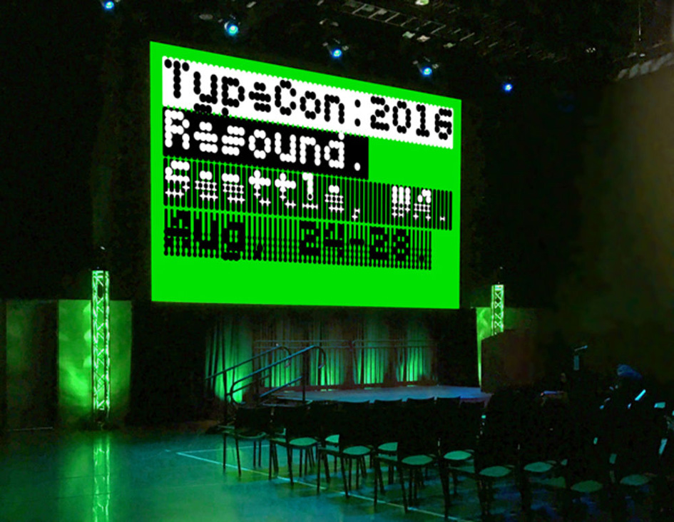
“In response to the title of the event, Resound, our solution was to produce a modular visual system that would have both impact and coherence across a wide range of applications. Working with a deliberately restricted palette of typographic forms and colours, we developed an extensive series of visual hierarchies that varied as the result of differences in textual content. In individual applications, separate levels of information were emphasized or diminished as required within predefined constraints”, writes MuirMcNeil.
Working with a deliberately restricted palette of typographic forms and colours, we developed an extensive series of visual hierarchies that varied as the result of differences in textual content
“The visual system was generated from a set of parametric typefaces and corresponding background panels developed specifically for the project. The MuirMcNeil TwoPoint and TwoPlus type systems consist of 76 base fonts that can be manipulated in layers to provide over 5,500 possible typographic configurations that are unpredictable and remarkably variegated in their appearance. The result of their implementation for TypeCon 2016 was a flexible but instantly recognizable identity whose bright colours, clean geometries and ambiguous relationships of form and counterform playfully engaged with notions of legibility and taste while also reflecting on the modular foundations of traditional and contemporary typographic form-giving”.
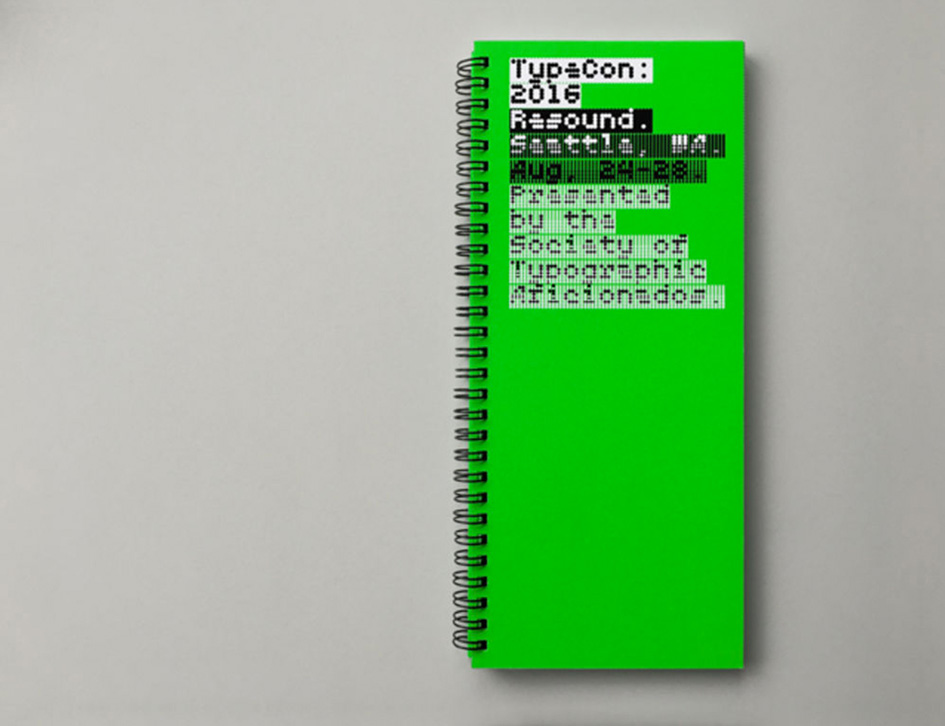
Asked on their playful approach, the design studio had their fair share to say about it to Grafik. “All of the visual components are plain geometric forms and their structural relationships are governed by a few equally simple conditions: use only one size of type; allow the format to dictate line breaks, information flow and overall shape; use contrasts between glyph-based overlays and background panels to become more or less legible; emphasize or diminish parts of the information hierarchy accordingly.
The playfulness of TypeCon identity is the direct product of its own system. In essence, the identity is the expression of a set of logical rules in a variety of visual outputs, everything from badges to programs to interstitial animated movies. The algorithmic principles employed might be said to mirror the methods used by contemporary type designers, where sophisticated structures can be built parametrically on axes of weight, width, optical size and so on. Likewise, the use of geometric letterforms that resemble bitmaps also reflects the origins of digital type design. However, a key feature of our method is that its end results can be volatile, unpredictable and unfettered by notions of good or bad taste. For this reason, the design might be perceived as somewhat provocative in the way it challenges accepted conventions of legibility in the context of a ‘serious’ type conference. But, for us, seriousness is seriously overrated.”
Founded in 2010, MuirMcNeil’s activities are focused on exploring parametric design systems to generate appropriate solutions to visual communication problems. Paul McNeil is a typographic designer with experience in visual identity and brand communications. He currently works in Postgraduate Design at the London College of Communication where he is Course Leader, MA Contemporary Typographic Media. Hamish Muir was co-founder of the London-based graphic design studio 8vo (1985-2001), and co-editor of Octavo, International Journal of Typography (1986-92). Since 2002 he has taught part-time on the BA Graphic and Media Design Course at the London College of Communication.
Check more of their portfolio here.

Tags/ inspiration, graphic design, visual identity, identity, event, international, society of typographic aficionados, hamish muir, paul mcneil, muirmcneil, american society of typographic aficionados, mmcn twopoint, corporate typeface, bright colours, clean geometries, parametric design, typecon 2016


