CIA rebrand: a controversial heavy-type redesign for USA’s premier intelligence agency
Looking for spies across all ages in order to “further diversify its ranks” USA’s Central Intelligence Agency recently introduced a new logo and website made for the millennial generation.
Per Associated Press CIA launched the website “to find top-tier candidates who will bring a broader range of life experiences to the nation’s premier intelligence agency.”
For CIA Director Gina Haspel, the agency’s first female director ever, the rebranding will give potential recruits a sense of the “dynamic environment that awaits them here. We’ve come a long way since I applied by simply mailing a letter marked ‘CIA, Washington, D.C.’”
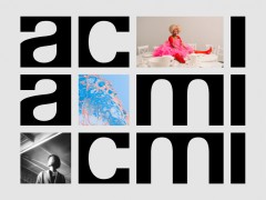
For many creative’s the rebranding is similar to that of a trendy start-up, a music festival or even a publication of the Intercept with Twitter mocking hard the new visual identity of CIA.
CIA rebranding as a modular synthesizer festival in Berlin pic.twitter.com/3PQwejMGUq
— SARAH SQUIRM (@SarahSquirm) January 4, 2021
After the rebrand went live, the internet did what it does best. Twitter users in droves made memes and jokes about the logo and the site” reports Refinery29. “It's hysterical to think about these archaic institutions rebranding as a millennial DTC brand or ad agency” Zachary Roif, creative director at advertising agency R/GA, told AdAge.
“It's a painfully common and trendy visual language they've chosen which is sort of the opposite of what you expect from a governmental institution.”
The CIA just rebranded to look like “hungry independent ad agency focused on their culture as much as their work” pic.twitter.com/XCnn6FGuDg
— rack zoif (@zckrf) January 4, 2021
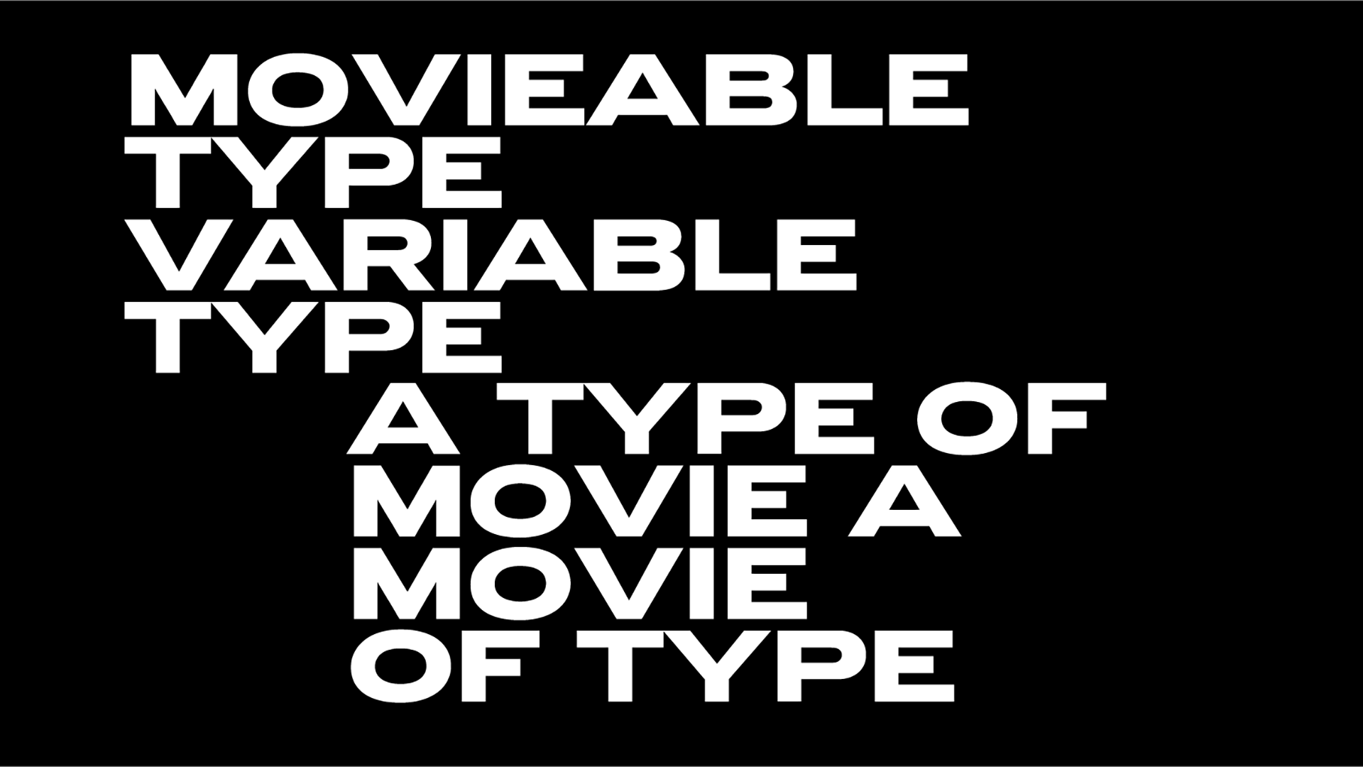
Interesting enough, CIA didn’t use Public Sans, an open source font developed by the U.S. government, for the redesign. CIA’s trendy rebrand showcases a suite of fonts from Swiss foundry Grilli Type, GT America, GT Sectra and GT America Mono.
As noted by Florian Hardwig of Fonts In Use “the use has sparked quite some discussion in the type scene... There seems to be a consensus that working for the CIA (as graphic designer) is unethical, for the reasons Will pointed out in the first paragraph” and type designer Gareth Hague called the rebrand out as being “morally bankrupt”.
The CIA *rebrand* is ODD ODD ODD (and morally bankrupt)
— Gareth Hague (@gareth_hague) January 5, 2021
As for who is responsible for the rebrand CIA’s Nicole de Haay denied that creative director and artist Ryder Ripps had any involvement in their website's updated look.
“The rebrand is meant to improve the spy agency’s image in the minds of talented, and more diverse, candidates by shedding its reputation as a club for white Ivy League men” reports AdAge.
“The new black-and-white circular logo depicts ‘CIA’ and ‘Central Intelligence Agency’ against an array of parallel and intertwined lines. The website proclaims ‘We are the Nation’s first line of defense,’ alongside a rotating series of images of diverse individuals. It invites visitors to ‘Find your calling,’ provides multiple ways for candidates to get in touch and lists open jobs and starting salaries.”
The agency is also promoting its new profile on social media with the hashtag #DiscoverCIA.
More here.
Tags/ typography, typefaces, fonts, gareth hague, usa, grilli type, rebrand, cia, public sans


.jpg)


