BMW: the future looks transparent in the company's brand new flat logo
BMW’s logo has been a hot discussion topic for decades. Now the company which remains tooted in its history is ready to face the challenges of the new decade with a flat, transparent logo just in time with the launch of Concept i4 aka BMW's first pure-electric gran coupe.
As the story goes, the company didn't even have a logo when it was founded, almost a century ago.
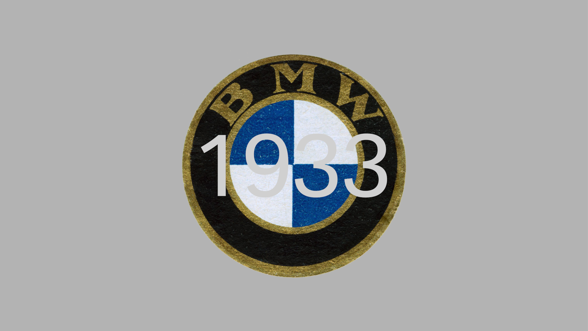
Nevertheless, on October 5th, 1917 the young firm whose main business in those early days was the production and maintenance of aircraft engines for the German Air Force, received a company logo.
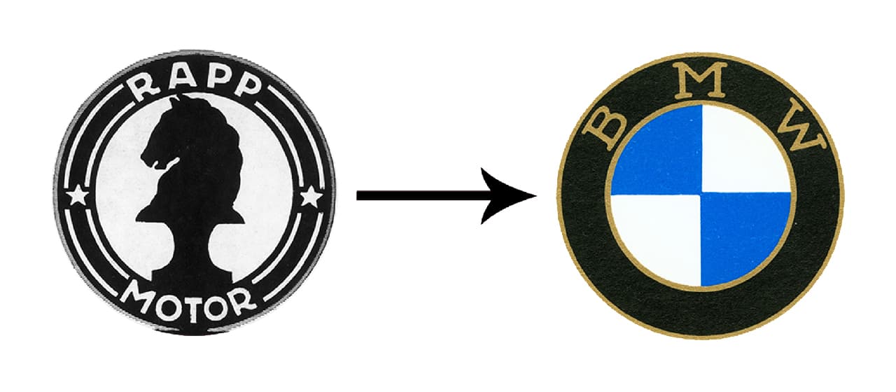
BMW's first badge was registered in the German Imperial Register of Trademarks. The design retained the round shape of the old Rapp logo and in this version the outer ring of the symbol was bounded by two gold lines bearing the letters BMW.
"Many people believe the BMW logo is a stylized propeller. But the truth is a little different" says Fred Jakobs of BMW Group Classic.
"The history of the name BMW – the Bayerische Motoren Werke or Bavarian Motor Works – dates back to 1917. BMW emerged from a renaming of the aircraft engine manufacturer Rapp Motorenwerke, located in Munich, the capital of the State of Bavaria in southern Germany. Although the company name changed, the technical equipment, assets and workforce initially remained the same."
From the past to the future with flat gear, BMW's 2020 new logo has the same palette with the company’s home state of Bavaria, white and blue - as a vital element of the branding.
According to the company this new look is not a "just a design update: The layout of BMW’s new brand look and feel stands for the mobility of the future."
"BMW is becoming a relationship brand. The old black ring was replaced, letting the new logo radiate more openness and clarity. We want to use this new transparent version to invite our customers, more than ever, to become part of the world of BMW" notes Jens Thiemer, senior vice president customer & brand of the company.
"In addition, our new brand design is geared to the challenges and opportunities of digitalization for brands. With visual restraint and graphic flexibility, we are equipping ourselves for the vast variety of touch points in communication at which BMW will be present, online and offline, in the future. The new logo and brand design symbolize the brand’s significance and relevance for mobility and driving pleasure in the future."
Read more on the long-lasting logo here.
Tags/ logo, bmw, bavaria, aircraft, cars, electric car, flat design


