One night sans: Durex rebrands and a bespoke font has landed
Created by London-based creative agency HAVAS London, and design agency Design Bridge, British condom brand Durex unveiled its rebranding and new positioning in the market with a bespoke font to accompany the company's new aesthetics.
Launched on Valentine's Day with an open letter to all, asking "what if this Valentine’s we challenge sexual norms", the rebranding of the 91-year-old company challenged "sexual taboos, stigmas and outdated attitudes in favour of more positive and inclusive ones about sex" per CampaignLive.
The refreshed identity was created based on Durex’s 2017 Global Sex Survey, where the company found that "underlying sexual anxiousness" was driven by "unrealistic representations of sex."
To accomplish the rebranding overall, HAVAS London and Design Bridge updated the company's logo and collaborated with Colophon Foundry for the design of a bespoke font aptly named One Night Sans.
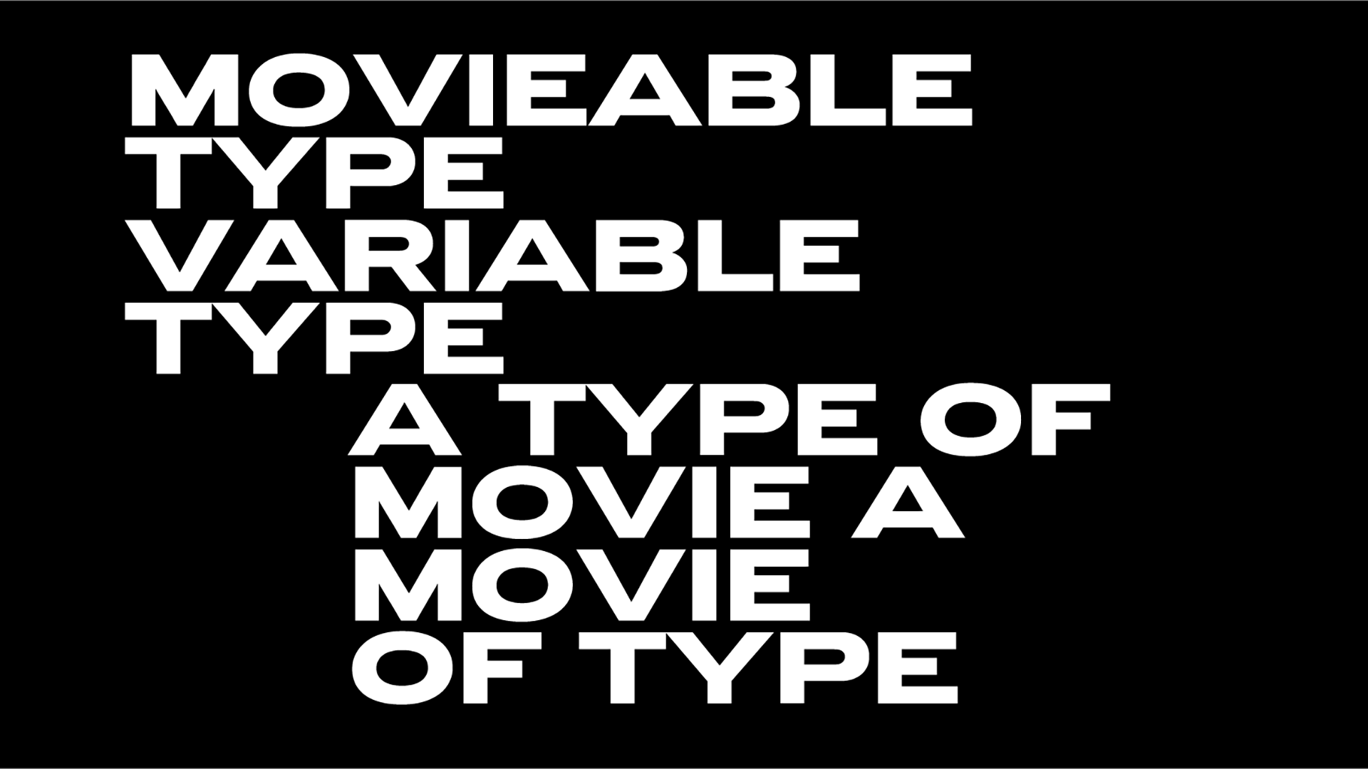
The thin sans serif font primarily uses an assertive all-cap set in a bright cobalt blue and comes in nine widths, ranging from condensed to extended and thin to black.
Durex is the latest company to own its own typeface just like Apple, Google, Coca-Cola and more. After all, a successful identity has to be recognizable with or without the presence of a logo mark and custom type is crucial to that.
The Colophon Foundry created bespoke typeface can be found throughout the company's products, the print advertisements and billboards.
Tags/ google, typeface, rebranding, fonts, colophon foundry, durex, havas london, design bridge


.jpg)


