Typical. Organization: Times New Solar is Times New Roman exposed in eternal sunbeams
In direct contrast with their brandname, nothing is typical about Athens-based design firm Typical. Organization for standards & order.
Joshua Olsthoorn and Kostas Vlachakis are no strangers to Typeroom X Parachute and this time the creative duo present a custom typeface under the sun.
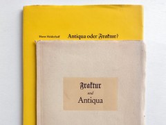
TP Times New Solar was TO's contribution to the collective exhibition Time Takes Time organized by A—DASH, an artist-run studios & project space in Athens, Greece which took place last September.
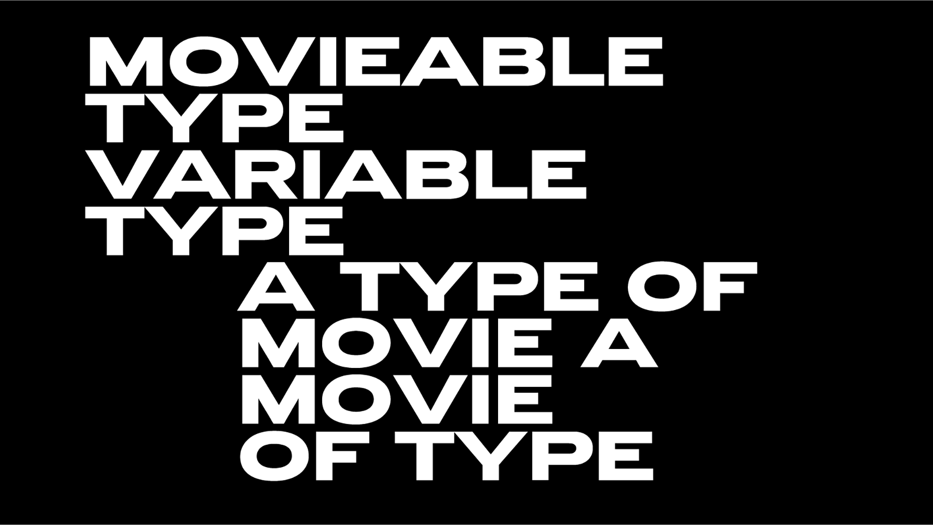
"The typeface TP Times New Solar was our typical contribution for a Thinking of Time and what it takes we proposed a time travel rearranging the monumental Times New Roman accordingly with timeless sunbeams" notes Typical of their custom font for the project which focused "on the processes, materiality, touch and smell of prints, letters, inks and stained fingers."
This is not the first and probably not the last typeface design by Typical. Organization for standards & order.
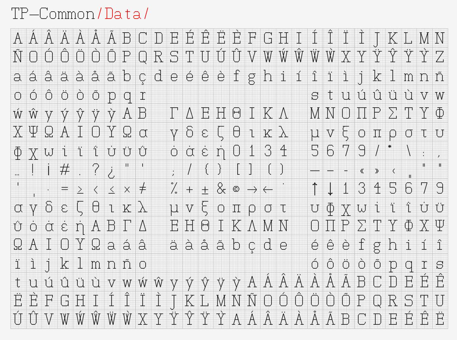
From TP Vorzeit Grotesk, a typeface designed mostly for the studio's communication materials, to the awarded TP Common, a monospace display typeface designed for the exhibition representing Greece at the Biennale Architettura 2018 in Venice aka "The School of Athens" curated by Xristina Argyros and Ryan Neiheiser, Typical. Organization for standards & order will reinvent our visuals, one grid at a time.
Tags/ typeface, font, exhibition, typical organization, joshua olsthoorn, kostas vlachakis, a—dash


