Derby County Football Club's dynamic bespoke typeface scores several typographic goals
Over the past couple of years, the creative people over at Derby County Football Club have been more than busy and now the full project in this typographic derby has been revealed in all its glory. Two years ago, work began to create its bespoke typeface, named ‘BBG’ after Derby’s famous former home, the Baseball Ground, to stand proudly with its other key marque, the iconic Derby County Ram.
The type was designed in-house by Derby County’s Graphic Design and Brand Manager Ian Cherry, who has extensive experience of creating typefaces within football. Along with Club Historian Andy Ellis, Cherry embarked on a journey through Derby County’s visual history, taking typographical influences from all kinds of objects from the club’s past such as signage, programmes, tickets and flags. Items from the Baseball Ground, which was Derby’s home for 102 years between 1895 and 1997, made up the bulk of these and provided the inspiration to take some of the club’s history to its impressive new home for the last 22 years, Pride Park Stadium.
Bold, dynamic in black & white: Ian Cherry on Derby County’s brand new magazine
The type’s body is proportionally modelled on the iconic Ley Stand “Welcome to the Baseball Ground” sign and leans in relation to the “Derby County Football Club” sign, once of the Baseball Ground and now located at Pride Park Stadium above the Lionel Pickering Entrance. The weight has been sympathetically lightened for legibility, and to appear less intimidating, whilst still retaining some bite. Serifs, and in-cutting areas, are taken from other items of Derby County’s history dating back to pre-1900.
‘BBG’ was introduced to the Derby County brand at the start of the 2015/16 season and since then has worked its way across the business. It now appears on areas such as marketing, ticketing, video, signage and corporate messaging across Pride Park Stadium and the club’s Training Centre. Now it has embedded itself firmly within the brand, there has been a strong desire to help it to spread its wings and take Derby’s visual identity to new heights.
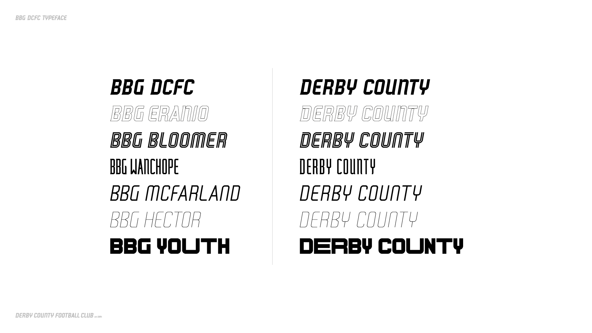
Once again led by Ian Cherry, Derby have developed a set of new weights to build a ‘BBG Family’, allowing the club to build typographical sub-brands within the overall Derby County identity. These will visually enhance and identify specific areas of the brand, such as historical or young fan related material. The weights are as follows:
BBG: designed to enhance the Derby County brand to ensure that the club’s identity is conveyed across all marketing and other areas of the business. Now it has been in place for two years – it is being expanded to create a full font family.
BBG Bloomer: an addition to the BBG family to identify with the Rams’ illustrious history. BBG Bloomer, named after Derby’s legendary former striker Steve Bloomer, will be used on all material relevant to former players or anything club related prior to moving to Pride Park Stadium in 1997. The bold tram line style design is influenced by the traditional numbers worn on historical football shirts.
BBG Eranio: Derby have created the outlined BBG and will be using this weight moving forwards as an additional design feature in artworks. It is never to be used for continuous text and only ever as a graphic element to artworks. BBG Eranio is named after club legend and scorer of the first-ever goal at Pride Park Stadium, Stefano Eranio, who just loved to go around opposition players.
BBG Wanchope: BBG Stretch is designed to offer a different dimension for marketing material and video content for the club. It is a unique design, particularly useful when more text is required to fit in narrow widths, such as Instagram graphics. Named lovingly after Derby’s great former Costa Rican striker Paulo Wanchope, tall and thin, and a nightmare to keep under control!
BBG McFarland: the medium weight has been created to work as an additional element to artworks, where a lighter weight is required for differentiation to standard BBG. This is not a replacement for DIN OT, but rather an extra option for graphics requiring a small amount of secondary text. BBG McFarland has been named after our Derby County’s legendary former England international centre-half Roy McFarland.
BBG Hector: the same as BBG Medium, this gives the club more flexibility for artworks. This will never be used as a headline type but gives us an extra option for less important information to allow the good stuff to sing. BBG Hector is named after Derby’s record appearance holder, Kevin Hector.
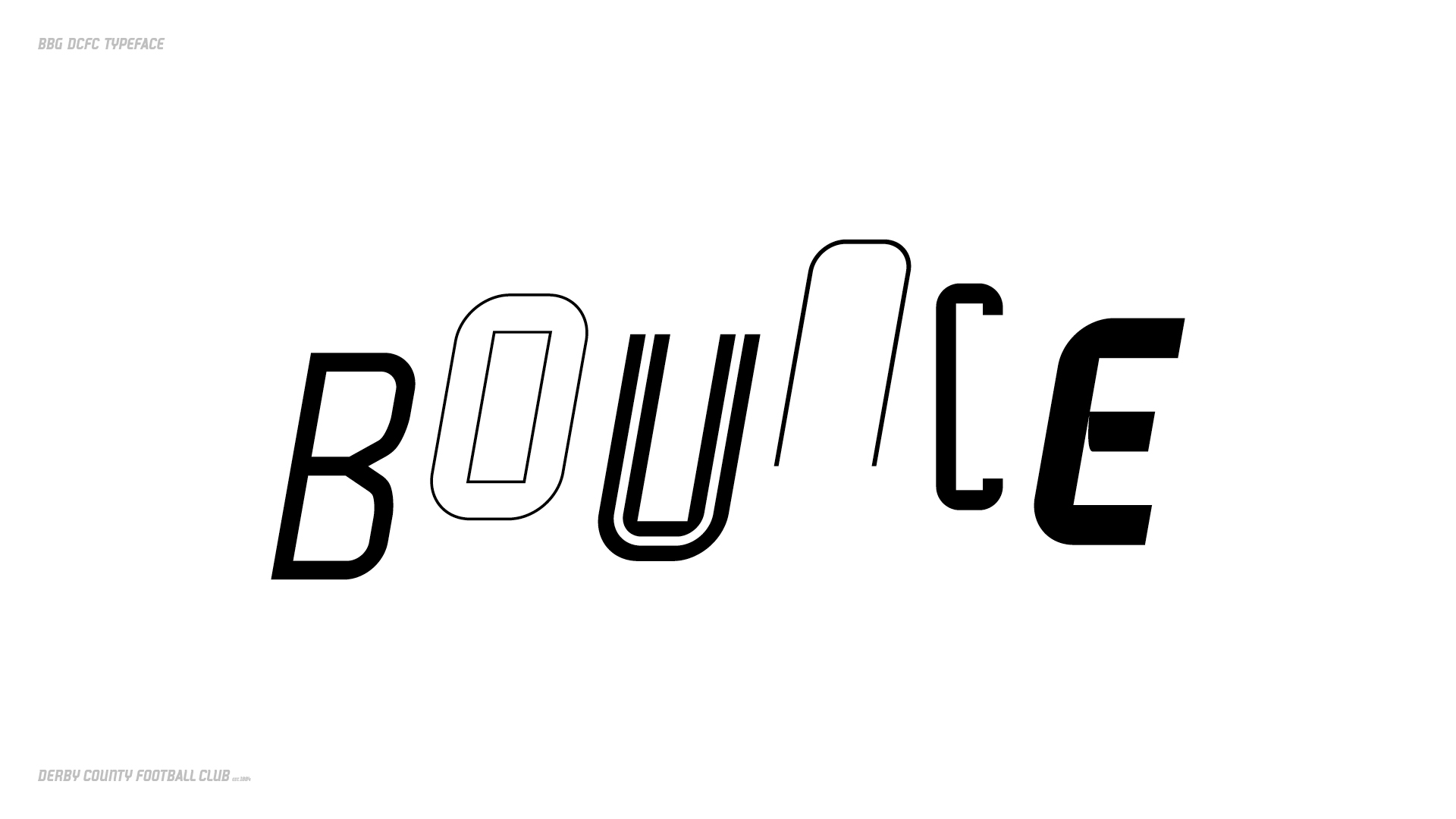
DNA Youth: this one is all about fun notes Derby. The young Rams have attitude, each one is individual and unique and Derby’s type celebrates that with an unpredictable typeface. It’s BBG but with more expression and freedom, which combine to create exciting and eye-catching graphics that will resonate with younger supporters. This will be used to rebrand the existing Rams Squad membership package and also on all artworks specific to under 18s. The basic type is big and bold just as the younger generation demands, whilst exaggerated widths of individual characters creates an interesting and creative style. The type will perform particularly well in digital platforms, which is vital for this age-group.
“The BBG Typeface has really allowed the Derby County brand to excel. It’s now instantly recognisable without even seeing our iconic logo and that is really powerful in conveying our brand across all aspects of our visual communications; be that print, digital or videography” explained Derby County’s Head of Marketing, Faye Nixon.
“The typeface has been lovingly created to tell its own story and embrace the rich history of our Football Club whilst looking firmly to the future. The new weights add an additional dimension to our mono colour pallet and also gives us the ability to be more dynamic with our visual representation.”
Derby County is a special Football Club with “unique identity and a remarkable history, as well as an exciting future” – and the club’s brand reflects that. As time goes on, the new typography will start to appear in more and more areas across Derby County’s brand over the summer and beyond.
Tags/ inspiration, branding, bespoke typeface, bespoke, football, football club, ian cherry, typographic family, derby county


