Programmed to evolve: A talk on Whitney Museum's algorithm-infused custom typeface
Artists play and experiment with algorithms and technology, working within limits but achieving effects greater than the sum of their codes or instructions. The duality at play in this exhibition is as separable as the wave and particle natures of light. To recognize only one explanation would be reductive; to see both is beautiful” writes Scientific American of Whitney's Museum of American Art impressive exhibition which explores how code became eventually an artist's paintbrush.
Featuring works drawn from Whitney’s collection, "Programmed" looks back at predecessors of computational art and shows how the ideas addressed in those earlier works have evolved in contemporary artistic practices.
"At a time when our world is increasingly driven by automated systems, Programmed traces how rules and instructions in art have both responded to and been shaped by technologies, resulting in profound changes to our image culture," writes Whitney's press release.
As all of the pieces in the exhibition are “programmed”, the Whitney’s graphic design department followed a similar approach to the exhibition graphics. In acknowledgement of the focus on algorithms, the team created an original typeface that augments three weights of the museum’s identity system based on a set of instructions.
Graphic designer Joel Fear, one of the creatives in Whitney's in-house graphic design team, has more insights in this exclusive interview with Typeroom's Loukas Karnis.
Typeroom: How long have u been working on the customised branding of Programmed?
Whitney: We were aware of Programmed since October 2017 but weren’t prepared to start sketching until around May 2018, 3-4 months before the show opened.
T: What was the main inspiration (eg. which piece of art, if there is any, was the main reference etc)?
W: We don’t usually pull exhibition graphics ideas from a single artwork or series in the exhibition, but rather the intent of the show as a whole. The way the Programmed exhibition is designed, the space is split in two by Nam June Paik’s Fin de Siècle II, a large structure made of televisions.

The works on either side of that piece deal with different aspects of computational art. Within the different sections, parallels are drawn between different artists, techniques and materials. The multiple versions of different characters in the typeface address this simply by carrying the same idea contained within each word, sentence, paragraph, and section.
T: The custom typeface is based on a set of instructions. Which are they? Which rules you should obey?
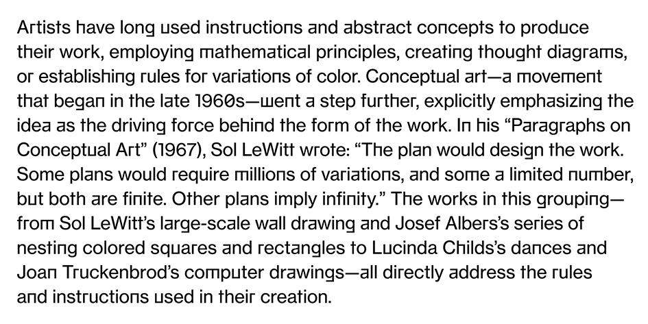
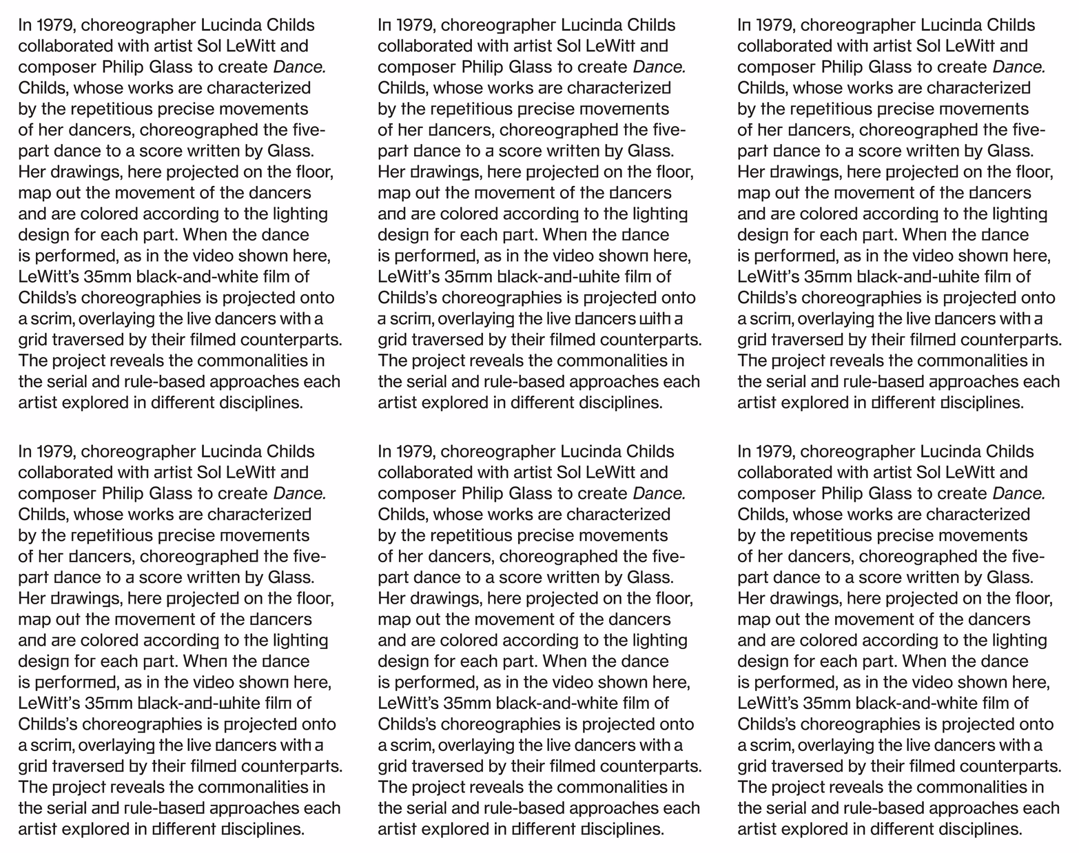
W: There are select characters that have square alternate glyphs. The characters are a, b, d, f, g, h, j, n, m, p, q, r, t, u, w, 0, and 1. There are 3 weights that use these alternates (roman, bold, and italic). Within each weight there are 3 different style sets (1, 2, and 3).
The style sets determine which alternate glyphs are used and how frequently they appear (1 being the least and 3 being most). Style 1: Square letters: a, f, g, h, j, n, m, r, t, u, w, and 1. Style 2: Square letters transform frequently: a, f, g, h, j, n, m, r, t, u, w, and 1; rounds are less frequent: b, d, p, and q. Style 3: Square and round letters all transform with equal frequency: a, b, d, f, g, h, j, n, m, p, q, r, t, u, w, and 1. Style 3 is used across all large exhibition graphics (intro and title). Style 2 is used across all medium exhibition graphics (section texts). Style 1 is used across all small exhibition graphics (object and warning labels).
There is one governing rule for all styles which is no two square characters will appear next to one another, they are always split by an original curved letter.

T: What was the most difficult aspect of this project?
W: Knowing the appropriate frequency level for the scale of the text. We wanted to run it across every piece of text in the show but they all serve different roles so we had to allow for some customization.
Commercial Type was a great collaborator in developing the software with a range of parameters, but making sure they were all still legible and smooth.
T: Please give us a small outline on the steps, the procedures you followed to come up with the exhibition's visual branding?
W: I wouldn’t say the show has its own brand, but it has its own personality within the Whitney identity. It’s an exhibition based on the Whitney’s collection, where we rely on our house typeface, Neue Haas Grotesk, for the graphics. We came up with a range of solutions that addressed different themes in the show, then worked with the curators to develop the most fitting solution. When we decided on this direction we commissioned Commercial Type to develop the software based on our sketches and together tested and defined the parameters.

T: Which are the similarities and the differences with Whitney's main branding?
W: It is built from the same system, but was developed to reflect the particular themes of the exhibition. All of the work we do is considered part of the Whitney brand.
T: Please define the branding in a single word.
W: Appropriate.
T: In which ways does technology shifts the typography and graphic design industry?
W: Like any other industry heavily reliant on tech, often messy innovation makes tools more accessible and quality harder to discern, eventually a stable landscape reveals itself then it starts all over again.
T: Should we be afraid or embrace the advance of AI and the latest advancements in technology that are ready to reshape our world.
W: Both.
T: Humans and machines. Who is the "master" and who is the "slave?
W: I think our relationship with machines is one of mutual dependency driven by impulse and curiosity.
T: What the Museum's Design department is working on now?
W: Around the same time as this show we were also working the sub-identity for the Warhol exhibition. It is the largest single artist show in the downtown location so we developed a more extensive identity that uses elements of (but deviates from) the usual branding. We are also in the midst of a similar exercise for the Biennial which is opening in May.
T: What is the ideal soundtrack to accompany the visuals of Programmed, if any?
W: The floor is filled with different sounds from different machines/media and changes as you walk through so the visuals already have a very fitting soundtrack.
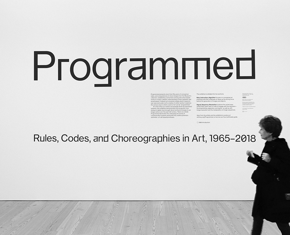
"Programmed: Rules, Codes, and Choreographies in Art, 1965–2018" establishes connections between works of art based on instructions, spanning over fifty years of conceptual, video, and computational art. The pieces in the exhibition are all “programmed” using instructions, sets of rules, and code, but they also address the use of programming in their creation. The exhibition links two strands of artistic exploration: the first examines the program as instructions, rules, and algorithms with a focus on conceptual art practices and their emphasis on ideas as the driving force behind the art; the second strand engages with the use of instructions and algorithms to manipulate the TV program, its apparatus, and signals or image sequences.
On view through April 14th, "Programmed: Rules, Codes, and Choreographies in Art, 1965-2018" establishes connections between works of art based on instructions, spanning over fifty years of conceptual, video, and computational art.
The exhibition is organized by Christiane Paul, Adjunct Curator of Digital Art, and Carol Mancusi-Ungaro, Melva Bucksbaum Associate Director for Conservation and Research, with Clémence White, curatorial assistant.
Please be warned this exhibition includes video and projection with a flashing light effect. Check more here.

Words: Loukas Karnis Images @Whitney Graphic Design Team. BW photograph @Mariana Cardenas
Tags/ inspiration, #whitneymuseum #art #newyork #code #exhibition #interview #programmed #typeface #customtypeface #commercialtype #software #algorithm


