Re-Inc X Pentagram: a reversed “e” just in time for the win in Women's World Cup and beyond
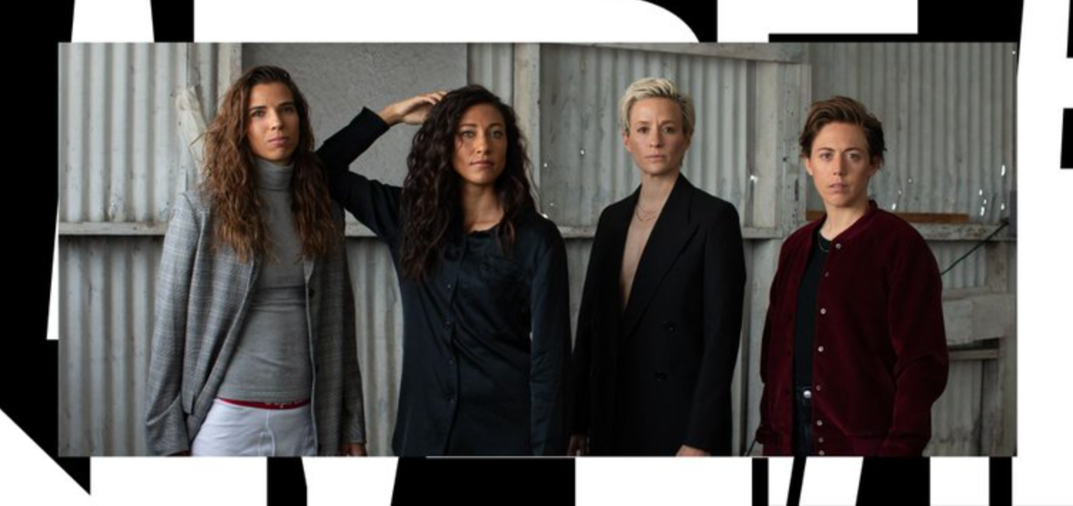
Founded by Christen Press, Megan Rapinoe, Meghan Klingenberg, and Tobin Heath, the four World Cup champions “whose time on the USWNT has taught them how to fight,” Re-inc is a purposeful lifestyle brand designed for those who defy the rules for justice and the four players from the U.S. Women’s National Soccer Team have launched their business just in time for the win.
Eventually, the US Women's National Team relentless 13-0 win against Thailand in their opening World Cup match this week in France during the opening round of fixtures of the competition is a good omen for Press, Rapinoe, Klingenberg, and Heath, who want to change the rules in fashion just as they do on the field.
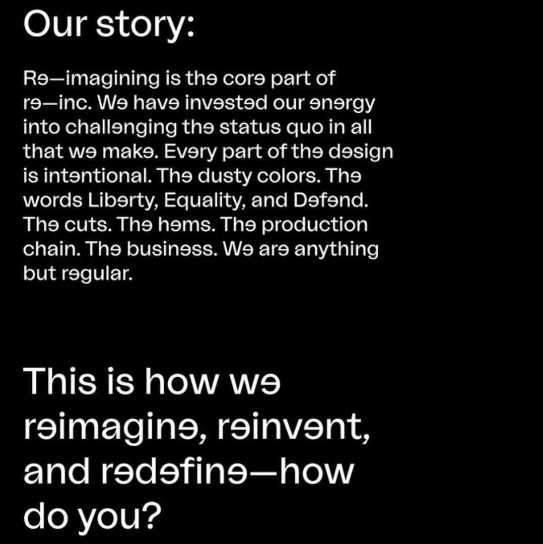
“We exist to boldly reimagine the status quo—championing equity, creativity, progress, and art” note the women behind Re-inc. “Over the next few years, we will create a transformative system of customizable fashion products and experiences for people looking for bold self-expression and non-binary design. By joining us now, you’re part of our 2019 product launch —two tees made as the first part of a full Lifestyle Suit— a template for you to wear in a way that’s true to your individual identity. Everything we design is made with our community in mind—a group of thousands of individuals that courageously break norms and challenge outdated beliefs. Why just resist when you can re-imagine?” ask the four WNST players upon welcoming everyone to their Re-inc realm.
Why just resist when you can re-imagine?
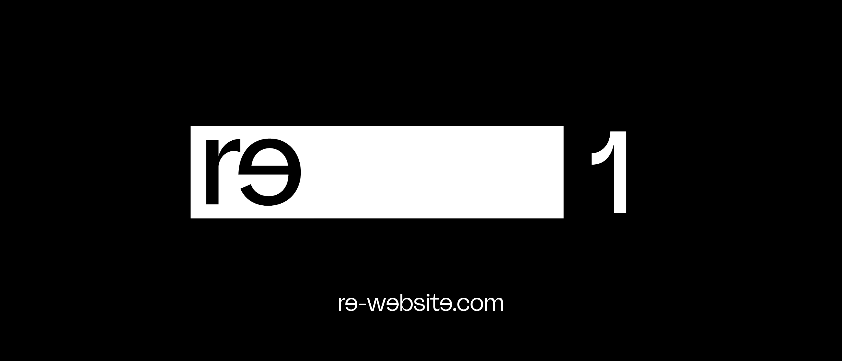
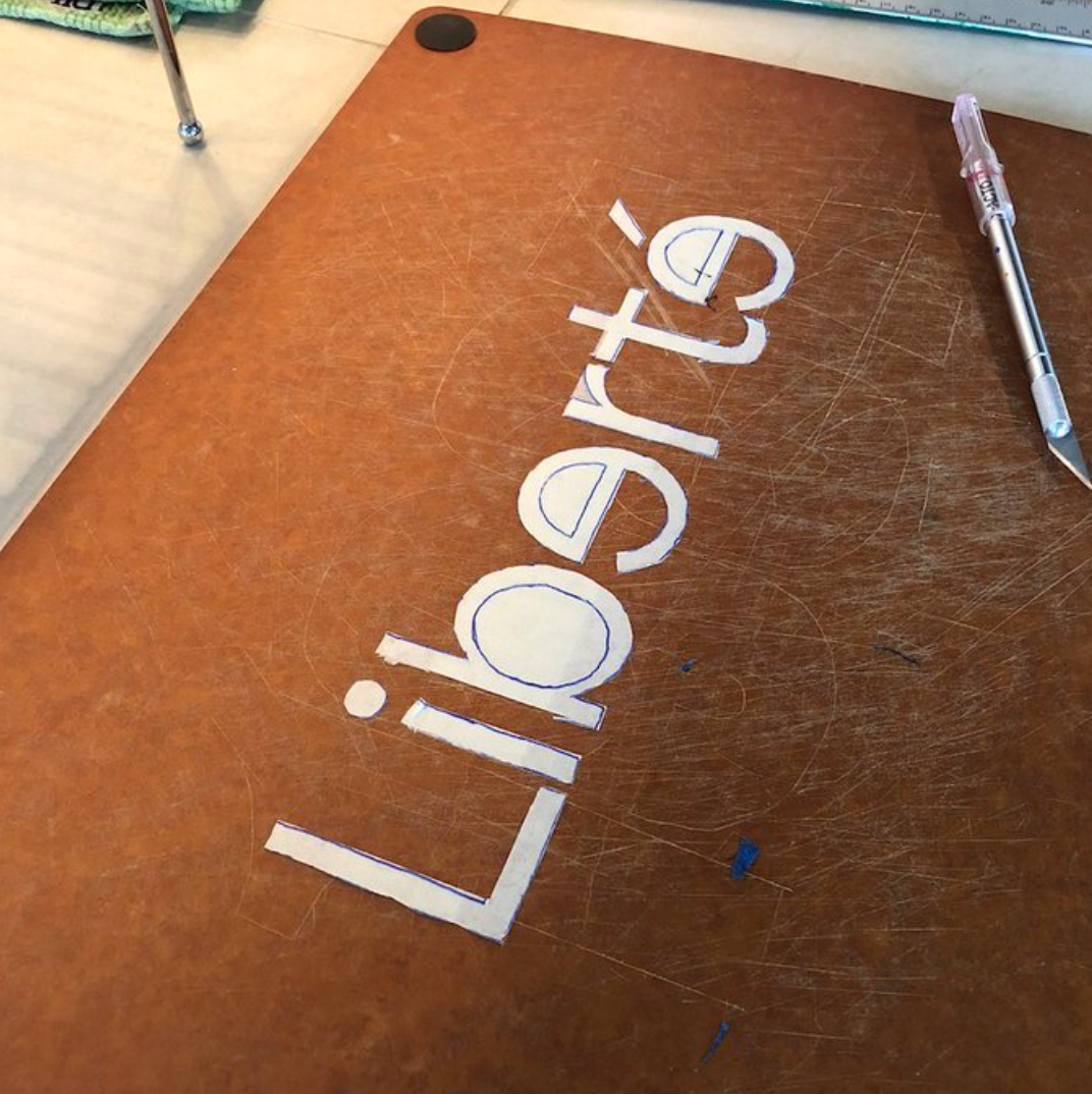
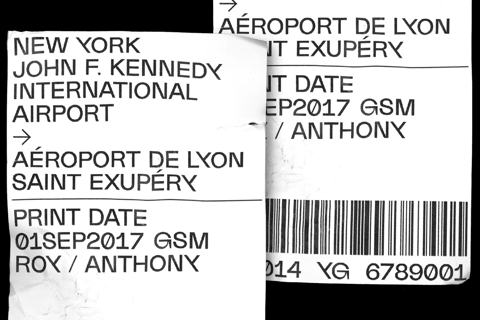
The visual branding of the project had to be an out-of-the-box creative affair and Pentagram's Eddie Opara decided to reverse a lower case “e” in Raoul Gottschling's La Nord typeface which was designed back in 2016.
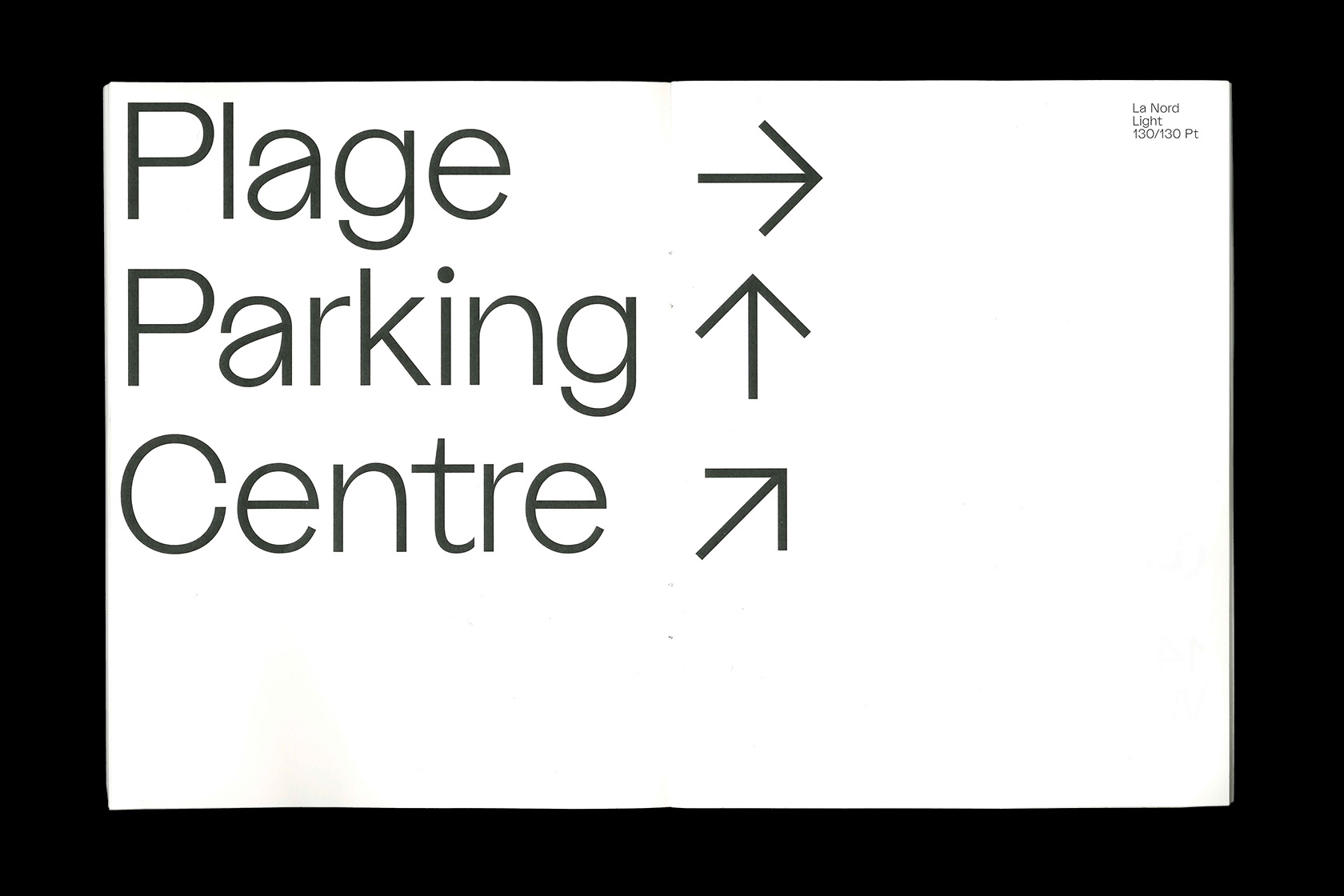
“Named after a beach at the coast of southern France, that is known both for its relentless surge as well as its fragile nature, the typeface captures these impressions in a set of 5×622 characters,” writes New York City based graphic designer from Düsseldorf, Gottschling, of La Nord.
La Nord typeface which was designed back in 2016 is named after a beach at the coast of southern France, that is known both for its relentless surge as well as its fragile nature
“They have fought to get equal or better pay in their profession. To be seen as heroes not only for females but also for males and non-binary gender identities as well. We wanted them to have a great foundation to start capturing people’s hearts and minds as they build their brand,” comments Opara in Eye on Design, having reversed the original lower case “e” making a single letterform the symbol of valuable irregularity in visual branding.
With plans to expand the brand to beauty, wellness, and tech the company’s first T-shirt is on sale with the tripartite motto “Liberté, égalité, défendez”running across the front of the tee -a word game based on France's national motto “Liberté, égalité, fraternité" which stands for “liberty, equality, fraternity”. The four women and founding players of Re-Inc want to score high as female “business owners in the largely male-dominated fashion and venture-capital arenas.”
“The world champions —28 of whom are plaintiffs in a gender-discrimination lawsuit against U.S. Soccer— say their athletic feats have not been matched financially. Four of the players are aiming to change that inconsistency with their own business” reports the Daily Beast of this fashion scoring adventure. Obviously, Re-Inc is ready to re-structure the fashion business one goal at a time. “For greatness. For our identities. For our own value.”
A female-powered journey has begun here.
All images via Re-Inc & Raoul Gottschling
Tags/ inspiration, fashion, typeface, world cup, fifa, pentagram, visual branding, eddie opara, fifa women's world cup france 2019, women's world cup, re-inc, soccer, u.s., lower case, raoul gottschling, la nord


