Thesaurus: Inspired from Geneva's Estiennes typographic heritage
The concept behind Thesaurus goes back to 2014, when I was finishing my bachelor’s degree in visual communications at the Haute École d’Art et Design, Geneva. My final project, ‘Genèva’, was to be a type family inspired by the city of Geneva itself, an attempt to answer the question ‘If Geneva were a typeface, what would it look like?’ My research into Geneva’s typographical history led me to the fascinating work of the Estiennes, Robert (1503–1559), printer to King Francis I and later to the reformer John Calvin, and his son Henri (1528?–1598), the printer, editor and publisher of the famous Thesaurus Græcæ Linguæ” says Fermin Guerrero, the 36yo Uruguayan graphic designer, and typographer whose passion about drawing and art brought him into the Swiss typographic realm.
Having moved to Switzerland to study Visual Communication at the Haute École d’Art et de Design (HEAD) - Geneva, where he received his BA with first class honors Guerrero was inspired by the city's rich typographic heritage. Therefore his curiosity, which has led him to move to Europe in the quest for personal development, a quality of his which keeps him constantly searching for new ways to express his ideas and emotions led him to Thesaurus.
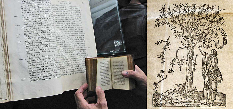
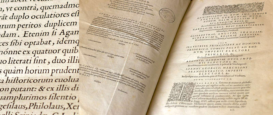
This new typeface of Guerrero is inspired by the typographic history of the city of Geneva and is based on the types that Robert Estienne brought from Paris to Geneva and his famous book Thesaurus Graecae Linguae - an "impressive, beautiful" book he considers himself tremendously lucky to have held and spent some time leafing through it, thanks to the rare book collection at the Bibliothèque de Genève.
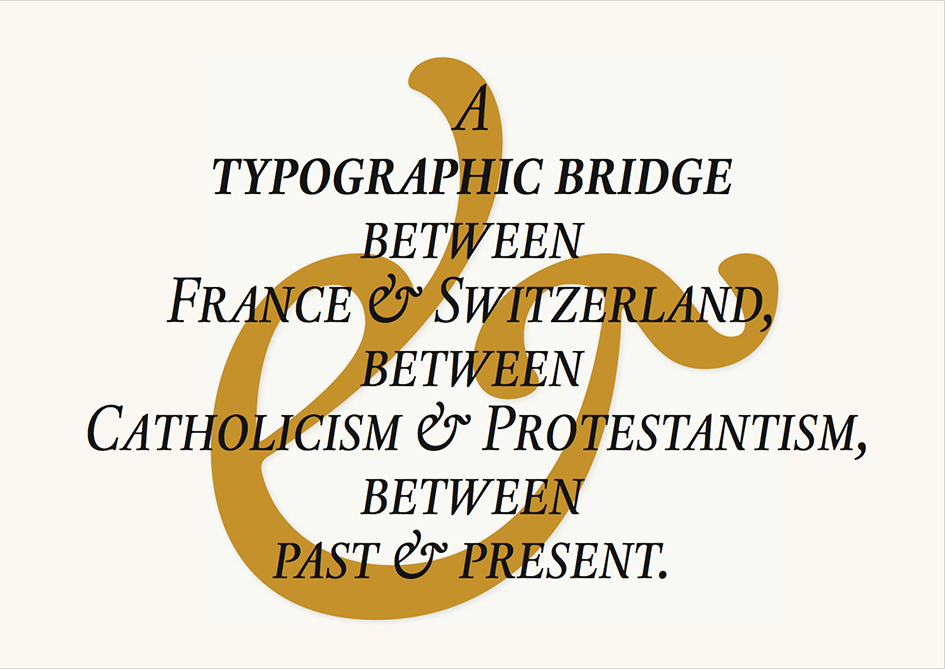
“These metal types served, in some way, as a bridge between France and Switzerland, between Catholicism and Protestantism, and now, through Thesaurus, between past and present,” says Guerrero.
“Although the original project combined different styles such as serif (humanistic and geometric), sans serif and stencil to reflect the city’s multicultural character, when I returned to the project after finishing my masters in typeface design at the University of Reading, it was the style most closely inspired by the Estiennes which seemed most worthy of further development, and this was the beginning of Thesaurus" he writes. Enter his inspiring adventure in a long-forgotten past resurrected in full detail in his own words.
"Although much recent typographic activity in Switzerland (conferences, workshops, competitions, etc.) has been based in Zurich, Basel or Lausanne, Geneva has an extremely rich typographic history that seems to have been largely forgotten.
During the second half of the 16th century, the city was one of the most important and renowned centers of European print culture, thanks to John Calvin and the Protestant Reformation. Calvin and his fellow reformers were prolific writers who provided abundant work to the city’s highly skilled printers, including the Estiennes, who in turn strove to provide the reformers with output of the highest quality."
However the relationship was not " purely commercial. Robert Estienne had emigrated from Paris to Geneva to escape religious persecution, leaving behind a renowned printing establishment where he had already published a number of classical and religious texts including a Greek New Testament called the Editio Regia (‘Royal Edition’) for its masterful typography.
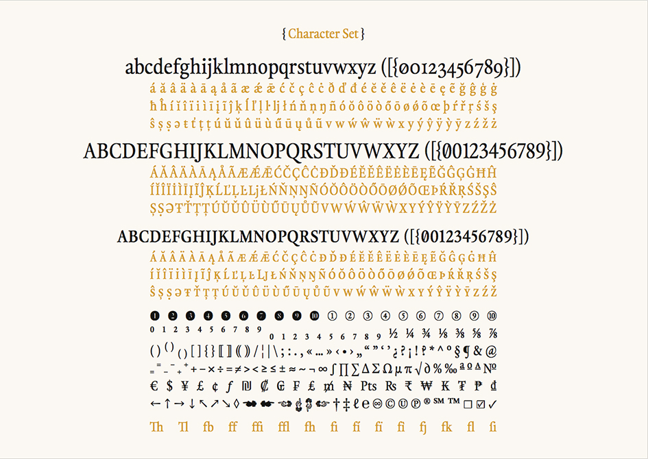

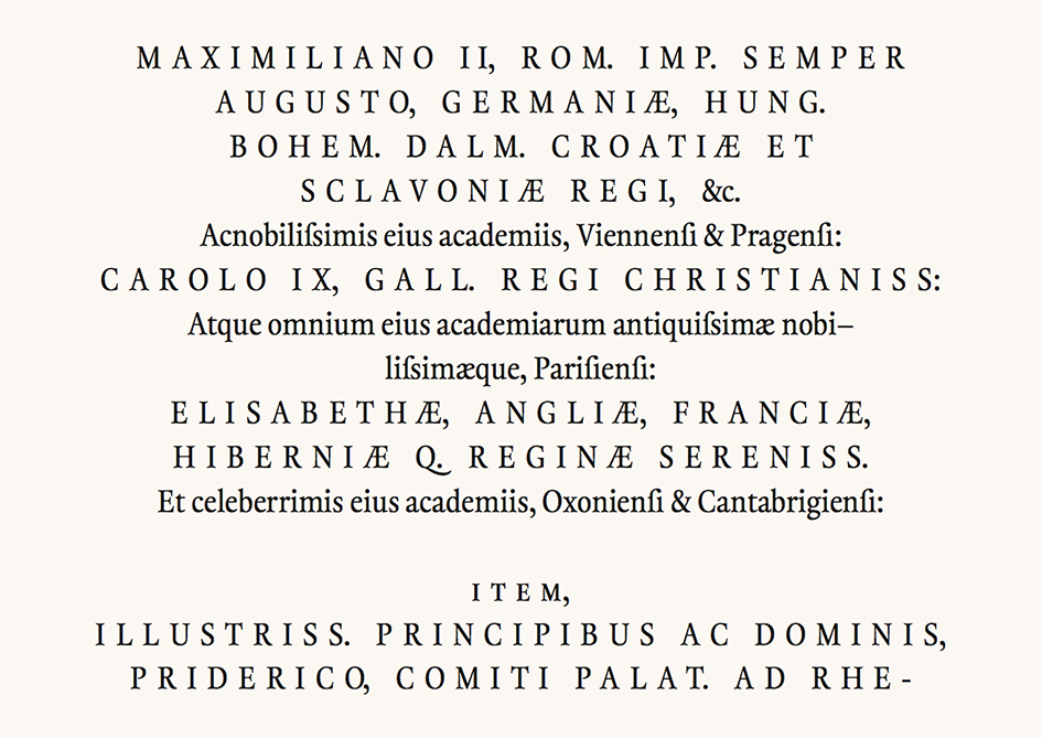
Thesaurus blends particular features of the original metal types used by the Estiennes with more contemporary characteristics such as a large x-height, narrower forms and increased modulation. The result is a charismatic typeface with a unique flavour, with one foot in the past and one foot in the present.
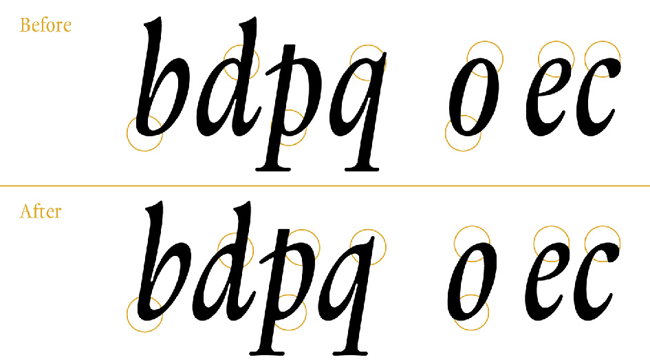
I completely redrew the character set, polishing the letter shapes, increasing the x-height, shortening the ascenders and descenders, increasing the consistency and improving the overall quality of the design. Some letters such as the a, c, e, g, f and s are markedly different from their original designs.
When drawing Thesaurus, I did not intend to trace Estienne’s letters to create an exact reproduction. On the contrary, I allowed myself to ignore some features, keeping only the ones I thought were interesting, either from an aesthetic point of view or because they contributed to the typeface’s identity.
Moreover, since the details of the letter shapes were influenced by the mechanics of the printing process (the texture of the paper, the type and amount of ink, the amount of pressure, etc), there were numerous versions of each letter to choose from; in some cases I chose to work from a single example, and in other cases I took details from several versions to create a composite. Another influence of the printing process can be seen in the rounded corners and junctions which emulate the characteristic ink spread found in books from this period.
The brief I defined for the Display style of Thesaurus was not about conceiving a contrasted version of the Regular, but rather to create a style that would look good on its own
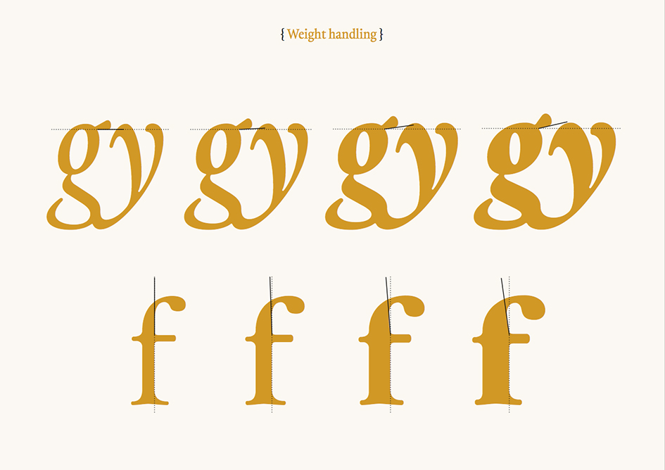
For some of Thesaurus’ styles (Display, Black Roman, Black Italic) there was no reference in the book to provide inspiration. The first high contrast display typefaces arrived in 18th century, and the first related bold types date to the early 19th century. Instead of seeing this as a restriction or an obstacle, I felt that having the opportunity to imagine how these styles would look was a nice challenge that provided more room for innovation.
The brief I defined for the Display style of Thesaurus was not about conceiving a contrasted version of the Regular, but rather to create a style that would look good on its own while being a good match for the Text version, even if that required small changes to its DNA. Consequently, the Display version was drawn with a much more rational and constructed approach, resulting in a more transitional look, which brings fresh air into the family and increases its versatility”.
Check more here
All images from www.ferminguerrero.com
Tags/ typography, details, type design, type family, fermin guerrero, thesaurus, editio regia, robert estienne, thesaurus græcæ linguæ, typographic heritage, typographic history


