Alexandria Ocasio Cortez X Tandem: when radical politics meet radical design victory ensues
Per Steven Heller and for each one of us who has faith in the power of typography and graphic arts, design is everything.
"Design is personality. When used well in election campaigns branding it says more than a candidates name. Color, type, and image contribute to the perception of that name, sometimes the person, too" noted Heller on Twitter. Maybe that's part of the triumphant case of Alexandria Ocasio-Cortez, one of the Democrats’ biggest stars from this midterm cycle and officially the youngest woman elected to US Congress.
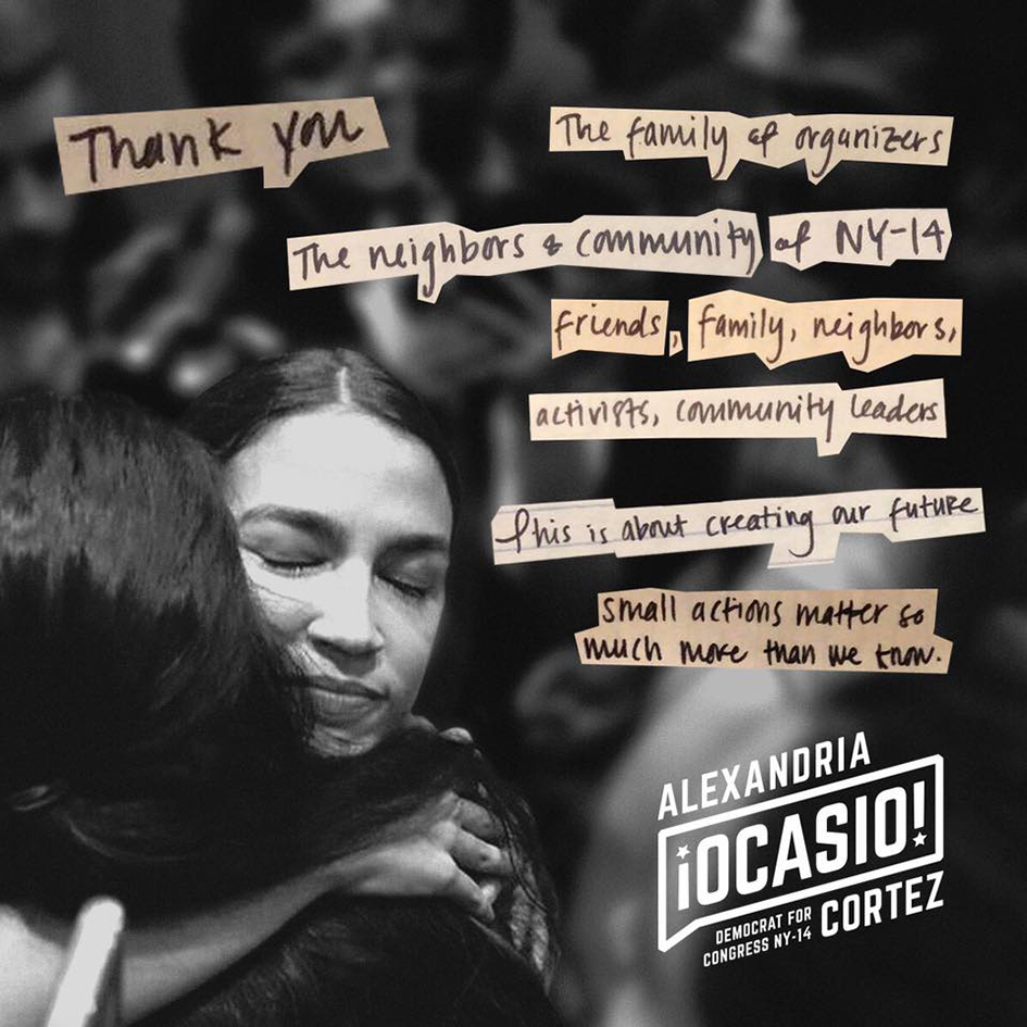
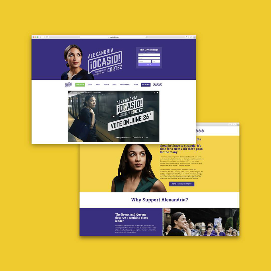
Cortez, 29, a democratic socialist who rose to fame after upsetting Democratic Rep. Joe Crowley earlier this year with over 75 percent of the vote, knew from the very beginning that for being radical you have to look and feel like one. Tandem, a New York-based creative firm whose co-founders, Scott Starrett and Shaun Gillen are close friends with Cortez, along with 24yo designer Maria Arenas branded the campaign as a reflection of Cortez's revolutionary spirit.
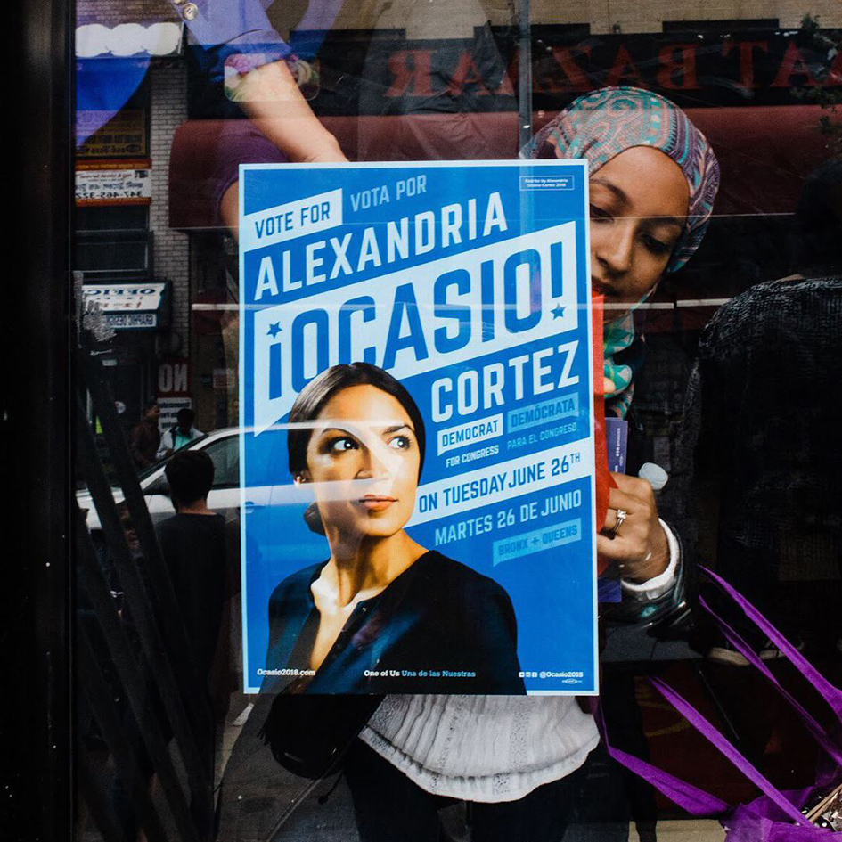
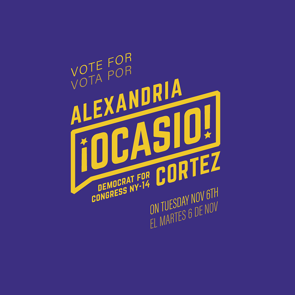
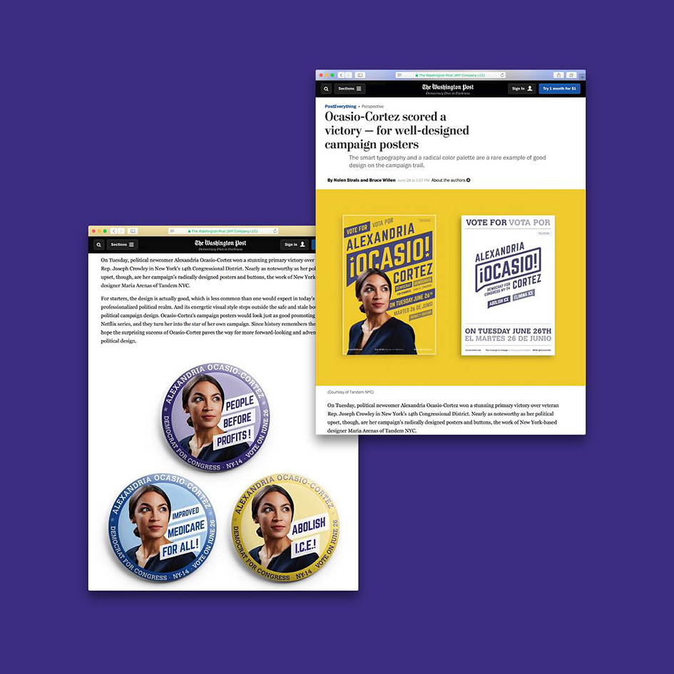
Cortez ditched the red, white, and blue palette and chose purple instead. "The color represents red and blue coming together and Tandem also used nontraditional yellow to associate positivity with Ocasio-Cortez’s campaign. Blue is the third official color, which is the Democrat’s traditional hue" reports Vox.
"Arenas, Starrett, and the Tandem team looked to revolutionary posters and visuals from the past to inspire Ocasio-Cortez’s branding — particularly those of Cesar Chavez and Dolores Huerta, Latino labor activists and co-founders of the United Farm Workers in the 1960s — and union badges. 'That was the closest representation to a populist, social-minded, justice-inclined, inspirational campaign that was about positivity and taking back the power,' Starrett says".
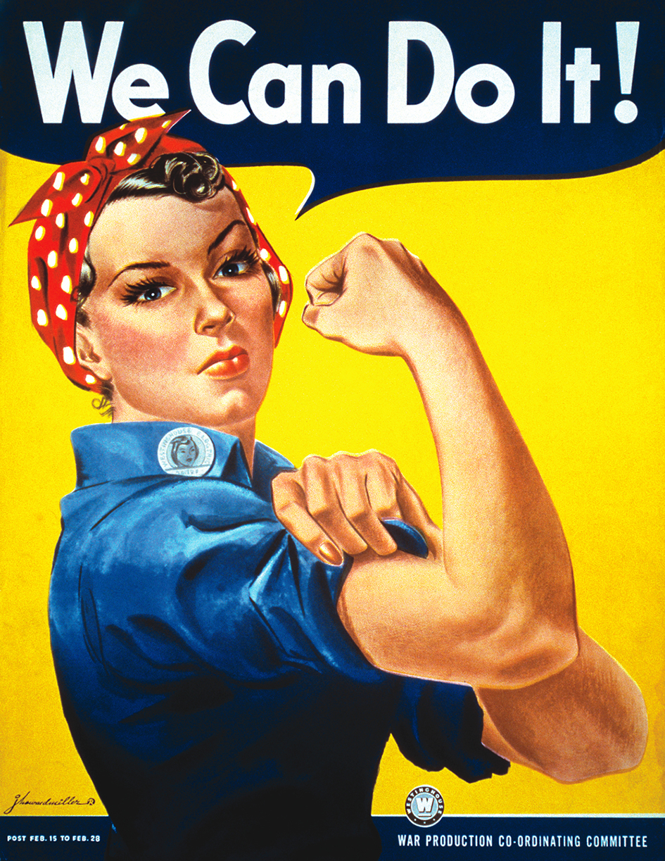
"Ocasio-Cortez’s designs clearly reference 20th-century leftist propaganda posters, and her poster’s color scheme and Heroic Everywoman photo evoke the iconic 'Rosie the Riveter' poster. Simultaneously, the designs could also double as fresh subway posters advertising a new app or Netflix series. Consistent brand application multiplies the force of this great design" notes Type of the campaign.
Tandem NYC used Norwester (the "price" of which is a requested donation to an anti-slavery organization) and Metropolis.
Tandem is not a traditional graphic design studio. Its co-founders began their careers as in-house designers at non-profits.
"The first night Shaun and Scott met, they discussed affecting substantive change through communication design and the barriers to success faced by even the most impassioned attempts like Milton Glaser’s 'It’s Not Warming, It’s Dying' campaign. It was only natural from the outset that Tandem would pursue work that advocates for social causes" says Tandem at Graphic Design USA.
"The role design plays in a culture is constantly changing and the meaning of the word 'design' itself has evolved over time. Similarly, we exist in an evolving global economy built increasingly on attention. In the 'WHO WHAT WHY' of information vying for our attention, design is the first touchpoint to all three questions. The democratization of technology makes targeted communication a constant. The best ideas can only rise to the top if they’re recognizable as such, and in order to be acted upon, they need to be noticed in the first place. The indistinguishable relationship between form (design) and content was eloquently described by Paul Rand: 'When form dominates, meaning is blunted but when content predominates, interest lags.'... In the case of the Ocasio campaign, the most vital components of the design process came down to understanding, deep understanding. Understanding our friend, understanding what she needed to stand for, understanding the people and the movements that came before her, and understanding the community and constituents she speaks on behalf of. Once we had the ethos baked into the visuals, the brand evolved into something larger than we ever could have imagined, but the identity held up and served its purpose throughout the primary campaign. We received positive attention from our work on the Ocasio campaign, but more interesting to us is that it sparked a broader discussion of communication design in political campaigns. This isn’t new to designers of course, but whenever the mainstream takes an interest in effective design, we all benefit. We continue to do work with new campaigns and plan on working with the Ocasio campaign through the election. We’ve also been lucky enough to develop relationships with some extremely admirable and forward-thinking organizations. We are, for example, very proud of a campaign we recently completed with Planned Parenthood and look forward to whatever’s in store for Tandem."
Graphic design is politics and Tandem is ready to advocate and resist. The team will share the process behind the concept and deployment of the Ocasio brand, including the studio's friendship with Alexandria and how time and understanding led Tandem to a better outcome on the 29th of November at Parsons.
Obviously, Ocasio-Cortez’s will inspire more radical and ambitious designs in political branding and Typeroom is thrilled with the idea of making politics look and feel great again.

Tags/ design, inspiration, new york, branding, milton glaser, paul rand, activism, netflix, metropolis, alexandria ocasio-cortez, democrats, midterms 2018, joe crowley, maria arenas, cesar chavez, dolores huerta, heroic everywoman, norwester, graphic design usa, parsons

