In Memoriam: Anthon Beeke (1940 – 2018)
This fall the graphic design scene lost a revolutionary guerilla made in Amsterdam. The renowned Anthon Beeke passed away at the age of 78. His death was confimed by the following statement. "On Tuesday afternoon, September the 25, 2018, the esteemed Dutch graphic designer Anthon Beeke died in his home city of Amsterdam as the result of a cerebral infarction," it read. Beeke, one of the prolific designers in the Netherlands that shaped the history of Dutch Design in the 20th century redefined the visual arts. Always an inspiring "guerilla" Beeke’s life and work blended his love for his hometown and erotica, for jazz and typography in provocative ways.
Regarded by many, Erik Kessels included, as the most liberated spirit in Dutch design history’ Beeke would never play by the rules. A game changer at large, the creator of the 1969 Naked Ladies typeface Beeke explored through his provocatice posters themes that other wouldn't dare to.
Born in 1940 in Amsterdam, Beeke learnt graphic design without any formal training. An assistant for designers including Ed Callahan in Germany, Janvan Toorn in The Netherlands, and Jacques Richez in France Beeke paved his own visual language in 1981 to set up his own agency titled "Studio AnthonBeeke".
"Anthon thought and acted absurdly. He loved the theatre and pantomime and could provoke the public like a cultural clown. His whole existence was shaped by graphic design" wrote his wife, the renowned Dutch trend forecaster Lidewij Edelkoort back in 2013 for the publication, an hommage to Beeke, It's a Miracle (BIS Publishers).
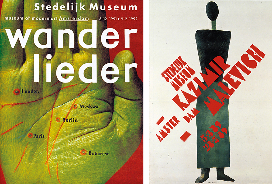
Image via BIS Publishers
"He is not only the poster boy of design but also the poetic image-maker, the naughty collector, the naive player, the avid photographer or the potent architect of collage layouts that are realised far before the cut-and-paste era," she explained.
Beeke founded and headed the Man and Communication department at the Design Academy of Eindhoven between 1985 and 1997. He continued working at the institution until 2008.
"Are you pleased by the stir your posters sometimes cause?" asked Beeke Eyemagazine's Carel Kuitenbrouwe, back in 1994.
"Yes, of course. That’s what I find most important in a poster: that it’s a means of communication, it can make people angry, you can use it to stir up debate. That’s when the medium really works. It’s the sort of power I have from time to time – a power that’s granted me by my clients. I’m not always provoking, that would reduce the tension. You have to measure out the indignation and anger, not walk around toting a red hot poker all the time. If you do that, you’re nothing but a pain in the neck" he answered. "Amsterdam gives me a lot of energy, so I try to give Amsterdam some of my energy back. My poster may be a curse to some, but they confirm what others already feel. We are allowed, indeed given government subsidies, to post them up freely, and this is a good I would like to preserve. I don’t think I could have come out on the streets with these posters in Berlin, Paris, Madrid, London or wherever, not to mention America" he added.
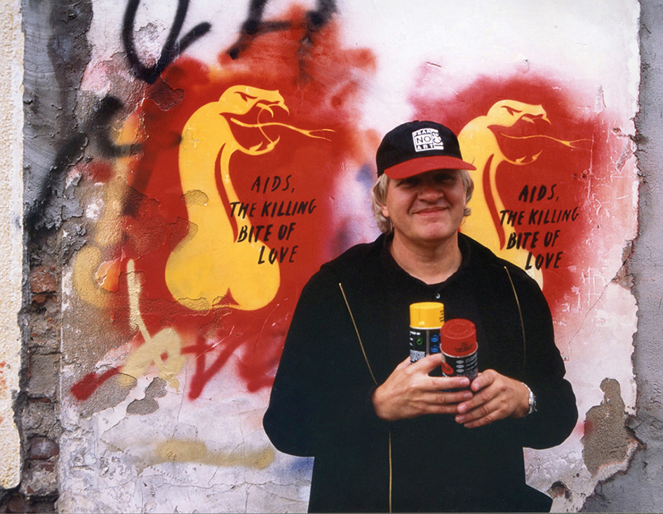
Image via Dutch Graphic Roots
The son of a plasterer Beeke, aged 15, secretly took the entrance exam for the school of applied arts (now the Rietveld Academy). The rest is history made of jazz and typography.
"I was, and still am, a jazz freak. You can clearly see in that world that musicians playing in someone else’s idiom may well be better at it than the originators, but they nevertheless remain shadowy figures. I was not going to be one of them. I had a role model in Thelonious Monk: with his unbridled imagination and limited piano technique he managed to become one of the greatest in his genre. Added to this, I had a strong suspicion that I had nothing to lose. The world is wound up, just as merry-go-round is wound up, and then spins for a while. Winding it up is done by individuals, who each give the world a twist, their twist. This sort of spinning, dancing, is what interests me" said Beeke who was not interested in doing any politics -his work did.
"I’m not someone who believes in politics. I believe in the individual. If you want to make a political statement, you have to do it by yourself, you have to be able to make your own independent choice".
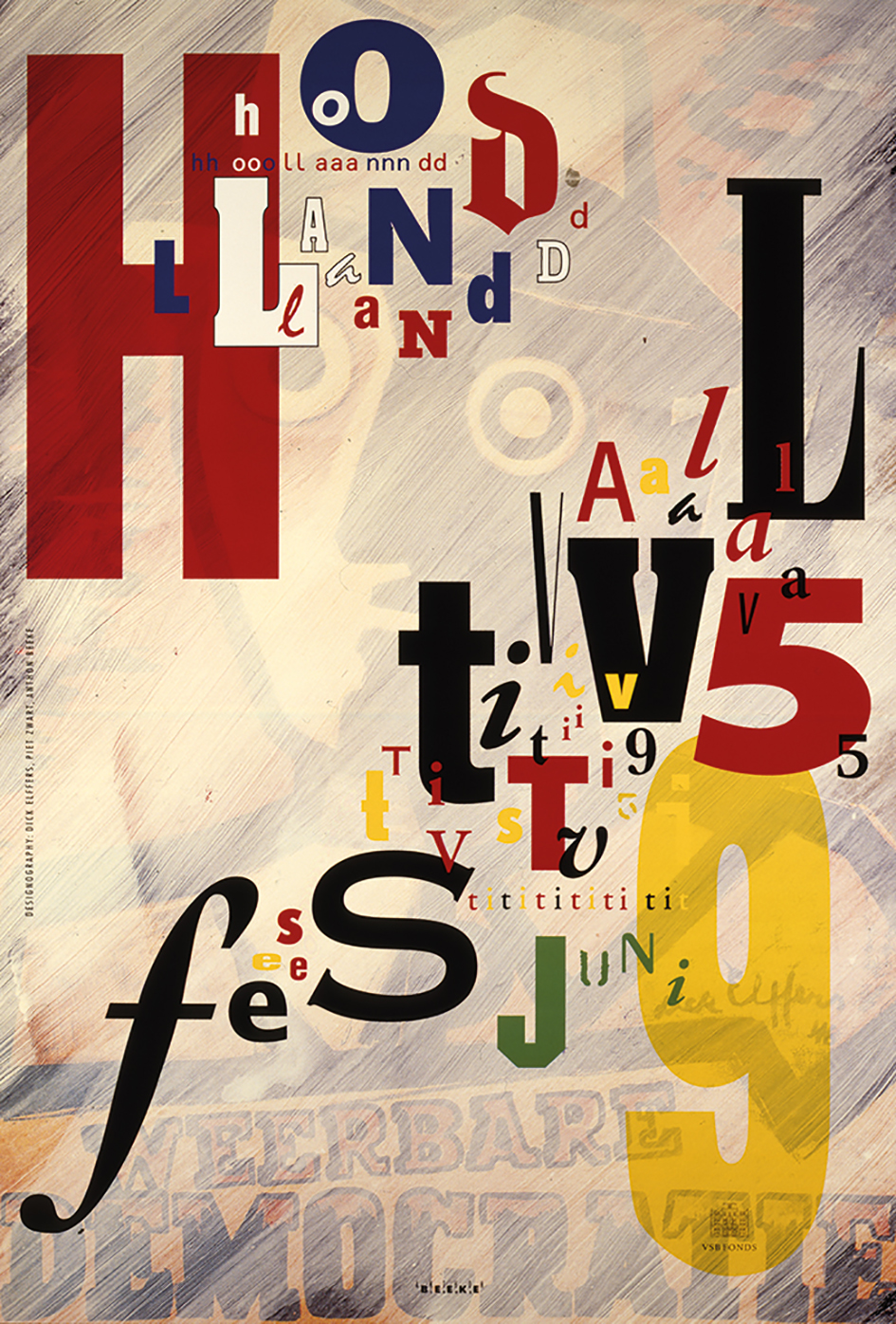
Image via Dutch Graphic Roots
"A graphic designer is like a fashion designer. He or she puts a company in new clothes, supplies the right shirts, jackets, trousers. These garments should fit like a glove, not too tight (not enough guts), but certainly not too large. If the company grows, you have to make new garments to suit the new demands. I am a person who likes people and things that are a bit eccentric, and that’s how I approach what I have to design. In the beginning it takes some pushing, but after a while the clients find they feel happy in their new jacket, it gives them room to move and stand out in their environment. Of course, you can’t do that for any company – the seeds must be there. But it generates a lot of energy and gives them charisma. This isn’t about design alone – I find design so incredibly uninteresting. Taste is something we have all acquired, but now any greengrocer is capable of dressing his shop window to perfection. So what do we have in this profession besides what anyone can do?" he questioned.
"Raw and rebellious Beeke together with Jan van Toorn, Gert Dumbar, Swip Stolk and others he saved in the 1970s the visual landscape of the Netherlands from the hands of what was in those days called the ‘Nieuwe Lelijkheid’ (The New Ugliness): i.e. commercial, institutional design that was applied whether relevant or not. Anthon Beeke was a Dutch street boy who without any formal training became one of the most admired designers of his generation. He owed this to a large extent to his widely discussed poster designs, which quite appropriate embellished the streets of Amsterdam. His approach was more the approach of an artist than of the classic ‘subservient’ designer. On all his work for any client or purpose, he put his own unambiguous stamp" writes Dutchdesigndaily's Sybrand Zijlstra.
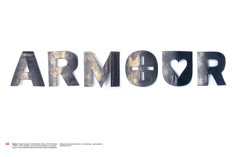
Image via BIS Publishers
This outspoken Dutch deserves per Steven Heller the title Design Provocateur.
"Beeke’s conceptual equation was simple: difficult image + public consternation = critical conversation. His posters do more than promote a product, they advocate a concept while testing the limits of free expression" he adds. "Seeing a collection of his posters is like bring exposed to the behavioral modification in A Clockwork Orange. If forced to stare at each of the posters reproduced here the eye wants to look away. But the viewer cannot help but engage. Beeke forces his audience to go slightly over the edge but does not push them into freefall. There is a safety cord –an aesthetic balance that keeps even his most disturbing images within control. Beeke’s typography enables this provocation to engage".
"The difference between a revolutionary and a provocateur is purpose. Beeke isn’t revolting by producing difficult pictures, he is provocative because he disturbs the status quo to influence the otherwise over-saturated and under-stimulated mind" notes Heller.
Image via BIS Publishers
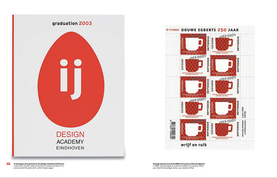
Image via BIS Publishers
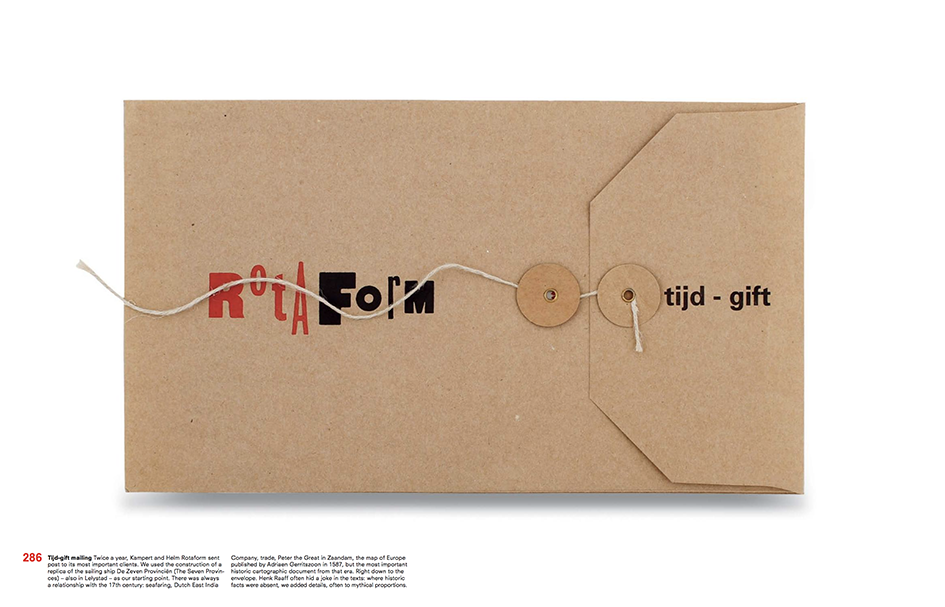
Image via BIS Publishers
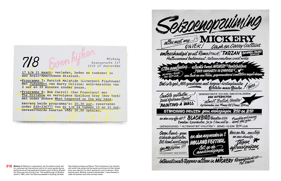
Image via BIS Publishers
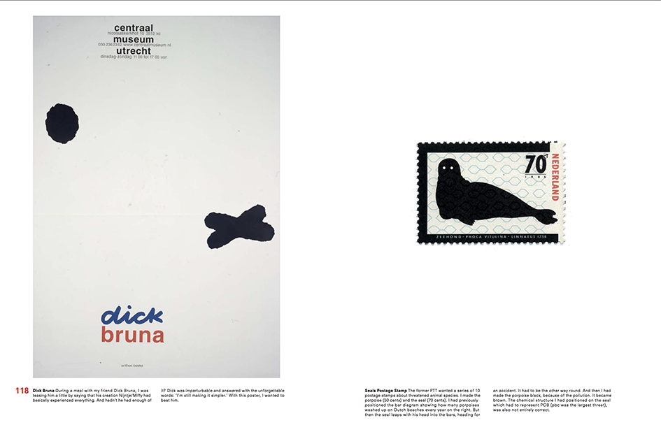
Image via BIS Publishers
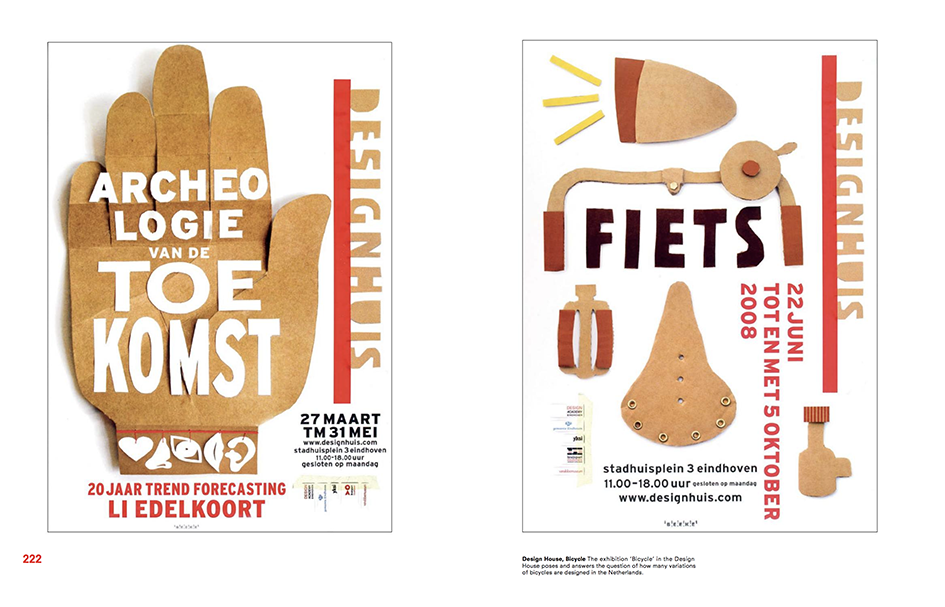
Image via Dutch Graphic Roots
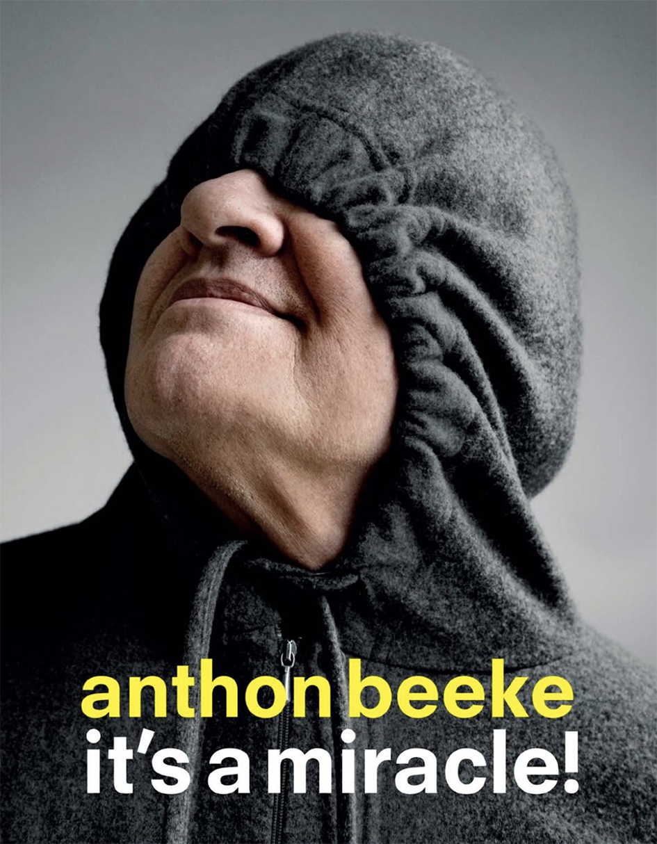
Image via BIS Publishers
Cover Image via Dutch Graphic Roots
Tags/ typography, graphic design, typeface, origins, posters, politics, steven heller, netherlands, france, amsterdam, jan van toorn, anthon beeke, dutch design, visual arts, jazz, germany, design provocateur, studio anthonbeeke, lidewij edelkoort, design academy of eindhoven, rietveld academy, gert dumbar, swip stolk, it's a miracle, bis publishers, ed callahan, janvan toorn, jacques richez, erik kessels, carel kuitenbrouwe, sybrand zijlstra, thelonious monk


