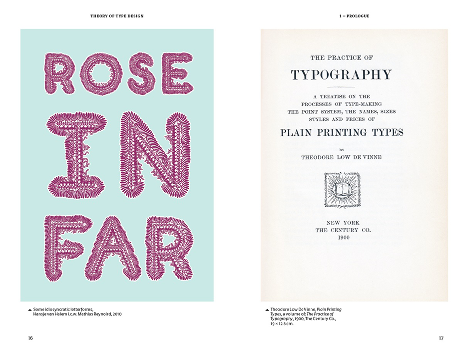
Gerard Unger's Theory of Type Design is the must-buy book of the season
Each and everyone of us is familiar with a certain typeface the internationally renowned Dutch graphic designer and typographer Gerard Unger has created over the years. Now this master of the letterform, the man who is responsible for developing famed typefaces such as Coranto or Gulliver, typeface used by USA Today, designed at the forefront of the 1990s movement towards economically advantageous fonts that saved printers both paper and ink, is ready to share his knowledge is his new publication, aptly named "Theory of Type Design".
In the book Unger theorizes how the design of type is a fundamental linguistic tool. He assesses the diversity and creativity of type and how design makes sense of communicating text.
"Of all designed objects letters are probably the most pervasive," Unger explains at the beginning of his study. "Very familiar yet amazingly diverse in their appearance … there seems to be no limit to human ingenuity when it comes to varying letterforms."
Unger approaches the diversity and creativity of the field with a wide-ranging, reflective, critical theory of how we design and make sense of text.
The history of typography is surveyed, from cuneiform script to Wim Crouwel's New Alphabet and today's digital developments, and explored in relation to how our eyes and brain process various letter shapes in order to understand text.
This volume consists of 24 concise chapters, each clearly describing a different aspect of type design (from practical considerations like spacing and rhythm, legibility, size and italics to more ineffable considerations like personality and preference). This theoretical material is illuminated by more than 200 illustrations and practical examples, and an extensive glossary succinctly explains terminology and key ideas.
Internationally oriented, and taking into consideration the past, present and future of typography, Theory of Type Design will be an indispensible resource for graphic design students, professionals, and those with a general interest in text and printed matter.
Gerard Unger studied graphic design, typography and type design at the Gerrit Rietveld Academy, Amsterdam. He teaches as visiting professor at the University of Reading and taught at the Gerrit Rietveld Academy till January 2007.
From 2006 till 2012 he was Professor of Typography at Leiden University, the Netherlands, and has been a freelance designer since 1972. He has designed stamps, coins, magazines, newspapers, books, logo’s, corporate identities, annual reports and other objects, and many typefaces.
Unger has received various awards, including the H.N. Werkman prize (1984) the Maurits Enschedé prize (1991) and in 2009 the SOTA Typography Award. In 2008 he received an honorary doctorate from the University of Hasselt, Belgium. In 2012 he was awarded the "Piet Zwart Lifetime Achievement Award" by the Association of Dutch Designers BNO. In 2017 he was awarded the TDC Medal by the Type Directors Club.
Designed by Hansje van Halem, this must have publication is available through nai010 publishers.

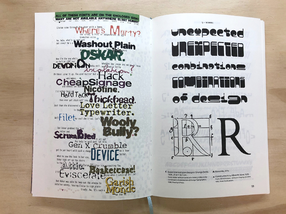
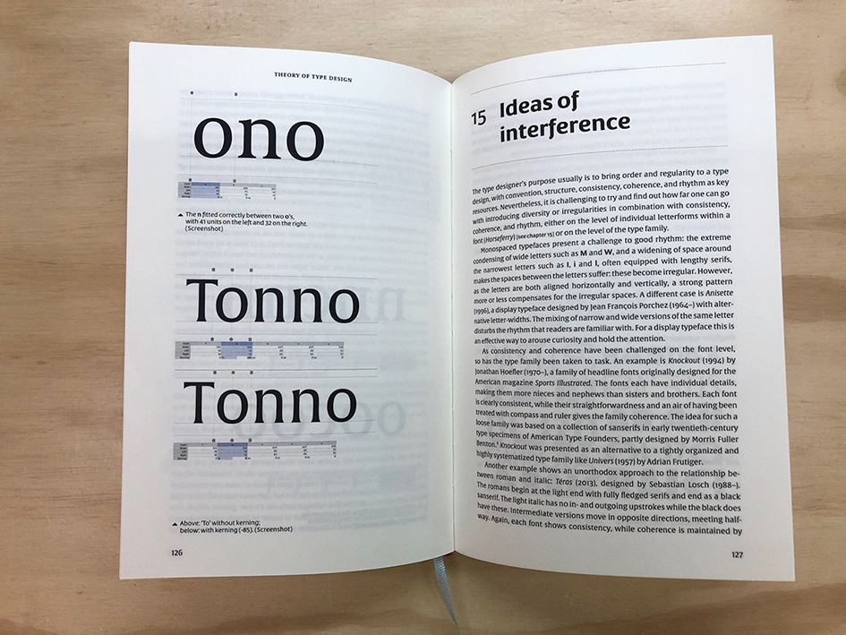
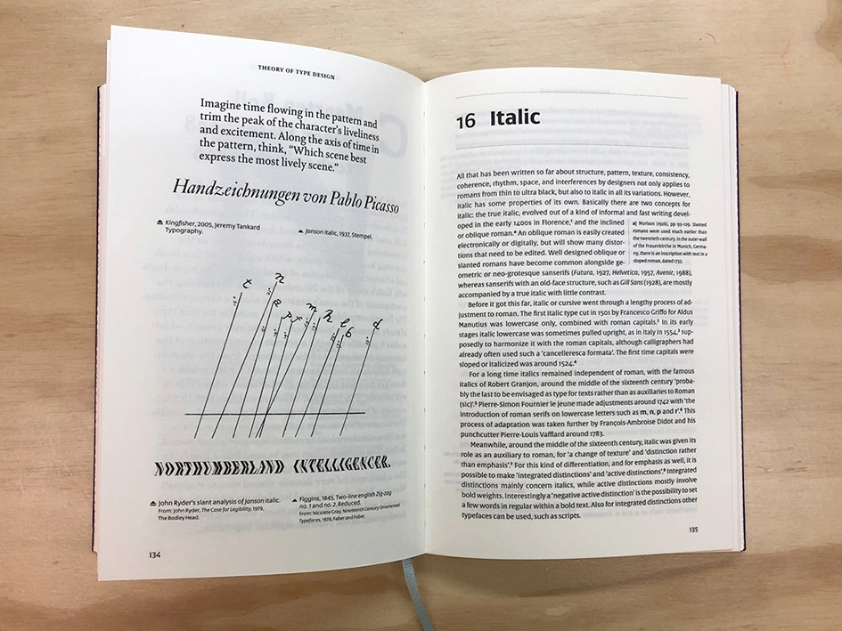
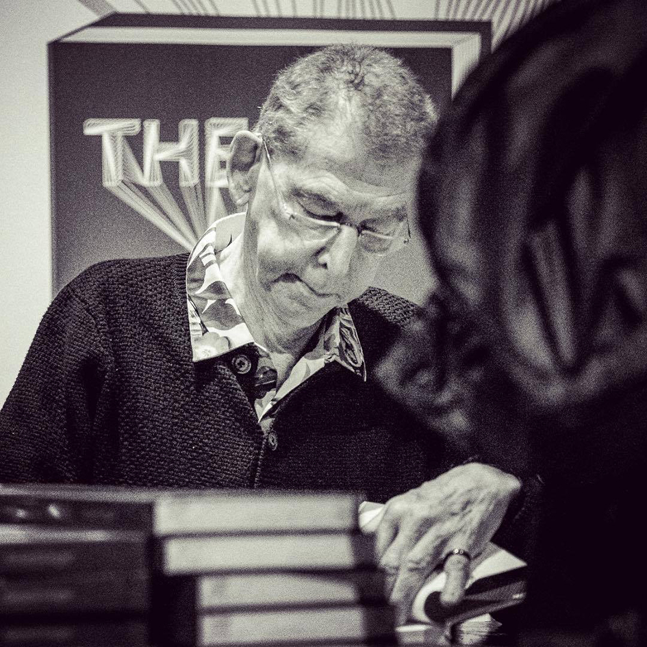
Images via NAi Booksellers
Tags/ typography, inspiration, typeface, type design, typographer, fonts, publication, hansje van halem, netherlands, dutch, wim crouwel, graphic designer, amsterdam, letterforms, type directors club, theory of type design, gerard unger, nai010 publishers, coranto, gulliver, usa today, cuneiform, new alphabet, gerrit rietveld academy, university of reading, leiden university, h.n. werkman, maurits enschedé prize, sota typography award, university of hasselt, belgium, piet zwart lifetime achievement award, association of dutch designers bno, tdc medal

