Letraset & bespoke type: how Mark Studio celebrates a decade of Manchester Literature Festival
Mark Studio, has done it again. The acclaimed design studio keeps on pushing the envelope in branding and it does it with such a tender and casual way that suits the best to one of UK's beloved celebration of literature. Mark Studio designed once again the branding for this year’s Manchester Literature Festival.
This is not a new act. "Our big idea for MLF’s new identity – and the 2008 campaign – came to us while staring vacantly at our book-shelves" notes Mark of the first collaboration, a decade of literature ago.
"We love a good book at Mark, and we’re proud of our home city. So not many of our achievements give us more satisfaction than our long and happy relationship with the Manchester Literature Festival (MLF). This year, we notch up a decade together. The secret of such long-term success? Partly, at least, it’s because we’ve taken a really bold approach. Early on in the partnership, we created a powerfully bookish visual identity to help set MLF apart from the ever-proliferating plethora of book festivals across the UK. But in terms of each year’s promotional campaign, we have started with a blank sheet of paper, creatively speaking. The result, we hope you will agree, is 10 campaigns (so far), each based on a compelling creative 'storyline' of its own, but all adding up to a coherently unputdownable continuing narrative" adds Mark.
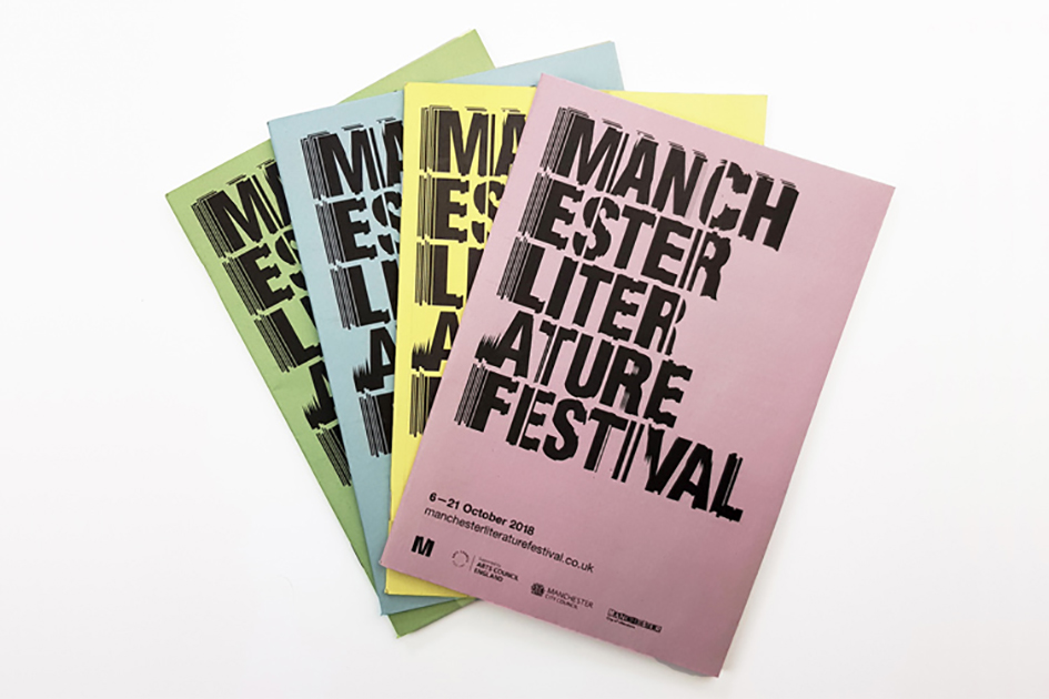
Manchester Literature Festival 2018
From the "reductive typographic look and feel, using remixed letters to create simple, playful typographic illustrations" back in 2014 through 2012's "ultra-tacky Golf Sale type signs, brandished by miserable -looking folk in rubbish costumes – who also acted as human signage at each event" and "the the powerful extracts from the work of writers taking part which were pasted up on posters around the city in 2010, Manchester-based design consultancy Mark Studio delivers once again for the festival with a branding that demands, and grabs, our attention.
“Once you start to flick through the pages of a book, the words and imagery distort,” says Mark Lester, founder at Mark Studio. “We wanted to portray that sense of turning pages. This vertical slicing approach is applied to all iconography and typography, so they all looked like part of the same family. We also felt that Manchester is quite a grey city with a lot of concrete, so bright colours would have more of a visual impact” he told to Design Week.
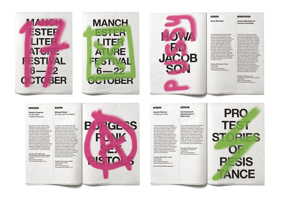
Machester Literature Festival 2017 | Image via Creative Review
Featuring an all-caps sans-serif bespoke typeface with the “vertical blind” pattern which has been achieved through letraset, the identity is modern and obviously targeted towards a younger audience to this literature fest.
Manchester Literature Festival runs 6-21 October 2018 across Manchester, UK. Manchester Literature Festival (MLF) began trading in 2006 and was built on the legacy of its successful predecessor, Manchester Poetry Festival. MLF provides unique and imaginative opportunities for audiences to experience high quality live literature via an annual festival format and associated project activities.
Check more here.
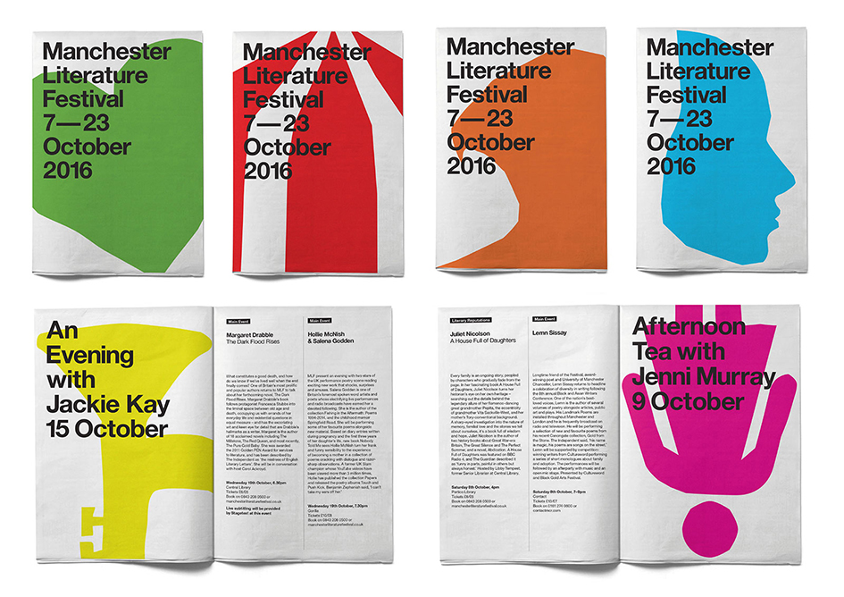
Manchester Literature Festival 2016

Manchester Literature Festival 2014
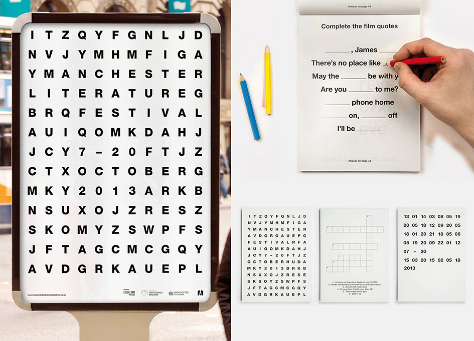
Manchester Literature Festival 2013
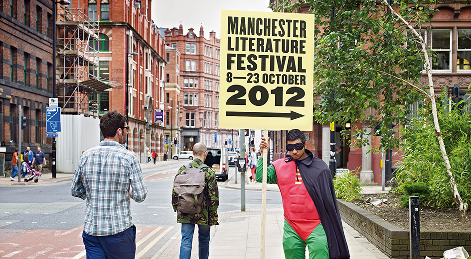
Manchester Literature Festival 2012
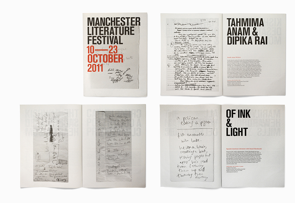
Manchester Literature Festival 2011
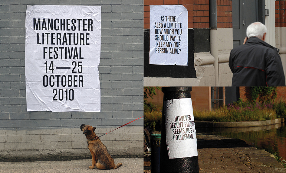
Manchester Literature Festival 2010
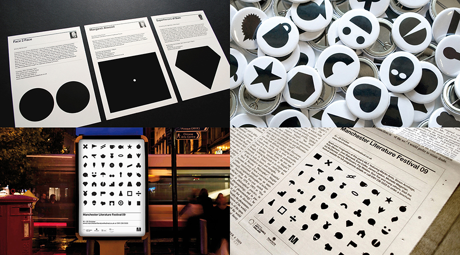
Manchester Literature Festival 2009
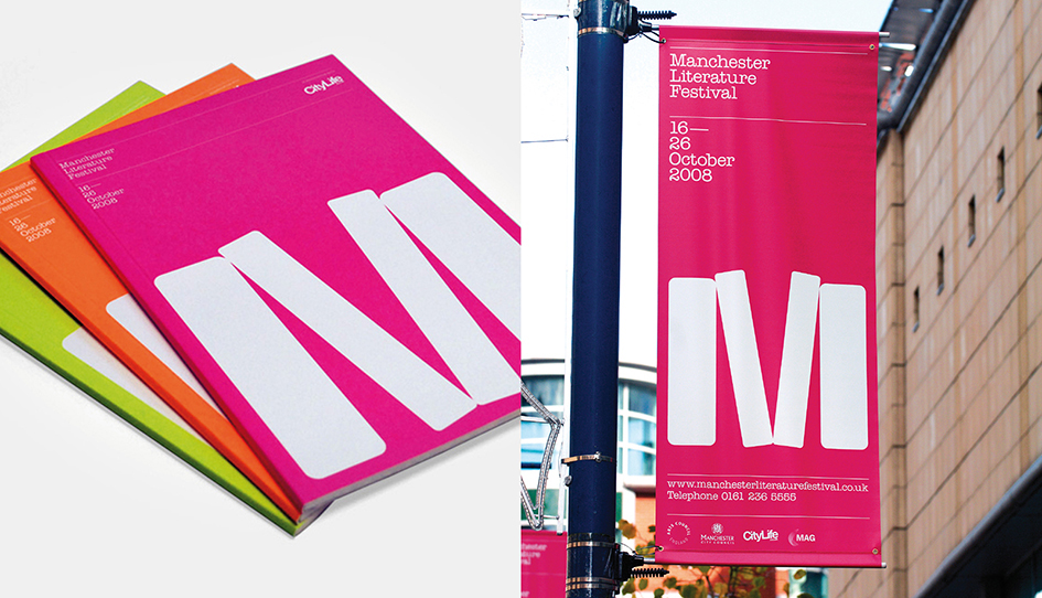
Manchester Literature Festival 2008
Tags/ design, typography, inspiration, illustration, letters, visual identity, posters, campaign, branding, uk, manchester, bespoke typeface, literature, mark studio, letraset, design week, typographic, partnership, sans-serif, manchester literature festival, mark lester, book festivals, iconography, manchester poetry festival


