G what? The elusive mystery of the letter g explained
Despite seeing it millions of times in pretty much every picture book, every novel, every newspaper, and every email message, people are essentially unaware of the more common version of the lowercase print letter "g," Johns Hopkins researchers have found in a study back in 2018.
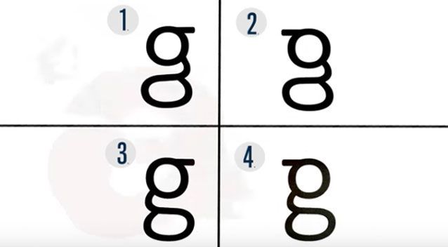
“Most people don't even know that two forms of the letter -one usually handwritten, the other typeset- exist. And if they do, they can't write the typeset one we typically see. They can't even pick the correct version of it out of a lineup” note the authors.
“What we think may be happening here is that we learn the shapes of most letters in part because we have to write them in school. 'Looptail g' is something we're never taught to write, so we may not learn its shape as well” said Johns Hopkins cognitive scientist Michael McCloskey, the study's senior author.
Unlike most letters, ‘g’ has two lowercase print versions. There's the opentail one that most everyone uses when writing by hand; it looks like a loop with a fishhook hanging from it. Then there's the looptail g, which is by far the more common, seen in everyday fonts like Times New Roman and Calibri and, hence, in most printed and typed material.
“To test people's awareness of the g they tend to write and the g they tend to read, the researchers conducted a three-part experiment.”
G or g is the seventh letter of the ISO basic Latin alphabet. The letter 'G' was introduced in the Old Latin period as a variant of 'C' to distinguish voiced /ɡ/ from voiceless /k/.
The modern lowercase 'g' has two typographic variants: the single-storey (sometimes opentail) 'g' and the double-storey (sometimes looptail) 'g'. The single-storey form derives from the majuscule (uppercase) form by raising the serif that distinguishes it from 'c' to the top of the loop, thus closing the loop, and extending the vertical stroke downward and to the left. The double-storey form (g) had developed similarly, except that some ornate forms then extended the tail back to the right, and to the left again, forming a closed bowl or loop. The initial extension to the left was absorbed into the upper closed bowl. The double-storey version became popular when printing switched to "Roman type" because the tail was effectively shorter, making it possible to put more lines on a page. In the double-storey version, a small top stroke in the upper-right, often terminating in an orb shape, is called an "ear".
Generally, the two forms are complementary, but occasionally the difference has been exploited to provide contrast.
The findings of the study demonstrate that “our knowledge of letters can suffer when we don't write them. And as we write less and become more dependent on electronic devices, the researchers wonder about the implications for reading.”
The study suggests the important role writing plays in learning letters, appeared in the Journal of Experimental Psychology: Human Perception & Performance.
Read more here.
Tags/ typography, alphabet, science, letterform, typesetting, letter, study
