Only X Pirate: a heavy type branding against the status quo
A revolution is on its way and Only, the award-winning branding agency based in Manchester always believing “in the transformative power of simplicity” provides the visual identity for a brand new kind of creative disruption.
Only collaborated with Pirate (formerly Pirate Studios) on a very clear and direct branding as this global network of creative studios that aims “to empower the next generation of musicians, producers, podcasters and dancers” commissioned Only to produce “a brand identity to capture the spirit of Pirate and to provide a platform to celebrate their community.”
Eventually, typography takes center stage and the message is amplified.
“There is a democratic and collaborative spirit that radiates from everything at Pirate. Working closely with the team, we identified ‘democratizing creative space’ as a founding principle of the business. The process would take Pirate back to basics; presenting an authentic brand that promised to empower people to ‘create something real’. The first step was to lose the corporate logo. The URL would instead become the calling card—clear, direct, and operative. Against the status quo” reads Only's press release.
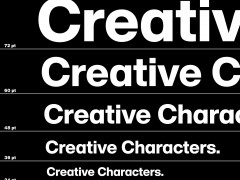
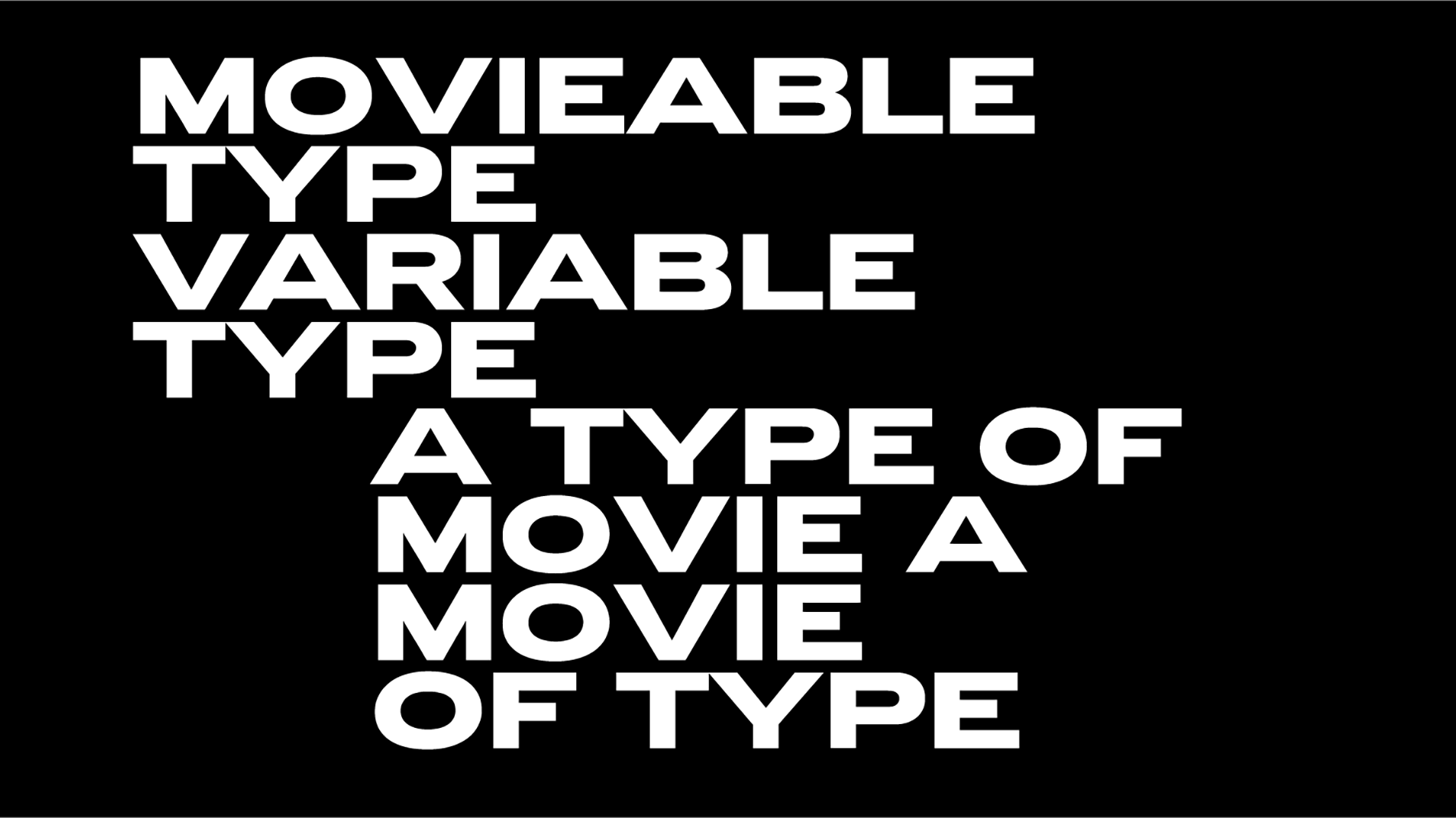
“For the wider identity, it was important that creative assets could be produced easily, by anyone, anywhere, without obstacle. Arial was selected as the brand’s corporate typeface—one of the most democratic and widely available fonts in the world. Three settings of stretch create a distinctive aesthetic and provide the necessary hierarchy for information. The sound recording symbol Ⓟ has been adapted from the Arial glyph set to act as a digital shorthand.”
“The project has proved a little divisive! It kind of stimulated the debate about ‘good ugly’... One thing I don’t talk about in the PDF is that the vast majority of the Pirate studios are necessarily situated in developing/often industrial areas to keep the price point where it is” Matthew Tweddle, Only's creative director, told Typeroom.
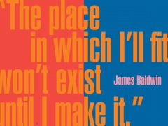
“The buildings and graphics that surround them have a utilitarian/DIY feel. It would have been wrong to try to impose an overly premium aesthetic on the buildings and into these areas. We instead opted to honour and celebrate the surroundings and elevate the vernacular through some bold and simple typographic treatments.”
Combined with an inclusive approach to photography and a diverse secondary palette comprised of widely available Pantone inks—the identity celebrates the passion, diversity and authenticity of the Pirate community.
“We’re a disruptive company, always trying to find a better way to support our community. That’s why we wouldn’t fall in line with looking like every other music tech brand” noted Pirate's co-founder, David Borrie.
“We wanted the brand to be an authentic reflection of the founders’ vision. To strip everything away and put the focus on our community of artists. The identity challenges the status quo and is a natural fit for Pirate” added Chris Ulyatt, Pirate's Head of Brand.
Explore more here.
Tags/ typography, typeface, music, branding, arial, manchester, glyph, matthew tweddle, only studio

.jpg)


