From Knockout to Times New Roman: Beyoncé's fierce typographic branding in full frame
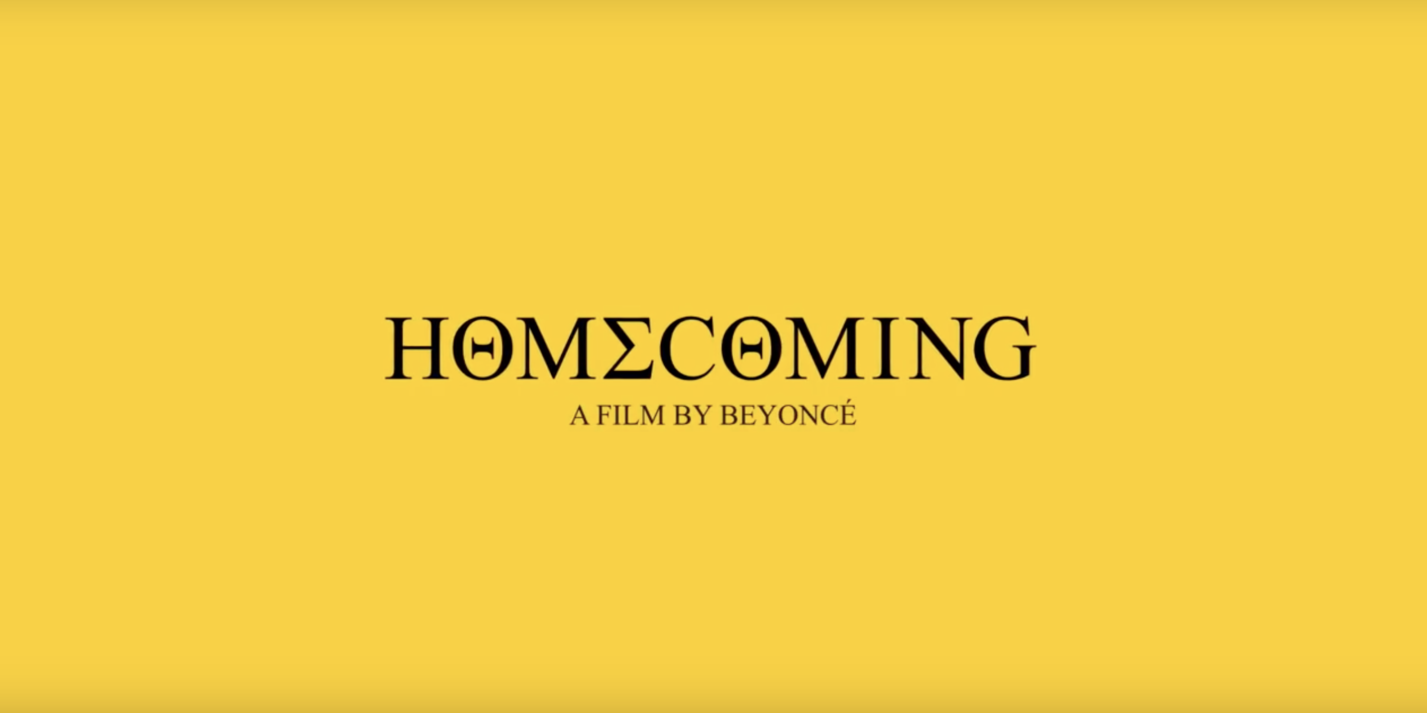
To celebrate Queen Bey’s energy Netflix released Homecoming: A Film by Beyoncé, a documentary about Mrs. Carter’s cultural evolution. Featuring behind-the-scenes footage and a look at the rehearsals of Beyonce’s epic #Beychella set in Coachella last year HΘMΣCΘMING has every bit of element that made Beyoncé one of the most precious brands out there. Beyoncé’s font of choice aka Times New Roman is a well-established typeface that does justice to her brand in the entertainment and fashion industry alike.
Commissioned by the British newspaper The Times in 1931 and conceived by Stanley Morison, the artistic advisor to the British branch of the printing equipment company Monotype in collaboration with Victor Lardent, Times New Roman, although no longer used by The Times, has a legacy of it’s own as one of the most popular and influential typefaces in history. A standard on desktop computers Times New Roman is one of Monotype’s best-selling typefaces of all time. Robust and bold, Queen Bey's visual branding is fierce and this is not the first time Beyoncé invested in the power of typography.
In her eponymous fifth solo album her name is stylized in all caps thanks to Parkwood Entertainment’s Todd Tourso who was tasked with designing Beyoncé’s album cover.
“For me I kept thinking about Metallica’s black album. How do you make a very iconic statement in an artist’s career: 'This is something new for me. This is my modern direction.' It was as simple as not having her face on it. Because that’s what everyone would expect, a beauty shot of her. That was the big breakthrough, coming to the conclusion that it doesn’t have to have her on it” he told to The Atlantic.
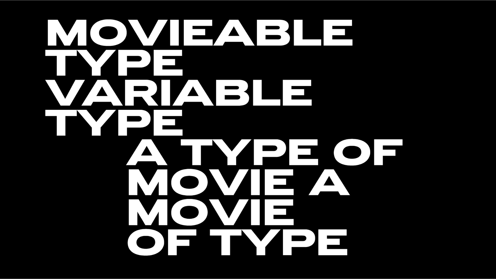
“We went for a typeface that is kind of masculine but still sexy and loud and is actually derived from fight cards, boxing-ring placards. So it seemed like metaphorically that was a good fit. And then we set it in this kind of grayed-out pink, which was sort of a subversion of femininity.” The “gender-bending” typeface is Knockout, a type family with a “sweeping collection of 32 sans serifs that defies the Modernist canon, in order to reclaim one of typography’s great natural wildernesses: the American sans serif” notes Hoefler&Co.
“For more than a century before Helvetica, the sans serif landscape was dominated by unrelated designs. Gothic woodtypes in a dazzling array of proportions lived comfortably alongside anonymous foundry types, each design’s integrity the product of its autonomy. Because none of these faces were intended to relate to one another, none of their design characteristics were beholden to any external constraints: what worked for a supercondensed boldface need only work for that design, not also for the extra-wide light face whose design afforded different possibilities and faced different challenges. This sort of 'situational' approach to type design allowed for more varied and interesting designs, and it’s this approach that Knockout celebrates.”
“With the functional benefits of a family that’s well-organized, and the visual appeal of styles that are individually designed, Knockout’s nine-width, four-weight family offers a range of voices that’s impossible to achieve with even the best Modernist sans serifs” writes the type foundry of the typeface which brought the letterforms in the most crowded stadiums and venues ever.Another fine example of Mrs. Carter’s devotion to the power of the letterforms was conceived by Beyoncé’s dream team of creatives aka Ed Burke, Todd Tourso and Es Delvin. During her best-selling Formation tour, the creatives paid tributes to some iconic visual artists of our times bringing more heavy-in-type fierceness on the stage.
“The best visual moments are the nods to contemporary artists. When the word ‘female’ is wrapped around the building, Jenny Holzer comes to mind, while short jumpy clips of pontificating fans, superimposed with text on their faces allude to Ryan Trecartin’s YouTube videos” writes ArtNet’s Karen Wong of Beyonce’s visual and design extravaganza.
Tags/ inspiration, typeface, font, times new roman, monotype, fonts, documentary, jenny holzer, netflix, visual branding, metallica, beyonce, knockout, album, ed burke, todd tourso, es delvin





.jpg)
