Helvetica for the digerati: Monotype reimagines the world's most popular font for the 21st century
Helvetica, regarded for good reasons as one of the best-known typefaces in the world, has a brand new chapter to its legacy. "It's been six decades since Helvetica® was released, and in that time the typeface has remained the go-to choice for clarity and neutrality. However, as with many typefaces, the demands on it have increased. Helvetica's famous Swiss simplicity is now expected to perform in a growing range of environments and at a wider spectrum of sizes than ever before" notes Monotype's Emma Tucker on the brand new take of an all-time classic.
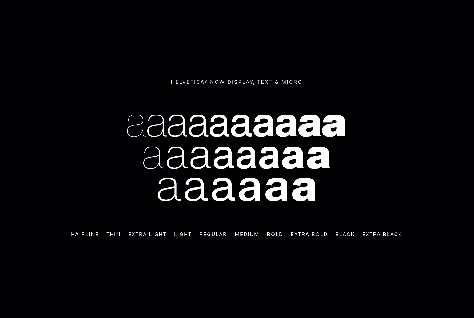
Helvetica Now reimagines Neue Helvetica, the classic font which was released in 1983, for the digital era whilst "staying true to its ethos of simplicity, clarity, and global appeal". Helvetica Now offers Micro, Text and Display sizes "each of which is tailored to a particular environment—unlike Neue Helvetica, which was drawn and spaced for use in text type," with the Micro version a standout feature of Helvetica Now.
“When you go back to the original source, it's so much more readable and that doesn't have to do with the forms themselves but the spacing,” says Monotype Type Director Charles Nix. “It was about studying the spaces between the letters and figuring out what the methodology was early on, how it made the type so much easier to read, and then restoring that and improving upon it.”
For this brand new version Monotype redraw Helvetica’s nearly 40,000 characters and as Charles Nix, the type director at Monotype, notes in Verge, the redesign was done with "extreme trepidation". Nix and his team got deep into the forms, studied the history of New York's original typeface, looked at every iteration between 1957 and now as it was more than important for him "to understand how it’s evolved and where the missteps happened — what can be corrected and what needs to be preserved".
Helvetica Now from Monotype on Vimeo.
"It’s like the Hippocratic oath: 'Do no harm.' Simplicity, clarity, neutrality, let that be the sort of mantra you keep repeating as you make every form. If you’re making any changes, make sure the variation serves that mantra. My part in the whole process was the micros, the sort of crazy 6pt, 5pt, 4pt or ultra-small pixel count typefaces, and the text typefaces" he says.
Consisting of 48 fonts and three optical sizes, the Helvetica Now typeface has been produced from size-specific drawings and with size-specific spacing. Clean and versatile design, the font continues the tradition established by the Helvetica and Neue Helvetica families, while introducing a number of improvements.
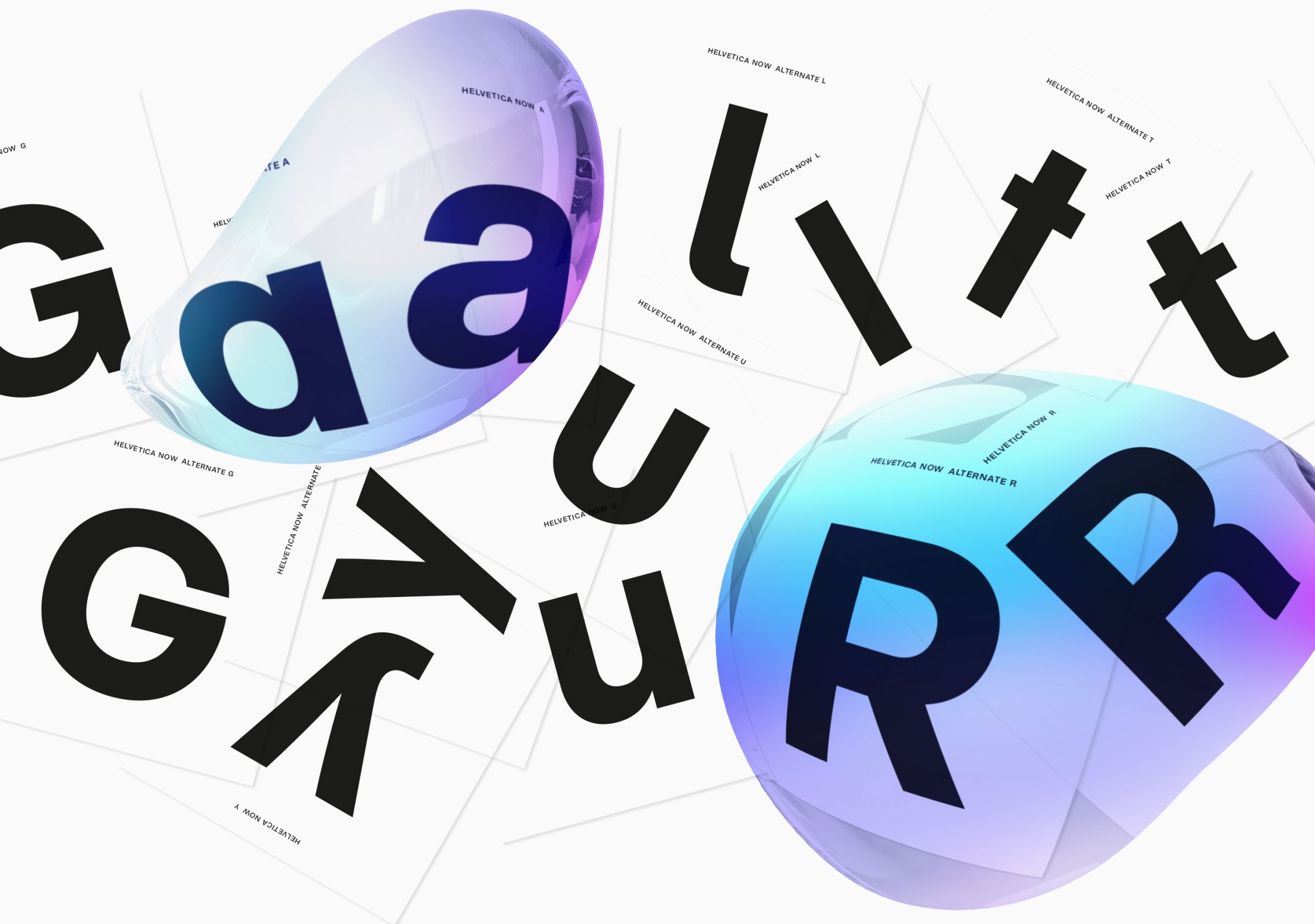
The brand new family offers a full set of alternates for the designers to choose from and per Monotype this release is more than a refresh or an update. "Monotype's team of designers returned to the original design, then reassessed and redrew every glyph in the family, adding popular modifications that have been made to the typeface over the years. Recurring issues, such as the easily confused capital I and lowercase l have been addressed, with a hooked version that increases legibility at smaller sizes. Other new additions include an updated @, rounded punctuation, a rounded G, a straight-legged R, a single-story a, and a lowercase u without a trailing serif".
“Helvetica Now is the tummy-tuck, facelift and lip filler we’ve been wanting, but were too afraid to ask for,” said Abbott Miller, partner at Pentagram. “It offers beautifully drawn alternates to some of Helvetica’s most awkward moments, giving it a surprisingly, thrillingly contemporary character.”
“Today, we’re asking Helvetica to do more than it ever has before. Previous versions of the typeface weren’t designed to be used in graphic applications that have developed over the last 30 years. As a result, older versions of the font were lacking in some important areas,” said Nix in Monotype's official press release. “Helvetica Now solves the legibility and style challenges that brands using Helvetica have consciously and unconsciously faced for years. The design introduces a new chapter in the Helvetica story—expanding its look and utility, while reinvigorating its heritage.”
“This is the typeface Max Miedinger and Eduard Hoffmann would have designed back in 1957 if they had known about offset printing, small screens, browsers, digital design tools and UI designers” added typographer, designer and writer Erik Spiekermann of Helvetica Now. Hans Eduard Meier and Eduard Hoffmann introduced Helvetica in 1957. Today, their impressive legacy got updated and the story of the world's most oft-used font is evolving in micro level. Enter the next chapter here.


Tags/ inspiration, #newrelease #typeface #fonts #typeface #helvetica #helveticanow #neuehelvetica #hanseduardmeier #eduardhoffmann #monotype #charlesnix #erikspiekermann #micro


.jpg)


