From a microsite to your screen: PF Grand Gothik is the brand new variable font embracing the future you should know
When variable fonts were first introduced back in 2016 a big, brand new milestone was revealed in the typographic universe. Variable fonts changed typography as we know it by bringing the digital element of letterforms and symbols into the limelight of our screens.
With variable fonts, typography embraced the flexible elements of technology and developers had a brand new arena to discover and experiment with.
Eventually, new rules of creativity dawned and Parachute Typefoundry enters the variable font industry with PF Grand Gothik, a postmodern, multiscript, multifaceted and ultra versatile variable type system which pays homage to typographic styles found in American and European grotesques.
Taking late 19th and early 20th century grotesques as a starting point, PF Grand Gothik traces this typeface genre up to mid-century movie theatre marquees, new wave cinematography, American highway signage and telephone directories, adding some historical references for good measure.


Originally designed in 2017 as a bespoke typeface for a bilingual, black and white magazine on surfers, waves and landscapes, PF Grand Gothik was later reimagined and redesigned, leading to the release of its commercial version with each variation of Grand Gothik's 3 stylistic alternates depicting a specific period and style. From the less calculated appearance of late 19th century grotesques all the way to their gracefully-shaped contemporary counterparts, the history of typography is evolving in remarkable ways.
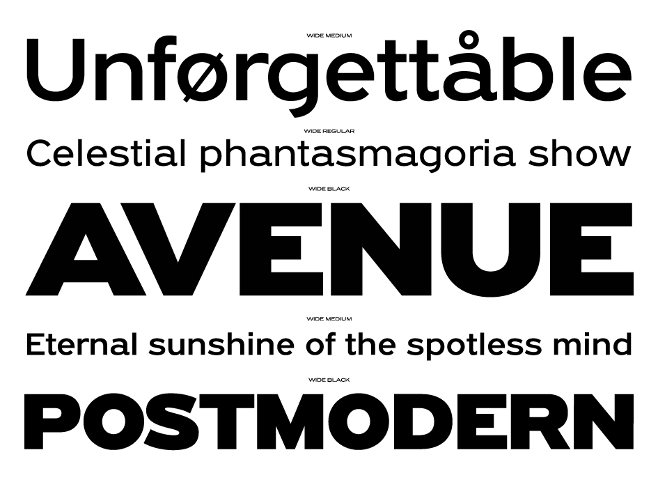
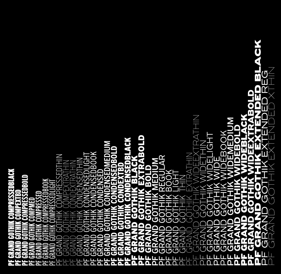
Grand Gothik’s design space includes 3 axes for weight, width and one for italics. Available as a variable font or as five separate opentype families (compressed, condensed, normal, wide and extended with 9 weights spanning from Extra Thin to Black plus italics for each one of them), PF Grand Gothik was designed with a default version and three stylistic variations:
"Its first variation (ss01) retains the squared-off stems of the default version, while letter 'a' and 'G' lose their spur, the curved tail of 'y' becomes straight and the crotch of 'M' sharp-pointed, altogether imbuing the typeface with a clean corporate texture" notes typographer and designer Panos Vassiliou of his latest creation. "The second variation (ss02) is more eclectic, exchanging the squared-off stems for slanted stem endings, ultimately becoming more angular. Last but not least, the third variation (ss03) is vibrant and uncalculated and constitutes a nod to early 20th century European grotesque styles, particularly Venus of the Bauer type foundry or the ATF gothics such as Franklin Gothic or the lesser known Times Gothic and Title Gothic No. 9" he adds.
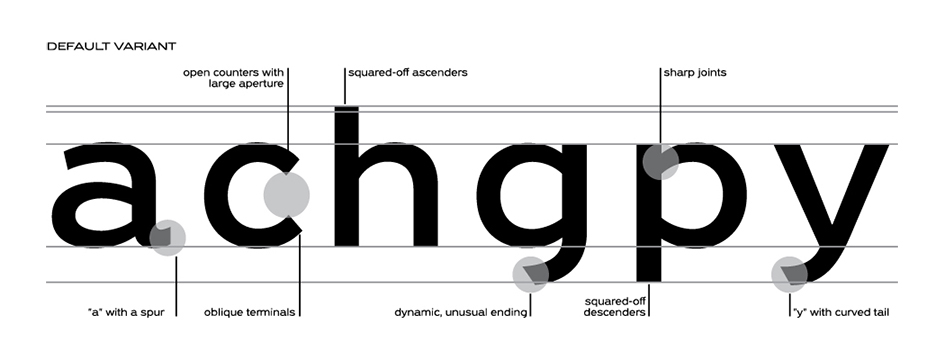
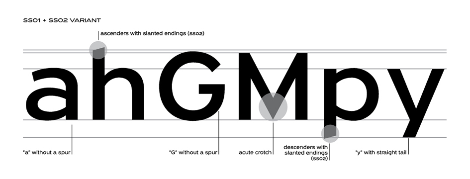
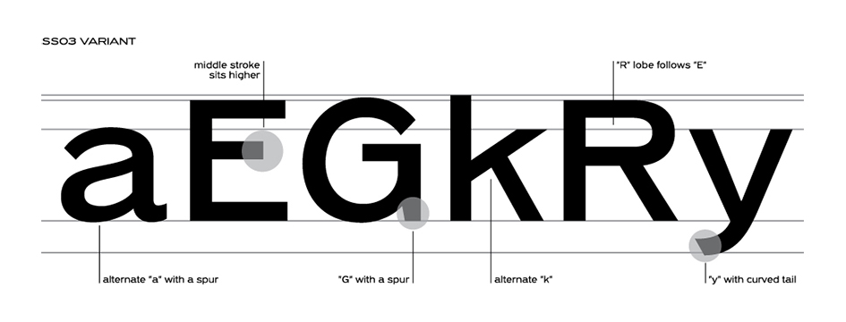
PF Grand Gothik was launched with an event as diverse as this font system really is. Creatives, industry insiders and typophiles explored the ultra versatile universe of a font made for action.
The idea behind Grand Gothik’s microcosm was born out of questions regarding the concept of variability in relation to the movement that is characteristic of cinematic frames. Parachute Typefoundry wanted to re-imagine and re-interpret traditional associations between letterforms and movement and navigate the possibilities generated by the variable font technology.
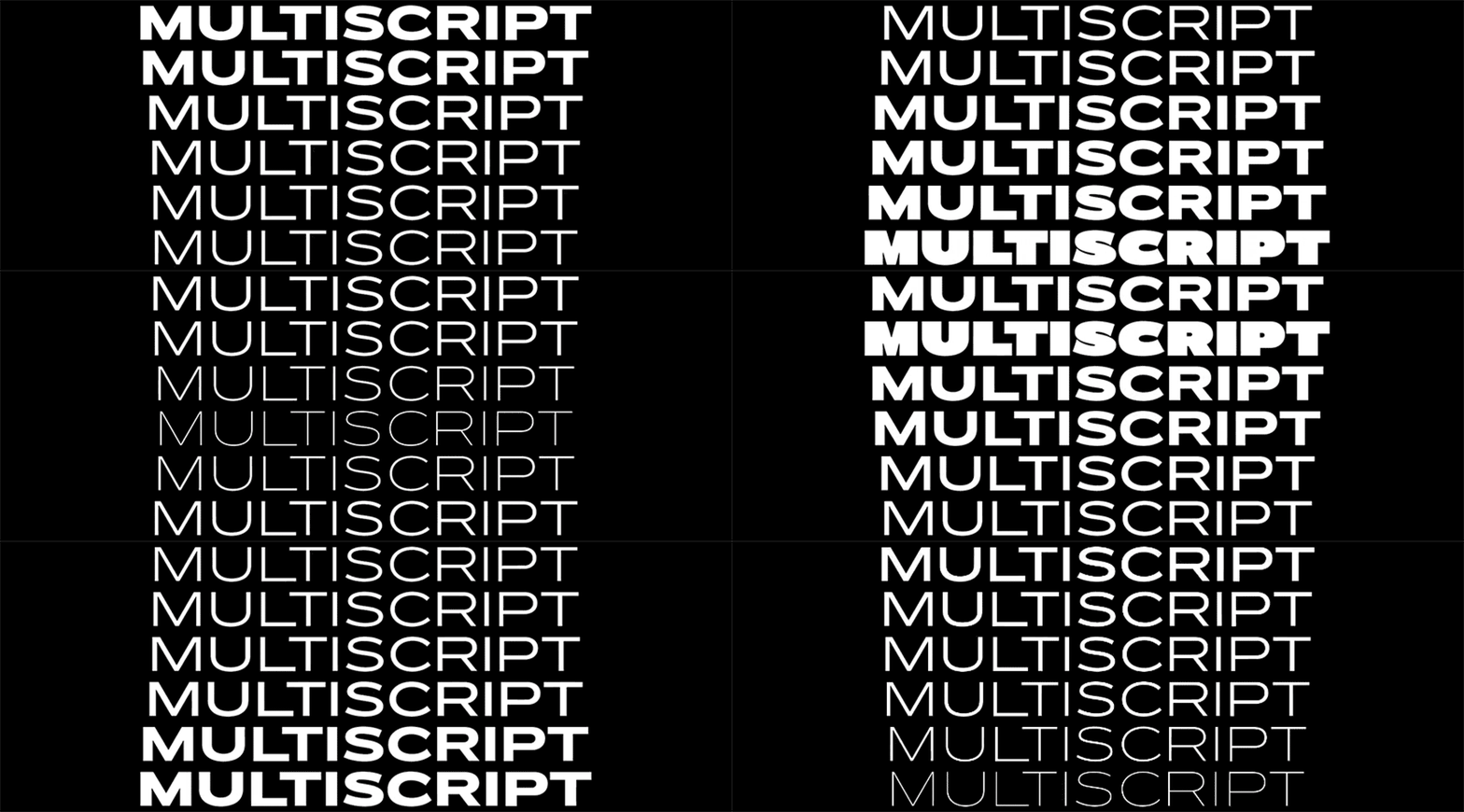
With this idea in mind, Parachute teamed up with the creative duo Typical Organisation to explore variable font technology in relation to moving images with a limited edition flipbook publication that features an array of typographic posters inspired by the art of the movies.
Aptly named "Cinematography", the 156-page flipbook, which was first introduced at the event, implements PF Grand Gothik and analyzes historically significant movie titles with 66 postmodern typographic images/posters, in an attempt to reflect and comment on cinematic content through type. Introducing PF Grand Gothik's multi-faceted elements to the lover of letterforms, a selection of these typographic posters had been printed in large-scale as part of a poster exhibition held at Typeroom to celebrate the launch of Parachute’s first variable type system.
Cinematography 16:9 Flipbook from Parachute Typefoundry on Vimeo.
On top of that, the new font family comes with a custom designed microsite which promotes the distinctive characteristics of Grand Gothik with a variety of features -the dedicated tester, through which the user explores the versatility of this variable font- being the core element we dare you to explore.
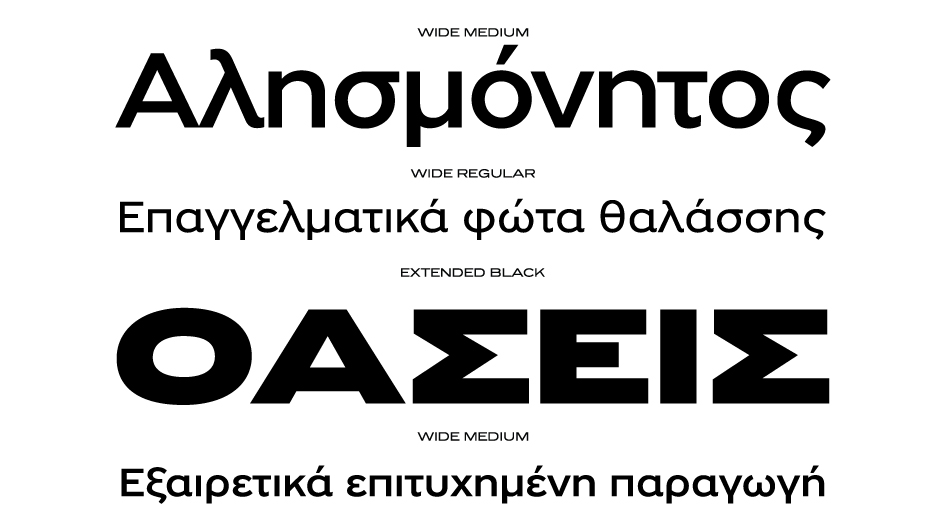
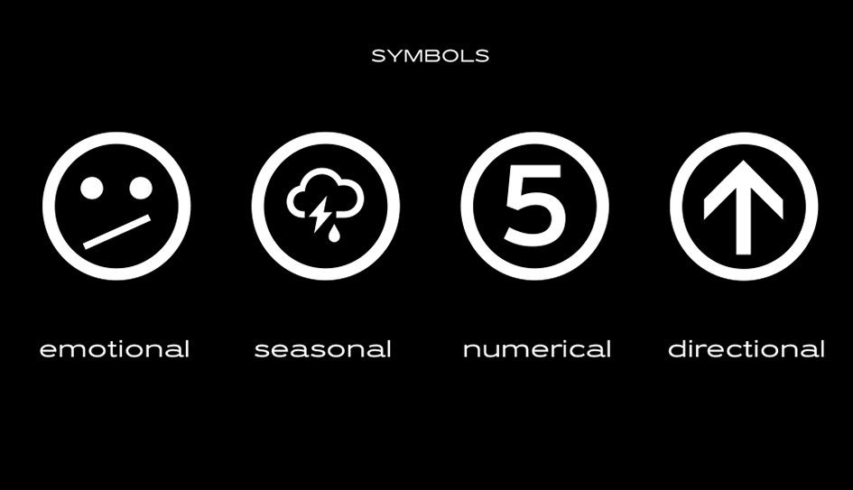
The Grand Gothik type system comes with a wide range of styles/weights and supports an extended array of languages and scripts such as Latin, Greek and Cyrillic. Keeping up with the ever-evolving virtual and digital landscape, Grand Gothik comes with an extended character set of weather icons, numeral symbols, wayfinding arrows, movie rating stars and emojis. A Bitcoin symbol was designed as part of its character set in its newly introduced unicode position, rendering Grand Gothik a truly functional modern typeface.
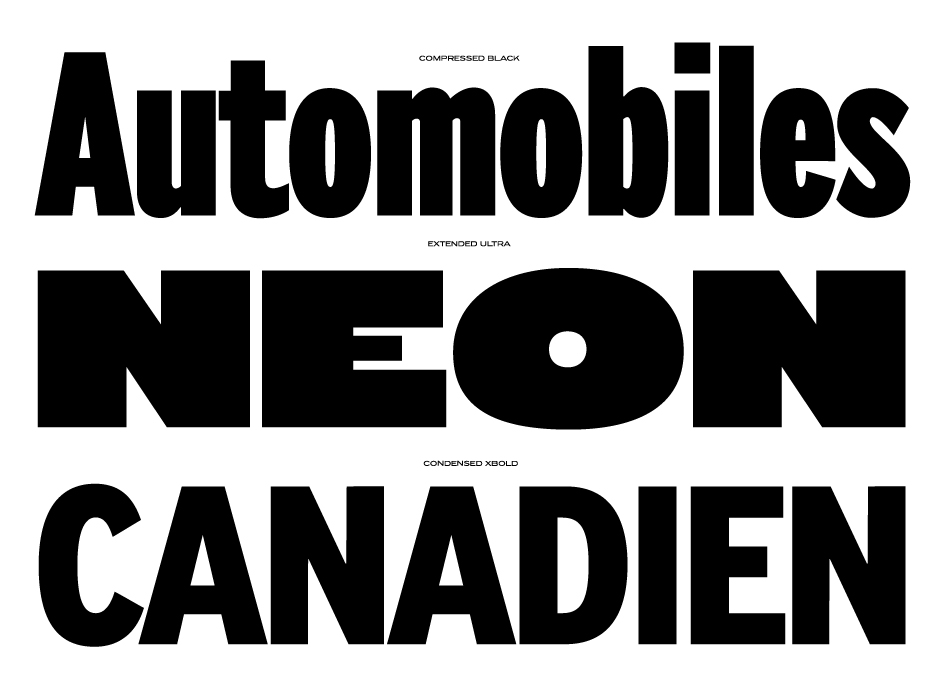

The whole series is complemented by its corresponding italics which are not cursive but rather refined oblique letterforms in sync with their traditional genre.
An essential tool for web designers and developers alike, PF Grand Gothik’s variable format brings to web design all the precision, variety and spirit once available only in print media.
Enter PF Grand Gothik's ultra versatile typographic universe in the font's dedicated microsite and be part of a new typographic, very digitized, era here.

A Story of Variable Characters - PF Grand Gothik from Parachute Typefoundry on Vimeo.
A Story of Movement - PF Grand Gothik from Parachute Typefoundry on Vimeo.
A Multidimensional Story - PF Grand Gothik from Parachute Typefoundry on Vimeo.
Tags/ inspiration, typeface, panos vassiliou, exhibition, event, poster, grotesque, type system, letterforms, cinematography, new wave, variable fonts, parachute typefoundry, pf grand gothik, microsite, postmodern, flipbook, typical organization, bauer type foundry, franklin gothic, times gothic, title gothic no 9


