David Bowie, the graphic designer that wasn’t
David Bowie was many things. The aficionado of otherworldly entertainment who passed way on this day in 2016 influenced many. The industry, the minds, the visions, the sounds and of course the design.
Bowie’s passion for everything visual was prominent from early on. After all Bowie studied at Bromley College of Art in the early '60s, specialising in layout and typesetting and even though type was a love of his, music was his love and a lover.
“I was motivated and encouraged by his creativity and ability to challenge the norm and make it work joyfully. He was brazen” once told Neville Brody. Bowie’s bold aesthetics and music are one of the biggest influences in creatives worldwide -but London and Berlin are Bowie’s cities. “He wasn't actually strong on ‘design’ per se,” says Malcolm Garrett, creator of seminal album sleeves for the Buzzcocks, Culture Club and Duran Duran in the 1970s and 1980s per Lynda Relph-Knight.

“But he obviously pioneered the way in which sound and image could be harnessed and manipulated by mainstream pop artists. Since I was about 13 he has always been there, creating soundscapes that helped define cultural moments in time and set visual standards for successive generations. It is a tremendous shock, then, to face the fact that the Starman has finally fallen to earth and his immortality has been tragically disproved. The irony is that all of those iconic images we each hold of him will now be forever preserved in our minds.”

“He was very involved,” said Jonathan Barnbrook -the graphic designer who has been Bowie’s alter ego from Heathen (2002) onwards. “It was just me and him, going back and forth in a very intense way. He cared a great deal about every aspect of his album. His references were very wide in discussions, deeply intellectual and full of pop culture. He was always very witty and gracious. He trusted me and I hope he felt I could express his ideas interestingly. There would be times when I would ask what he wanted and he would tell me I knew best, just to be brave and trust my instincts. “I think he made me do something ‘new’ with The Next Day (2013) and it is not often you can say that in your career.”

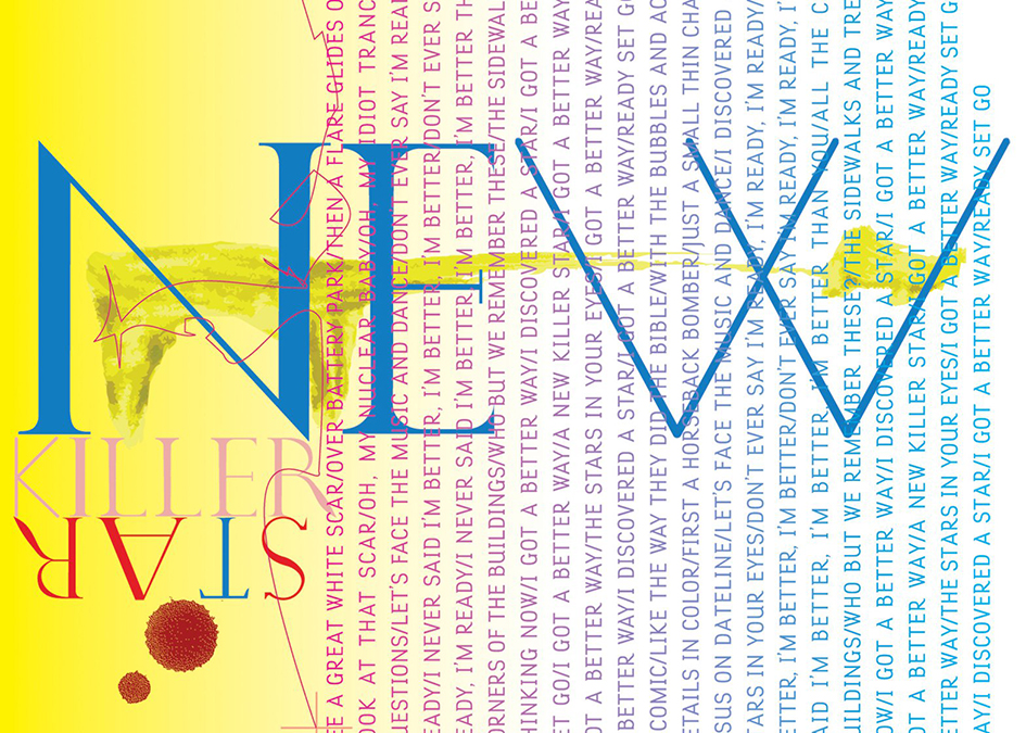
All through his exit Bowie spoke through design. The cover of David Bowie's Blackstar album, released just days before his death, was designed to reflect the musician's mortality according to Barnbrook.
Blackstar, represented by a ★ symbol, was released on 8 January 2016 – Bowie's 69th birthday. The musician died two days later, and the album has since been interpreted as a poignant farewell and has topped charts worldwide. The album artwork was one of five that Barnbrook worked on with Bowie in the last 15 years, making the British designer one of the star's closest and longest-serving collaborators.
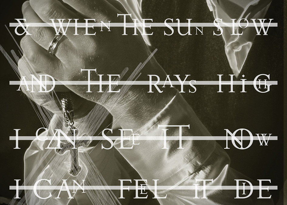
Speaking to Dezeen, Barnbrook added that Bowie was, more than anyone else, the artist responsible for bringing "art-school thinking into the mainstream."
"This was a man who was facing his own mortality," said Barnbrook. "The Blackstar symbol [★], rather than writing 'Blackstar', has as a sort of finality, a darkness, a simplicity, which is a representation of the music."
“He understood the value of the image on a record cover, when other people had forgotten about it. We had a renaissance in the 1970s and 1980s of album covers because the format of vinyl, but then it dropped when CDs were introduced. There are still good record/CD covers around, but a lot of time nowadays the cover just had to be "nice", it wasn't a thing that provoked discussion, our covers wanted to have that discussion again. Some people hated them, some people really liked them” noted Barnbrook.
London's Design Museum acquired a copy of David Bowie's Blackstar album for it’s permanent collection along with Gilbert Baker’s iconic flag and zero-gravity cup.



Tags/ origins, neville brody, gilbert baker, david bowie, bromley college of art, malcolm garrett, buzzcocks, culture club, lynda relph-knight, jonathan barnbrook, heathen, blackstar, the next day, dezeen

