Warriors Studio will fight for your typographic appetite with clarity
Founded by James Gilchrist and Beth Wilson, Warriors Studio is a design studio built on a shared passion for powerful communication and design. “We are a communication design agency working with companies, organisations and individuals across the cultural, private and public sectors, both locally and internationally” says Warriors. “We work with a strong team of graphic designers, web designers, web developers, copy writers, marketing experts, illustrators, animators and film-makers, handpicking the best people for each project”. On their everlasting vision to develop and implement effective communication solutions with strong concept, simplicity and clarity (some of the elements that are at the heart of Warrior’s work) the studio shared with Typeroom two of their projects that are trademarks of their typographic vision.
“We like to position ourselves so that we work with our clients, maintaining an open dialogue and transparency throughout the process” says Warriors Studio of their on-going partnerships. The case studies will feed your appetite for inspirational grinds and lines.
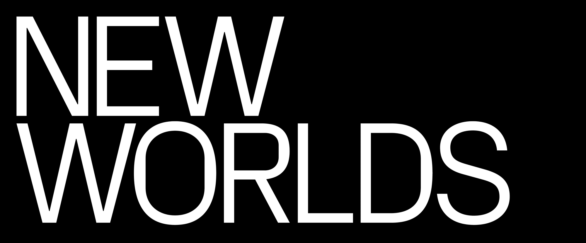
Case Study 1: New Worlds
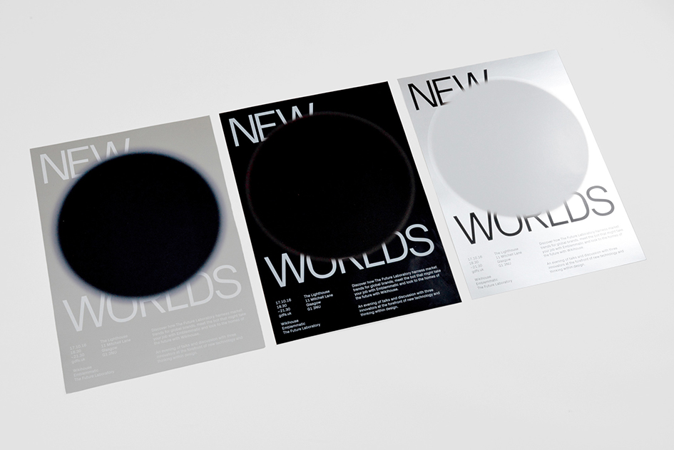
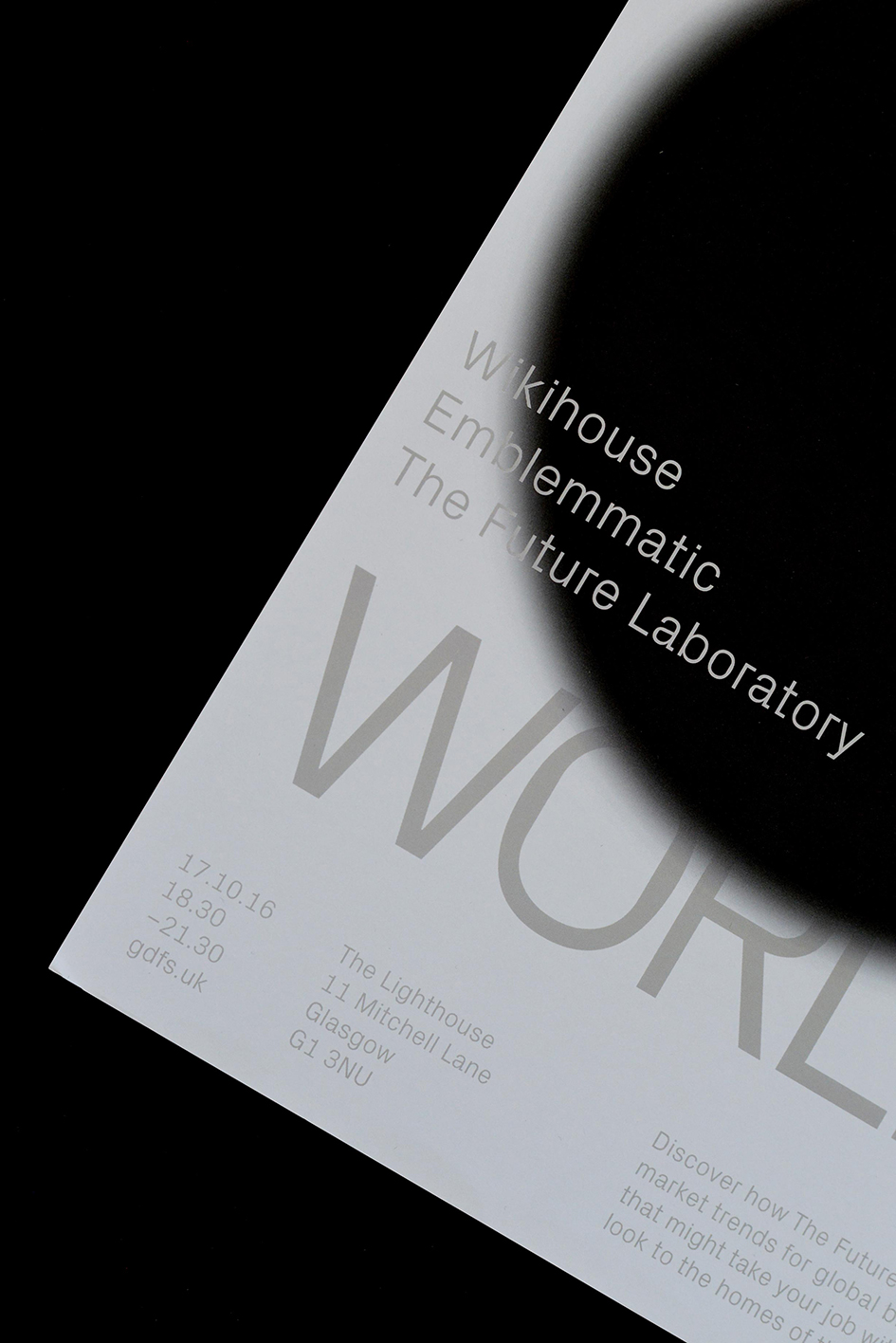
“Complete brand identity for an innovation led conference with esteemed international speakers. New Worlds welcomed three innovators at the forefront of new technology and thinking within design who discussed practical algorithmic design, open-source housing and trend forecasting for global brands. The conference required an identity which was sophisticated, bold and hinted at some of the key areas of discussion: technology, innovation, intelligence and science.
The typeface used within the identity, Px Grotesk by Optimo. In line with the conferences theme of innovation we produced three unique A2 posters using digital white ink layered over thick CMYK print on coated silver and black gloss paper to produce one off printed pieces. The paper was kindly provided by GF Smith.
Digital artworks were created for online advertising, social media and inclusion in events programmes”.
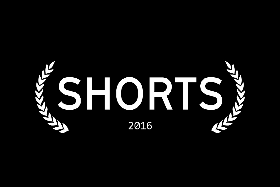
Case Study 2: SHORTS
“Complete brand identity for SHORTS, an independent short film festival based in Glasgow which welcomed more than 2,300 films from 96 countries to their open-call request for submissions in 2016. Visual language and artwork designed to be used effectively across print and digital.
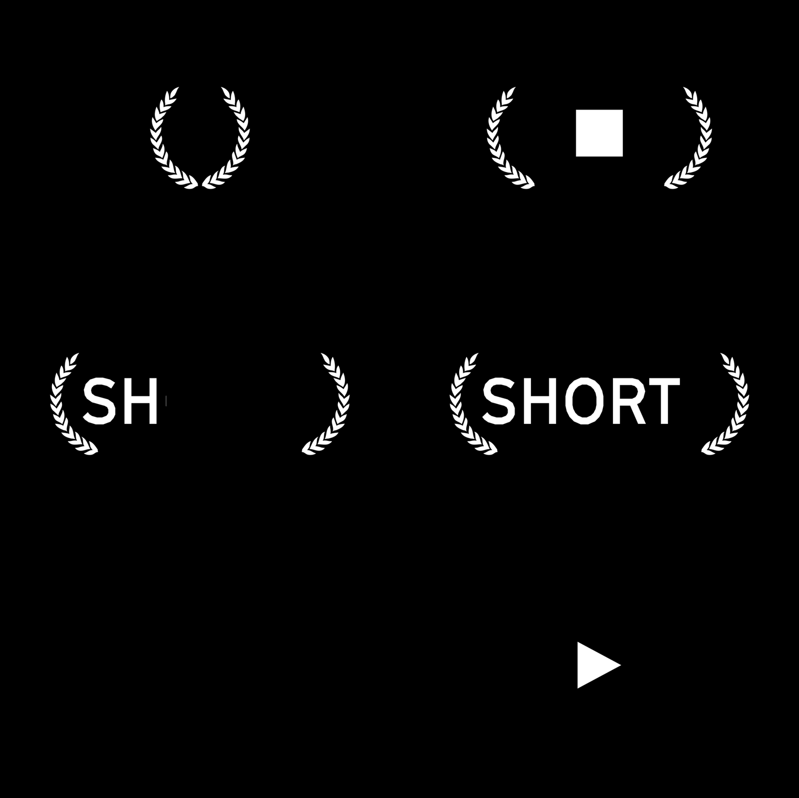
The illustrated play, pause, stop, fast forward and rewind icons employed throughout the identity provide an extension of the visual language used across film, cinema and media.
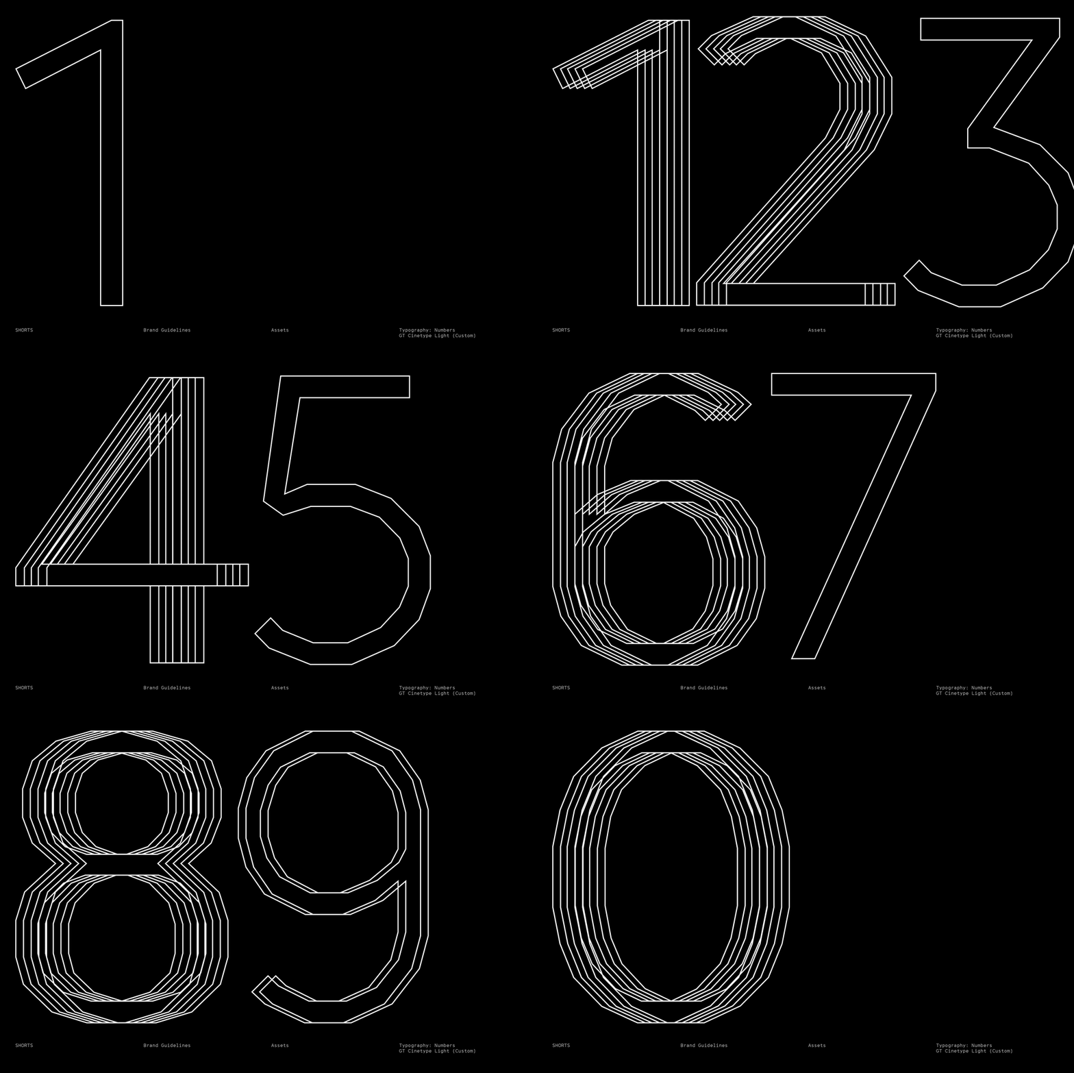
The typeface selected for Short's identity, GT Cinetype by Grilli Type. We also designed a custom set of numbers inspired by motion in film. The repeated letter frames mirror the repeated image frames which create the illusion of motion in films”.
For more info check here and here.

On top of their portfolio, James Gilchrist and Beth Wilson are two of the power minds behind Graphic Design Festival Scotland, an international organisation promoting creativity, innovation, collaboration and challenging ways of thinking through a programme of workshops, talks, panel discussions, exhibitions, competitions, music and urban murals.
The festival promotes the best of international graphic design and visual communication and aims to inspire and educate through active engagement. Networking and socialising play a key role in the festival and we aim to build relationships and networks across the world.
Check their adventure here.


Tags/ inspiration, graphic design, brand identity, visual communication, warriors studio, james gilchrist, beth wilson, new worlds, px grotesk, optimo, shorts, visual language, gt cinetype, grilli type


