IAMGOD: Enter the big bang of graphic design as it happens
IAMGOD does not describe an explosion in an existing space, but the mutual creation of matter, space and time from an original singularity” writes Robin Coenen and André van Rueth on their explosive new platform of a Big Bang universe made of and with graphic design. “Regarding the big bang from a graphical perspective, it perfectly describes the incredible process of transformation and manifestation of disorder into visual definitions. What starts with a point and ends with a universe— as a creation of matter, space and time through a structured and designed shape—can be read as a blueprint of writing, typography and type design. Our name »IAMGOD« is to be understood as a literal allusion to this creational process—a hommage to the immense meaning of letters, their visuality and concepts—and their fundamental creational nature”.
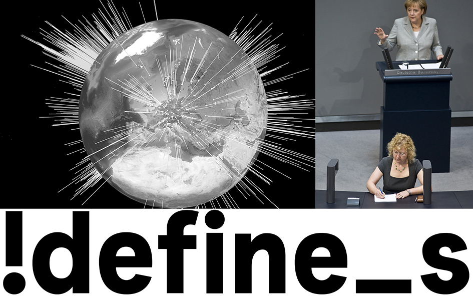
“Whilst each person has its very own style of handwriting and therefore each handwritten big bang has its unique visual expression, it might be enlightening to compare the idea of ubiquitous uniqueness to the approach of architects of the countless digital typographical universes: Which tools—in terms of digital typefaces—do they provide to those which want to manifest their information? As tools might be a misleading terminology, preferably we would say: Which ways of expression do they provide? Which position do they take? Do they already understand the typefaces itself as content? Or do they fall into the outdated trap of considering the ways of expression they design as neutral tools, which stand back behind the content and whose concepts have solely to serve certain needs of graphic design? A dangerous fallacy; but a closer look at the commercial and academic context and selfdescription is sobering. It seems that typedesign is mostly still understood as a craft, which has no autonomous quality. An empty discipline, occupied by discussions on readability and technical needs, which is necessary, of course, but obstructs space for other approaches”.
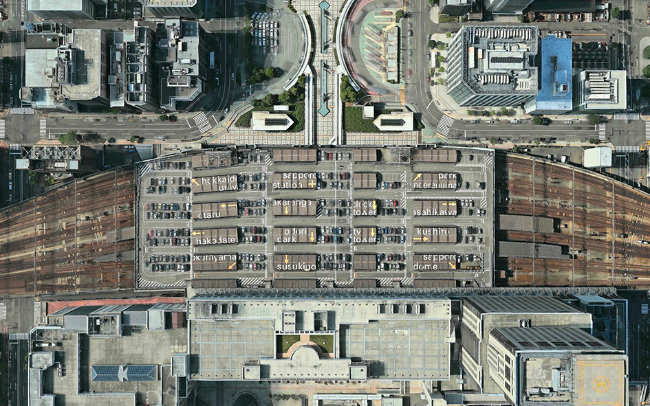
“Visuality always bears a discursive potential. In typedesign this potential is mostly not even expressed or at least perceived as such. A lot of production is based on the method of repetition of prosperous marketed typefaces, which is a common economic logic. Unfortunately, therewith comes a system of visual fascism and oppression of style and culture”.
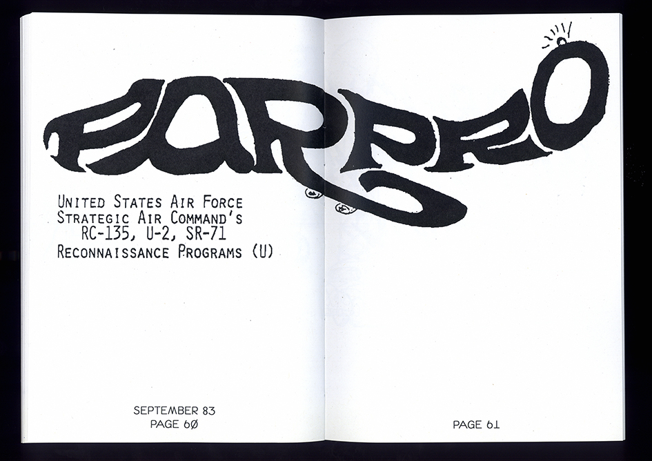
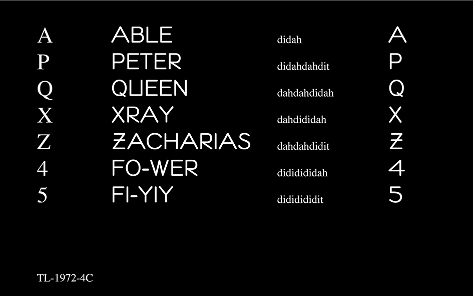
»Iamgod—Aesthetic and Semiotic Research and Development« is the duo’s platform to negotiate diverse narratives within the context of typedesign and typography. Robin Coenen and André van Rueth are bold enough to put up different ideas to discussion—either through typefaces evolved out of a specific context or phenomenon, or a proposed manifest of an aesthetical outline through typefaces on such. Besides that they publish researches, investigations or manifests on a curation of topics which they consider relevant for the progression of type and design culture.
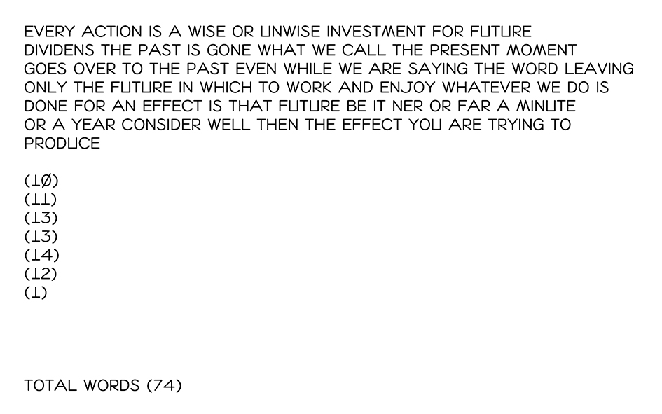
“Writing systems and the visuality of writing systems—typefaces—are a filter through which the respective world can be literally read. Cultural codes are accessible through the visuality of type and thus the other way around: through the visuality of type cultural codes can be created, ruptured or re-arranged. In an era where 160 letters of the U.S. president perform an absurd cyber-weapon, we find it more than necessary to take a readable position and re-think the possibilities of our profession” writes their manifest before urging us to take graphic design and typography into discursive negotiation.
Enter their bursting experiment of the letterform here.
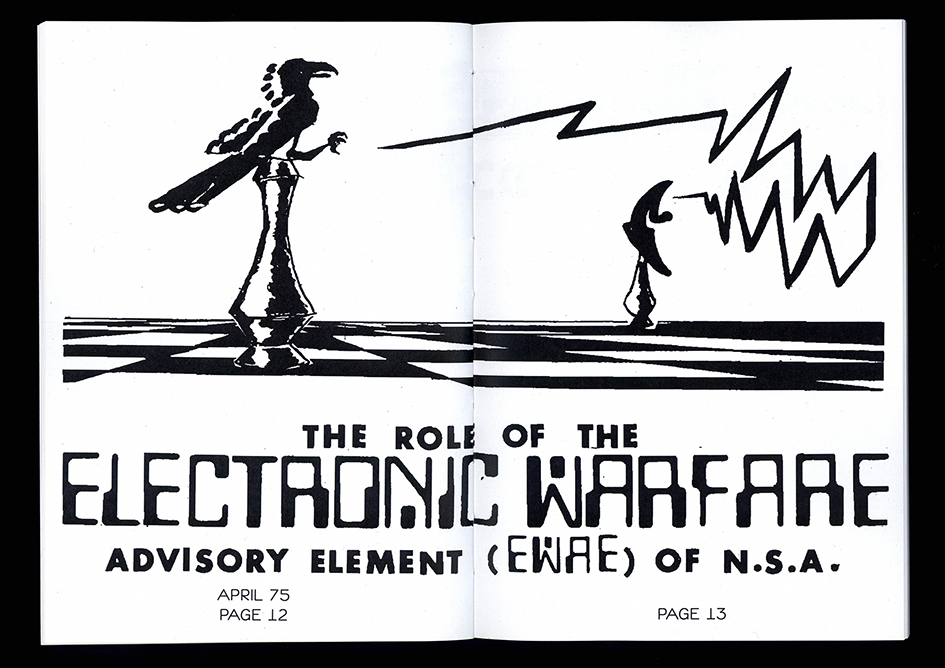


Tags/ typography, inspiration, graphic design, semiotics, semiology, writing systems


