Kern in hell! Hellvetica is the creepiest typeface to love this Halloween
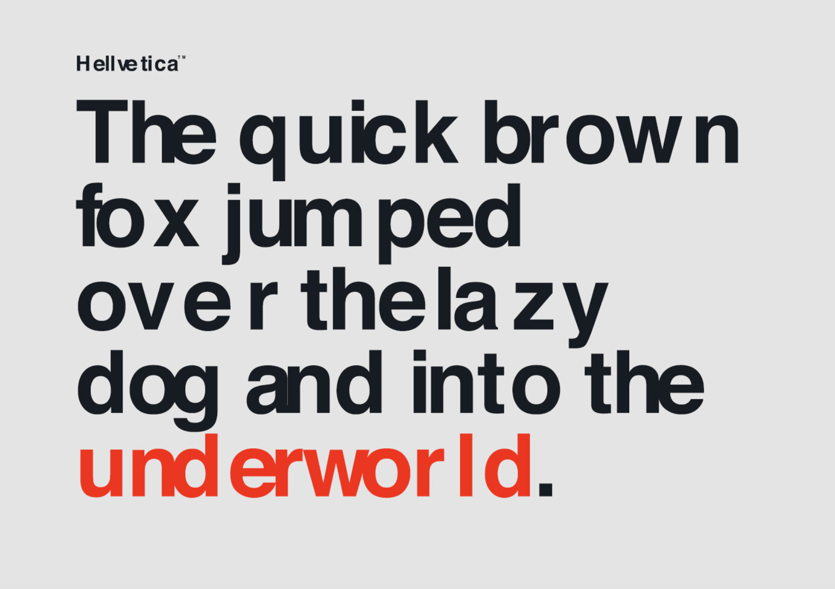
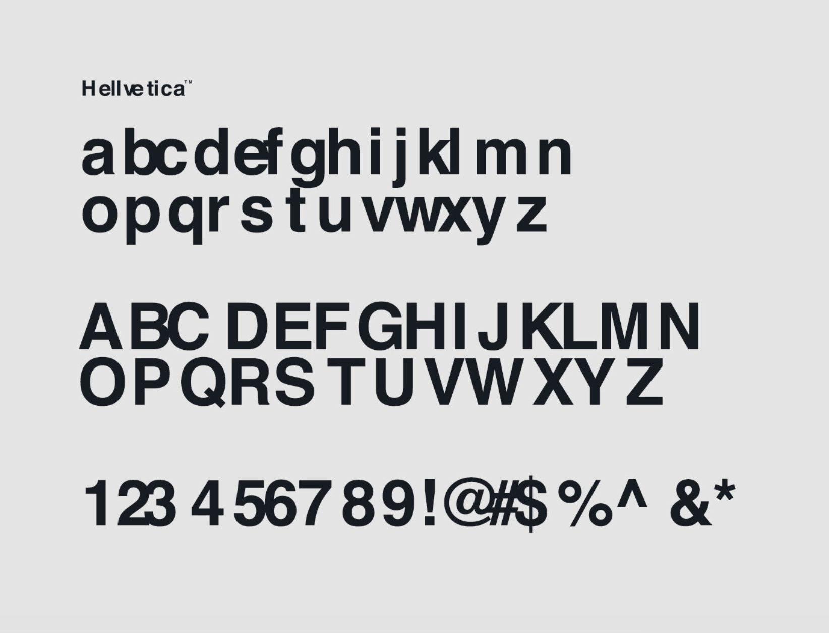
Forget Helvetica and kern it all with the Devil's all-time favorite typeface aka “Hellvetica”.
Ideal for any Halloween-inspired project the font is literally the uber-popular Helvetica with extremely bad kerning. So bad it will even the calmest designer of all, furious for what this font brings to typography.
“I love Hellvetica! Any new way to look at Helvetica is great to me” told Charles Nix, type director at Monotype which owns the licensing rights to the original Helvetica, to WIRED.
Designed by Zack Roif and Matthew Woodward aka the associate creative directors at R/GA New York the font from hell is cursed in eternity. Beat that!

Tags/ helvetica, monotype, kerning, hellvatica







.jpg)
