Harvard Business Review: a study of 597 logos reveals the power in branding
Great logos help sell products. But what kind of logo is right for your brand?
Harvard Business Review's researchers analyzed 597 companies to answer this question and the findings are more than insightful.
The researchers discovered that descriptive logos (eg. those that include visual design elements that communicate the type of product) affect consumers’ brand perceptions more favorably than nondescriptive ones (eg. logos that are not indicative of the type of product). They also found that descriptive logos are more likely to improve brand performance.
“If you are considering creating or modifying a logo, our findings suggest that you might want to include at least one textual and/or visual design element that is indicative of the type of product or service your company offers” reveals HBR.
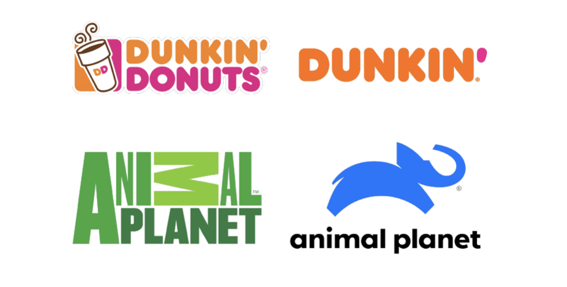
“If, however, you work for a brand that markets a product or service that can easily bring to mind negative concepts, a nondescriptive logo is probably better. We also suspect that nondescriptive logos are better for companies that operate in several unrelated business segments, such as Uber, Procter & Gamble, and the Walt Disney Company. For these companies, a logo that is indicative of the unrelated products or services they offer might be unappealing and confusing. Brands that do not want to be strongly associated with a specific product should also avoid descriptive logos. For example, the decision to change the Dunkin’ logo likely arose from the company’s desire to become more associated with products like bagels” note the editors.

“Dunkin’ removed the word “donuts” and the coffee cup from its logo, making it nondescriptive. Conversely, Animal Planet made its logo even more descriptive by adding an elephant to the design. In our analysis, we found that about 60% of companies used a nondescriptive logo, while 40% used a descriptive logo.”
To learn more why underestimating the importance of logo design and the power of descriptive design elements can, sometimes, be a costly mistake check here.
Tags/ logotype, branding, logos, logo design, harvard business review, visual


.jpg)


