Bernie for the win! 1,250 voters pick the best & worst campaign logos of 2020
“If you aren’t familiar with the 2020 presidential candidates’ logos and slogans yet, don’t worry: You will be soon enough. The two dozen hopefuls looking to replace President Trump have been raising money and hiring strategists to help them stand out in the crowded race. A good chunk of that money is set aside for branding and marketing” notes Crestline of its survey on the branding of next year’s US Elections.
As noted by Crestline there are some features that stand out in next year’s US elections political branding.
- The field is one of the most crowded and most diverse ever, putting more pressure on candidates to differentiate themselves through branding.
- More candidates are abandoning familiar patriotic color schemes and flag-inspired imagery.
- Digital communication is more important than ever.
- Candidates are reaching out to voters via an enormous array of platforms and devices. Nearly half the hopefuls have put themselves on a first-name basis with the American public.
- The costs are staggering. This election will likely shatter spending records.
To find out how the Class of 2020’s branding resonates with the public, Crestline partnered with an independent research firm to survey 1,250 registered voters across the country and score the campaign materials. In every question and set of instructions, respondents were urged to focus on the graphic design or slogan, not the candidate.
In the survey voters were asked to score each logo on a scale of 1 to 10, setting aside their personal feelings about the candidates and judging solely on the effectiveness of their logos.
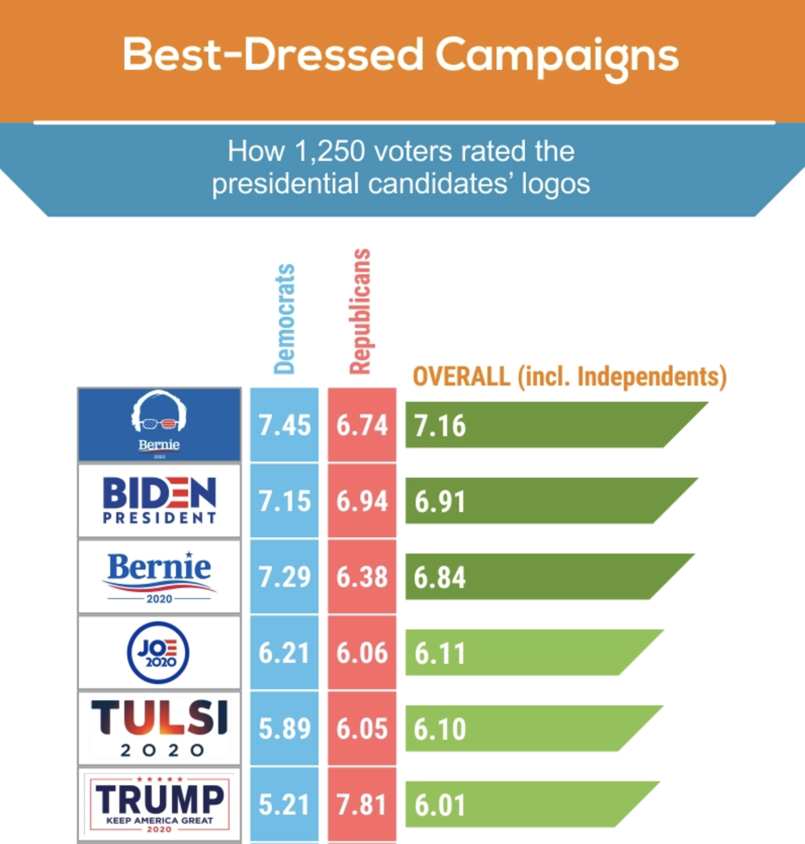
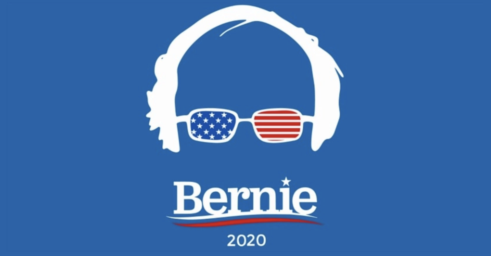
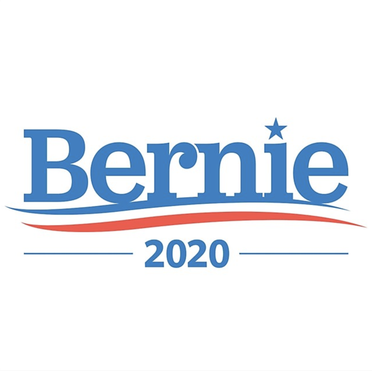
Sanders’ clever “glasses logo” topped the list of voter favorites, and his more conservative “swoosh” logo landed in third place. Biden’s logos traded off the other top spots at second and fourth place. They shared the top five with a surprise showing from Tulsi Gabbard’s unusual “sunrise gradient” logo, which beat out the Donald Trump solo logo, in sixth place.

The best-received logo overall made creative use of Bernie Sanders’ uncool attributes — a silhouette of his unkempt hair, and glasses adorned by the stars and stripes. Survey takers voted Bernie’s logo Most Likely to Succeed with an overall score of 7.16 out of 10. It also ranked first for qualities like “memorable,” “dynamic,” and “clever.” Sanders and Biden shared the top five spots with Tulsi Gabbard, who ranked high in “modern” and “dynamic” categories and finished just above Trump’s solo logo. (The president did not win for Best Hair, alas.)

The top rankings for positive qualities were dominated by logos for front-runners Biden, Sanders, and Trump, exhibiting “memorable,” “polished,” “confident,” and “powerful” qualities (also highly associated with the traditional red-white-and-blue color palette they all used). But a few wild cards sneaked into top spots for other categories, such as Yang, who ranked high for “dynamic,” “clever,” and “sporty” qualities, and Castro, whose logo was in the top 3 for “polished” and “modern” qualities. Williamson’s pink logo ranked among the most “friendly,” and O’Rourke’s stark black-and-white logo placed third in the “powerful” category.

Sanders’ “swoosh” logo, which rated an overall score of 6.84 out of 10, ranks third behind only Biden and Sanders’ own “glasses” logo. The font used for both is Jubilat, styled by Revolution Messaging. Respondents gave descriptions from “crisp,” “clean,” and “sharp” to “average,” “generic,” and “traditional,” the consensus being that it has everything a classic campaign logo needs.
Explore many more insights on US Elections 2020 political branding through Crestline Custom Promotional Products here.
Tags/ elections, donald trump, political branding, survey, bernie sanders, us elections 2020, us president


.jpg)


