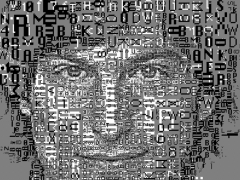
Goo-Ryong takes you on a ride to South Korean evolving typography
Korea’s ascent on culture map is undeniable. As this country is capturing the world with images and songs, South Korea’s graphic design scene is bursting with the same quality talent the rest of “Korean Wave” provides.
From dramas to pop songs, Korea is emerging as a force to reckon with and it is not due to K-pop, at least not in the case of typographers, graphic designers and art directors who originate from the country of glowing and menacing Mr Gangnam Style.
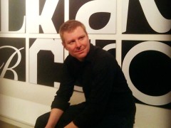
Even stepping into the airport of the country you are aware that this place has design masterfully infused into its genes. South Korea boasts a prolific graphic design scene which originates in the early days of Hangul typography, the Korean alphabet created in the mid-15th century, and the square frame of Korean writing. Typeroom is pleased to introduce to you a man of talent that loves typography the way we do, paying respectfully the passion any symbols and letterform requires. His name is Goo-Ryong and he was born 34 years ago. This is his Seoul based story and glory.
“I’m a graphic designer and a co-founder of Seoul-based studio Chung Choon which was established back in 2013. Chung Choon consists of 2 members, me and Jungran Kim. Kim is the creative director and I’m the art director” he says. They met each other back in 2002. For 7 years they took different paths but believing in yourself never harmed anyone. “We quit our job to establish our own design studio, Chung Choon. Chung Choon means ‘Youth’ in Korean, and we like this name cause we are after youthful design” Goo-Ryong explains.
“I like to draw letters and Hangul (Korean Alphabet) on A4 paper, or doodle letters with image while I'm on the phone. Everyday I’m going outside with my small sketchbook and pen to draw unique letters. Sometimes, when I see beautiful works or letters on the street, I capture them and save them as images in my Evernote app on my iPhone. These are my main inspiration once I come back to the studio, so I guess drawing letters and capturing images are my way of getting inspired for my typographic adventures”.
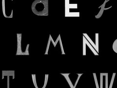
Having a keyword or a message as his theme is essential to him. “Almost uncertain on where this idea will take me, I study and research the general meaning of the keyword or the message, using a dictionary. After that, I experiment with new method to expressing my letter, drawing unusual shapes on A4 paper. Then I use a computer to complete the works by eliminating any ambiguous shapes, fixing message with clear lines. For me is interesting if not essential to change common letters into unusual images with typography. I thing that if you change their shape or add lines, dots, other elements on letters, their meaning and the message they communicate is evolving. Being a typographer or a graphic designer is very similar to being a writer or a poet, so it is very important how you define a message and it’s keywords in a more general perspective. By using visual methods you change your own message to the world” is his definition of what Goo-Ryong likes to name “evolving typography.”
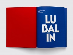
“Lettering is booming up in the Korean design scene. Many young designer are drawing and making new letters instead of using an already established font for posters and other design related projects. Making new fonts, for example new Hangul fonts inspired by the roman alphabet, Bodoni or Gothic Scripts is a trend to Korean type design scene.”
“Asian typographic scene is very interesting as well. I recently joined Beijing Design Week 2015 as a participant after the invitation of Li-Xu, a very well known curator and graphic designer. There many Chinese designers were experimenting with new typographic expressions in poster design. I think we are having a new wave of expressionism in Asian design scene, the likes of German expressionism in the West. Many designers use posters as their new media of choice, literally saying that Poster Is Not Dead. They use this format as their canvas. It’s interesting to figure out where this new wave of typography is going in China, Japan and Korea. I think Asian designers are more sensitive and they like to express typography in a non logical way.”
Wim Crouwel’s ‘Hiroshima’ poster (1957) is one of his favorites as Goo-Ryong appreciates simplicity.
“It’s very simple and yet very impressive and powerful to the message it conveys. Changing spaces between letters, connecting them in any way imaginable is a key point to come forward with a new message” he adds. For him, as for many, South Korea is bursting with talent. “Kim Kijo is a very well known typographer and type designer in South Korea” he says.
Obviously this Chung Choon’s curated typographic ride is one to adore.


Tags/ graphic design, faces, poster design, bodoni, south korea, asian typographic scene, chung choon, evolving typography, hangul, beijing design week, gothic, seoul

