A book, a day: Herb Lubalin by Adrian Shaughnessy
One of the genuine, original Mad Men of his era, graphic designer Herb Lubalin is an undeniable giant of American design and typography.
“Lubalin helped push back the boundaries of the impact and perception of design—from an ill-defined, narrowly recognized craft to a powerful communication medium that could put big, important ideas smack in the public eye” writes the American Institute of Graphic Arts (AIGA) for a reason. A sublime typographer, Lubalin was sometimes offended at the use of that word. “What I do is not really typography, which I think of as an essentially mechanical means of putting characters down on a page. It’s designing with letters. Mr. Aaron Burns called it, ‘typographics’, and since you’ve got to put a name on things to make them memorable, 'typographics' is as good a name for what I do as any.”
Following his education at New York’s Cooper Union, Herb Lubalin went to work in advertising where he enjoyed a successful career as an art director for over twenty years, until he left to start his own shop. A designer of the letterform, he had a unique and rather playful approach to design and he was amazed at how the shape and the weight of each symbol could change the meaning of words. “It is Lubalin and his typographics—words, letters, pieces of letters, additions to letters, connections and combinations, and virtuoso manipulation of letters—to which all must return” the AIGA explains.
Experimental unlike many, Lubalin evolved with the times and “like the 1960s and 70s during which his fame peaked, he was as idealistic and anti-establishment as hippies in the Haight”.
Most of us recognize his name in association with the typeface Avant Garde (a font he created for Avant Garde magazine) but his career spanned a much wider scope than that. A constant boundary breaker on both a visual and social level, he was a co-creator of the culture-shocking magazines Avant-Garde, Eros and Fact, founder of the prominent U&lc and it was this passion for inventiveness that made him one of the most successful art directors of the 20th century and beyond.
This small, subdued man, was once described as a person “who churns out mountains of work without ever looking ruffled, frantic or hurried.” Soft-spoken most of the times, Lubalin was emphatic about the need for good typography to get a message across whether it was editorial matter, advertising or a gum wrapper. “You can do a good ad without good typography”, he once said. “But you can’t do a great ad without good typography”. When asked how he selected the right type and placed it just the right way to get the right message across he answered: “You can’t say why you do these things - sort of a subconscious thing that a good art director does”, he said. “The guys who can explain are the ones who can’t do them too well.”
Lubalin believed that the key objective in redesigning a newspaper or magazine is to fortify and help interpret the editorial material. A prodigious worker, Lubalin once noted that there are more than 2,000 typefaces and that a good art director should know the strong points of every one of them and how to use them best. Of course those existing fonts were not enough for him, therefore he designed his own. A New Yorker to the bone, Lubalin’s (his name was pronounced Loo-ball-in, with the accent on the loo) position as a graphic innovator and seminal figure in American design is more secure and respected even among those very few who find his work “over-decorative”.
“From a classic sense, I don’t feel I am a great typographer. In fact, from this standpoint, I’m terrible, because I don’t follow the rules. I use razor blades, cut out spaces between letterforms and join type together in a kind of design unity” he once wrote. “He was no intellectual, yet he was a highly intelligent and self-reflective individual” commented Adrian Shaughnessy. The color-blind and ambidextrous graphic designer who rejected Swiss modernism as he felt was ill-suited to the popular American imagination was an avid supporter of liberal causes. Lubalin “pioneered a form of typographic design that required the participation of his audience, and never did anything that was authoritarian, bombastic or elitist. Today, as we foreground human-centered design, Lubalin seems remarkably contemporary” he added.
“Even when Lubalin’s typography was quiet, it was never neutral” writes Steven Heller. “Maybe it was compensation because he was soft-spoken, in fact painfully shy when addressing strangers. But he spoke loudly through his design. His headlines for articles and advertisements were signs that forced the reader to halt, read, and experience, before being engrossed by the message. He would tweak and manipulate story titles until he had just the right combination of letters to make a striking composition. The graphic strength of “No More War”, originally an advertisement for Avant Garde that featured block letters forming the pattern of an American flag, with a bold black exclamation point at the end, was one of the most iconographic visual statements issued during the Vietnam War era. Lubalin rarely missed the opportunity to make a kind of concrete poetry which expanded typographic language.”
Type talks and when you talk about that kind of typography the master was Herb Lubalin. “Type does not actually talk, type sings, it's like an opera” says the amazing living legend of graphic design George Lois. “The thing about Lubalin is that he conceptualized type in many many cases and he was also a very good writer. He was more than just a type designer, he was inventive with type. There is nobody like him today, not by ten miles”.
Lubalin pushed the limits of typography to a different level bringing the element of communication to design. “If today’s rules exist to be bashed it is because he bashed them first” said Steven Heller and we couldn't agree more.
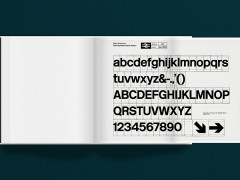
Unit Editions’ monograph on Herb Lubalin is a major work on a major figure.
Tags/ graphic design, origins, unit editions, herb lubalin, conceptual typography


