From Experimental Jetset to MuirMcNeil & Tubik: these type tributes to Stanley Kubrick will inspire
Stanley Kubrick, the mastermind of cinema, was in love with type and especially Futura, a secret which was unveiled in 2004 when the Guardian published an article on the auteur's favorite typeface.
"It's Futura Extra Bold," explained a man named Tony to Jon Ronson when the writer paid a visit to Kubrick estate, two years after the filmmaker's death. "It was Stanley's favorite typeface. It's sans serif. He liked Helvetica and Univers, too. Clean and elegant."
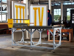
This quote was a starting point of inspiration for Experimental Jetset.
"In June 2005, Kai Bernau, a student at the Royal Academy of Fine Arts (KABK) in The Hague, asked us (among some other designers) to participate in Neutral, a graduation project that was both a neutral typeface and a statement about neutrality. Apart from contributing to an e-mail discussion on the subject of neutrality, he also asked the invited designers to create a poster displaying the Neutral typeface. These posters were shown during Kai's graduating exhibition. More about this project can be seen at Letterlabor" explains the renowned Amsterdam-based studio.
"Thinking about the idea of introducing a new sans serif typeface, we suddenly remembered a quote about Stanley Kubrick, a quote that has been posted on a lot of (typo)graphic forums. It's a quote pulled from an article in The Guardian, describing Kubrick's obsession with the typeface Futura: 'It was Stanley's favorite typeface. It's sans serif. He liked Helvetica and Univers too. Clean and elegant.' We used this quote as a starting point for our poster."
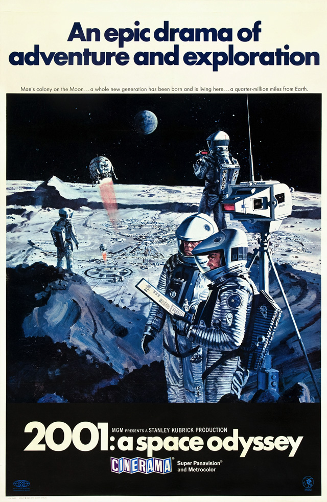
"Since Kubrick was clearly so interested in sans serif type, we figured that the best context to show a new typeface would be a poster for one of Kubrick's movies; the ultimate testing environment for a sans serif. Also, a movie poster is a very recognizable format, so we thought it would fit quite naturally in Kai's series of posters."
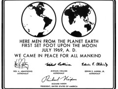
"While we were thinking about this plan (to design a completely typographic poster, as a sort of hybrid between a film poster and a type specimen), we suddenly had another idea. We realized that the most 'neutral' letter of a sans serif alphabet would be the 'I', as it is just a black vertical bar: it could be either a capital 'i' or an undercast 'L'. In fact, it is the context (the word in which the letter is placed) that decides whether the 'I' is an 'i' or an 'L'. At that point, we made the connection between this neutral 'I', and the black monolith that plays a central role in Kubrick's '2001: A Space Odyssey'" writes Experimental Jetset.
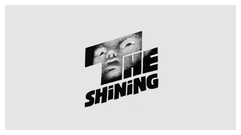
Kubrick, the director who made Saul Bass go through at least 300 versions of The Shining's poster until finally ending on the extremely alien-looking version we now know, has also been the inspiration for a typeface.
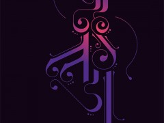
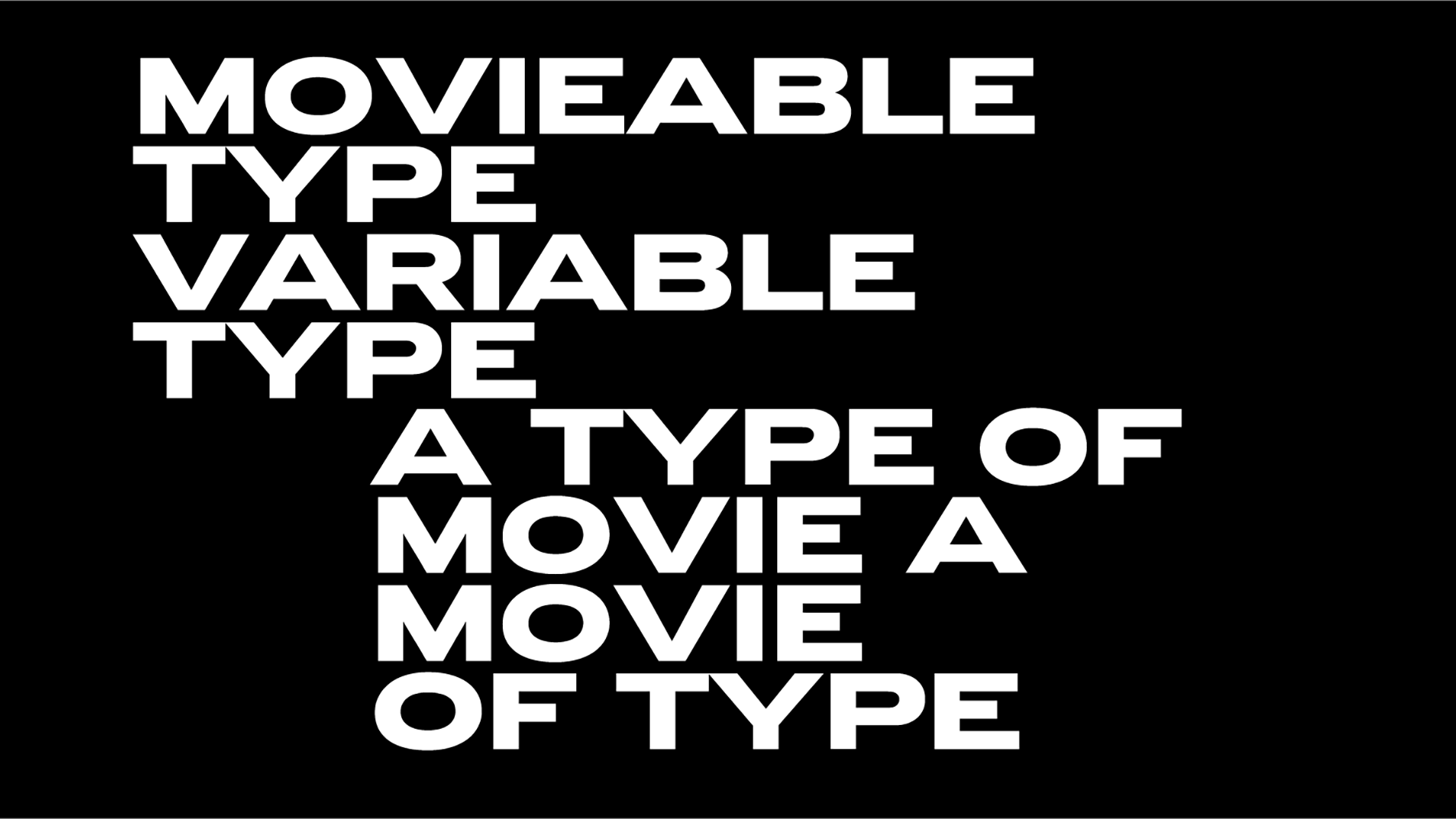
"THD Sentient is an all-capitals type family in four weights, designed by Tim Hutchinson in collaboration with MuirMcNeil. It was originally created in 2017 in a single weight for 'Beyond 2001: New Horizons', a celebration of the 10th anniversary of the Stanley Kubrick archive at the London College of Communication" explains the studio.
"Hutchinson based THD Sentient's characters on the forms of numerals used to display telemetric data on the screen of HAL 9000, the intelligent computer that controls the systems of the Discovery One spacecraft in Kubrick's 2001: A Space Odyssey. These characters were re-appropriated from an original typewriter font created for the IBM Selectric II System at two fixed sizes specifically for financial settings. "
"Although Kubrick's meticulous research and attention to detail in his films are known to extend to the minutiae of letterforms, whether he was directly involved in the implementation of HAL's display has not been established. However, it is evident that HAL's designer enlisted the IBM numerals more for their subtle evocation of an otherworldly computer language than for any technological accuracy."
"THD Sentient is an interpretation of these forms that has been rationalized by MuirMcNeil and extended into a fully-functional Latin-1 character set in capitals only. Monolinear, proportionally spaced and cut in four weights on matching bodies that occupy precisely the same spaces across the range, it is available in OpenType for Macintosh."
Kubrick indeed loved Futura, the legendary typeface he used for nearly all of the posters and titles for his films starting with 2001: A Space Odyssey. But Kubrick was also in love with typewriters (he used an Adler Tippa S typewriter for his scripts and of course, the typewriter is as ominous as ever in Kubrick's nightmarish The Shining) and stationery.
"His great hobby was stationery. One time a package arrived with 100 bottles of brown ink. I said to Stanley, 'What are you going to do with all that ink?' He said, 'I was told they were going to discontinue the line, so I bought all the remaining bottles in existence" Kubrick's brother-in-law revealed to Ronson.
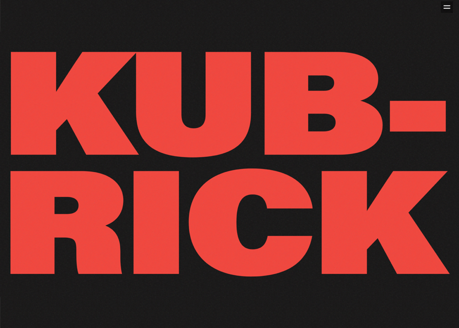
A screenwriter, director and editor Kubrick is the original Typophile auteur of all times and his legacy is to be remembered and we do believe that design studio Tubik has paid the best design-forward tribute to the British master of arts.
Kubrick Life wasn't a commissioned work for the Ukraine-based studio rather than "a purely creative project for the purpose of education and with deep respect to a cinematography legend."
The winner of Webby Award 2019 in the category Movie & Film, Kubrick Life was accomplished by studio designers Vladyslav Taran, Ksenia Lashko and Denys Koloskov.
"The initial idea was to create something extraordinary in terms of design and at the same time insightful in terms of content. It could be a website about a famous photographer, artist or anyone else connected with art. Stanley Kubrick and his great works eventually matched all our criteria to create an interesting piece of work that would be not only good to look at but also interesting to read. There was no commercial or business goal behind the project: only creativity and the wish to share something cool and useful with the others" writes Tubik.
"It was Stanley Kubrick's 90th anniversary when we started to work on Kubrick Life in 2018. It was a great honor for us to be the ones who eternalize his art on a well-designed website. Considering that Stanley Kubrick is one of the most influential filmmakers in history, we thought that there are a lot of admirers who would be thrilled to learn more facts about him and his art."
"On the other hand, some people might get more interested in Stanley Kubrick once they check kubrick.life. The idea was to create a complete and consistent story. Keeping in mind that Kubrick was a great filmmaker, the designers wanted the whole website to feel like a movie, allegorically."
Eventually, as soon as Kubrick Life was released, the creative team got the recognition from the community: it got the Site of the Day Award on The FWA as well as the Site of the Day and Developer Award on Awwwards.
Tags/ inspiration, typeface, exhibition, fonts, poster, website, futura, saul bass, stanley kubrick, experimental jetset, design museum, ukraine, vladyslav taran, ksenia lashko, denys koloskov, tubik, webby award
