Glastonbury of type: Dimitris Papazoglou, Snask & more festival type smashing hits to remember
It all started back in 1970; back then, only a day after the death of Jimi Hendrix, the first Glastonbury music event took place at Worthy Farm in Pilton, Somerset. With boasting appearances from The Kinks, Al Stewart, Keith Christmas, T Rex and Stackridge the music event had a stellar line-up with tickets sold at £1 each -free milk from the Worthy Farm cows included. The simple black-and-white poster were more than ok to announce this celebration of music with 13 acts and 2,000 people.
In the early years the festival had a bumpy ride, its existence threatened by new licensing laws, security breaches and reluctance from the local council. However, from 1979 onwards, and despite a few ongoing glitches, the festival became firmly established and has continued to grow ever since. In 1979 there were some 12,000 people; ten years later it was 60,000. Today? Eventually Glastonbury is a British institution by default and the posters of the festival are as individual as the music event itself with many controversial designs on display...
In the event of this year's Glastonbury the Design Museum's beloved Font Sunday team asked the Twitterverse to submit their own festival type posters. As usual the submissions were many and here we present you some of our favorite submissions and more case studies to be inspired and rock the house down with grids!
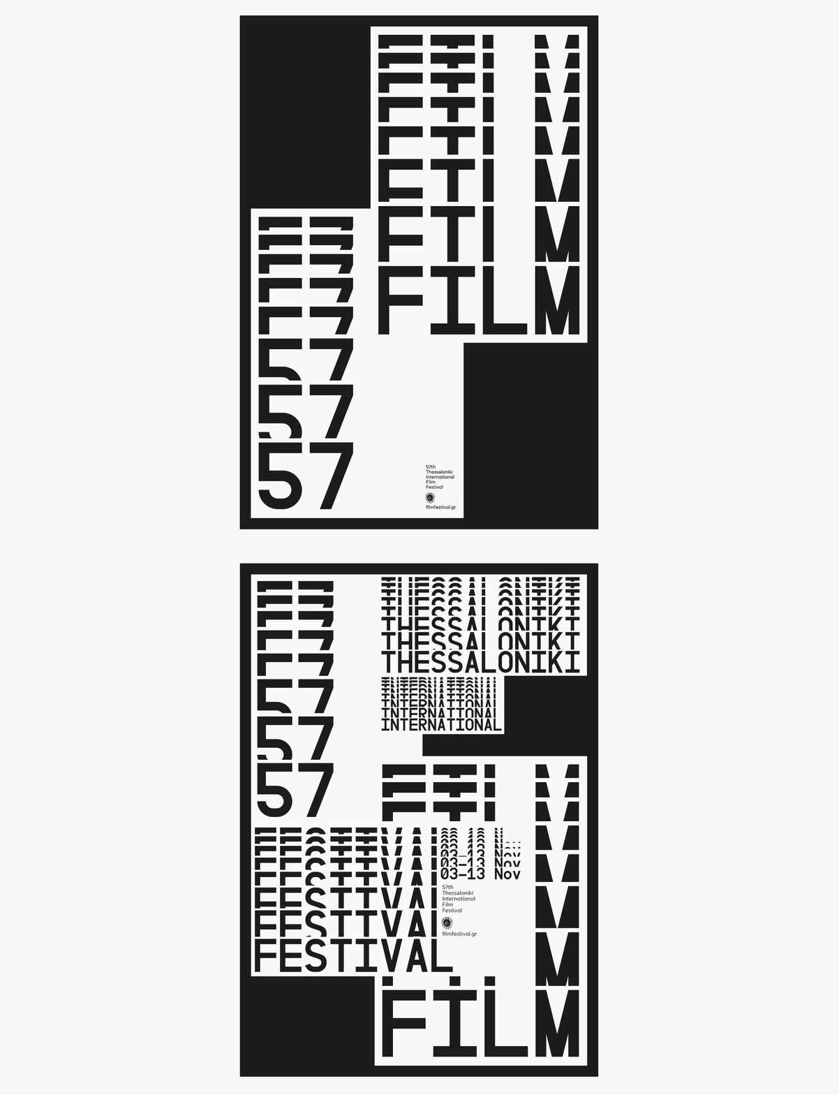

Dimitris Papazoglou for 57th Thessaloniki International Film Festival
“The visual language adopted for the design of both poster and all applications of the 57th TIFF’s visual identity, is inspired by a series of cinema’s key-features; the projection screen, repetition of film frames, the sense of movement and the perspective view of the theatre itself upon the viewer’s entry (the row of seats from last to first). These elements were interpreted and translated to layout, typography and imagery treatment, supported by a strict use of black and white and a technical monospaced typeface creating a link between classic cinema and the technology that surrounds it nowadays. A collaboration with Axel Peemoeller and Yannis Fetanis” via Dimitris Papazoglou
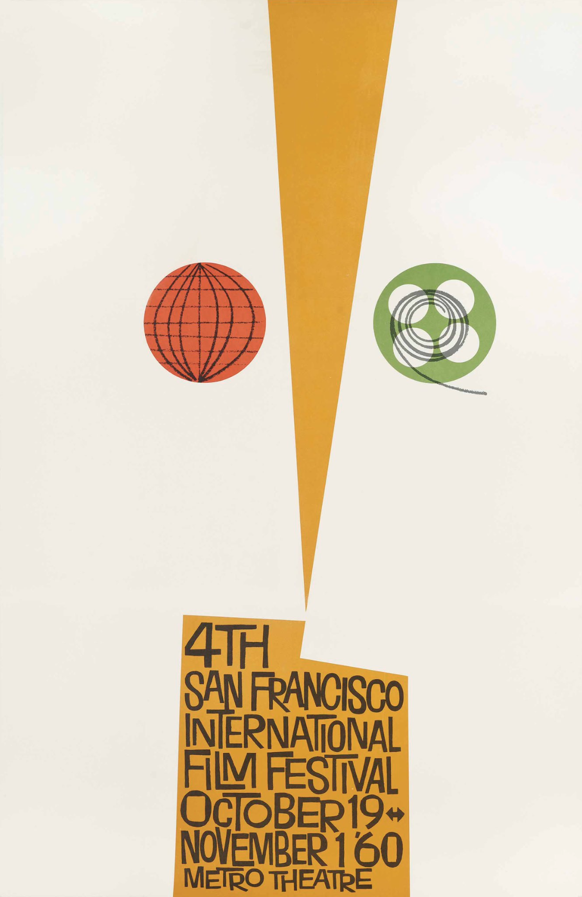
Saul Bass for the 4th San Francisco Film Festival. This poster was designed by the legendary American graphic designer Saul Bass in 1960. Bass was already very well established, having designed posters for Man with a Golden Arm, Vertigo and Anatomy of a Murder. Less than ten of these posters are known to have survived per Sotheby's.
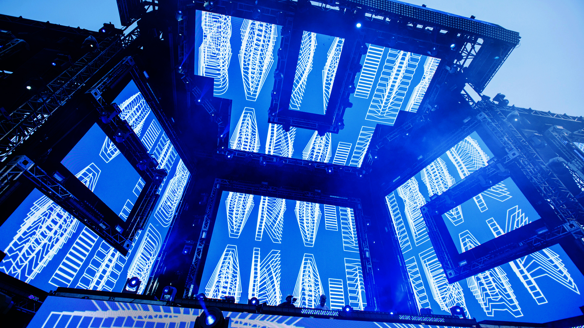
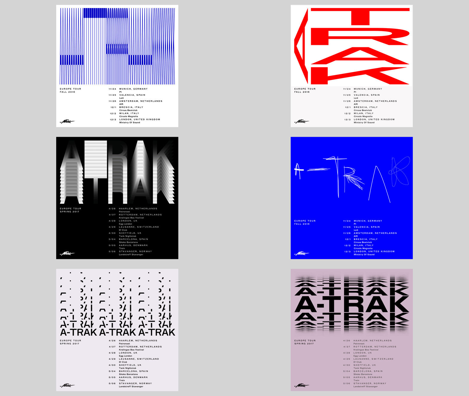
DIA Studio for A-Trak
“We have been collaborating with Alain Macklovitch, DJ and record producer known as A-trak, since early 2016. We first created a typographic identity system as the foundation for all design. We are then able to create a range of unique artwork for his varying assets working within a set of parameters. From the more minimal expression of the brand seen in the website and tour flyers to a maximal expression illustrated in album covers and live show visuals” via DIA Studio
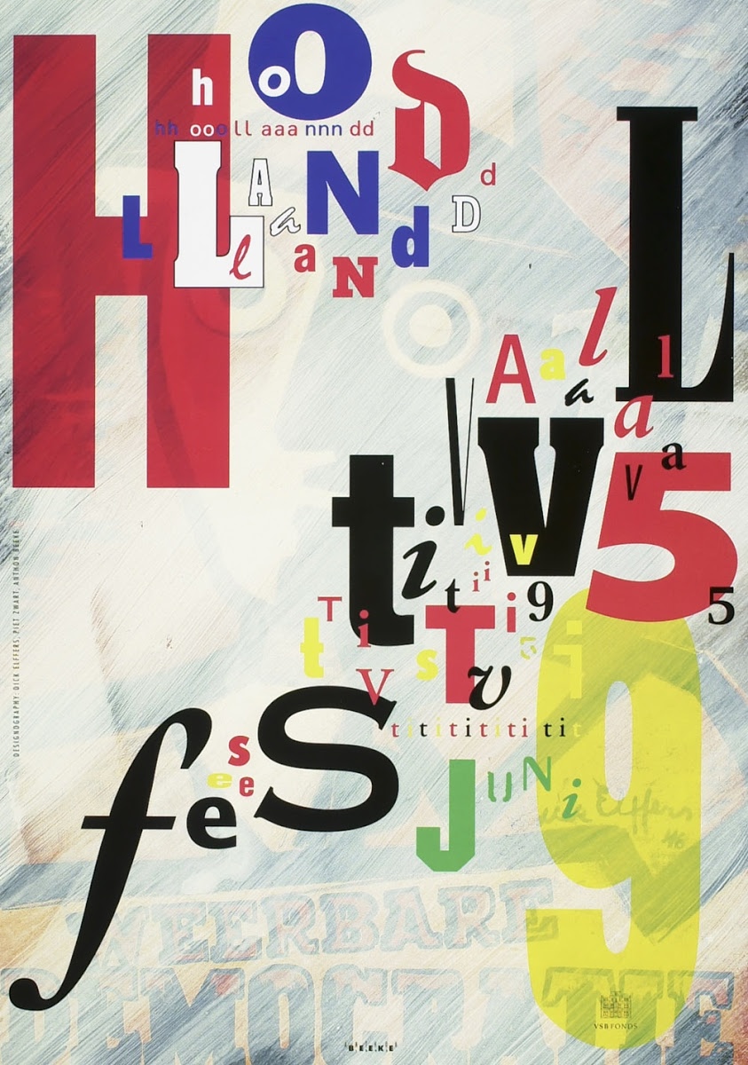
Anthon Beeke for Holland Festival circa 1995 via Twitter@deptofdev
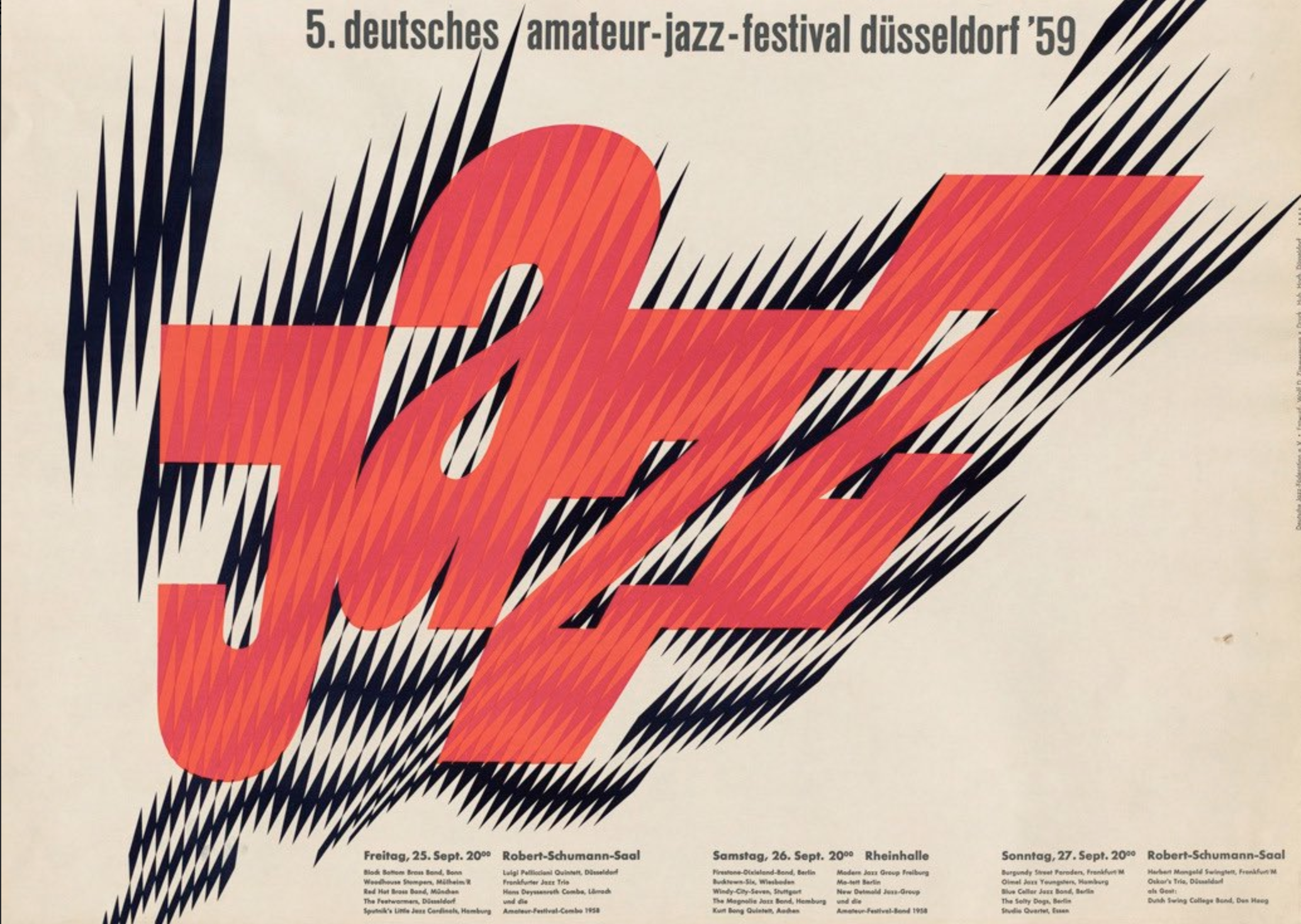
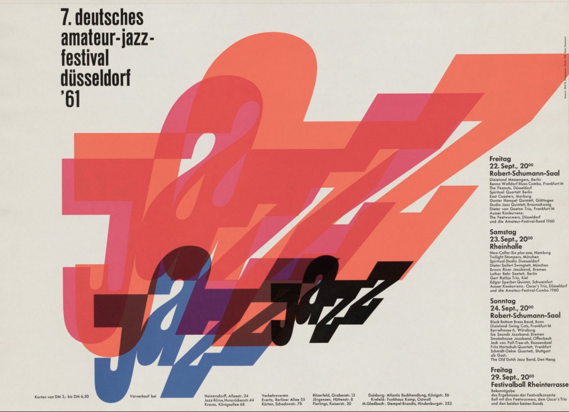
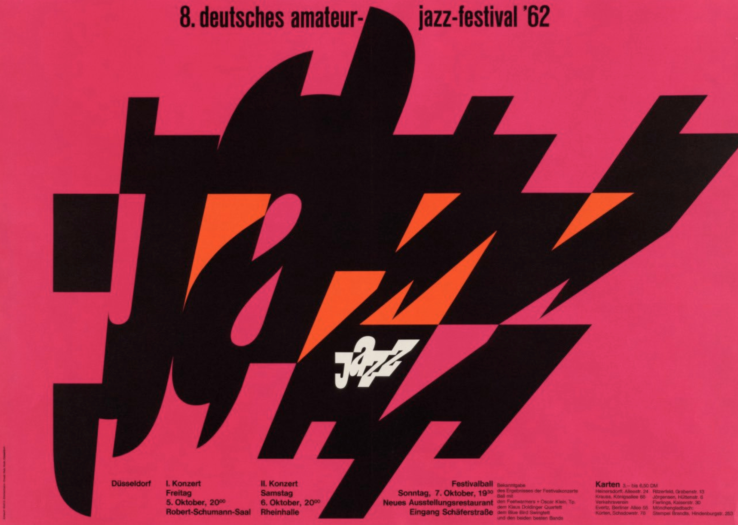
Wolf Zimmerman for the German Amateur Jazz Festival held in Dusseldorf, Germany circa 1959 via Twitter@poesiealbums
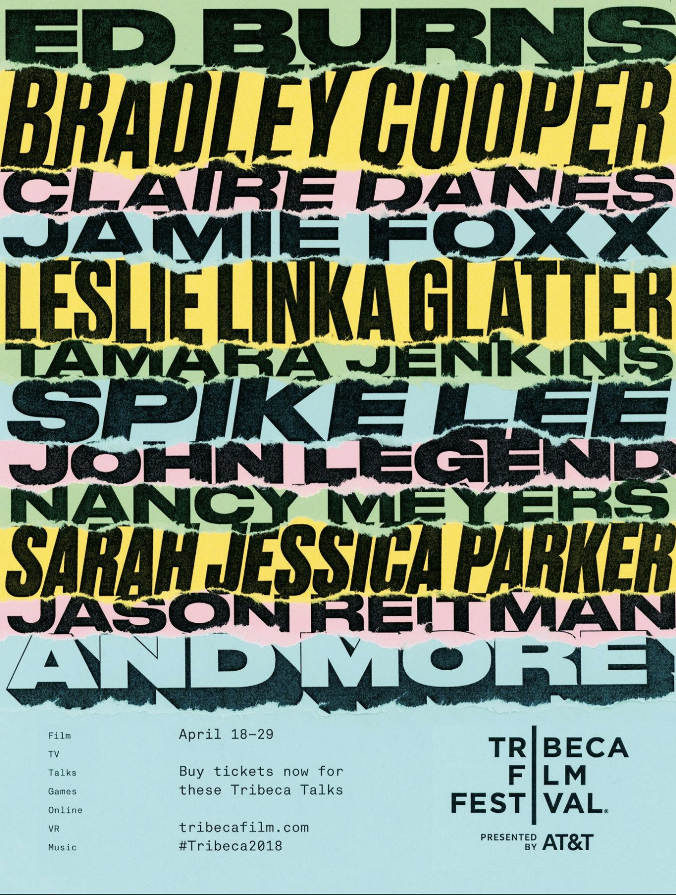

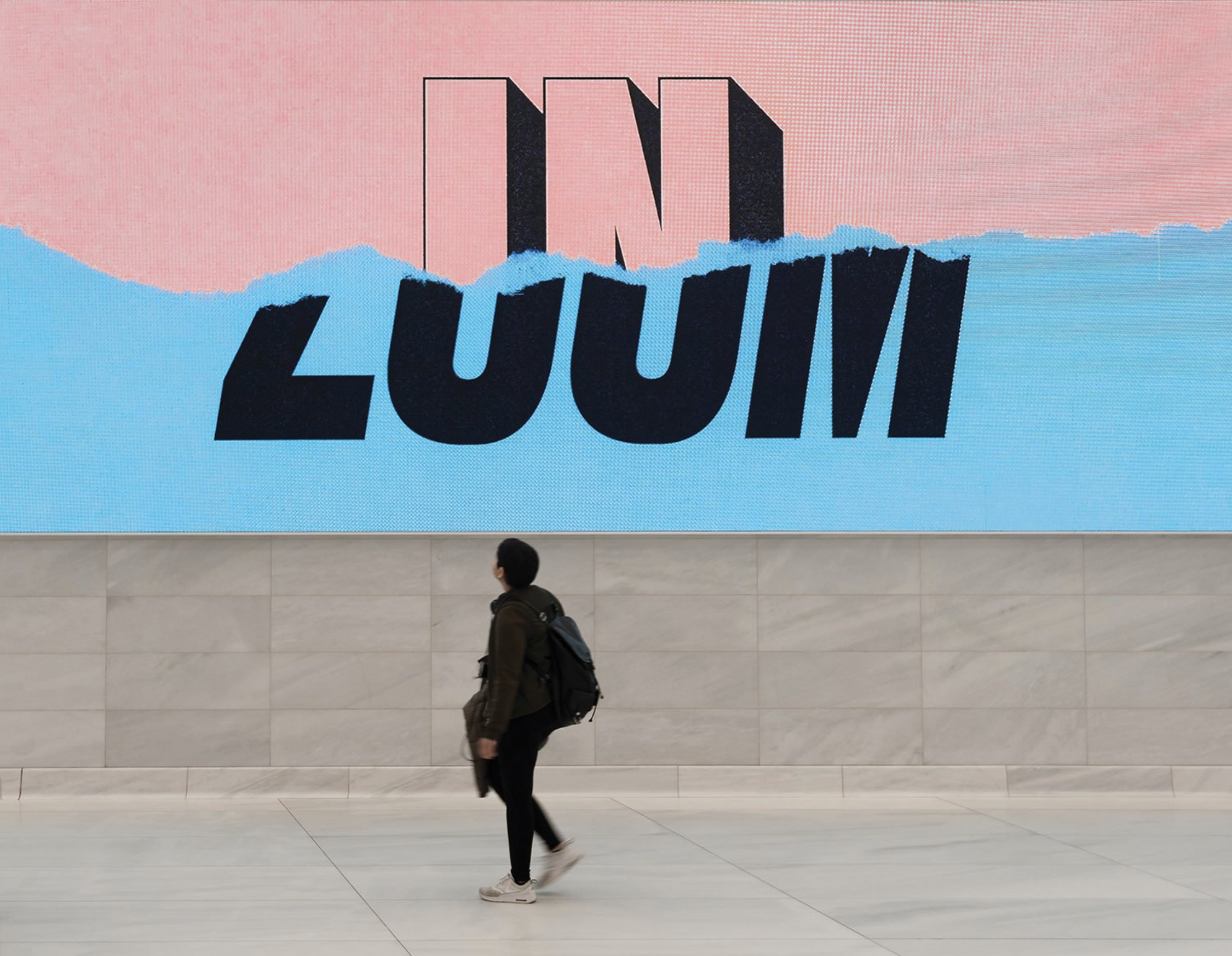

Eduardo Palma for Tribeca 2018 Film Festival
“For its 2018 edition, after several years of working with major advertising agencies, Tribeca Film Festival designed and produced its whole campaign in-house. As Tribeca's lead designer, and along with Avni Jain, Luke Williams and Juan Miguel Marín, we sought to design a campaign and identity based on Tribeca's mission of 'celebrating storytelling', but also to reframe the way in which the festival itself was presented. We aimed to speak about culture from a more accessible standpoint, and to invite a wider audience to engage in the conversation. The resulting concept finds its roots in screenwriting language, and the script as an object.
The campaign expands the commands commonly found in any script (such as "fade in", "cut to") through language mash-ups, and addresses the audience directly. The system is based on phrasal verbs, and the effect the matching of different adverbs has on each verb. The color and type choices, as well as the hands-on approach, reference the actual printed script. The campaign presents the Tribeca Film Festival as a layered experience; the more complex and layered the experience is, the more meaningful and richer the pay-off. This is an invitation to explore the festival beyond film, and engage with the rest of its verticals (Talks, TV, VR). The design references this through the layering and tearing of the pieces. It's a human touch that speaks about the individual's Tribeca Film Festival experience. The sequencing of pieces led to the reveal of 'Tribeca Forward' as the final mash-up. This final version was placed in the actual space of the festival, the final frame of motion pieces, and also the last batch of printed and digital pieces to come out.
The point was to raise the question 'if Tribeca was a verb, what would it be?' to the audience. The adverb 'Forward' hints at moving forward, seeing beyond, but doesn't provide an answer. The campaign lived in a wide array of media, including printed ads in magazines, badges, merchandise, outdoors, motion pieces and online ads, and every single piece was produced by hand” via Eduardo Palma
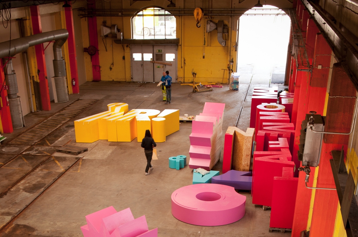
Snask for Malmö Festival
“Every year Malmöfestivalen, as we Swedes call it, makes a party…a gigantic block party that spans eight days in Malmö’s streets and squares. During this magical time, the city is filled with expectations, food, activities, amazing artists and, above everything, the loveliest people on the planet! It’s Sweden’s oldest city festival! And in 2014, it was time to celebrated nearly 30 years of festivities. The grand party took place in August and roughly 1.4 million people visited the festival over eight days of celebration.
We wanted Malmöfestivalen to be able to celebrate their 30-year landmark in style. Therefore, we decided to create the largest physical graphic identity the world has ever seen! A gigantic physical art installation measuring 13 x 8 meters. The installation was interactive friendly and visitors could jump, climb, or chill on its many levels of typography: from letters to symbols to objects. To produce this masterpiece, we used 10,000 nails, 175 liters of paint, 280 plywood sheets, and 14 laborers over the course of 900 hours. A huge endeavor, but Snask likes to go big. Really big!
To photograph our creation for the Festival’s print marketing, we rented a sky lift to hoist ourselves 30 meters up in the air. The view was jaw-dropping. 2014’s graphic identity for Malmöfestivalen has been featured in hundreds of articles around the globe, including AdWeek, Creative Review, HOW Design and many more. The praise from visitors in the streets and from the global creative community at large has exceeded all of our expectations. We set out to give visitors an unforgettable experience and in the end we created a typographic wonderland that was the talk of the universe.” via Snask
Tags/ inspiration, festival, twitter, snask, poster, glastonbury, saul bass, design museum, anthon beeke, dimitris papazoglou, dia studio, font sunday


