Walter Tracy: 10 things to know about
1. Walter Tracy was an English type designer, typographer and writer whose work has influenced the British design industry and beyond is also the man who predicted responsive, variable fonts back in 1986 in his highly influential book Letters of Credit: a view of type design. For Tracy “type is a beautiful group of letters, not a group of beautiful letters” and this is his story.
2. Born on the 14th of February 1914, a Valentine of the type industry by default, Walter Valentine Tracy RDI was born in Islington, London. The son of a Royal Navy seaman and a mother who was a part-time charlady Tracy once said: 'we were of the London working class, poor but respectable - an important word in those days.''
At the age of 12 Tracy entered the printing deparment of the Central School of Arts & Crafts, who arranged an apprenticeship for him in the great printing firm of William Clowes. “In the school, he was made to spend hours drawing the letter-forms of Caslon (one of the most popular book faces), not by tracing but by copying them detail by detail. To a 14-year-old schoolboy nothing could have been more boring, and he developed a deep hatred of the face which lasted for years” reads Tracy’s obituary.
Having completed his apprenticeship, Tracy went to work in the typographic studio of The Baynard Press and he spent the years of WWII working as a print buyer for an advertising from 1938 to 1946, as he was rejected by the army's medical examination.
3. In 1946, Tracy was offered a part-time job by "the man who had most influence in his life” aka printer, writer and designer James Shand. “His influence on me was strong. My mind expanded (and not before time: after all, I was in my thirties), and I began to take a serious interest in the history and aesthetics of printing, to acquire books on the subject, and to form opinions - and even to learn when to change them” Tracy wrote of this relationship that changed his life forever.
4. A year later he began to work part-time for the British Linotype & Machinery Ltd. (L&M) company, a subsidiary of Mergenthaler Linotype and in 1948 his career in L&M kicked off. Tracy was a full-time employee of the company for 30 years, providing numerous type designs and insights on the science of typography and more specifically typefaces for newspapers, and classified advertising.
Letters of Credit by Walter Tracy https://t.co/SEMJIUJL25 pic.twitter.com/5CTzBOhnPI
— fontdotnews (@fontdotnews) September 13, 2018
5. His most influential typeface Jubilee, designed to be more robust than Stanley Morison's 1931 font Times New Roman, was adopted by a number of newspapers, and his Telegraph Modern was used by the Daily Telegraph from 1967. He also designed two important faces for classified advertisements, Adsans and Maximus and he was responsible for a range of influential Arabic type developments, among them the making of the Mrowa-Linotype Simplified Arabic type in collaboration with Kamel Mrowa and Nabih Jaroudi by the mid 50s.
6. “In 1965 he was asked by Francis Mathew, the manager of the Times, to leave Linotype and join the newspaper's staff as its designer, full-time. Tracy, after also being interviewed by Stanley Morison, the father-figure of Times typography, accepted the invitation, but at the last moment Mathew died suddenly of a heart attack; his successor, George Pope, thought that the new appointment was not a good idea and that it would be better for Tracy to work for the Times while still at Linotype; which Tracy did. A redesigned Times appeared in 1966, but it did not last long, as the newspaper soon changed hands and, in Tracy's own modest words, ‘new people changed the style and content of the pages - for the better, I think’” reports the Independent.
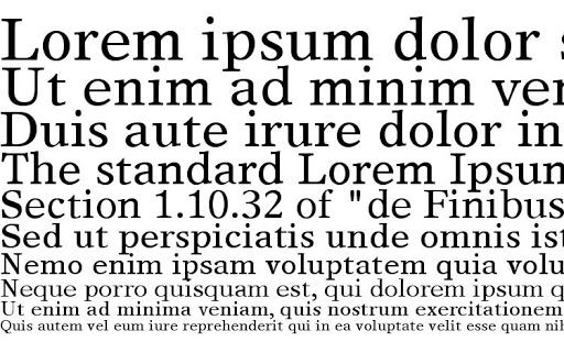
In the early seventies Tracy was asked by The Times to design a replacement for Times New Roman and Times Europa was born. The typeface was introduced into the Times on 9 October 1972 to replace Morison's Times Roman, a week after the 40th anniversary of that typeface's first appearance. The Sunday Times began using the new face a year or so later.
7. In 1973 he was elected A Royal Designer for Industry and although retired in 1977 he remained active, designing a range of Arabic typefaces for Linotype, Letraset and Bitstream a Hebrew font, under a pseudonym.
Tracy designed the following typefaces: Jubilee (1954), Adsans (1959), Maximus (1967), Telegraph Modern (1969), Times Europa (1972), Doric (1973), Telegraph Newface Bold (with Shelley Winter, 1979), Qadi (1979), Kufics (1980), Oasis (1985), Sharif (1989), Malik (1988) and Medina (1989).
8. Walter Tracy “slight in build, with an alert and humorous face, had an incisive mind and was deeply kind and honest, always ready to help those who asked for his advice. He dispensed that, too, in two excellent and modest books written in his retirement, Letters of Credit: a view of type design (1986) and The Typographic Scene (1988).”
“For my own part, I take the view that typography, like most other sorts of designing, is essentially a means to an end; and the end is not the self-satisfaction of the designer but the contribution he or she makes to the effectiveness of whatever is presented to the public” wrote Tracy.
9. In Letters of Credit, an influential book for type designers and graphic designers alike, Tracy explains how the revolution in typesetting eliminated a five-hundred-year-old system of hot metal production and replaced it with one of photo-generated and computer-driven composition. His book traces the steps that went into that revolution and simultaneously makes the argument that the letter forms themselves are in process of evolution. Tracy argues that, whether they are of the sixteenth or the twentieth century, the forms that comprise our alphabet are subject to the same rules of good taste, proportion, and clarity that have always obtained.
For Tracy “the design of distinguished, contemporary typefaces is far outnumbered by the mediocre and downright bad. Part of the reason for this deplorable deterioration is a lack of critical analysis of the particular esthetics involved. This step-by-step examination of type-design esthetics is precisely what Tracy provides here, while avoiding both the promoter's hype and the manufacturer's claims. Here are the gut issues of what makes type good or bad, legible or unreadable.”
Walter Tracy predicted responsive fonts in 1986, before the web was even a thing. (“Letters of Credit”, page 79) pic.twitter.com/7i2I1W3I51
— Nick Sherman (@NickSherman) March 21, 2016
10. Walter Valentine Tracy passed away on the 28th of April 1985 at the age of 81.
Tags/ typography, type design, typefaces, fonts, ten things, typesetting, linotype, walter tracy, the times, the telegraph, jubilee


