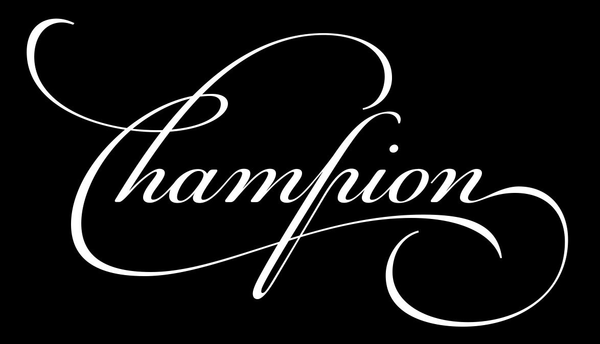
PF Champion Script Pro: the making of Parachute's advanced script typeface in 10 steps
Probably one of the most advanced and powerful formal script typefaces ever made, Parachute's Champion Script Pro was developed over a period of two and a half years before its release in 2007.
"The decision to develop such a typeface was taken during my trip to London back in 2001, while I was doing a research at the St Bride Library" writes the creator of PFChampionScriptPro, type designer Panos Vassiliou.
Following is a deep dive into the font's origins and development, contributed by the typographer himself for a stunning typographic adventure -from past to present.
"It was then when I came across a number of beautiful 18th century manuscripts written by English calligraphers. I was particularly impressed by the writing of Joseph Champion, somebody whom I had never heard before.
Being myself a self-taught type designer and not a calligrapher, the idea of pursuing such a task seemed at the moment unattainable. Nevertheless, it haunted me for at least three years before the project got started and after I learned a thing or two about calligraphy.
Joseph Champion was born at Chatham in 1709 and was educated partly at St Paul’s School and partly at Sir John Johnson’s Free Writing School in Foster Lane under Charles Snell to whom he was afterwards apprenticed.
Champion contributed no fewer than 47 plates to Bickham’s Universal Penman. His most important work, "The Parallel or Comparative Penmanship Exemplified," was published in 1750.
The Parallel consists of reproductions of the work of foreign masters like Materot, Barbedor, Van den Velde, Perlingh and Maria Strick, with corresponding plates by Champion. Following these plates come some alphabets by Champion whose last published work was "The Penman’s Employment," 1762.
Champion's manuscripts were embellished with several beautiful swashes, frames, ornaments, endings and beginnings, all written with such a precision that seems very difficult to achieve in our days.
Something that strangely enough is not mentioned often in typography circles, is that the first known attempt to decode Champion's writing, was done in 1989 by the French typographic designer François Boltana mostly known for his typeface Stilla.
Later, in his published paper "Ligatures & calligraphie assistée par ordinateur" (1995), he proposed a couple of alphabets, based on Champion, with a minimal set of alternate glyphs but it did not really make it into a commercial font as he passed away in 1999.
The development of Champion Script Pro started in 2004 with the intention to design a contemporary typeface with classic roots which, for the first time, would be able to fully support three major scripts such as Latin, Greek and Cyrillic, as well as document at the same time alternate glyphs and ligatures (for all three scripts) never before released.
Eventually each one of the font's two weights is loaded with 4300 glyphs, which offer simultaneous support for all European languages based on the Latin, Greek and Cyrillic scripts.
Champion Script was officially presented in June 2007 at the 3rd International Conference on Typography and Visual Communication ICTVC.
Concept & Guidelines
Three basic requirements became clear right from start.
The new typeface would have to loose its deep classic calligraphy roots and instead acquire a clean contemporary identity; retain the handwriting elements without the mechanical repetition of identical glyphs for the same character and finally, apply similar design aesthetics to Latin, Greek and Cyrillic, without compromising the traditional roots of each script.
The intention was to design this typeface in a way that works equally well for a variety of projects from music and fashion to business, entertainment and luxury products.
On a practical basis the following guidelines were followed:
1. Lowercase characters were designed so they are less inclined, have a higher x-height and are less condensed than the original. Uppercase letters were corrected accordingly to follow suit (weight, stress, etc)
2. Several characters were stripped-off their connecting lines in order to enhance legibility.
3. Design four sets of alternate swashed capitals.
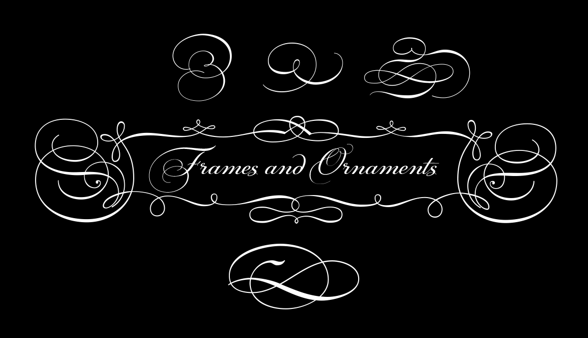
4. A plethora of ornaments and frames (117) was included.
5. Small caps and their alternate forms were designed to replace the capitals which disrupt the flow of text within a sentence with their extravagant swashes.
6. All characters were carefully designed with the proper weight in order to sustain harsh printing conditions (on special papers), a situation which affects mainly the light connecting parts of calligraphic typefaces.
7. A wide selection of alternate forms and ligatures (never before released or incorporated within the same font) was included for all languages, in order to accommodate diverse design aesthetics and preserve handwriting qualities. These alternates are either applied automatically through an advanced programming scheme, or manually through several opentype features.
8. Apply a programming scheme which will balance the frequency that ascenders, descenders and swashes appear among the various scripts in order to achieve a homogeneous optical effect.
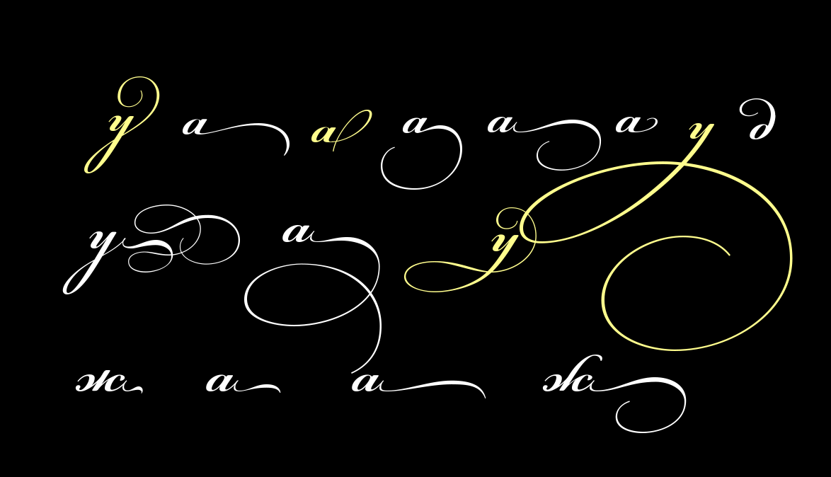
9. Embellish the endings and beginnings of letters with several alternate swashes.
After having examined thoroughly the particulars of Champion’s writing, the development of the typeface had to be properly organized into ten well defined steps which were strictly followed.
Stage 1
Selection Tables. During this stage a number of tables was created which documented all possible versions of characters which were numbered.
Later on, the dominant glyphs were chosen and highlighted in order to be used for the basic alphabet. Several others were dropped from the list whereas the remaining were used as alternate forms.
Stage 2
Uppercase. The list for uppercase letters was passed on to my two assistant designers George Lygas and Sophia Kalaentzidou who put together all the glyphs that were chosen from the manuscripts for each character and prepared them for digitization.
Sophia run the initial digitization process, made corrections and passed it on to George for further adjustments based on above guidelines. Finally, they were sent to me for the final adjustments which were performed when most glyphs were put together as a font.
Stage 3
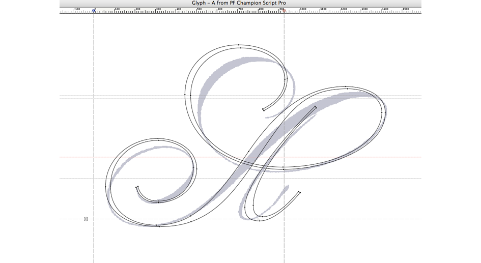
Lowercase. Meanwhile, I was busy designing the lowercase glyphs. It was realized right from the beginning, that instead of digitizing lowercase characters from the manuscripts, it would be easier for me to set them up right from scratch.
Numerous single line pencil sketches were tried out in order to set the basic skeleton of the letters, especially for Greek, for which there is not as yet a comprehensive calligraphy reference that can match Champion's Latin. For that reason I had to rely on my collected knowledge of Greek handwriting in order to figure out all possible variations of Greek formal script letters.
Eventually, I managed to introduce numerous alternate Greek forms for letters such as ‘beta’, ‘gamma’, ‘delta’, ‘zeta’, ‘lambda’, ‘xi’, ‘rho’, ‘phi’ as well as Greek ligatures which either appear for the first time or have appeared irregularly in personal handwritings of Greek natives.
Initial rough sketches were followed by a few elaborate sketches, mostly for ‘difficult letters’, which were later scanned.
The first letters I designed were ‘o’, ‘n’ and ‘i’, from which I built the basic letterforms and afterwards I designed the rest, based on the initial guidelines and a visual reference of the original.
A key point is to set, right at start, the spacing of the characters for proper interlocking between the letters. Having done thar begins a long process of proofing the letters and amending the shapes, so that they harmonize in form and weight.
Stage 4
Endings / Beginnings. A special list which was created in stage 1, documented a large number of swashed endings and beginnings for lowercase characters.
By incorporating the information from this list into the original lowercase characters which were designed in stage 3, I created several new glyphs to be used as alternate initial and terminal forms.
Stage 5
Small Caps. Small caps were created during this stage. These are not scaled-down versions of the capitals -just like the ones we see in other fonts- but rather small and simple capital forms, whose main purpose is to replace the capitals which disrupt the flow of text -when used within a sentence- with their extravagant swashes.
Furthermore, two more sets of stylistic variant small caps were created to be used within a sentence, in order to connect words which are separated with space, thus creating the effect of a continuous text flow.
Stage 6
Alternates. Hundreds of alternate glyphs and ligatures -for Latin, Greek and Cyrillic- were created either based on the original manuscripts, or right from scratch.
Stage 7
Ornaments. A total of 117 ornaments/frames were digitized (mostly done by George and Sophia) and incorporated into this typeface.
Stage 8
Kerning. Best designed formal script typefaces don’t need kerning. There are a few exceptions though, as is in the case of Champion Script Pro, where there are several occurences of letters which do not interconnect and kerning had to be applied.
Stage 9
Programming. This involves the automatic replacement of a glyph into an alternate form, which either looks better in a certain sequence of characters, or avoids clashing with neighbouring glyphs.
This was a painstaking process as specific parameters had to be taken into consideration, such as possible neighbouring characters, frequency of occurence, etc.
During this stage many groups of glyphs were established in order to facilitate the manual selection of alternate forms. Finally, several more opentype features were incorporated into this typeface, in order to manage its vast array of glyphs.
Stage 10
Bold. After completing the design and programming for the regular version, it was decided to complement it with a bold version. Initially, the lowercase glyphs were designed using as reference the regular version and the rest just followed.
In conclusion, Champion Script Pro exceeded my initial expectations" writes Vassiliou.
PF Champion Script Pro's first version was upgraded a few months after the font's official release in 2007 to include additional features and letterforms.
The final version includes a regular and a bold weight which support simultaneously Latin, Greek and Cyrillic with numerous alternates and features in all supported languages.
PF Champion Script Pro has been awarded at the International Type Design Competition 2009 and Granshan Awards 2010.
For additional info check the following: Specimen manual PDF, Attention to Details and Champion Script on Behance.
Tags/ typeface, parachute, details, making of, calligraphy, panos vassiliou, joseph champion, champion script, boltana, type family, formal script
