Pentagram's Eddie Opara rebrands Dashlane
“This is just the beginning” notes Dashlane of its latest massive rebranding by Pentagram’s partner Eddie Opara.
Dashlane, a password manager and online security app, invested in Opara’s knowledge for a massive rebranding with a new logo and a visual identity to match today’s digital needs.
“As the experience of our digital lives has only gotten more complicated, we worked with Pentagram to deliver a new brand identity that feels simpler than ever and sets a solid foundation for what’s next” notes Dashlane.
“The basic building blocks of our design system are elements we’ve named AroundRects, hearkening back to the very beginnings of UI design, but with an added third dimension. Simple, dynamic, and endlessly versatile, they evoke dashes in the most literal sense. But they also conjure lanes on a highway, gesturing towards freedom of information and exploration.”
This exact “sense of discovery” flows into Dashlane’s newly designed logo.
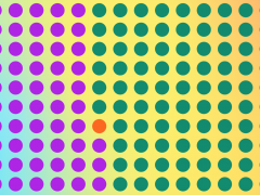
“In its animated form, it’s inspired by the wooden pixels of Daniel Rozin’s 1999 art piece, ‘Wooden Mirror,’ a reflection on self-perception and identity. As the viewer stood in front of Rozin’s kinetic artwork, they experienced a beautiful image of themselves come to life in an array of ordinary objects. His work recalls a point in the not-so-distant-past when we viewed ourselves reflected online and were moved by what we saw there: the promise of the internet.”
“Technology companies did not deliver on that promise, and today the web feels a lot less safe. Our conviction that you and you alone should control access to your digital identity takes shape through a visual language of intentional concealing and revealing.”
“We removed any extraneous filigree to present a sharp-edged visual identity system that points to Dashlane’s commitment to fix the UX of the internet” says Opara.
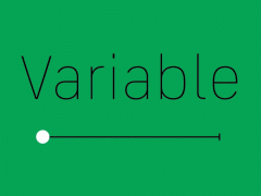
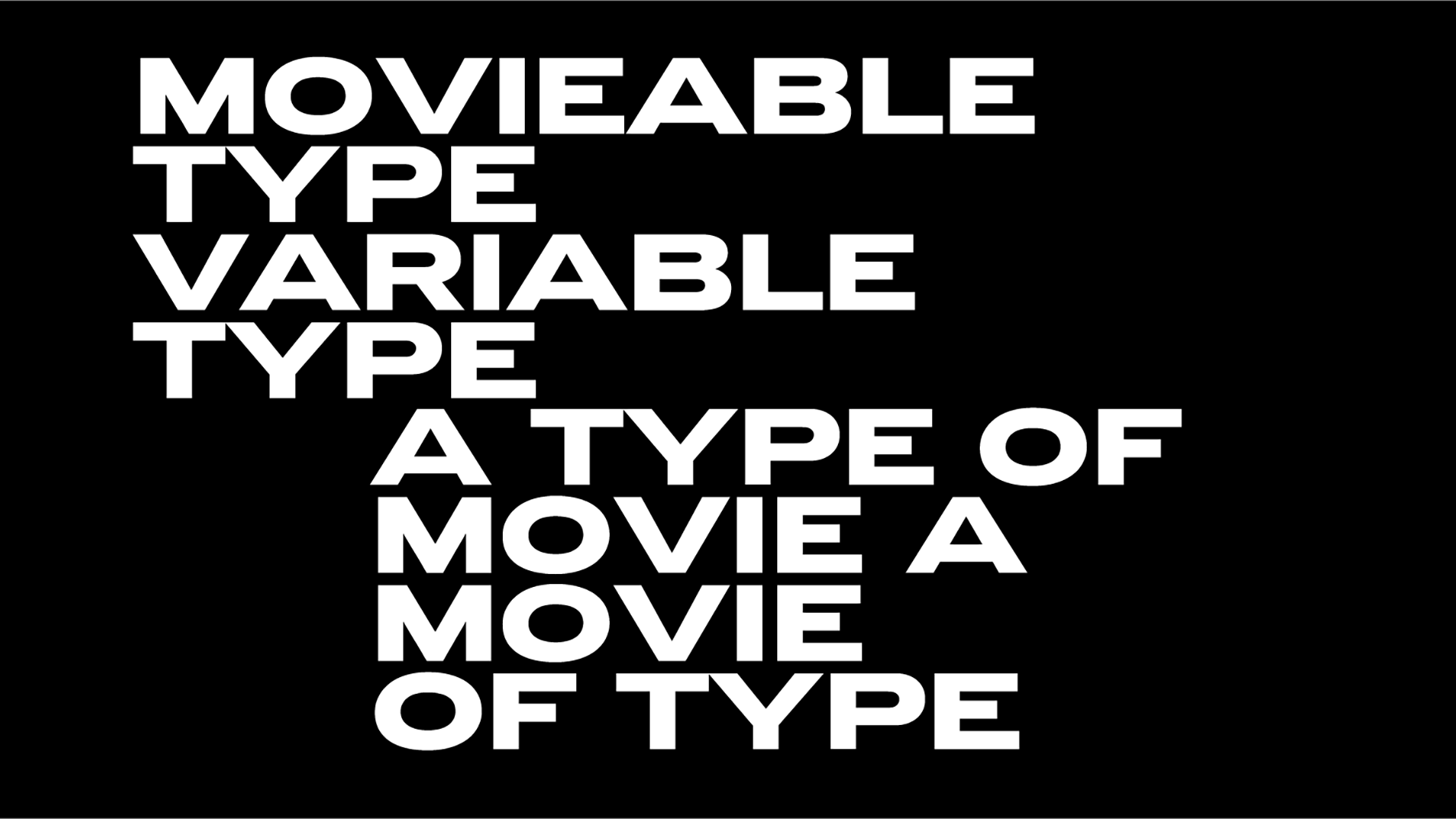
And then there is a typeface “grounded in strength“ aka GT Walsheim that represents an evolution “from an overly tech-forward look and feel to reflect a much warmer, more human, way forward.”
“The new color palette is rooted in green, the universal symbol for go, supported by a complementary shade of gentle pink. We added an orange and a red, used sparingly, for those moments when we need to alert our customers to security issues. While imbued with purpose and energy, our colors resist becoming bright or flashy. We give you a better way to move through the web. The last thing we want is to get in your way” notes the design team headed by Pentagram’s partner.
Eddie Opara studied graphic design at the London College of Printing and Yale University, where he received his MFA in 1997. He began his career as a designer at ATG and Imaginary Forces and worked as a senior designer/art director at 2×4 before establishing his own studio, The Map Office, in 2005. He joined Pentagram’s New York office as partner in 2010.
His clients have included Cooper Hewitt, Smithsonian Design Museum, Princeton Architectural Press and more.
Opara has won numerous awards and his work is in the permanent collection of the Museum of Modern Art. Pentagram’s partner Opara is a senior critic at the Yale University School of Art.
Discover his latest work for Dashlane live here.
Tags/ typeface, visual identity, logo, rebranding, app, digital, pentagram, eddie opara


