COVID-19: Fonts in social distancing mode and a supersize logo drama
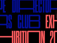
This Sunday the fonts were separated for a social distancing typographic feed on Twitter. Design Museum took note of kiko84's suggestion and the past Font Sunday's theme was open / separated type.
Social distancing is essential against the coronavirus pandemic and this brand new rule has inspired many visual creatives. Yet, when social distancing is applied to brands and their logos, things will get weird.
McDonald's Brazil's social media accounts shared a minimalist ad in which the brand's golden arches were separated. Created by agency DPZ&T the image tried to convey a message: “separated for a moment so that we can always be together.”
Twitter exploded, arguing the company's policy with many users calling out McDonalds's marketing effort.
I don’t want your cute logo play McDonalds. I want you offering a million free meals to those in need. I want you turning your drive thru into safe testing sites. I want you doubling down on that happy meal box content for kiddos who are stuck inside RN. https://t.co/xgpf2mIaQe
— Laurel Stark Akman (@LaurelLu) March 20, 2020
Eventually McDonald's Brazil removed the ad and released an apology statement to the New York Post.
“As a brand that operates in nearly 120 countries, we share a collective responsibility to help our communities in times of need. We apologise for any misunderstanding of the intent to remind our customers and communities on the importance of social distancing during these uncertain times” it reads.
“Clever marketing or tasteless gesture? The internet has spoken. Social distancing logos are the design equivalent of 'thoughts and prayers'” notes Fast Company.
Social distancing logos are the design equivalent of ‘thoughts and prayers’ https://t.co/tCBynCTi1a
— Fast Company (@FastCompany) April 2, 2020
Tone-deaf or not, keep your distance, keep safe from harm and let the fonts show us the way.
Thanks to @kikocasa844 for suggesting this week's theme for #FontSunday ???? | The theme is open / separated type. Send in your examples from noon tomorrow.
— Design Museum (@DesignMuseum) April 4, 2020
---
Remember, we are much safer apart ????♂️✋ ????????♀️ pic.twitter.com/7N50Gol5ov
Walter Gropius poster for the @bauhausarchiv by Sascha Lobe @DesignMuseum #FontSunday pic.twitter.com/iFVsGNP7Yg
— ???????????????????? (@DanielCookney) April 5, 2020
Masha Kornienko Food Truck magazine cover 2017 @DesignMuseum #FontSunday #SocialDistancing #separation pic.twitter.com/VNbnl2UTmE
— kiko84 (@kikocasa844) April 5, 2020
.@DesignMuseum’s open/separated type #FontSunday — Leica Monochrome poster. pic.twitter.com/zXJYG0qFvk
— Armando Roque ????????????????????????????️???? (@ArmandoRoqueCcs) April 5, 2020
Social Distancing, Autechre album cover #FontSunday pic.twitter.com/fL081Wf6bJ
— Briar Levit (@BriarMade) April 5, 2020
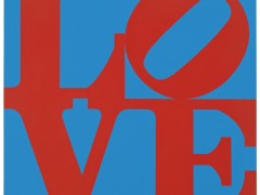
Paula Scher, "You/Me" print, 2015, after a poster originally created for @MuseumontheSEAM, 2000 @DesignMuseum #FontSunday #separatedtype #socialdistancing pic.twitter.com/xiZQ288AaL
— Pentagram Design (@pentagram) April 5, 2020
#FontSunday André Gürtler’s covers for for 1966 issues of Typographische Monatsblätter (TM). #open #separated @DesignMuseum pic.twitter.com/isEzC87pHc
— Wayne Ford (@wayneford) April 5, 2020
#FontSunday @RobertBrownjohn, Ivan Chermayeff, Thomas Geismar designed christmas card, for Brownjohn, Chermayeff & Geismar, c.1957-1960. #separated #open @DesignMuseum pic.twitter.com/KRoDJVm2qL
— Wayne Ford (@wayneford) April 5, 2020
AD Magazine cover by Paul Rand 1939 #FontSunday @DesignMuseum #open pic.twitter.com/kPhp5ymlCL
— Donald Partyka (@donaldpartyka) April 5, 2020
#FontSunday Idea no.78 cover, designed by Helmut Schmid, 1966. #open #separated @DesignMuseum pic.twitter.com/dQC64bgLes
— Wayne Ford (@wayneford) April 5, 2020
Mathilde Proteau @DesignMuseum #FontSunday pic.twitter.com/A1xvyb2m4Q
— Tony Pritchard (@tonyplcc) April 5, 2020
Mjölk – Confluence visual identity #FontSunday @DesignMuseum #SocialDistancing pic.twitter.com/jRISUzzaXm
— SHOW\TRIAL (@ShowTrialStudio) April 5, 2020
Last but not least Herbert Bayer, “Die Figurinen der Bayer Type”, semi bold, 1935 @DesignMuseum #fontsunday #separation #typography #SocialDistance pic.twitter.com/YS4xSbJJRZ
— kiko84 (@kikocasa844) April 5, 2020
Takenobu Igarashi, Poster “Graphic Designers on the West Coast”, 1975 @DesignMuseum #fontsunday #posters #typography #SocialDistance #separation pic.twitter.com/cV7H11CjG1
— kiko84 (@kikocasa844) April 5, 2020
Poster for AIA (American Institute of Architects) National Convention and Design Exposition, 1988@michaelbierut posters source @VignelliCenter @DesignMuseum #fontsunday #separation #SocialDistance #typography pic.twitter.com/ydLYGP4SHQ
— kiko84 (@kikocasa844) April 5, 2020
#fontsunday #socialdistancing lovely vernacular typography with the necessary tracking pic.twitter.com/oinGfbrw4D
— ribbit (@eionjwklm) April 5, 2020
“The Favourite” 2018
— Jason Tselentis (@JasonTselentis) April 5, 2020
Fox Searchlight
director Yorgos Lanthimos
typographer
Vasilis Marmatakis
font Village @DesignMuseum #fontsunday #separatedtype #spacestype pic.twitter.com/v5OgLHXKKh
A late entry to #FontSunday today, title page spread of the always beautifully made Port Magazine, Autumn 2011 pic.twitter.com/VijKy7DJ95
— Akua Afari (@Graphicsandme) April 5, 2020
Immigration to Canada 1900-75, Ernst Roch (1975) #opentype #distancedtype #socialdistancy #fontsunday @DesignMuseum pic.twitter.com/lE6DGPBwLv
— Canada Modern (@canadamodern) April 5, 2020
Typography Process No 4 by Wolfgang Weingart 1971-1972 @DesignMuseum #FontSunday #SocialDistancing pic.twitter.com/ccgpBXGHUd
— kiko84 (@kikocasa844) April 5, 2020
.@DesignMuseum #FontSunday Mind the gap with @neworder. Tour flyer from 1984. I went to Pompey - a great time was had by all. pic.twitter.com/3dZbcmfTNS
— David Bonney (@isetta_windsor) April 5, 2020
Thanks to @kikocasa844 for suggesting this week's theme for #FontSunday ???? | The theme is open / separated type. Send in your examples from noon today.
— Design Museum (@DesignMuseum) April 5, 2020
---
Remember, we are much safer apart ????♂️✋ ????????♀️ pic.twitter.com/UcQwEUyln1
Explore more here.
Tags/ typography, logo, twitter, branding, fonts, coronavirus, covid-19, social distancing


