When the font stood still! A celebration of type in Space for Apollo 11
To celebrate NASA’s, and humankind’s, anniversary of Apollo 11 the Design Museum devoted its latest #FontSUnday thread to type in space.
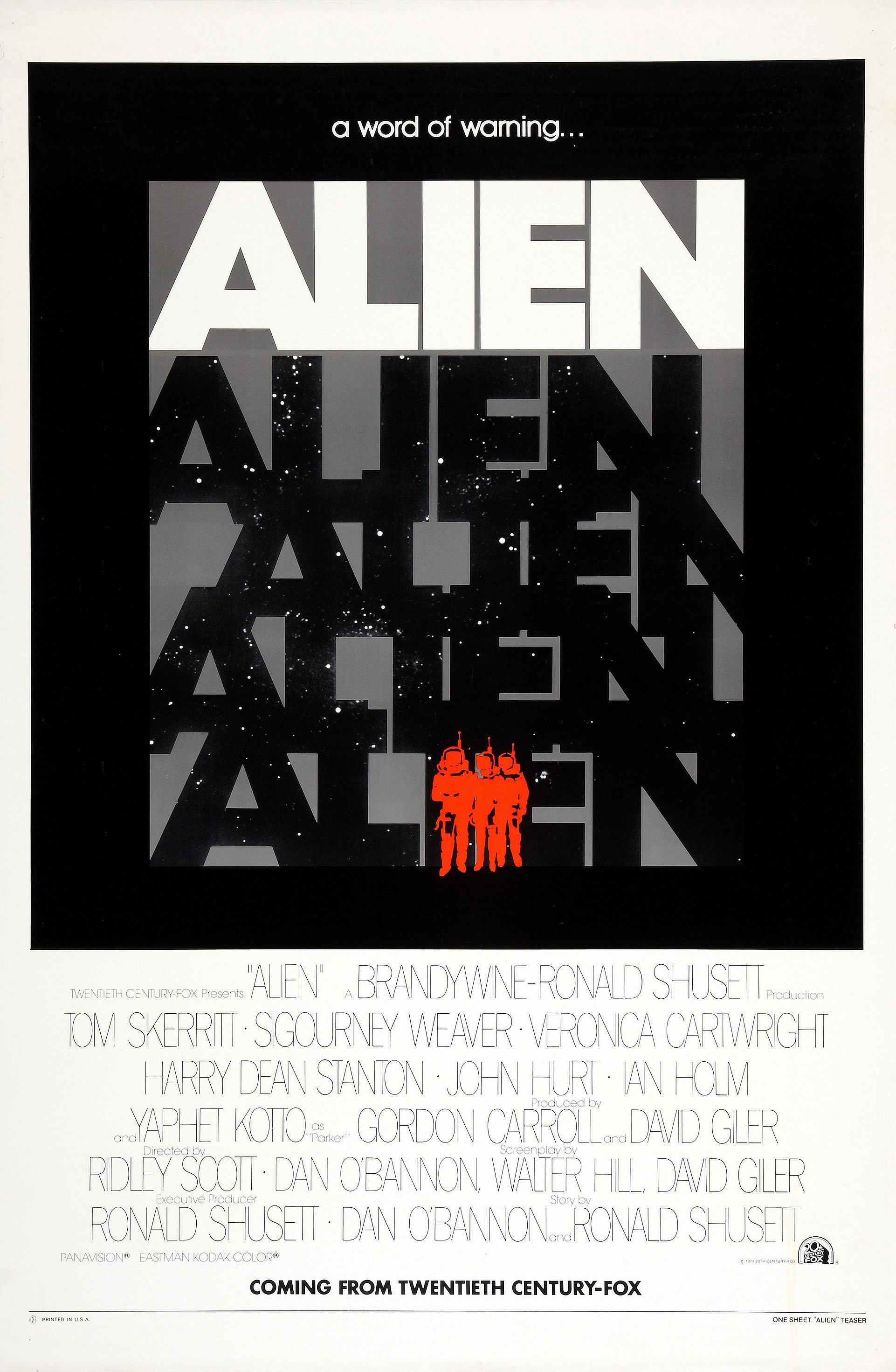
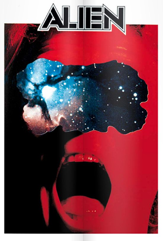
From Polish posters of Solaris through the iconic title design of Alien to Stanley Kubrick’s exploration in typography during his 2001 space opus, Twitter celebrated the iconic anniversary in pure typographic brilliance reminding us stories and fonts that are part of our common pop culture references, the ones which dictate our visual language on Earth and beyond.
Michael Bierut has interesting info regarding the typography in 2001. “As a graphic designer, I was interested to learn from the Guardian article that Kubrick was obsessed with typography, with a special affection for Futura Extra Bold” writes Bierut. “This font is so strongly associated with 2001 that I was surprised to realize that it appears only in the promotional material for the movie; the main titles are a kind of cross between Trajan and Optima, and I regret to say this is as horrible as it sounds. In space, however, all is forgiven” he notes.
For a more thorough investigation of type in Space, we dare you to enter Dave Addey’s Typeset in the Future. The site -and book- breaks down every bit of type launched in Space in iconic sci-fi films such as 2001, Alien and more.


“Alien's 1978 teaser poster was part of a series of concepts by Hollywood legend Bill Gold that played with the typography of ALIEN” writes Dave Addey
“Typography and font choice are often used to create a sense of futurism in movies. Indeed, it’s got to the point where you can set your calendar to FUTURE simply from the presence of Eurostile Bold Extended on the wall of a passing spaceship. This site is dedicated to typography and iconography as it appears in sci-fi and fantasy movies and TV shows” writes Addey who insists that his project “isn’t really about typography at all. It’s about storytelling through design.”
For more space-in-type adventures Typeroom has plenty to offer as well.
How Apollo 11 launched Futura to the moon
NASA celebrates its space odyssey milestones with two logos and beyond
From Alien to Seven: 7 times typography ruled the silver screen
Launching! NASA’s long-forgotten design manual is yours to own
In the meantime enter Twitterverse and remember, in Space no one will hear you scream but EVERYONE will see your design.
To mark the moment humankind took its first step on the moon, today's #fontsunday is all about space movies. Send in your favourites from noon. #Apollo50th #Apollo11 pic.twitter.com/BNmJG5vaIG
— Design Museum (@DesignMuseum) July 21, 2019
#FontSunday #Apollo50th #Typography #Apollo11 #Mars pic.twitter.com/qwCySU5Pn4
— PYITE (@jlf_420) July 21, 2019
#FontSunday Evolution of the #StarWars Logo:
— MHD / Graphic Design (@MHD_Studio) July 21, 2019
Storyboard illustration of the opening crawl by Alex Tavoularis, an early logo concept by Dan Perri, the pre-production logo by Joe Johnston and the original chosen design by Suzy Rice.@DesignMuseum #Design #Logo #Type #SciFi #Space pic.twitter.com/eahXEZNcUP
In 2001: A Space Odyssey, Kubrick used a Gill Sans capital letter "O" rather than a zero for the title card's "2001", to match the roundness of the planetary bodies in the background. @DesignMuseum #FontSunday #Apollo50th pic.twitter.com/zDqIEUU5Kh
— Dave Addey (@daveaddey) July 21, 2019
#FontSunday 29/52 @DesignMuseum #spacefonts The iconically memorable cover of Jeff Wayne’s The War of the Worlds. Illustrated by Michael Trim. #dumdumdum #ullaaaa #thunderchild pic.twitter.com/fT0wU0d1Tx
— Ben Atkins Design (@BenAtkinsDesign) July 21, 2019
Ever since Alien's iconic title sequence, space-based movies with a one-word title put a lot of extra space in the title's one word. @DesignMuseum #FontSunday #Apollo50th pic.twitter.com/Kh7m8QjdqW
— Dave Addey (@daveaddey) July 21, 2019
Posters for "space western" Moon Zero Two, 1969, unknown designer @DesignMuseum #fontsunday #Apollo50th #Apollo11 pic.twitter.com/dEKamPw7Rw
— SHOW\TRIAL (@ShowTrialStudio) July 21, 2019
The original polish poster for Solaris (1972) is a work of geometric beauty with a headline font inspired by Futura Black #FontSunday #SpaceFilms @DesignMuseum pic.twitter.com/LtkNIN54JO
— Olivia D'Cruz (@ormdcruz) July 21, 2019
#FontSunday Some of the original sketches, icons and designs created for the Nostromo Starship from Ridley Scott's #Alien (1979) by artist & film designer Ron Cobb.@DesignMuseum #Design #Type #SciFi #Space #Illustration #Logo #Art #Film #Movies pic.twitter.com/x25jiqVD2U
— MHD / Graphic Design (@MHD_Studio) July 21, 2019
.@DesignMuseum’s space movies #fontsunday — 1950s Sci-fi movie posters . #Apollo50th #Apollo11 pic.twitter.com/vOZEXLR3Pb
— Armando Roque (@ArmandoRoqueCcs) July 21, 2019
Alien, Blade Runner, Wall-E, @ManMadeMoon’s … Moon – Typeset In The Future is a great collection of #typography in science fiction #film. https://t.co/C5a49zh3iD #FontSunday pic.twitter.com/84L6Hx8q4z
— Sebastian Groebner (@SGroebner) July 21, 2019
Tags/ posters, nasa, twitter, logos, futura, anniversary, stanley kubrick, michael beirut, alien, space, font sunday, typeset in the future


