Typefaces of an era: the zeitgeist of type revealed on Twitter
It's Monday so this is another #FontSunday fest on Twitter. To mark the Beazley Designs of the Year exhibition Design Museum invited the exhibition’s graphic designers Zak Group, the international design practice that gives shape to contemporary visual culture, to be the guest hosts of this typographic extravaganza.
This Font Sunday's theme was “zeitgeist” and Zak Group asked from the Twitterverse to post those typefaces which “capture the spirit of our times.”
From Futura, the typeface that Bauer proclaimed was the typeface of its time and tomorrow ever since 1928, through Neville Brody's The Face of the 80s to Susan Kare's 'Chicago' typeface designed for Apple Macintosh, back in 1983, or Frank Augugliaro's magazine spread for Wired and Pentagram's brand identity for OMNY Twitter exploded with a variety of typographic examples that defines an era.
Check more “zeitgeist” entries here and do visit Zak Group's typographical display inside the Beazley Designs of the Year exhibition until 9 February 2020.
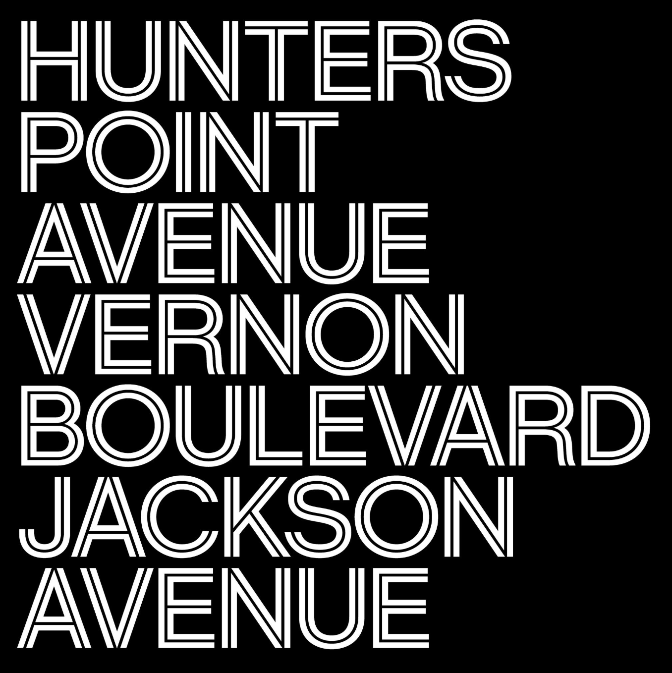
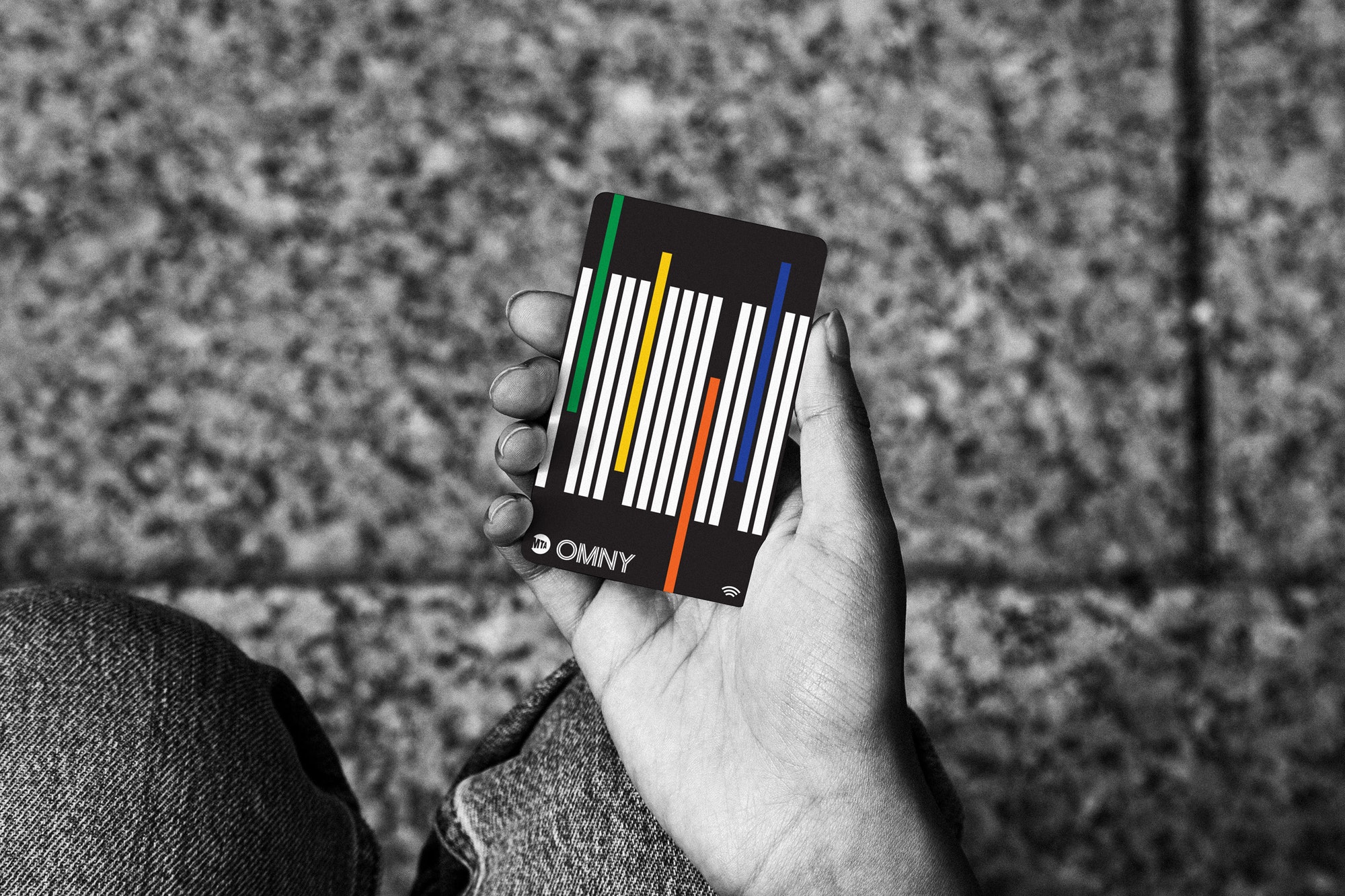
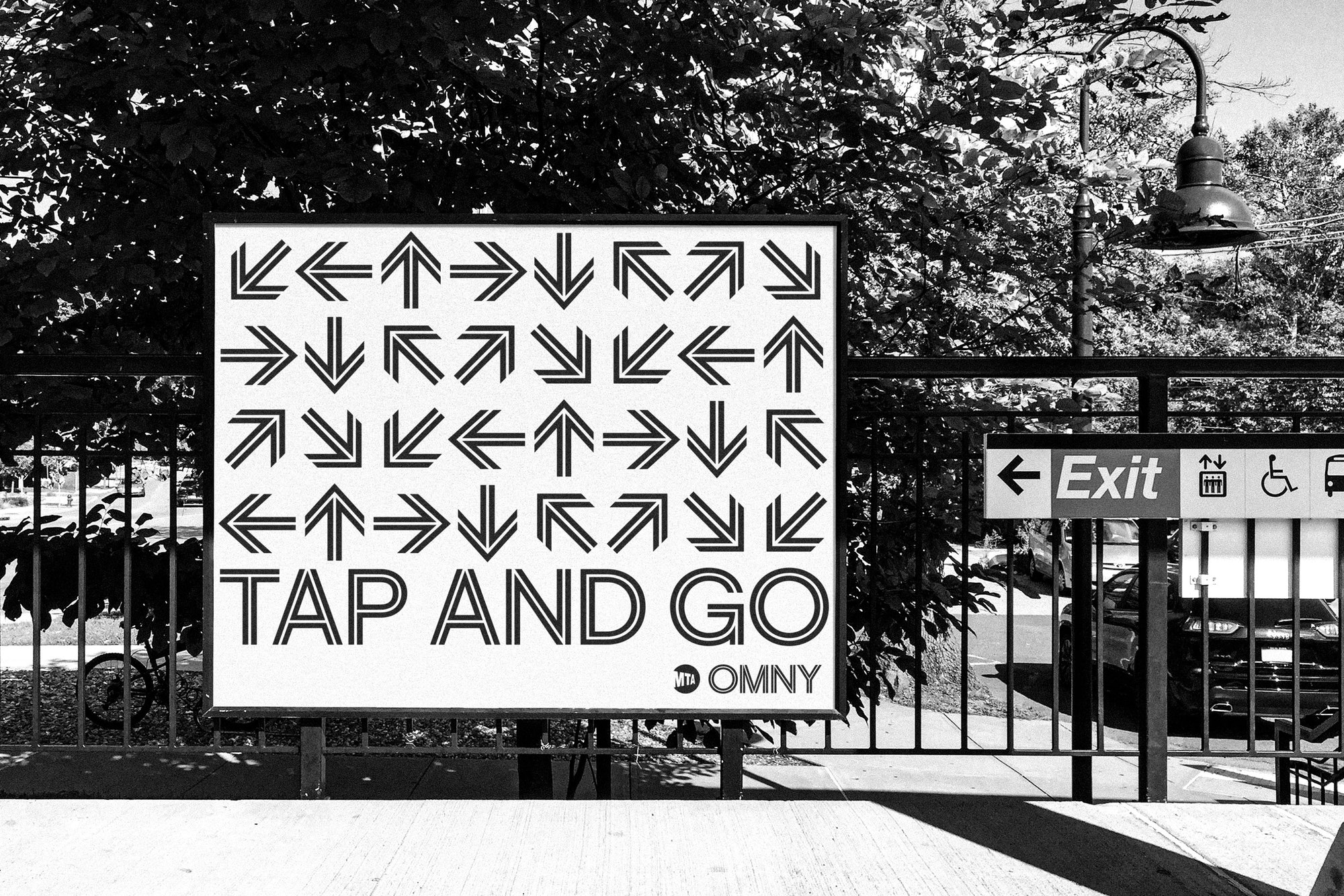
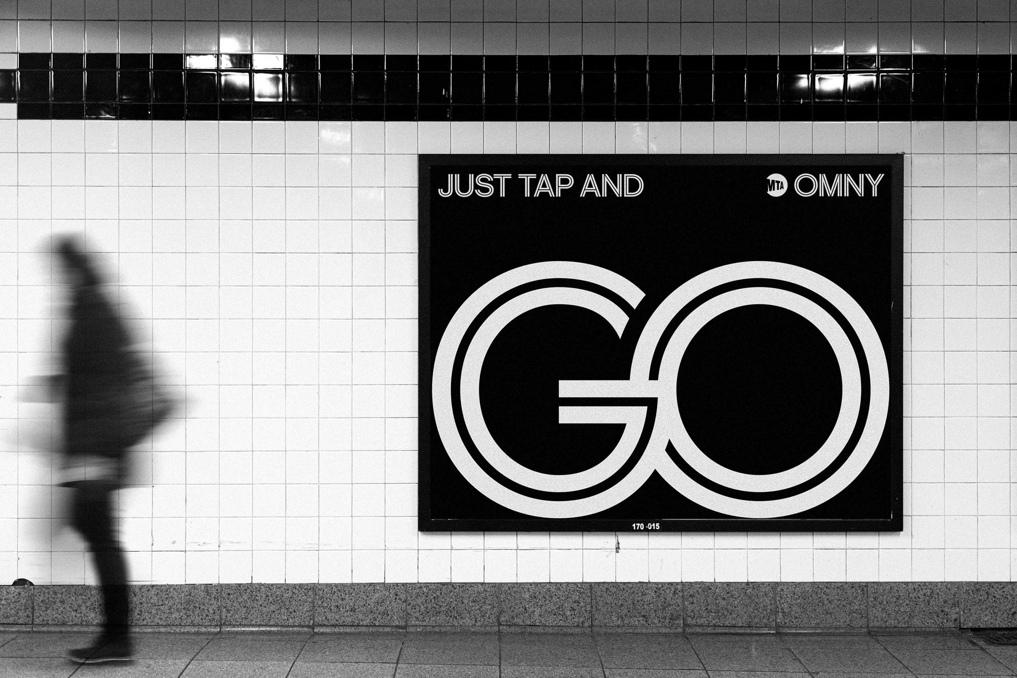
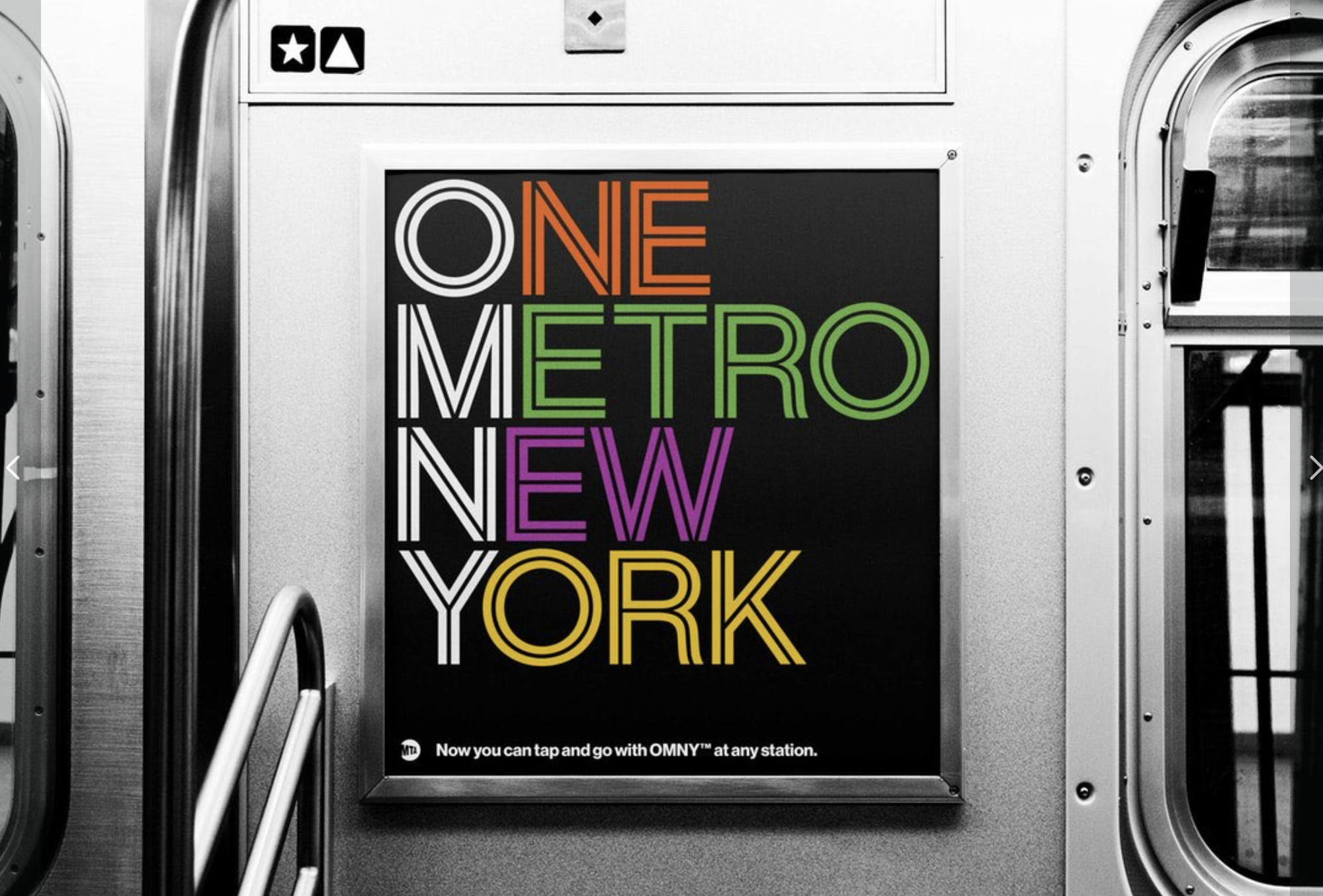
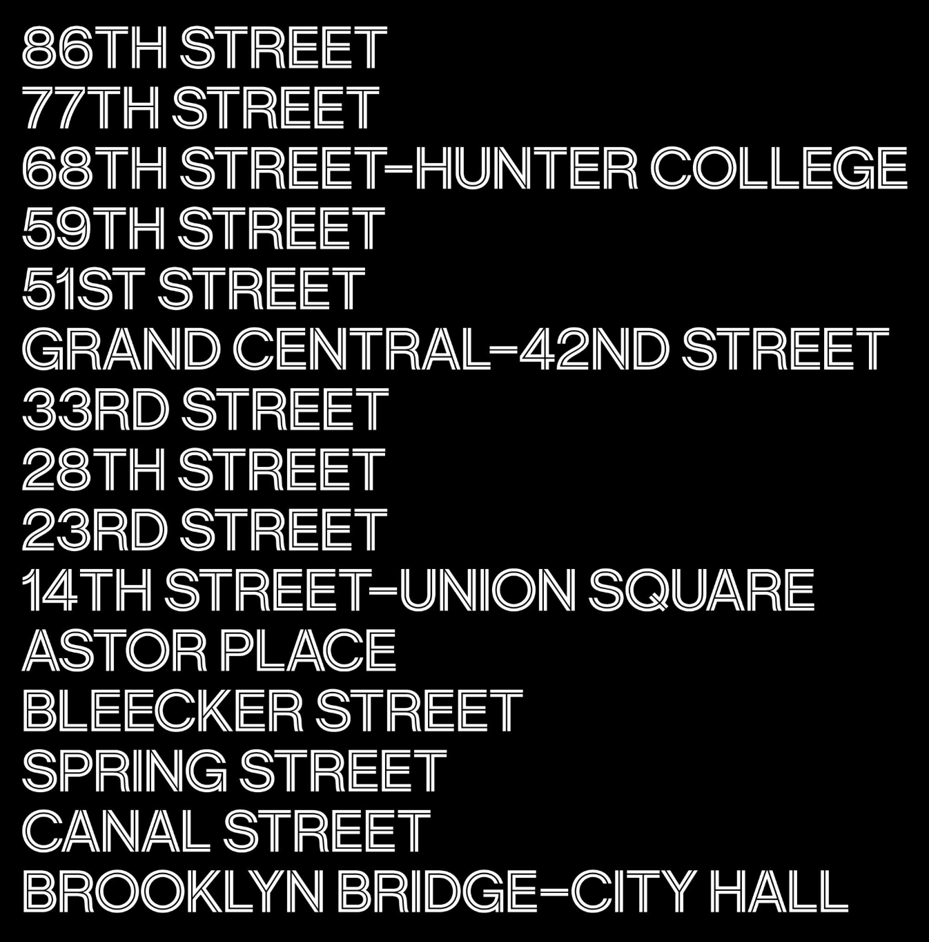
Brand identity and naming for the new contactless fare payment system for the MTA transit networks in NYC by Pentagram and Michael Bierut Via @Dazarbeygui
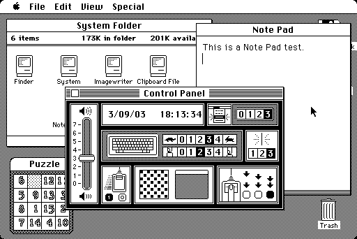
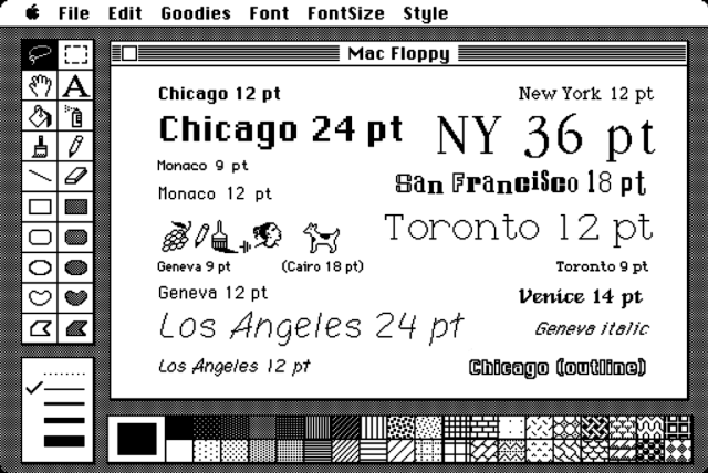
The 'Chicago' typeface designed by Susan Kare for Apple Macintosh (in 1983) became an integral part of the Mac interface and Apple's identity for over a decade via
@MHD_Studio
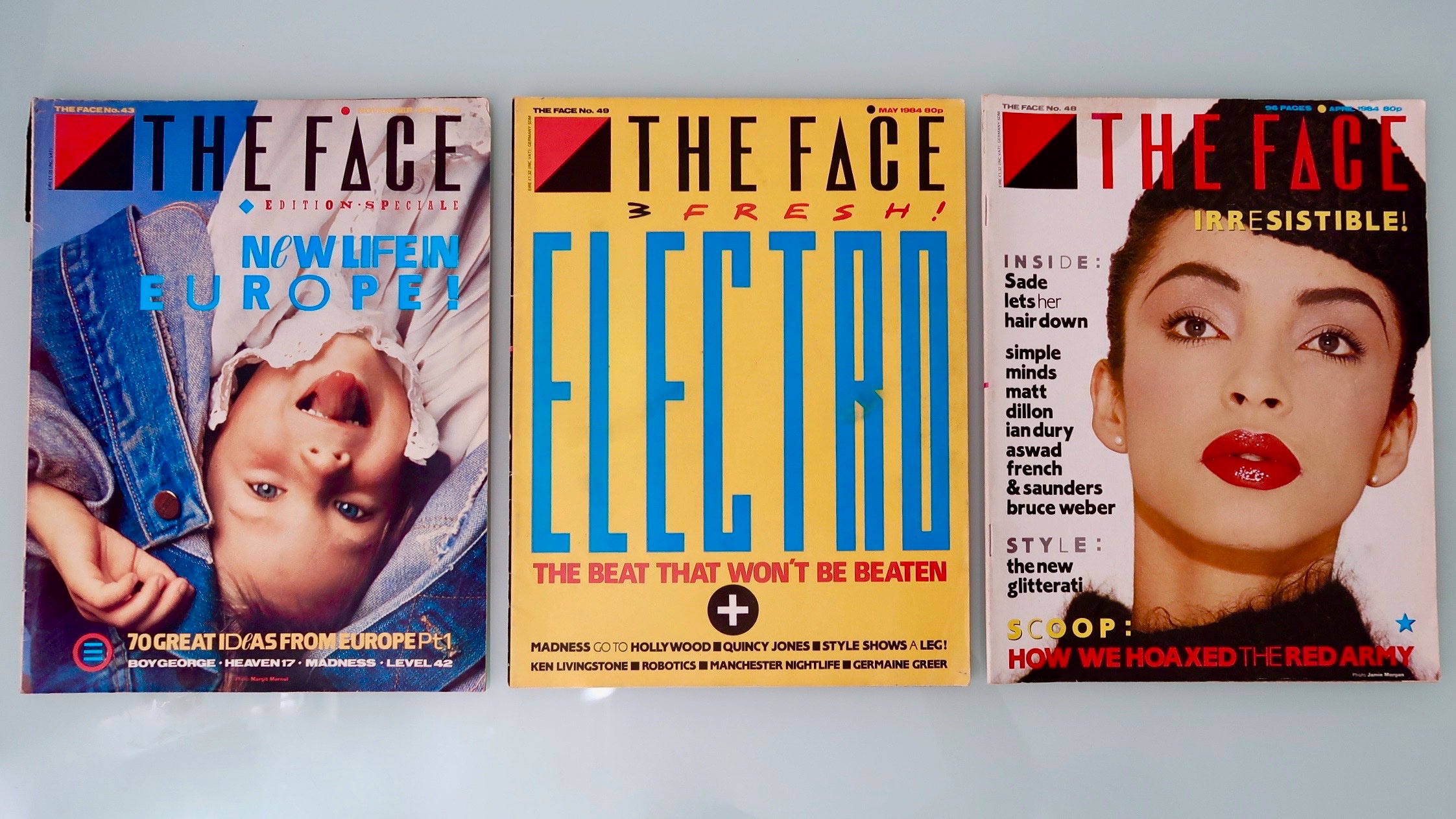
The Face of the 80s - Neville Brody capturing the zeitgeist via @Birmingham_81

WIRED magazine spread by @franktheguy via @ArmandoRoqueCcs
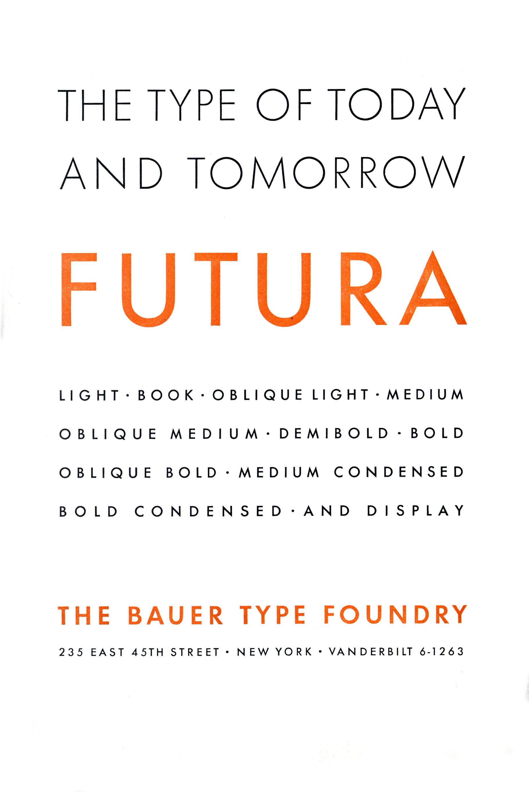
Futura: the typeface that Bauer proclaimed was the typeface of its time and tomorrow. Its popularity proved the advertisements true. This ad from 1928 in NYC via
@dougthomas31
Bonus the story of Futura explained by Vox.
Tags/ exhibition, typefaces, twitter, wired, fonts, apple, pentagram, futura, design museum, michael beirut, zak group, font sunday, susan kare, zeitgeist, beazley


