TCM tv channel has a brand new alphabet of old Hollywood glory
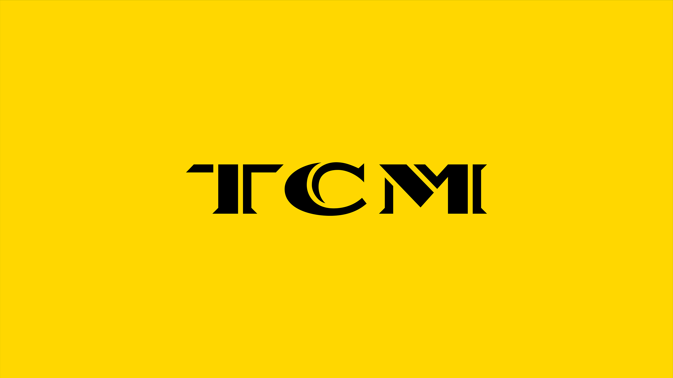
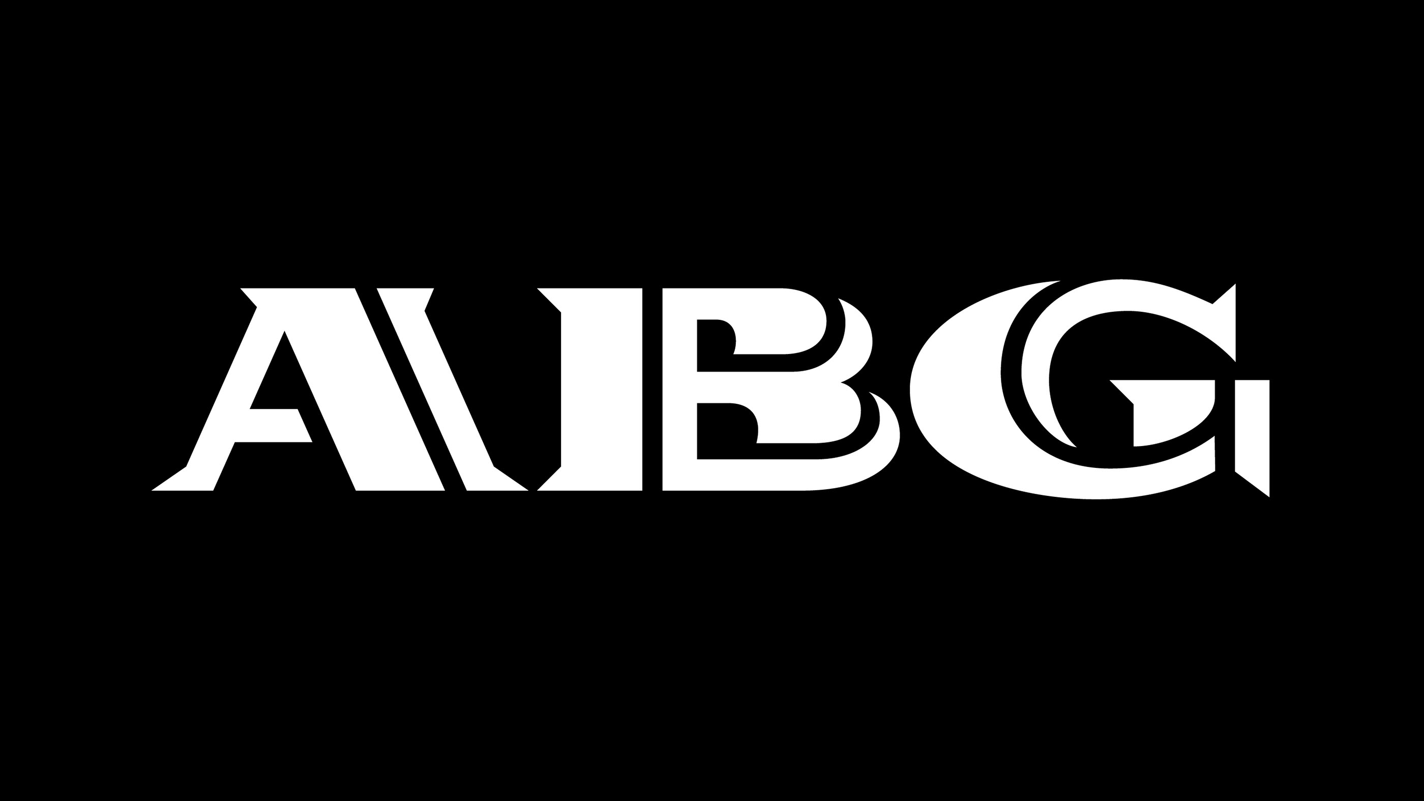
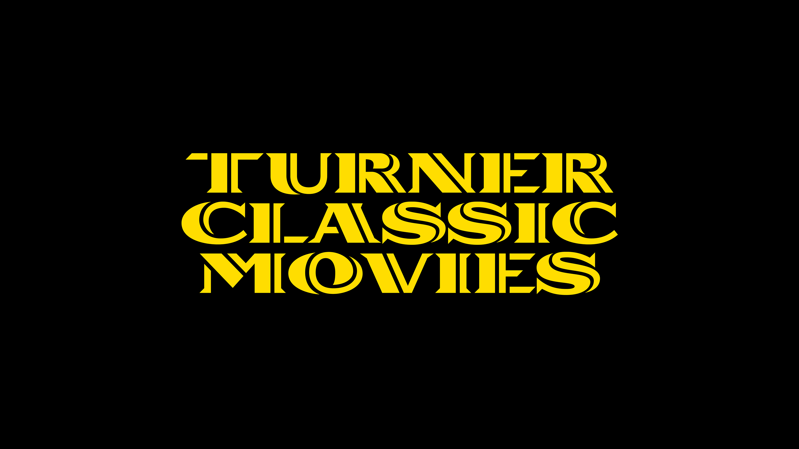
Wete, the small & independent graphic design studio based in Barcelona has another client in its portfolio. After Adobe, HP, Reebok, Yorokobu, Desigual, Fortune Magazine, W Hotels, AIGA, and LVMH group, Wete has been commissioned to breathe some fresh air into the old Hollywood through the redesign of the logotype and alphabet for TCM (Turner Classic Movies) tv channel in Spain.
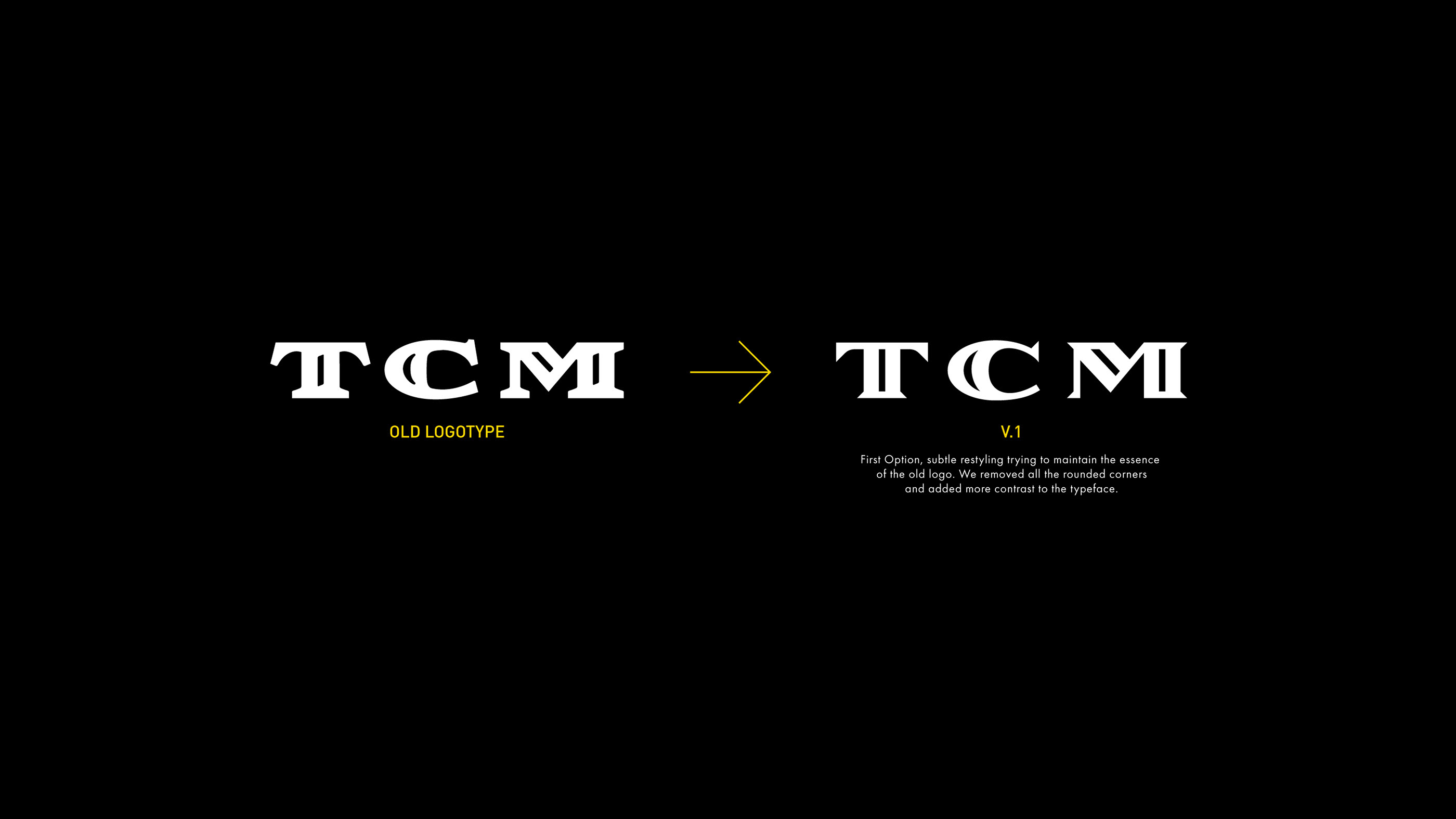
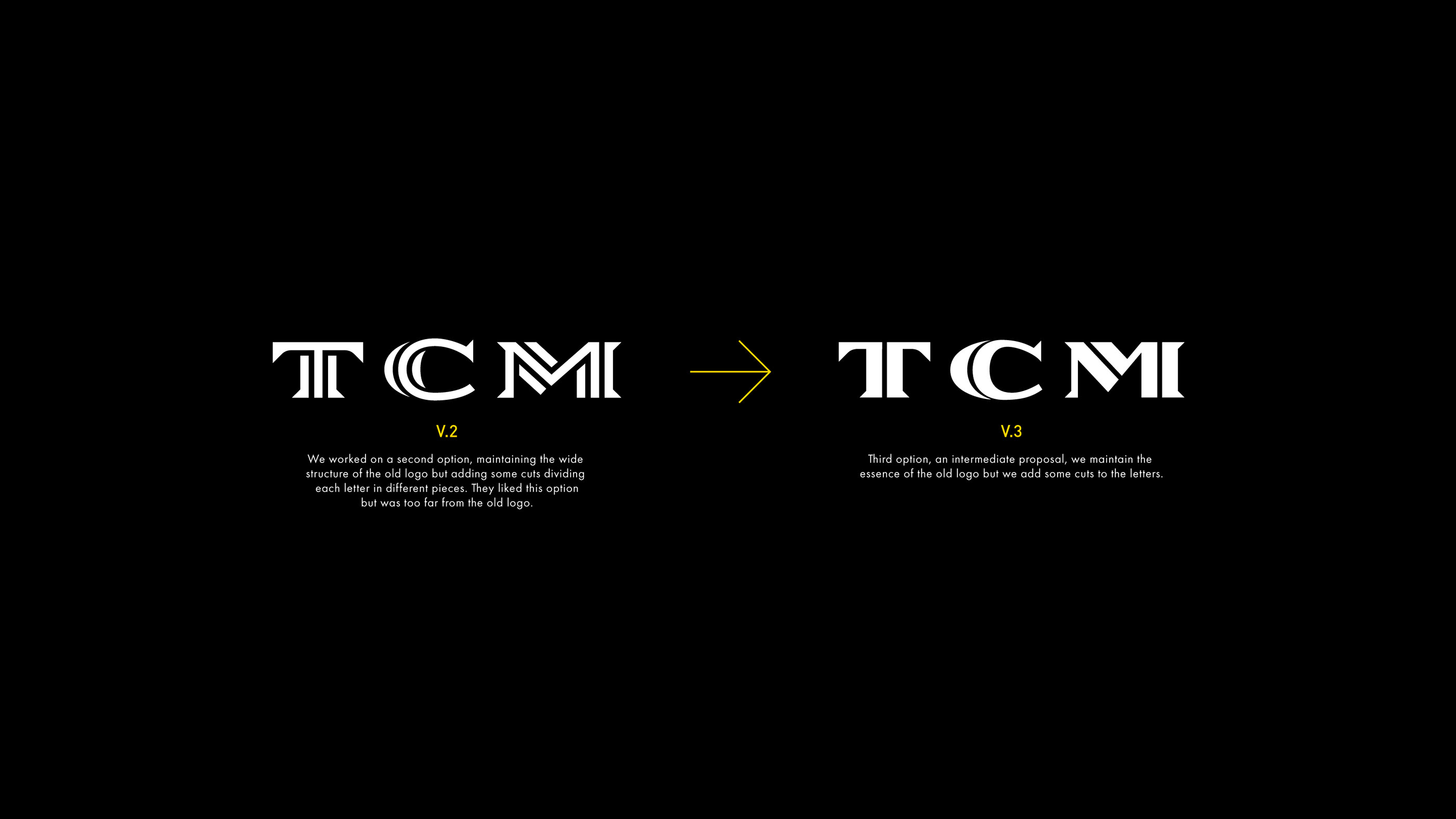
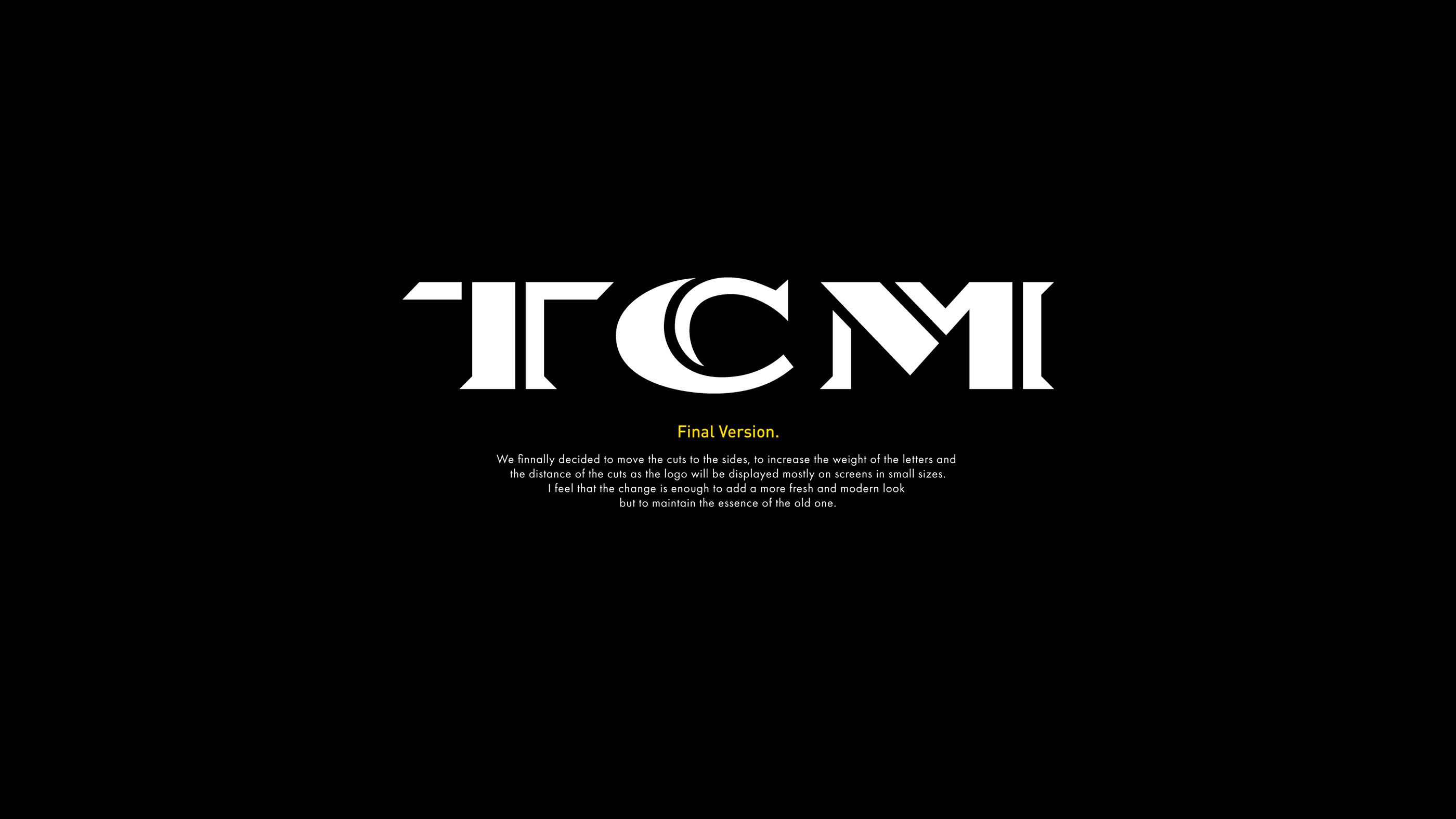
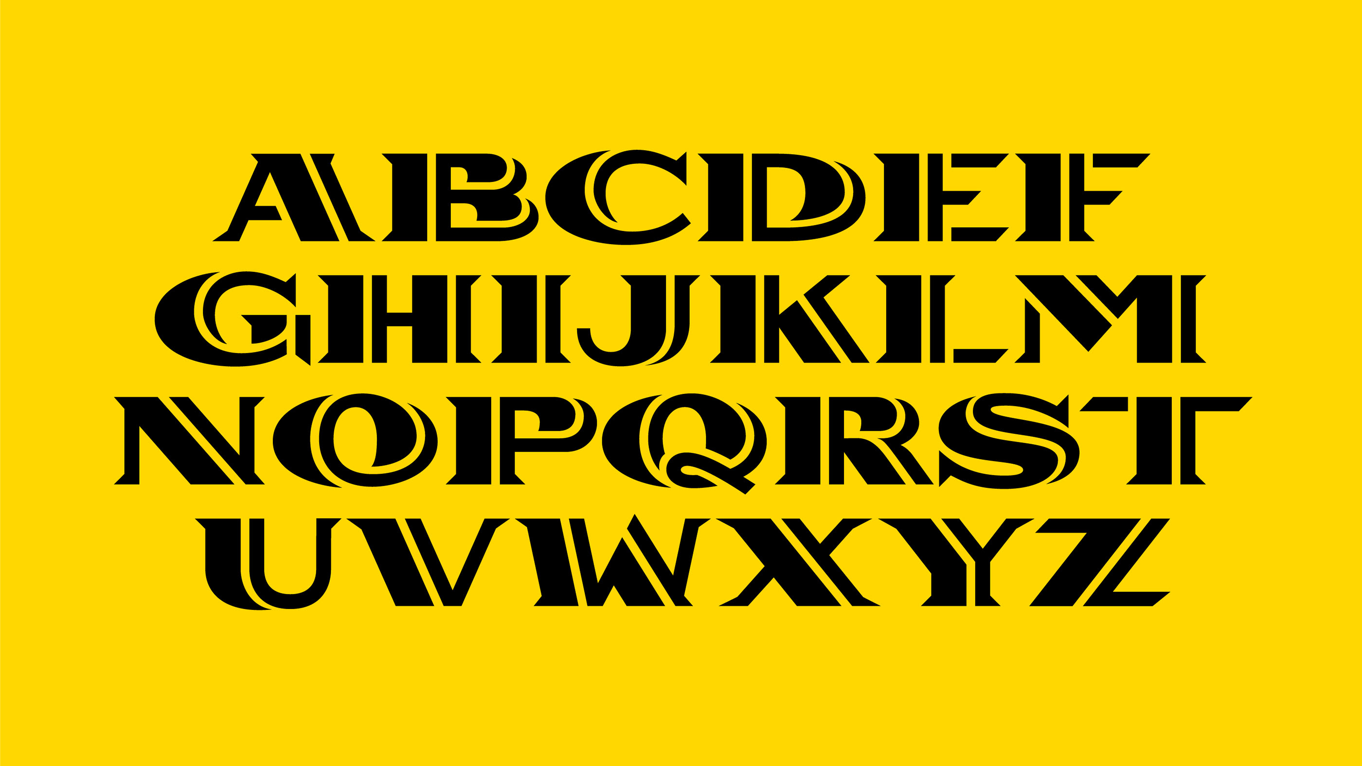
“The goal was to make a subtle change to the old logo that modernizes it and gives it a more actual and fresh look. Initially, the idea was not to change the logo too much but to update it a bit. As we were working on new proposals we saw that we could take a step further and make something more different/risky, always maintaining the essence of the old one. I think it's interesting to see the evolution to understand the result” writes Wete. “Once we had the logo we began to develop the alphabet, an important piece within the identity since it would accompany the titles in the different animated pieces.”
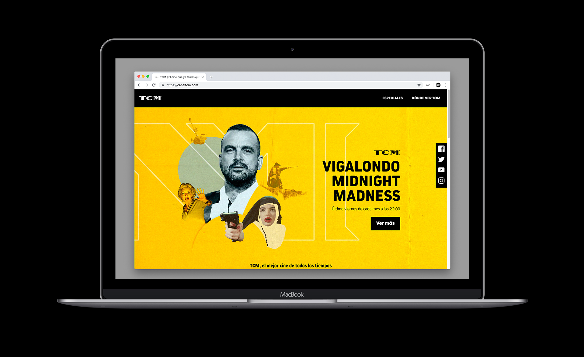
Art directed by Ignacio Gaubert with typography by Wete this is TCM's brand new visual identity for all things Hollywood. Discover more here.

Tags/ alphabet, logotype, barcelona, spain, tv channel, wete


